All articles in 'Analytics' Category

Imagine you are the in-charge of finance department at Hogwarts. So one fine day, while you are practicing the spells, Dumbledore walks in to your office and says, “Our electricity bills are way too high. As the muggles don’t accept wizard money, we have to find a way to reduce our power consumption.”
So you summoned the previous 12 month utility bills to examine energy consumption patterns, and pretty soon you realized that most of the electricity consumption is due to the light bulbs. You suddenly have a brilliant idea. Why not replace the light bulbs with a variety that consumes low power? A light bulb moment indeed.
Your next step is to figure out what varieties of light bulbs are out there. Fortunately this is easier than catching a snitch in a game of quidditch. A quick search revealed that there are 3 types of light bulbs:
- Regular incandescent bulbs (the kind Hogwarts currently uses)
- Compact Fluorescent Light bulbs (CFL)
- Light Emitting Diode bulbs (LED)
Now your job is to do a cost benefit analysis of these options and pick one.
Continue »Please help me design our new course – “50 ways to analyze your data”

Hi friends & readers of Chandoo.org,
I have an exciting and awesome new training program for you. 50 ways to analyze your data is aimed to give you critical data analysis & charting skills necessary for your success as an analyst (or manager). I want to make sure that this course offers you best content & value. I need your help in designing it. Please take a few minutes to read this short post & share your feedback.
Continue »
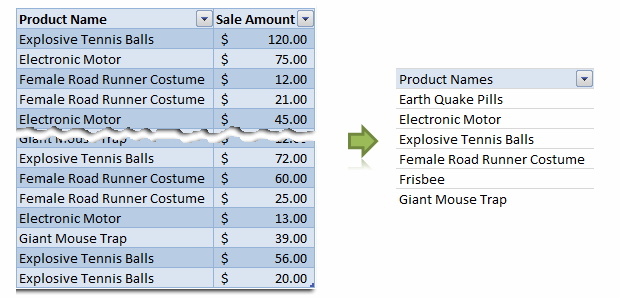
Removing duplicate data is like morning coffee for us, data analysts. Our day must start with it. It is no wonder that I have written extensively about it (here: 1, 2, 3, 4, 5, 6, 7, 8). But today I want to show you a technique I have been using to dynamically extract and sort […]
Continue »Data Tables & Monte Carlo Simulations in Excel – A Comprehensive Guide

If anybody asks me what is the best function in excel I am drawn between Sumproduct and Data Tables, Both make handling large amounts of data a breeze, the only thing missing is the Spandex Pants and Red Cape!
How often have you thought of or been asked “I’d like to know what our profit would be for a number of values of an input variable” or “Can I have a graph of Profit vs Cost”
This post is going to detail the use of the Data Table function within Excel, which can help you answer that question and then so so much more.
Continue »
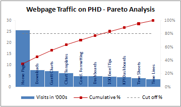
A Pareto chart or pareto graph displays the importance of various factors in decreasing order in columns along with cumulative importance in a line. Pareto charts are often used in quality control to display most common reasons for failure, customer complaints or product defects. The pareto chart is a great way to do the pareto analysis. Today, we will learn how to use excel to make a pareto chart.
Continue »
Often when you are writing code or testing an application, it might be helpful to have random phone numbers generated for you. Here is an excel formula that I use: =value(left(substitute(rand(),”0.”,””),10)) try these 2 instead (thanks to John) =RAND()*(9999999999-1000000000)+1000000000 =RANDBETWEEN(1000000000,9999999999) [needs analysis toolpack add-in or excel 2007] Even though it works most of the time […]
Continue »Extracting Unique, Duplicate and Missing Items using Formulas [spreadcheats]
![Extracting Unique, Duplicate and Missing Items using Formulas [spreadcheats]](https://chandoo.org/wp/wp-content/uploads/2008/11/duplicate-items-excel-formula-find.gif)
Often I wish Microsoft had spent the effort and time on a data genie (and a set of powerful formulas) that can automate common data cleanup tasks like extracting duplicates, makings lists unique, find missing items, remove spaces etc. Alas, instead they have provided features like clippy which are intrusive to say the least. So […]
Continue »![Adding Box Plots to Show Data Distribution in Dashboards [Part 6 of 6]](https://chandoo.org/wp/wp-content/uploads/2008/10/box-plot-excel-dashboard-visualization-thumb.png)
This is a Guest Post by Robert on Visualization Techniques for Excel KPI Dashboards. This 6 Part Tutorial on Management Dashboards Teaches YOU: Creating a Scrollable List View in Dashboard Add Ability to Sort on Any KPI to the Dashboard Highlight KPIs Based on Percentile Add Microcharts to KPI Dashboards Compare 2 KPIs in the […]
Continue »Making Pie-charts look Sexy – The CNN’s tax burden analysis chart

There is always a debate about how good or evil pie charts are. While visualization purists believe pie charts should be avoided at all costs, newbies find creating and using pies very easy and often over do it. I have blogged few techniques involving pie chart visualizations like in-cell pie charts, speedometer charts, donut clocks […]
Continue »
Sorting text is such a day to day activity that it always surprises me why Excel hasn’t provided a simple spreadsheet formula for doing it. Of course you can use the sorting menu command (menu > data > sort) but this requires manual steps (or VBA). Most of the times we get raw textual data […]
Continue »![KPI Dashboards – Compare 2 Decision Parameters [Part 5 of 6]](https://chandoo.org/wp/wp-content/uploads/2008/10/excel-dashboard-visualization-tips-thumb.png)
This is a Guest Post by Robert on Visualization Techniques for KPI Dashboards using Excel. This 6 Part Tutorial on Management Dashboards Teaches YOU: Creating a Scrollable List View in Dashboard Add Ability to Sort on Any KPI to the Dashboard Highlight KPIs Based on Percentile Add Microcharts to KPI Dashboards Compare 2 KPIs in […]
Continue »
Spelling mistakes are a thing of day to day carporate life. Most of the data in spreadsheets is entered by people and hence prone to having spelling mistakes or alternate spellings. For eg. a person named John could have been spelled as Jon. And when John calls you back to confirm his reservation and you […]
Continue »Sorting a list of items in random order in excel – using formulas

In shuffling a list of items in excel I have described the technique of using random numbers generated by RAND() to sort a list of items. The technique had one disadvantage though, every time you need to reshuffle the list you have to press F9 to recalculate the rand() and then go to menu > […]
Continue »Creating KPI Dashboards in Microsoft Excel is a series of 6 posts by Robert from Munich, Germany. This 6 Part Tutorial on KPI Dashboards Teaches YOU: Creating a Scrollable List View in Dashboard Add Ability to Sort on Any KPI to the Dashboard Highlight KPIs Based on Percentile Add Microcharts to KPI Dashboards Compare 2 […]
Continue »Google docs spreadsheet app is going mainstream with each passing day. Recently they have introduced split() formula to divide text in to multiple cells using a user specified delimiter. The syntax for this function is =split(text value, delimeter), for eg. =split(“pointy haired dilbert”, ” “) would result in 3 individual cells with “pointy”, “haired” and […]
Continue »

