Archive for November, 2015

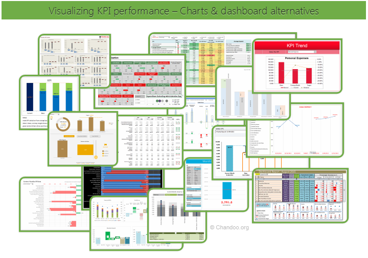
Hello all, prepare to be amazed! Here are 43 creative, fun & informative ways to visualize KPI data.
About a month ago, I asked you to visualize KPI data. We received 65 entries for this contest. After carefully reviewing the entries, our panel of judges have discarded 22 of them due to poor charting choices, errors or just plain data dumps. We are left with 43 amazing entries, each creatively analyzed the data and presented results in a powerful way.
How to read this post?
This is a fairly large post. If you are reading this in email or news-reader, it may not look properly. Click here to read it on chandoo.org.
- Each entry is shown in a box with the contestant’s name on top. Entries are shown in alphabetical order of contestant’s name.
- You can see a snapshot of the entry and more thumbnails below.
- The thumb-nails are click-able, so that you can enlarge and see the details.
- You can download the contest entry workbook, see & play with the files.
- You can read my comments at the bottom.
- At the bottom of this post, you can find a list of key charting & dashboard design techniques. Go thru them to learn how to create similar reports at work.
Thank you
Thank you very much for all the participants in this contest. I have thoroughly enjoyed exploring your work & learned a lot from them. I am sure you had fun creating these too.
So go ahead and enjoy the entries.
Continue »CP049: Don’t do data dumps!!!

Podcast: Play in new window | Download
Subscribe: Apple Podcasts | Spotify | RSS
In the 49th session of Chandoo.org podcast, let’s talk about data dumps!
What is in this session?
In this podcast,
- What is a data dump
- Examples of data dump
- Why we dump
- Ways to avoid data dumps
- Go for information dumps
- Sort the dump
- Filter the dump
- Give a table
- Resources for you
![Edit cells & formulas faster [shortcut]](https://chandoo.org/wp/wp-content/uploads/2015/11/shortcuts-for-editing-quickly.png)
Let’s keep this simple & short.
Whenever you are editing cells or formulas, the usual sequence is like this:
- Double click on the cell you want to edit
- For existing cells: Go to the left most / right most part and start typing
- For blank cells: start typing right away
Here is a faster sequence:
Read on…
Continue »
Podcast: Play in new window | Download
Subscribe: Apple Podcasts | Spotify | RSS
In the 48th session of Chandoo.org podcast, let’s make some animated charts!!!
What is in this session?
In this podcast,
- Announcements
- Why animate your charts?
- Non-VBA methods to animate charts
- Excel 2013’s built-in animation effects
- Iterative formula approach
- VBA based animation
- Cartoon film analogy
- Understanding the VBA part
- Example animated chart – Sales of a new product
- Resources and downloads for you
Happy Diwali for all our readers – Animated Flower Pot Cracker in Excel for you…

Today is Diwali, the festival of lights. I wish you and your family a happy, bright and prosperous festive time. May your house shower with lots of light, laughter and love.
Diwali is one of my favorite festivals. It is a time when all family members get together, eat delicious food, laugh to hearts content and light up diyas (small oil lamps) to celebrate the victory of good over evil. This year, my kids (who are 6 yrs btw) are very excited about the festival. They are looking forward to lighting up diyas and crackers (fire works).
To celebrate the holiday, I made something for you.
An animated flower pot firework in Excel.
Continue »Employee training tracker & calendar – tutorial & download

Imagine you are the head of training department at ACME Inc. You arrange training programs round the year to empower your team. It is hard work, coordinating between employees, trainers, department heads, venues and coffee machines. What if there is something to help you keep track of all this? I am not talking about getting you a shiny new iPad, you silly. I am talking about a tracker & calendar built in Excel that ties everything together (well, almost everything, you still have to fill the coffee machine.)
We are going to build a training program tracker & calendar using Excel.
Continue »

