Archive for January, 2014
How to select a random sample from all your data [trick]
![How to select a random sample from all your data [trick]](https://img.chandoo.org/pivot/how-to-select-random-samples-from-data.png)
The other day, I got a text message (SMS) from one of our readers. It read,
So today, let us learn a very easy trick to select random sample from your data.
Continue »
Power Pivot for Excel has come a long way since it was introduced in late 2009. In the last 4 years not only has the technology matured, but also became a standard reporting platform in many businesses. As a smart analyst (or manager), you will gain a lot of mileage by adding this vital skill to your resume.
Today, let me show 5 reasons why you should learn Power Pivot this year.
Continue »Did Jeff just chart?

How do you segment customers by revenue easily in Excel, so that you can see which customer groups to focus on. Find out, and download this handy template.
In this charting example, Jeff, our guest author, occasional charter and Excel wizard shows us how to segment customers based on revenue and depict the result using Excel charts.
Continue »Right-click from the keyboard, not the mouse.

Well here’s something I never knew until today…I was watching one of Mike ExcelIsFun Girvin’s great YouTube videos from his great Slaying Excel Dragons series – the one on Excel 2010 Keyboard Shortcuts – when he showed how to do the equivalent of a mouse right click using a key on the keyboard that I’d […]
Continue »Howdy folks. Jeff here. I recently gave a presentation on Excel efficiency to a bunch of analysts, in which – among other things – I’d pointed out that if you ever find yourself having to switch calculation to Manual, there’s probably something wrong with your spreadsheet. Here’s the slide: This prompted one of the […]
Continue »Find first non-blank item in a list with formulas

Blank cells are an invisible pain in the analysis. Dealing with them is frustrating, time consuming and often very complex. At chandoo.org, we are not big fans of blank cells. That is why we wrote:
- How to delete blank cells & rows?
- Dealing with blanks – case study
- Quickly filling blank cells in a table
- Extracting non-blank data from a list
Today, lets talk about one more scenario. Lets say you want to find out the first non-blank item in a list. How would you do it?
Continue »Quickly combine text in multiple cells using this trick! [Formulas]
![Quickly combine text in multiple cells using this trick! [Formulas]](https://img.chandoo.org/q/combine-text-values-to-one-value-excel-trick.png)
Ever wondered how to go from a bunch of cells with text to one big combined text? Like shown above.
Well, there is a simple trick. One of our readers, Grant shared this with us. Read on to learn this.
Continue »42% of the world goes to polls around a pie chart – Like it or hate it?

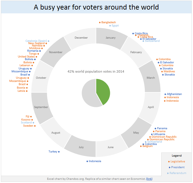
Today lets have a poll. Lets debate if this pie chart about world elections in 2014 is good or bad.
First lets take a look at the chart
This chart, published by The Economist talks about how 42% of the world population is going to vote this year. Take a look and read on to learn how you can re-create this in Excel.
Continue »Bar chart with lower & upper bounds [tutorial]
![Bar chart with lower & upper bounds [tutorial]](https://img.chandoo.org/c/bar-chart-with-lower-and-upper-bounds.png)
Bar & Column charts are very useful for comparison. Here is a little trick that can enhance them even more.
Lets say you are looking at sales of various products in a column chart. And you want to know how sales of a given product compare with a lower bound (last year sales) and an upper bound (competition benchmark). By adding these boundary markers, your chart instantly becomes even more meaningful.
Lets learn how to create a column chart with lower & upper bounds in this tutorial.
Continue »Top 10 things I learned using Excel for a decade

Sometime during the 2nd half of 2013, I finished 10 years of Excel usage. In the last 10 years, I completed my studies, got my first job, married, had kids, visited 15 different countries, quit my job to start a business, bought first car, first house, made dozens of new friends, read 100s of books, wrote a book and learned 1000s of new things. And all along, Excel stayed a true companion. Right from MBA entrance exam preparation in 2003 to making my summer internship project reports in 2005 to planning my wedding expenses in 2007 to getting a promotion in 2009 to planning my kids feeding schedule in 2010 to running a successful business in 2014, Excel helped me in every step.
So today, I want to tell you the top 10 things I learned using Excel in last decade. Grab a hot cup of coffee, buckle your belts and get ready for time travel.
Continue »Free 2014 Calendar, daily planner templates [download]
![Free 2014 Calendar, daily planner templates [download]](https://chandoo.org/wp/wp-content/uploads/2014/01/free-calendar-and-daily-planner-template-2014.png)
Here is a New year gift to all our readers – free 2014 Excel Calendar & daily planner Template.
This calender has,
- One page full calendar with notes, in 4 different color schemes
- Daily event planner & tracker
- 1 Mini calendar
- Monthly calendar (prints to 12 pages)
- Works for any year, just change year in Full tab.


