
Today lets close some gaps.
Recently I saw this interesting chart on Economist Daily Charts page. This chart is based on World Economic Forum’s survey on how women compare to men in terms of various development parameters. First take a look at the chart prepared by Economist team.
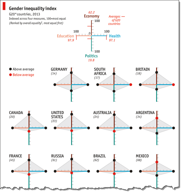
So what are the gaps in this chart?
This chart fails to communicate because,
- All country charts look same, thus making it difficult to spot any deviations.
- We cannot quickly compare one country with another on any particular indicator.
- It does not provide a better context (for eg. how did these countries perform last year?)
But criticizing someone’s work is not awesome. Fixing it and making an even better chart, that has awesome written all over it. So that is what we are going to do.
Fixing the gaps in Gender Equality chart
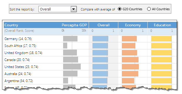
First take a look at the improved chart. Play below video.
Step 1: Getting the data for this chart
Although folks at Economist have not included source data, the good people at WEF have provided detailed PDF reports (2013, 2012) where all the data is naked and waiting for us, analyst to pounce and go nuts.
I copy pasted table in to Excel.
While 2012 data loaded alright, 2013 loaded in a weird fashion.
So we move to step 2.
Step 2: Cleaning the data
I feel dirty every time I clean a piece of data 😉
But I also like it (cleaning part, not feeling dirty part). I learn some techniques when I am working with messy, sticky and disorganized data sets.
The 2013 data is pasted in to Excel in this format.
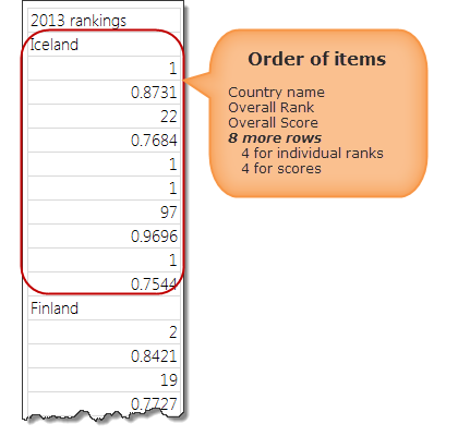
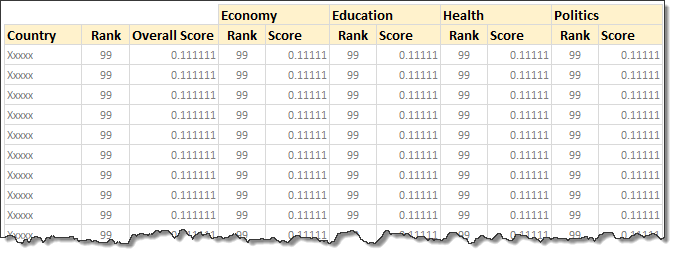
From this, we need to transform our data to:
If we know magic, we could point our wand at the table and say something like, Mobiliarbus Datum.
Alas. We are muggles. So lets rely on the most potent magic we know: Excel formulas. Using INDEX + MATCH combination, we can easily convert 2013 data to the format we want.
The actual formula to fetch overall rank (2nd item in the list for each country) is,
=INDEX(gaps2013,MATCH($B5,gaps2013,0)+1)
Explanation:
- gaps2013 is the range where all the 2013 gender gap survey data is copied
- B5 contains the name of the country for which we want the data.
- +1 because we want to get rank, not country name.
For more, read how to get VLOOKUP + 1 item.
Step 3: Set up form controls
Now that we have sparkling clean data, lets create necessary form controls on our output sheet.
![]()
 We need 2 controls.
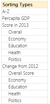
- A combo-box (drop-down) control so that user can select what field to sort the report on.
- A set of option buttons to specify which average to compare.
The combo-box is set up to use the list of values shown aside.
Related: Introduction to Excel Form Controls.
Lets link these to 2 cells, named sortCol & avgType on a different sheet. Call this sheet as calculations. All our formulas will go here.
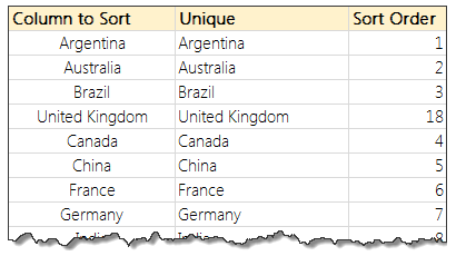
Step 4: Find sort order based on the selected column
This is the tricky part. I am going to give highlights here and point you to a link where you can learn more.
- Fetch the column we want to sort in a range of cells.
If sorting a number column:
- Make the column unique by adding a very small running fraction.
- This ensures that if our data has duplicates, still our formula works.
- Find the sort order of each item using RANK() formula.
- Refer to Sorting KPIs using Formulas article for more on this technique.
If sorting a text column:
- Find the sort order using COUNTIF() formula.
- Refer to sorting text using formulas article.
Step 5: Re-arrange all data in the sort order
Using INDEX formula, rearrange all data according to the sort order.
Step 6: Calculate % change values
Based on 2012 & 2013 scores, calculate % change and place them in the last 5 columns.
Step 7: Calculate averages
Calculate averages (both G20 & all country values) for all the columns and place them somewhere on your calculations worksheet.
Related: Calculating the average of every nth item.
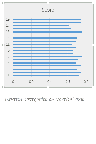
Step 8: Create charts
Here is the process for creating chart for Overall Score (2013). The same process is used to create all the charts.
- Select all the numbers in overall score column.
- Create a bar chart
- Select vertical axis and press CTRL+1 to format it.
- Select “Categories in reverse order.”
- Adjust series gap to 25%
- Set horizontal axis min to 0 and max to 1 and remove the axis.
- Remove vertical axis, grid lines
- Remove title
- Fill chart background & plot background with no color.
- Set chart outline to no outline.
- And you are done!
See the demo aside to understand the process.
Step 9: Add average as secondary series to the chart
Calculate which average to use in the chart based on the avgType value. And fetch that number to a cell.
Now add average to the chart as a line. This can be done by,
- Adding average point to the chart as second series
- Converting this series to scatter (XY) plot.
- Adjusting the X & Y values of the average point.
- Adding 100% positive (or negative) error bar
- Formatting the error bar to make it look like a line.
- Removing any axis, grid lines added in the process.
Step 10: Oh wow, this is getting long. Have a coffee
I guess this is now a fairly long process. But closing gender gaps (or gaps in the gender gap chart) is never easy. So have a cup of coffee or tea. Rejuvenate and come back.
Step 11: Create all other charts
Follow the same process and create rest of the charts.
One easy way to create rest of the charts is,
- Copy the first chart and paste it elsewhere.
- Select the bars and edit the range address in the formula bar.
- Select the average point and edit that too.
- Adjust axis if needed.
- And you are done!
Step 12: Put everything together
Create a nice table like structure in your output tab and put everything together. Re-size and position the charts as needed. Make sure the colors are nice. Add conditional formatting to highlight column being sorted and you are done!
Missing Steps
I have deliberately omitted a few steps in this process to keep it simple. For those of you with a keen eye:
- Using conditional formatting data bars for the % change column.
- Turning on / off last column in the report based on sort selection using conditional formatting.
- Adding data labels to the country names based on the sort selection.
Download this Excel chart
Click here to download this Excel chart. Play with it. Explore the chart settings, formats, formulas and controls to understand it better.
Conclusions – What does the Gender Inequality Chart say?
After all this analysis, 2 things are clear.
- In most countries, women have high equality with men when it comes to health or education.
- The real gap seems to be in politics & economical development of women.
While this may seem like common sense, it also means, World Economic Forum people should measure inequality on some more parameters. There is little point tracking and analyzing indicators related to health or education (especially in OECD or Western countries).
What do you think?
Want to fill gaps in your Excel knowledge
While no one appreciates gender inequality, we all love awesomeness inequality. There is nothing wrong in wanting to be more awesome than your peers. And here is how you can be unmatched…
- Using Panel charts to understand data
- Spot matrix charts – alternative to radars
- Analyzing performance of stocks using charts
- Suicides & Murders data – interactive analysis
- Visualizing world education rankings
- Survey data analysis with in-cell charts
Want some challenge… How would you analyze this data?
If you want some challenge, go ahead and download the file. It has all the data for 2012 & 2013. Analyze it and share with me your charts. You can email me at chandoo.d@gmail.com or upload your files somewhere and post the links in comments. I would love to see how you can analyze and present this data.


28 Responses to “2010 Calendar – Excel Template [Downloads]”
[...] Download and print the calendars today. You can add notes to individual dates or complete … [...] Uni Ego / Free 2010 Calendar – Download and Print Year 2010 Calendar today [...]
Any chance on a 2016 calendar?
Afternoon,
I have one similar calander that I added conditional formatting to so that I could highlight any planned factory holidays. I think i "borrowed" the formula from another calander so I won't post it here.
I also added week numbers to it using the formula =WEEKNUM(MAX(C6:I6)) Where C6:I6 is the range of dates in that give week. It works fine on most of the months but return strange values on other months (Week 6 in October?) I can't see any logic behind why it does this.
Any suggestions for an alternative formula to give the week numbers?
Regards,
William
Hi Chandoo,
I've added a new feature on your spreadsheet.
This control can be useful for all the sheets where you need to check dates.
Cheers
http://cid-69a78592a23a8438.skydrive.live.com/self.aspx/.Public/2010-calendar%5E_Miguel.xls
Hi Chandoo,
Nice calendar.
Till now whichever calendar I saw in Excel, it contained only the outline sheet.
Good to see monthly views and the mini view too.
Liked the mini view much. 🙂
-Nimesh
@William: This weeknum may be because the input dates to max are not properly formatting as excel dates.
Good tip on the conditional formatting and holidays btw...
@Migueal: Now that is super awesome. This is the reason why I love to blog. Readers will always one up me with such cool alternatives. Thank you for sharing this with us.
@Nimesh: You are welcome 🙂
is it possible to get the Notes section on the outline page to display the notes added to the month page for a specific date?
So if you add thing for January 2nd, and then select January 2nd those notes appear on the outline page
@Shish... You can do that using some formula magic. I would not recommend pushing excel to that as outlook / google calendar / icalc etc. do exactly that much more elegantly.
[...] Perpetual Excel Calendar – Free Downloadable Template [...]
Happy christmas to all of you!
This is really awesome. The nicest calender I've seen for Excel. I also like Miguels version of the sheet.
Just one "feature" is missing to me. As I live in Germany - where weeks start on Monday - I'd like to change this. Could someone please give me a hint how to do this?
Thanks in advance
Jörg
Hi Chandoo, I’ve added some new features on your spreadsheet with your permission.
Check it here:
http://cid-6b219f16da7128e3.skydrive.live.com/self.aspx/.Public/Calendar%5E_Pedro.xlsm
Miguel, this calendar is translated to Spanish language.
Jörg, this new approach allows us to start weeks on Monday.
Also it's possible to start weeks on Sunday if you enable Excel macros and push the arrows.
Best Regards,
Pedro.
@Pedro.. superb stuff.. thanks for sharing the file with all of us.
Hi Chandoo, for dates before March 1, 1900 our calendars are wrong.
In Microsoft Excel, DATE, EOMONTH, WEEKDAY functions return an incorrect result between Monday, January 1, 1900 and Wednesday, February 28, 1900.
See this page: http://support.microsoft.com/kb/214326/en-us/
Microsoft Excel incorrectly assumes that the year 1900 is a leap year in all Excel versions.
That's the reason why our calendar versions only work from March, 1, 1900 until December, 31, 9999.
Your comments are welcome.
Pedro.
@Pedro.. Thanks for pointing that out. wow... This reminds me of the Joel Spolsky's first BillG review - http://www.joelonsoftware.com/items/2006/06/16.html (read it, I am sure you would love it.) when Bill out of blue asks about date time implementations for VBA (which Joel is the program manager for...)
Thanks for sharing the URL too... Here is a specially made, chocolate sprinkled, extra fluffy donut for you 🙂
Hi Chandoo, thanks a lot for the donut but I prefer it without chocolate!
Always it's good to know a little history of Excel.
The Joel Spolsky’s last BillG Excel review was about the "Hall of Tortured Souls"
(See this Excel 95 Easter Egg here: http://www.eeggs.com/items/719.html)
Do not miss the humor!
@Chandoo.. I just return with a new calendar version.
http://cid-6b219f16da7128e3.skydrive.live.com/self.aspx/.Public/calendar-pedrowave.xltx
It helped me to practice conditional formatting, formulas to show check boxes, data validation drop down list, find out Thanksgiving Day's date for any year, how to find dates of public holidays using Excel, all reading your wonderful posts!
Perpetual Calendar Spanish version starting weeks on Monday:
http://cid-6b219f16da7128e3.skydrive.live.com/self.aspx/.Public/calendario-pedrowave.xltx
Main characteristics:
- Not macros.
- Select a year from 1900 to 9999 with a dropdown listbox.
- All date fields with the real date format.
- Easy language change of day of the week and month names because are also dates.
- Hide Saturdays and/or Sundays.
- Week starting on Sunday or Monday.
- Week and month numbers.
- Hyperlink between sheets.
- Consistent colors to Holidays, Diary and Events dates.
- Easy change of Holidays by country.
- Include 80 World Days and you can add more.
- A diary with my birthday and 50 more programable appointments.
- Check box to hide individual dates or all.
- Holidays, diary and events text are showed on each month's sheet.
- Ranges defined with Name Manager variables.
I'll appreciate if you make me some suggestions to improve this calendar.
Pedro.
Please, I need help!
I like all calendar from Pedro, thank you for them. Let me show my problem:
I have 2 excel cells (for example AE12 and AE13) which mean the starting and the ending date of my duty. I need a macro to insert sheets with label YEAR. MONTH (for example 2010. August or similar) with the proper datas between the two dates. Is it possible?
Thank you for reading me and sorry about my terribel english! 🙂
Hello Pedro,
Thanks so much for the modified calendar template. I love the extra functionality you added. Is there any way you could upload an unlocked version? I wanted to change some of the comments and data validation so I could use it for one of my applications.
As for feedback on potential improvements, with all the additions you made the file runs pretty slow. I'm sure this has to do with all the interconnectivity between the various tabs, but if there is a way to use less memory via more efficient formulas or something else I think this would make it easier to use. I have a brand new computer and with it running alone the response was pretty slow. One of the changes I'm making is changing the order of the months to match my company's fiscal year, so maybe something to automate a change like that could be useful.
Cheers,
Peter
Peter, my calendars are unlocked but you need Excel 2007 and 2010 versions to open them.
Now I return with a new Programmable Task Calendar:
http://cid-6b219f16da7128e3.office.live.com/view.aspx/.Public/Calendario%20de%20Tareas.xlsx
Wath an introductory video here:
http://pedrowave.blogspot.com/2010/10/programmable-task-calendar.html
This new calendar allows to select the start month to match the school and fiscal year.
This is great stuff Chandoo and company
Wanted to know if someone had built something similar
I need to store one Excel Sheet on this calendar that has all the holidays
US Holidays appear in RED
UK Holidays appear in Blue
Meetings appear in Green
Submissions appear in Orange
Is there a way I can store the list in a separate worksheet and all the calendars get updated with this?
Thanks
[...] Calendars: Year 2010 Excel Calendar | Year 2009 Excel [...]
please tell me "how to convert Rs.10000/- in to words through excel formula
[...] is all! http://chandoo.org/wp/2009/12/11/2010-calendar-excel-template-downloads/ See more Templates at http://www.vertex42.com/ Share this:Like this:LikeBe the first to like this [...]
Greetings,
Thanks for this wonderful excel vacation tracker. I notice that the tracker only has three months November, December and January 2015, however, I would like to add the other ten months for 2014. Can you please instruct me on how I can add the other months?
Thanking you in advance.
Hi Chandoo,
Calendar: can this be printed as single sheet 8.5x11 inch per month
kanu
@Kanu
Yes,
You can resize it to fit
WOW! I just searching some of like this, that help me.
Thank you for sharing.