All articles with 'error bars' Tag

A stream graph or stream plot is an area chart that looks like a stream. In this post, let me show you how to create an interactive stream graph using Excel area charts. The original design for this graph is inspired from Cedric Scherer.
Continue »How to fake “Key influencers chart” in Excel?

Recently, Microsoft Power BI introduced a very useful visualization, called key influencers visualization. As the name suggests, this is a chart of key parameters that effect a measure or outcome.
For example, you have customer satisfaction rating as a measure. Now you want to know which aspects of your data impact the ratings most? You can create the key influencer visual and Power BI finds all the top ranking influencers (using rules and machine learning).
But can we make it in Excel?
Let’s see…
Continue »How to add a line to column chart? [Charting trick]
![How to add a line to column chart? [Charting trick]](https://chandoo.org/wp/wp-content/uploads/2016/11/column-chart-with-line.png)
Let’s say you work in super hero factory as floor manager. You are looking at the recent time sheet data submitted by your underlings and want to know who works more. So you did what any self respecting floor manager does. You made yourself a large cup of hot chocolate, whipped open Excel and created a column chart.
But now, you want to add a line to it at 6:00 PM (or some other arbitrary point) so you can clearly see which superheros are over working.
So how do you go about it?
Continue »ABC Inventory Analysis using Excel
ABC analysis is a popular technique to understand and categorize inventories. Imagine you are handling inventory at a plant that manufactures high-end super expensive cars. Each car requires several parts (4,693 to be exact) to assemble. Some of these parts are very costly (say few thousand dollars per part), while others are cheap (50 cents per part). So how do you make sure that your inventory tracking efforts are optimized so that you waste less time on 50 cent parts & spend more time on costly ones?
This is where ABC analysis helps.
We group the parts in to 3 classes.
- Class A: High cost items. Very tight control & tracking.
- Class B: Medium cost items. Tight control & moderate tracking.
- Class C: Low cost items. No or little control & tracking.
Given a list of items (part numbers, unit costs & number of units needed for assembly), how do we automatically figure which class each item belongs to?
And how do we generate above ABC analysis chart from it?
Continue »Closing gaps in this Gender Equality Gap chart…

Today lets close some gaps.
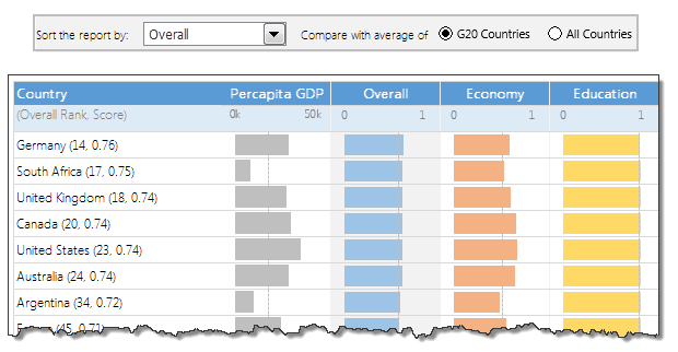
Recently I saw this interesting chart on Economist Daily Charts page. This chart is based on World Economic Forum’s survey on how women compare to men in terms of various development parameters. First take a look at the chart prepared by Economist team.
So what are the gaps in this chart?
This chart fails to communicate because,
- All country charts look same, thus making it difficult to spot any deviations.
- We cannot quickly compare one country with another on any particular indicator.
- It does not provide a better context (for eg. how did these countries perform last year?)
But criticizing someone’s work is not awesome. Fixing it and making an even better chart, that has awesome written all over it. So that is what we are going to do. You can see the improved chart above. Click on it to learn how you can create it.
Continue »How to make Box plots in Excel [Dashboard Essentials]
![How to make Box plots in Excel [Dashboard Essentials]](https://img.chandoo.org/dashboards/bp/box-plot-in-excel-how-to.png)
Whenever we deal with large amounts of data, one of the goals for analysis is, How is this data distributed?
This is where a Box plot can help. According to Wikipedia, a box plot is a convenient way of graphically depicting groups of numerical data through their five-number summaries: the smallest observation (sample minimum), lower quartile (Q1), median (Q2), upper quartile (Q3), and largest observation (sample maximum)
Today, let us learn how to create a box plot using MS Excel. You can also download the example workbook to play with static & interactive versions of box plots.
Continue »Thermo-meter chart with Marker for Last Year Value

During a recent training program, one of the students asked,
Thermo-meter chart is very good to show how actual value compares with target (or budget). But how can we add another point for say Last Year value to the chart with out cluttering it.
Something like above.
Sounds interesting? Read on
Continue »Gantt Box Chart Tutorial & Template – Download and Try today

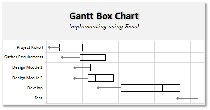
On Firday, we proposed a new chart for showing project plans. I chose an ugly name for it and called it Gantt Box Chart. Essentially, a gantt box chart is what you get when a gantt chart and box plot go to a bar, get drunk and decide to make out. It shows the project […]
Continue »A Brief History of Microsoft Excel – Timeline Visualization

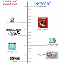
Timeline charts are great for providing quick snapshots of historical events. And hardly a day goes by without some one making a cool visualization of a time line of this or that. Time lines are easy to read, present information in a logical manner and mostly fun.
So yesterday, I set out to mimic the iconic gadgets of all time in excel, just for fun. Then it strike me, why not make a visual time line of Microsoft Excel ? So I did that instead.
Continue »Do you know these Excel 2007 Productivity Secrets (Hint: Coffee is not one of them)

Do you know these excel 2007 productivity secrets? (1) How to turn on the clipboard pane so that you can do rapid copy pasting (2) How to lock a feature for repeated use (3) How to copy charts as pictures (4) How to features not on ribbon to the quick access tool bar (5) How to change the default file save settings so that excel always save files in earlier version and much more. Go ahead and read the secrets and become excel guru.
Continue »Finally I have got internet connection at home. The folks at Airtel Broadband are very fast and professional. They set up the connection in very few days. So I will be able to blog regularly from now on.
Moving to this week’s excel links you should browse;
Continue »

