Archive for April, 2011
Place Key Information in Golden Triangle on your Reports, Dashboards etc. [Quick Tips]
![Place Key Information in Golden Triangle on your Reports, Dashboards etc. [Quick Tips]](https://img.chandoo.org/dashboards/golden-traingle-excel-workbooks.jpg)
Today, we will take a detour to world-wide web and learn how we can improve our dashboards, reports, presentations or workbooks by using one of the ideas, called as Golden Triangle.
Continue »
Last week, we have learned what Pivot Table Report Filters are & how to use them.
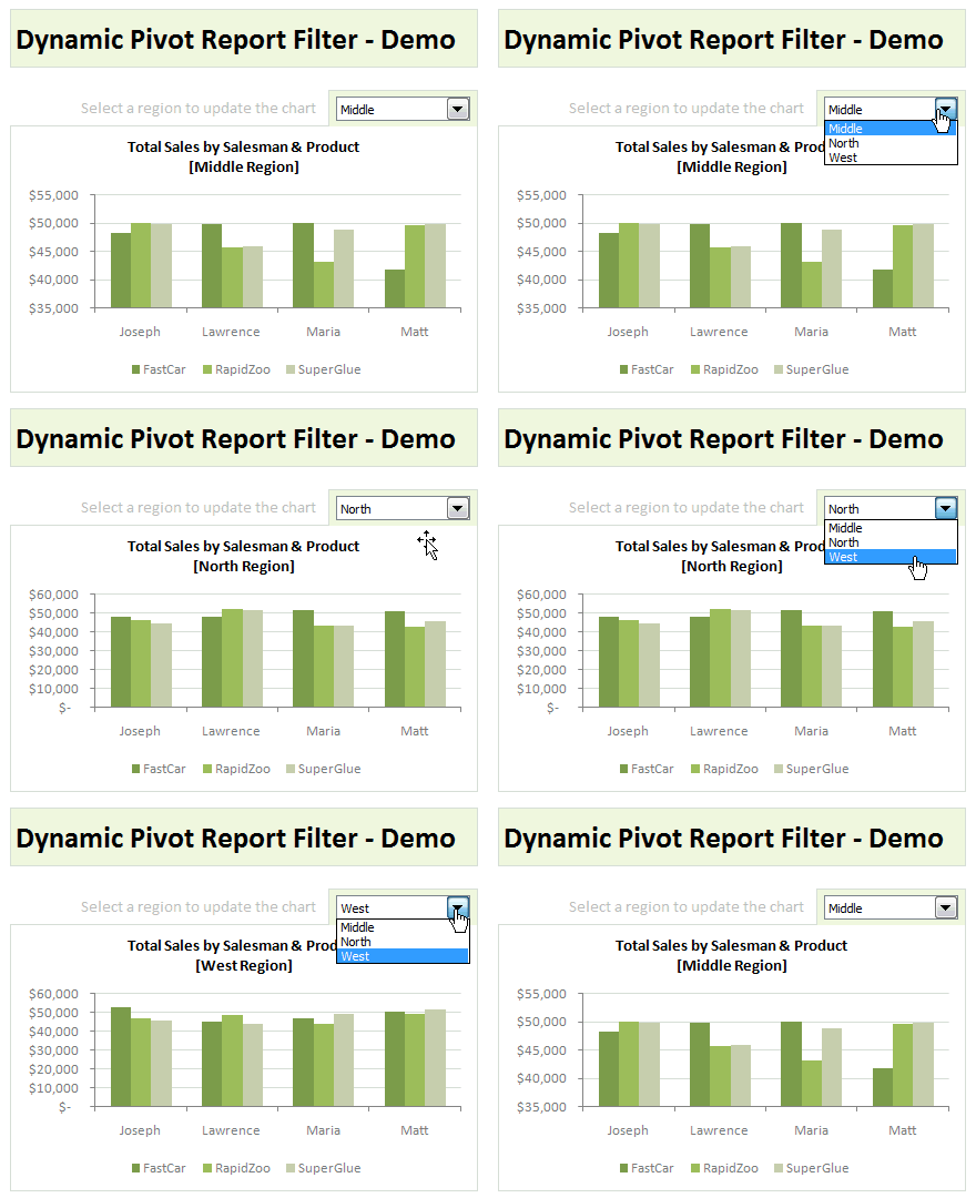
Today, I am going to show, how you can use simple macro code to change the report filter value dynamically.
We will learn how to create the chart shown here.
Continue »Comparing Sales of One Product with Another [Excel Techniques]
![Comparing Sales of One Product with Another [Excel Techniques]](https://img.chandoo.org/c/comparing-sales-of-one-product-with-another-demo.png)
This is a guest article by Theodor on how to Compare Sales of One Product with Another
Ok, now here’s one for you.
Suppose you’d like to come up with a sales report on different products, comparing their evolution on the same period of different years (say Jan ’09 vs. Jan Jan ’10). At the same time, you’d like to keep an eye on their yearly trend (entire 2009 vs. entire 2010).
Read on to learn how you can use Excel Charts to do this very easily.
Continue »
Did you know that MS Excel has a hidden, life altering Easter egg? This is a story of how I found it and discovered joy. Read on.
Almost an year ago, I have quit my job with one of the leading IT companies in the world, to embark on an uncertain but very exciting journey. I have started my own business around MS Excel – creating & selling awesome Excel products & training programs.
This is a continuation of the Chandoo.org Start-up Story posted around the same time last year. Grab a cup of coffee and read it in leisure. Do not expect any Excel tips. 🙂
Continue »What are Pivot Table Report Filters and How to use them?

Today we will learn about Pivot Table Report Filters.
We all know that Pivot Tables help us analyze and report massive amount of data in little time. Excel has several useful pivot table features to help us make all sorts of reports and charts.
Report Filters are one such thing.
Continue »Are You Ready for Online VBA Classes? I need your help!

Many of you have emailed and asked me, “Chandoo, can you help us learn VBA too? Just like you do with Excel.”
Well, as flattering as those requests were, the fact is, I was lousy at VBA. Well, I used to be very good at Visual Basic, back in the college days. But my programming skills have rusted over the years as I did very little coding. I guess, I have become a business-guy. So it took me time to re-learn VBA. And now, I am happy to announce that We are ready to start our very first batch of VBA Class.
But, before we start, I need some help from you. I want to know what is it that you want to learn, so that we can design the course curriculum & methodology around your needs.
So please take a few minutes and complete this survey:
Continue »
I know I am late to the party, but better late than…, uh! forget it.
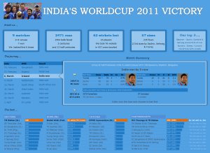
As the keen readers of our blog knew, I like cricket and I show my enthusiasm by making an excel dashboard (or info-graphic) whenever Indian team reaches a major milestone. So naturally, I was super excited when we won the ICC World cup 2011. Last time Indian won the event was in 1983 and my idea of a dashboard at that time was a bottle of milk and jingo-bell, my favorite shake-to-make-annoying-noise toy. I think our latest world-cup victory deserves something more than that. So here we go.
Continue »
How to make a 5 Star Chart (Similar to Amazon)
Last week Chandoo presented Give more details by showing average and distribution
At the top of the post was a small screen capture from Amazon.com showing a 5 Star chart showing that Twilight had a 3.5 Star Rating (way over-rated if you ask me).
I received an email shortly afterwards from Rajiv, “How can I make one of those charts ? ” with the Stars Circled
It’s actually very simple and this post will show you how.
Continue »Auditing Spreadsheets? – Disable Direct Editing Mode to save time [quick tip]
![Auditing Spreadsheets? – Disable Direct Editing Mode to save time [quick tip]](https://chandoo.org/img/q/find-dependent-cells-by-disabling-direct-editing-model-excel-tip.gif)
For most of us, the prospect of inheriting a large, undisclosed sum of money is bleak. But we have high probability of inheriting a complex Excel workbook with 19 worksheets and 2300 rows of data and 195 formulas. The kind where entire rainbow colors are used to color code accounts receivable statuses. Then what do we do? We spend a whole afternoon (and then the rest of the month) breaking our head trying to figure out why the total revenues are only $ 41.2 million when profits are $ 99.23 million.
So how do we deal with our inheritance?
Here is a quick tip to help you get started. Disable “Direct editing mode“.
Continue »![Show Details On-demand in Excel [Tutorial + Training Program]](https://img.chandoo.org/c/on-demand-analysis-and-details-in-excel-demo.gif)
Yesterday, we have seen a beautiful example of how showing details (like distribution) on-demand can increase the effectiveness of your reports. Today, we will learn how to do the same in Excel.
Continue »Give more details by showing average and distribution [Charting Tips]
![Give more details by showing average and distribution [Charting Tips]](https://chandoo.org/img/c/show-distribution-along-with-average-to-give-more-details-charting-tips.jpg)
When we have lots of data, we try to summarize it by calculating the average. As they say, averages are mean, they do not give away much.
I want to share with you an interesting example from Amazon.com on how they give more details by combining average with distribution.
As you might know, Amazon shows the rating of each of the products they sell. Customers & users rate the products from 1 to 5 stars. When you visit the product page you will see the average rating. But there is a small down-arrow next to it. When you click on it, Amazon shows you the break-up of that rating so you have a better idea of how the ratings are split.
Continue »Excel Links – Congratulations Team India Edition

Wow, what a weekend it has been. Indian cricket team has won Cricket world cup 2011. It has been a highly entertaining tournament and the finals were just incredible.
Congratulations to Team India for winning Cricket World-cup 2011.
I am tempted to make a dashboard of sorts to show the journey of Team India in this world cup. But I could not get much time to work on anything. I will post something this week to celebrate the victory.
Read the rest of this post to get 5 recommended Excel resources to learn new things.
Continue »
Alert readers of chandoo.org would have noticed that I have been away from action for a week. You are right. I took an unexpected break this week. I was commissioned to do an important baby sitting project. And you know how difficult they can be. So for the last one week Jo (my wife) and […]
Continue »

