Thank you, we are flying to US tonight
This is a personal note, not an Excel tip. So grab a cup of coffee, relax and read on. As I pack our bags and

This is a personal note, not an Excel tip. So grab a cup of coffee, relax and read on. As I pack our bags and
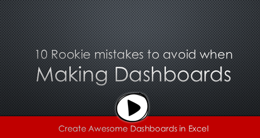
Are you making these 10 rookie mistakes when creating dashboards?
Watch below to video to understand what these mistakes and how to avoid them.
10 Rookie mistakes to avoid when making dashboards [23 mins]
Imagine you have a worksheet with lots of charts. And you want to make it look awesome & clean.
Solution?
Simple, create an interactive chart so that your users can pick one of many charts and see them.
Today let us understand how to create an interactive chart using Excel.
Livio, one of our readers from Italy sent me this interesting problem in email.
I would like to prepare an xy linear graphic as representation of the variation of temperature trough a wall between two different bulk temperature i.e. outside and inside a house. This graphic should show the temperature gradient trough the wall thickness. The wall is normally made by different construction materials (different layers, as bricks, insulation, …..) and so the temperature change but not as a straight line with only one slope, instead as few lines with different slopes (see below figure) Calculations are not difficult, and also prepare the graphic also not difficult.
But, I am looking a beautiful solution for x-axis. X-axis should be divided not with constant interval, instead with different length between each sub-division exactly as the different thickness of the wall. This is a correct graphic, because you can show the correct slope of each straight line though each layer of the wall.
Last week, we had a lovely poll on what are your favorite features of Excel? More than 120 people responded to it with various answers. So I did what any data analyst worth his salt would do,
I analyzed the data and here are the top 10 features in Excel according to you.
Read on to learn more.
Recently I saw a big screaming ad that said “the chartbuster rules”. Of course, I know that chartbusters rule. Not just because I was one of them 🙂
So I got curious and read on. And I realized the ‘chartbuster’ is actually a car, not some cool, spreadsheet waving, goatee sporting dude like Jon Peltier. What a bummer!
And then to my horror of horrors, I saw the exploding 3d pie chart, with reflection effects & glossy colors. And the sole purpose of the chart is to create an impression that Verna sells better than any car in India.
Today, lets talk about this chart and alternatives for it. Read on.
One of the popular uses of Excel is to maintain a list of events, appointments or other calendar related stuff. While Excel shines easily when you want to log this data, it has no quick way to visualize this information. But we can use little creativity, conditional formatting, few formulas & 3 lines of VBA code to create a slick, interactive calendar in Excel. Today, lets understand how to do this.
Its Friday, time for another poll.
This weeks topic is inspired from a discussion Jordan started in our forums.
I will go first.
My favorite features are,
Conditional formatting: Quickly highlight something that is not alright (or meets conditions), see trends with data bars or heat maps.
Pivot tables: Turn data in to understandable information with just a few clicks. When combined with slicers & conditional formats, becomes very powerful.
Formulas: Ofcourse, with out formulas, Excel would be a glorified notepad!
What about you? What are your favorite features in Excel? Go ahead and share with us by posting a comment.

If you are new to Excel or have never used it, use below links to come up to speed.
![]()
 Have been using Excel for a while? Check out these tutorials to learn more and become awesome.
Work with Excel a lot and know your game well? We have some very-advanced topics for you too.
Check out:
Excel challenges
Advanced Charting
Data Tables & Simulations
Power BI
Power BI is the most exciting thing to happen for your data since spreadsheets. If you are looking for a new skill to learn this year, I highly recommend Power BI. Check out below tutorials and get started today.


Learn how to work with data, make calculations, pivots, create amazing charts and powerful dashboards from scratch using Excel School + Dashboards program. Suitable for analysts, managers or professionals who need to use Excel often.

Use VBA to automate your tasks and build powerful spreadsheet based apps. In this course, learn all about how to program with VBA, how to use the language and object model to your advantage. Suitable for people who build a lot of things with Excel.

Power BI, the newest technology from Microsoft is a game changer. You can build rich, interactive and informative displays for your audience using Power BI. In this course, learn all about Power BI, Power Query and Power Pivot and how to combine them to achieve awesome results.


