
One of the popular uses of Excel is to maintain a list of events, appointments or other calendar related stuff. While Excel shines easily when you want to log this data, it has no quick way to visualize this information. But we can use little creativity, conditional formatting, few formulas & 3 lines of VBA code to create a slick, interactive calendar in Excel. Today, lets understand how to do this.
But first, a reminder to join my Advanced Excel masterclass in USA
As you may know, I am running my first ever Advanced Excel & Dashboards Masterclass in USA this summer (May / June 2013). We will be doing 2 day interactive sessions on Excel, advanced Excel, interactive charts, pivot tables & dashboards in Chicago, New York, Washington (DC) & Columbus (OH). If you live near any of these cities and want to become awesome in Excel, please consider enrolling in my Masterclass.
Click here for details & to book your spot | Download Masterclass brochure
Back to the interactive calendar
Coming back to our topic at hand – interactive calendar, what do we mean by this?
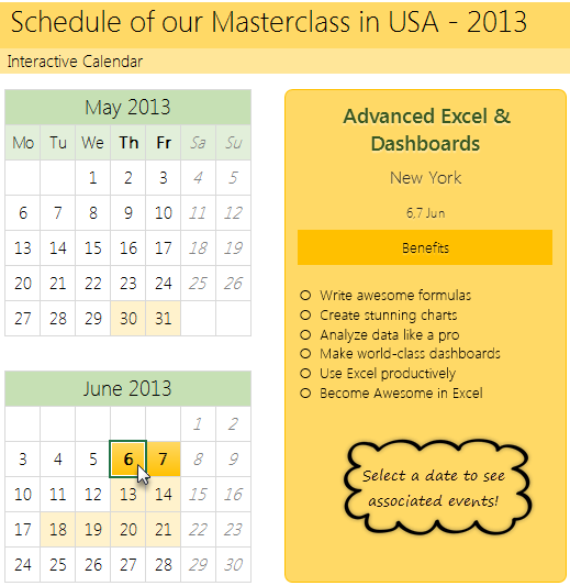
Well, something like below:
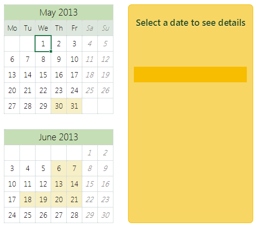
How to create an interactive calendar from a set of events
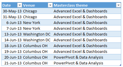
1. Collect all the event data in a table
Just enter event data in a table like below:
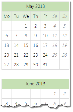
2. Set up a calendar in a separate rate
If your events span several months, then you can use formulas to generate calendar.
In my case, all the events (Masterclass sessions) are in May & June 2013. So I just entered date of May 1st in a cell, dragged it sideways and then re-arranged the cells to make it look like a calendar. At this stage, the calendar should look like this:
3. Name the calendar range
This is simple. Select all the cells in calendar range and give a name to it. I called mine “calendar”.
4. Assign a cell for identifying which date is selected
Select a blank cell in your workbook, give it a name like “selectedCell”. We will use this to identify which date is selected by user.
5. Write Worksheet_selectionchange() event
This will help us identify when user selects a cell in “calendar” range. The below 3 line VBA should do. Please attach it to the sheet where your calendar is.
Private Sub Worksheet_SelectionChange(ByVal Target As Range)
    If Not Application.Intersect(Target, Range("calendar")) Is Nothing Then
       [selectedCell] = ActiveCell.Value
    End If
End Sub
Tutorial: Showing details when user selects a cell
6. Set up the formulas to show details when a valid date is selected
Lets say, each event has 4 details associated with it – title, date, venue & description.
Now, we need to show details of the event when user selects a date in the calendar. Since the selected date is in “selectedCell”, we can use VLOOKUP, IF, IFERROR formulas to do this:
- Fetch event title in a cell if date selected has an event in it. Else keep it blank
-
=IFERROR(VLOOKUP(selectedCell, table_of_events, event_title_column, false),"")
-
- Fetch rest of event details, but keep them blank if date has no events.
Lets say these 4 details are fetched to cells D1, D2, D3 & D4 cells.
7. In calendar sheet, add 4 text boxes and assign them to cells
Finally, in calendar sheet, add 4 text boxes. Assign them to D1, D2, D3 & D4 cells. Arrange and format them as you fancy.
Tip: to assign a cell to text box, just select the text box, go to formula bar and type =D1 press enter.
8. Set up conditional formatting to highlight selected dates
Finally, add a simple conditional formatting rule to highlight the selected dates in calendar. This is simple. Assuming calendar starts at cell A1,
- Select the calendar range
- Go to conditional formatting
- Add new rule
- Select rule type as “Use a formula to determine which cells to highlight”
- type the rule as =A1=selectedCell
- Set up formatting
PS: in my data above, I have used different formula as we need to highlight 2 dates of a Masterclass even when 1 is selected.
Tip: Introduction to conditional formatting.
9. Clean up and formatting
Clean up your worksheets and format the calendar so that it looks gorgeous. And you are done!
Download Interactive Calendar Example file
Click here to download interactive calendar example file and play with it to understand this better.
Examine the formulas in “Calcs” sheet & VBA code so that you can see how this is weaved.
Work with calendar data often, then you are in luck
If you use calendar data often and are looking for some inspiration, ideas & examples on how to represent it, then check out below examples:
- Employee vacation tracker & dashboard
- Creating perpetual calendar & event tracker in Excel
- Interactive pivot table calendar & chart in Excel
- Creating an interactive picture calendar
- Employee shift calendar template
- Annual goals tracker
Do you like the interactive calendar?
I often use interactive calendars in my dashboards & client projects. Since calendars are very natural way to understand events, they work really well.
What about you? Do you use calendars often? How do you like the above technique? Please share your thoughts & ideas using comments.
PS: And if you are waiting to become awesome in Excel, then wait no more. Book your spot in my upcoming Masterclass. Click here.


40 Responses to “How to create interactive calendar to highlight events & appointments [Tutorial]”
Awesome
How do you deal with more than 1 calendar entry on a specific day?
That's weird no one replied. I'd really like to know how to work around this as well.
Would love to know this, also, if possible.
Could we just lookup to the 2nd, 3rd, or 4th occurrence of a lookup and have the selection fill multiple cells at once?
Calcs:G12 presents the dates better as: =IFERROR(TEXT(MIN(I3:I4),"d,")&TEXT(MAX(I3:I4),"d mmm"),"")
Love the aesthetics. Is Segoe UI the best font or what?
Thank you.. Yes, I too think Segoe UI light is one of the best.
Chandoo,
This is a very good implementation and use case of interactive calendars. In my templates, so far, I have used dynamic calendars but not interactive ones. One is a Calendar template for customizable printable calendars and the other is a Task Manager template where I used a mini calendar.
Is there a way to identify the selected cell without the VBA code?
Thanks,
Love this one! This may have already been shown somewhere, but how could I add to this by having the calendar highlight dates that had some event connected with them? So, in the little mini-calendars, if there was some event on May 1, it might have a light yellow background, or be bold. I'd click on the date to see the details of the event, but it would be nice to see at a glance which dates were 'filled'.
Thanks for a GREAT site!
CC
@CC... welcome to Chandoo.org and thanks for your comments.
To fill up dates with events associated with them, I used conditional formatting.
This will highlight all dates on which there are events in different format. To know more about conditional formatting visit below pages.
http://chandoo.org/wp/2009/03/13/excel-conditional-formatting-basics/
http://chandoo.org/wp/tag/conditional-formatting/
That worked perfectly, thanks so much!
Chandoo you really do present some very clever techniques and I'm learning a lot from your site.
A little bugette/feature in this sample though...
1. Change the dates for the New York events to 1st / 2nd June in the hidden calcs sheet.
2. Click the green June 2013 calendar caption.
June 1st / 2nd are highlit (as the green caption also has the date 1/6/13.)
There are two ways to avoid this.
1. Change the range for the calendar named range to two regions of the calendar days. (=calendar!$B$7:$H$11,calendar!$B$14:$H$18)
2. Make the calendar days unlocked and de-select the option "Select locked cells" when you protect the calendar work sheet.
I prefer option 1 as it is cleaner and defines exactly which cells you are interested in tracking.
i know you know this but I just thought I'd point it out for people who read your site. (That's how I'm learning Excel!!! - by others posting examples based on their own experience.)
Chandoo
To clarify my previous post.
It was not a nit-picking, point scoring post to try and point out a "bug".
It's just that I have 24 years of computer programming experience which makes me instinctively test worste case scenarios. That's what led me to this observation.
However, as far as Excel goes I'm nowhere near competent and I do appreciate that you and lots of the posters on your site make my Excel skills look like a beginner!!!
My advice is to always try and think of extreme examples and see if your spreadsheet copes with it.
Chandoo,
Awesome. But I found a small problem, when I selected 31, the Details block showing the dates as "31-30 May". Please correct it.
Perfect thank you!
Bravo Chandoo!!! After reading this article and another one (perpetual calendar) from you, I think that it would be great if you could combine both ideas to make an interactive perpetual calendar. Do you think it is possible!?
I have to say that for the past couple of hours i have been hooked by the amazing posts on this site. Keep up the great work.
Hi Chandoo
VBA was really good,
Thank you,
[…] http://chandoo.org/wp/2013/04/09/how-to-create-interactive-calendar-to-highlight-events-appointments… and here http://chandoo.org/wp/2011/04/07/show-details-on-demand-in-excel/. […]
the VBA code is working well on Office 2010, but is not working on Office 2011 for MAC OS X. Any idea?
When I try save the spreadsheet show this message: "The following features cannot saved in macro-free workbooks."
I am working in excel 2010and would love to download your example file is i can not seem to get steps 6 & 7 figured, any help with this or a more in depth explanation will be greatly appreciated
[…] Sounds like a very interesting project. Maybe check out this tutorial to get your creative juices flowing Chandoo.org […]
Hello Chandoo...
can I get a video for this pls? or a more detailed instructions on what to do. I am new to excel but I have a task to do this.
Any chance something like this could be worked into google's spreadsheet and calendar programs? I use google spreadsheets for work so that other employees can view and Id love to be able to transfer that info into google calendar so myself and other employees can view past info. Thanks
Can someone assist me in creating one of these interactive calendars for 2015. I need a very comprehensive calender. My calender need to be from January 1, 2015 to December 31, 2015. I can have up to 200 events on one day. My event data table is big.
Thank You in advance.
Ronnie
what about if I have multiple events in the same day?
As others have said, I need to display multiple events on the sameday. How can I add more than 1 event and have the calendar cover a full 12 months.
Great site by the way. So much to learn
@Dwayne
have a look at: http://www.excelhero.com/blog/2012/01/excel-universal-calendar-template.html
I believe it handles multiple events in the same day
Hi Hui
Thanks for providing the link for me. I think this is exactly what I am looking for.
Thanks Hui
Cheers
Dwayne
Thank you for the calendar link. It’s what I have been looking for.
I’ve followed the link and entered multiple events per calendar day. However, the calendar displays only the one event per calendar date. What I am doing wrong? Appreciate guidance.
Regards,
Sharif
Chandoo, first thank you for all this help you are giving in excel. Next this calendar is amazing but would you be able to help me in expanding the formula? I have several events on the same day and some events last 5 days. Would you be able to help with this?
Super helpful content here, interested if anyone has cracked adding multiple events on the same date?
HI,
I am unable to download the sample file for this.
Showing an error
"ERROR
The request could not be satisfied.
CloudFront attempted to establish a connection with the origin, but either the attempt failed or the origin closed the connection.
Generated by cloudfront (CloudFront)
Request ID: lu9bM7F40-z_3SwKR9w1yHHR42qSR4vGQ1r57orOyitiNqkcJR9qqQ=="
Could you please help me with the same through emailing a copy of it.
Thanks
Parul
Hello ! I am trying to proceed as you explained but when I do the formula. =IFERROR(VLOOKUP(selectedCell, table_of_events, event_title_column, false),"")
It tells me the error #NAME. Could someone please advise on this error ?
I have a calendar, the selected cells that display the selected date on the calendar. I have put the formula in a random cell and I selected
=IFERROR(VLOOKUP(selectedCell, table array were to look for the same value as selected cell; column number were the data I want to return is; false);""). I do not know what is the wrong thing ...
However, if I let the , instead of the ; then it returns me an empty cell even though there is somethint happening on that day ...
I do not know what to do, I spent the whole day on this error....
If someone could advise me please.
My table is on the same sheet as my calendar.
4 columns: Date, country, site nb and patient nb.
I want that it returns the patient nb.
The date column is the first of the array in case.
Thank you for your support.
To correct my comment: Name was because I did not put the "" before and after a word. To know if the formula was working or not I have pur for the IFERROR to return "ERROR" if it does not find the date in the array.
When selecting everything for the VLOOKUP fonction I get the ERROR, however I have something on that day.
Could someone please advise ?
Thank you for your support
You are simply a wow man!!!
Any word on how to add multiple events to the same day?
I have the conditional formatting to highlight dates of events, =COUNTIF(lstDates,B7)>0
But i need to color code events by the type of event. What would I need to do to include a second criteria? I already have the criteria (type) in my table .
Did someone resolve now the need for a calendar to display multiple events on the same day?
Cheerz