
Yesterday, we have seen a beautiful example of how showing details (like distribution) on-demand can increase the effectiveness of your reports. Today, we will learn how to do the same in Excel.
Before jumping in to the tutorial,
In this post, I have explained one technique of using charts + VBA to dynamically show details for a selected item. There are 4 other ways to do the same – viz. using cell comments, pivot charts, group / un-group feature and hyperlinks. I have made a 45 minute video training explaining all the 5 techniques in detail. Plus there an Excel workbook with all the techniques demoed. You can get both of these for $17.
Click here to get the video training – Showing on-demand details in Excel
How does the on-demand details chart work – demo:
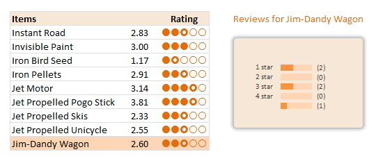
This is a replica of yesterday’s chart from Amazon. When you click on any cell inside the Items + Rating table, the corresponding items review break-up is shown in the chart aside.
Creating this chart in Excel – Step-by-step Instruction
So you are ready to learn how to do this chart? Great, grab a cup of coffee or tea and get started.
1. Understanding the data
This is how I have setup the source data for the chart. It has 3 columns – Item name, Reviewer ID and Rating. Each item has several ratings from several different reviewers. And our goal is to summarize all these ratings.
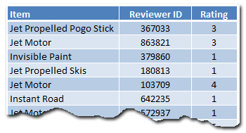
All this data is in the range Table1. We will use structured references [what are they?] in formulas to keep them readable.
2. Setting up the Item & Rating Table
The first step is to show a table with all the products we sell and their corresponding average rating. We will then add the circle indicators at the end to visually show the rating.

Calculating the averages using AVERAGEIF() formula:
The formula is quite simple. Assuming the product names are in C5:C13,
We just write =AVERAGEIF(Table1[Item],C5,Table1[Rating]) for first product’s average. Fill the rest by dragging the formula down.
Displaying Circles:
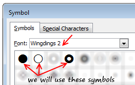 There are no star symbols in the default fonts. But we have circles – a full circle, an empty circle and a donut to indicate half-circle. These symbols are available in Wingdings 2 font. We will use an incell chart to display the circles. Assuming the rating is 2.83, we need to print 2 full circles, one donut and 2 empty circles. [related: inserting symbols in to Excel workbooks]
The formula is quite simple. Since the ratings are in D5:D13, the formula becomes,
=REPT(fullCircleSymbol,INT(D5)) & REPT(donutSymbol,(INT(D5)<>D5)+0) & REPT(emptyCircleSymbol,INT(5-D5))
Naming this grid
Now that we are done with the rating grid, let us name it – rngReviews.
3. Finding out which cell is selected
Now comes the macro part.
Before jumping in to the code, take a sip of that coffee. It is getting cold.
When a user selects any cell inside rngReviews, we need to findout which product it is so that we can load corresponding details.
The macro logic is quite straight forward.
- On Worksheet_SelectionChange, check if the ActiveCell overlaps with rngReviews
- If so,
- findout the relative row number of ActiveCell with respect to topmost row in rngReviews (ie the position of selected cell inside rngReviews)
- Put this value in to a cell on worksheet – say E28
The macro code can be found in the downloaded workbook. Here is an image of macro code.
4. Using the macro output to drive…,
We need to use the value E28 to do 2 things.
- Highlight the corresponding row in the rngReviews using conditional formatting.
- Findout the corresponding product using INDEX formula.
I am leaving both of these to your imagination.
5. Calculating Product – Rating Breakup
In order to show details for the product, we must calculate the corresponding breakup of ratings (ie how many 1 star, 2 star … 5 star reviews the product got).
I am leaving the formulas for this to your imagination. But when you are done, make sure your output looks like this:
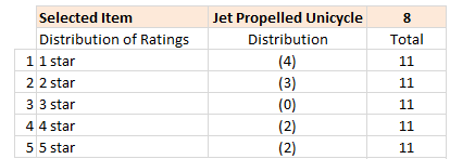
(hint: use COUNTIFS formula).
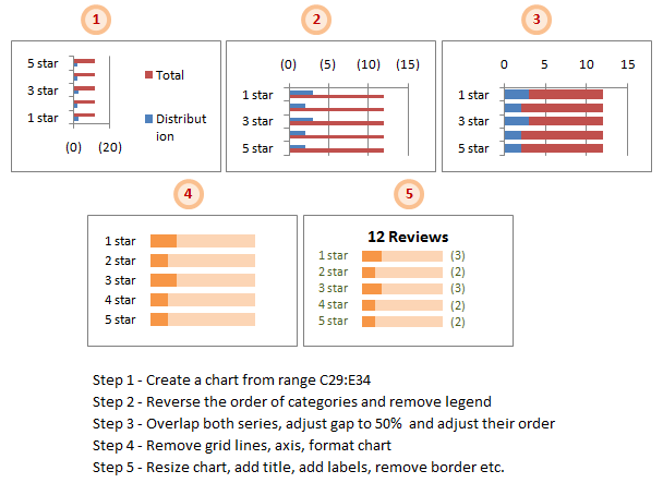
6. Create a Chart to show Rating Break-up
This is the last one before we put everything together. Just follow below 5 steps.
- Select the 3 columns – Rating type, number of reviews, total reviews and create a bar chart (not stacked bar chart). In my workbook, this data is in the range C29:E34 in the sheet “Rating Summary”.
- Reverse the order of categories as Excel shows them upside down. For this select the vertical axis and hit CTRL+1 (or go to axis options from right click menu). Here check the “Show categories in reverse order” option. Also remove the chart legend.
- Set both series of the chart such that they completely overlap each other [image]. Adjust the gap width to 50%. Also, adjust the order of the series from Chart’s source data options [image].
- Remove grid lines, axis line and horizontal axis. Format the chart colors to your pink and translucent green (really!).
- Re-size the chart, add title, add labels, remove border. You need to use dynamic titles.
7. Put everything together
Now is the time to put everything together and test. Move the chart close to the rating table. Test it by clicking on any value inside table.
You can also do some colorful formatting if you prefer.
Finish the coffee and show-off the chart to a colleague or boss. Bask in glory.
Download Example Workbook – On-demand Details in Excel
Click here to download the workbook with this example. Play with it to understand how this chart works.
Note: You must enable macros to use the file.
Note2: If the file does not open on double-click, just open Excel (2007 or above) and drag the file inside to Excel.
Learn this + 4 other techniques using Video Training,
In this post, I have explained one technique of using charts + VBA to dynamically show details for a selected item. There are 4 other ways to do the same – viz. using cell comments, pivot charts, group / un-group feature and hyperlinks. I have made a 45 minute video training explaining all the 5 techniques in detail. Plus there an Excel workbook with all the techniques demoed. You can get both of these for $17.
Click here to get the video training – Showing on-demand details in Excel
How do you like this chart?
Ever since I learned this technique from a good friend, I have been using it in dashboards & complex models to make them more user friendly.
What about you? Did you like this technique? Where are you planning to use it? Please share your views & ideas using comments.
More Resources to One-up your Chart Awesomeness
Want more, here is more:


48 Responses
Hi Chandoo,
At the beginning of the week,you promised,about a dashboard,celebrating team India’s victory at the WC.where is it ?
Un fantástico tutorial. Muchas gracias
I really like to use click for details in my projects.
The more and more ‘complicated’ workbooks I do, the more I really think that form controls kind of suck. They have their place, but they really do sort of break up the flow of the workbook. Click to explore feels very ‘webish’, so it’s a good solution.
This is really cool, Chandoo. I can see how this would be a very helpful part of a dynamic Excel dashboard. Thanks for showing us, once again, how we can have very powerful Excel reporting without too much difficulty.
I don’t know how to open an excel 07 Zip file. After I unzip there are a number of folders and sub folders, many with xml extensions. Where is the xlsm or xlsx fiel?
chandoo….U! R! a God!
cool knowledge indeed
Hello,
How do you move the distribution totals outside of the grap area? Under Lable Position when I choose to move data points “Outside_End” it only move’s it outside the distribution bar, not the total. Is there another option?
Thanks
Thanks for the great lesson. other than the macro part, which I still have some issues with, how do you get the distribution count on the graph to display outside the ligher color bars?
I tried to format the lable to show outside the “lighter” color bar. However, I can only make them to show up outside the “darker” color bar and so the distribution numbers are not aligned. How do you make them all aligned to the outside of the lighter color bar?
i am learning lot … from you thanks a ton
The use of a half circle whenever the rating is not an integer is I think unnecessary. as it is, 2.01 and 2.99 will receive the same number of Circles. Using the mod formula to test for a specific fraction allows you to use different sized or filled circles to indicate relative score below integer level.
REPT(fullCircleSymbol,INT(D5)) & REPT(donutSymbol,mod(D5,1)<0.5)+0) & REPT(emptyCircleSymbol,5-int(D5)-(mod(D5,1)<0.5))
Thanks for a good post. It is a very nice integration of table and barchart!
It made me think ….. suppose, for the sake of saving dashboard real estate, you wanted to be able to toggle the visibility of the barcharts. You could then do the following, attaching the macro ‘ToggleGroupVisibility’ to ‘Group 3’:
Sub UpdateAfterAction()
Dim topRow As Integer
Sheet1.Shapes(“Group 3”).Visible = True
‘Group 3 being the group with the barcharts
topRow = Range(“rngReviews”).Cells(1, 1).Row
[valSelItem] = ActiveCell.Row() – topRow + 1
End Sub
Sub ToggleGroupVisibilty()
Sheet1.Shapes(“Group 3”).Visible = Not Sheet1.Shapes(“Group 3”).Visible
End Sub
@All.. Thank you so much for your comments. I am happy you liked this.
@Arnab: I got unusually busy this week. May be next week I will put a dashboard. I have all the data I need for this + made some progress. But I need some more time.
@Dave: Just drag and drop the file in to Excel 2007.
@Matt & Fred: Very simple. First I set the labels for outside series. Then I manually assigned the labels to the inside values using formula bar. If you would like to automate this, you can use Rob Bevey’s Chart Labeler – http://www.appspro.com/Utilities/ChartLabeler.htm
@Ikkeman: I agree.
@Ulrik: Very good idea 🙂
@Ikkeman & Chandoo:
A slightly different approach on the “star ranking”:
I have arranged my symbols from most filled to least filled in A1:A5
And the formula I’ve used:
=REPT($A$1,INT(I1)) &
IF(INT(I1)=I1,””,OFFSET($A$1,MAX(1,(CEILING(I1,1)-I1)*6),0))
& REPT($A$5,5-CEILING(I1,1))
I imagine a different formula could be used to generate a better spread between the symbols. Currently the breaks are on .33/.34 .50/.51 .66/.67
@Myself: Duh!
=REPT($A$1,INT(O25))
&IF(INT(O25)=O25,””,OFFSET($A$1,MIN(4,MAX(1,(CEILING(O25,1)-O25)*6)),0))
&REPT($A$5,5-CEILING(O25,1))
The MIN is very important!
…And now I’m amusing myself by making filled-circle Sine waves march across my spreadsheet.
I thought this blog was about PRODUCTIVITY?
@cameron
Look how productive you’ll be next time the boss asks for a chart with filled circle sin waves…!
Hi Chandoo
I would give five stars for this lesson 🙂 and its one of great lesson I learned from you. Thank for bringing up this kind of great excels. I would say it is a attempt to think out of the box .. …!
I want to share this with u guys..
https://cid-c6f0db2b5c8a20d3.skydrive.live.com/redir.aspx?resid=C6F0DB2B5C8A20D3!104&authkey=GMtDjGMi93Q%24
This convert numeric figures to words.
Sorry For damaged link
here is new
https://cid-c6f0db2b5c8a20d3.skydrive.live.com/redir.aspx?resid=C6F0DB2B5C8A20D3104&authkey=GMtDjGMi93Q%24
Regards
Istiyak
Sorry For Inconvenience
New Working Link is here
https://cid-c6f0db2b5c8a20d3.office.live.com/self.aspx/.Documents/Words%5E_Template.xls
Thanks
Istiyak
@Istiyak, it appears that the file or folder would have to be shared in order to work, and it’s based off of Windows Live ID/registered email. Probably not going to work here since you would have to share the folder with all the emails of the people who wanted to see it, and the emails remain anonymous on this website.
Perhaps mediafire or some other file hosting option?
@Cameron
I openend the third link
Login to Skydrive first
Then paste the link
Download the file for best results as it doesn’t work in Firefox
/This folder might not be shared with you/
-It appears that you don’t have permission to access My Documents. You might be trying to access it with a different account or might need to ask the folder’s owner for permission to access it.
Istiyak, I’d love to see this in action!
Is this in VBA or Excel Formulas?
@cameron and hui -thanks for ur attension. I will upload it any where else and share it with u. It is just with the help of formula. Give ur email i will mail it to u. Hey hui whats ur veiw about that one?
@Istayak
Well done, its well put together and a good piece of work
Great for One Of’s
But as a series of worksheet formulas, it lacks flexibility.
I think it is better handled as a User Defined Function as per the Microsoft link I previously sent you. Using a UDF allows it to be used anywhere and multiple times in a workbook.
@istiyak
vertexvortex
(at)
gmail
@ Hui : Thanks for ur motivated Comment
@Cameron : Hi i had sent it to ur email id. Plz confirm once received…..
Regards
Istiyak
For anyone trying to use Istiyak’s links above and having problems:
1. Login to Skydrive first
2. Paste the link from Post 18 all the way to the %24
Istayaks Link
Chandoo, I’m still a bit confused, what exactly is it that I drag and drop to excel.
I am unzipping and getting quite a few files, mostly with xml extensions. I drag anyone of these to an open workbook and get the schemas but no working file.
if I drag the zip file to excel workbook, I get asci type of data in the workbook.
Thanks and sorry for being so thick on this one.
@Dave
Try renaming the file to *.xlsx
Where the * is the filename
Now try and open in Excel
Hi Chandoo,
Thanks again for the awesome tip. Have a question. When i overlap the two charts, both of them becomes of the colour and i get single colour bars. Anyone on this ???
Hi Chandoo,
Thanks, but I have excel 2003 where some formula do not work. I faced similar issues in “Dynamic Dashboard” file share by you earlier.Is there any alternate for averageif and sumifs in excel 2003..will be a big help for me. I’m a beginner and do not know much about this.
Thanks
@Anushri
AverageIfs and Sumifs can be replicated by using Sumproduct.
.
Sumifs(Range1, Criteria1, Range2, Criteria2)=Sumproduct((Range1=Criteria1)*(Range2=Criteria2))
.
Averageifs(Range1, Range1, Criteria1, Range2, Criteria2)=Sumproduct((Range1=Criteria1)*(Range2=Criteria2),SumRang1)/Sumproduct(1*(Range2=Criteria2))
Thanks Hui!
I tried following formula in the Dynamic Dashboard CH1; All Products & YTD:
=IF($C$21=$L$22,SUMPRODUCT((Data!$C$2:$C$141=’CH1′!B24)*Data!$G$2:$G$141),IF($C$21=$M$22,SUMPRODUCT((Data!$C$2:$C$141=’CH1′!B24)*Data!$H$2:$H$141),IF($C$21=$N$22,SUMPRODUCT((Data!$C$2:$C$141=’CH1′!B24)*Data!$I$2:$I$141),SUMPRODUCT((Data!$C$2:$C$141=’CH1′!B24)*Data!$J$2:$J$141))))
I pasted KPI parameter names in cells I22 to O22.
It worked fine but its cumbersome specially if I have 10 KPI parameters (here it was only 4)
Please suggest if I could have used any shortcut in Excel 2003 for this
Tx
Anushri
Guess formula did not appear in previous post. Here is what I used
=IF($C$21=$L$22,SUMPRODUCT((Data!$C$2:$C$141=’CH1′!B24)*Data!$G$2:$G$141),IF($C$21=$M$22,SUMPRODUCT((Data!$C$2:$C$141=’CH1′!B24)*Data!$H$2:$H$141),IF($C$21=$N$22,SUMPRODUCT((Data!$C$2:$C$141=’CH1′!B24)*Data!$I$2:$I$141),SUMPRODUCT((Data!$C$2:$C$141=’CH1′!B24)*Data!$J$2:$J$141))))
Please suggest if there can be a shorter way
@Anushri
Yep, that will get messy with 10 KPI’s, except that you can’t nest that deep with Excel 2003 anyway.
Is this the only formula like this or is it repeated hundreds of times ?
Can you do all the Sumproducts in named ranges ?
Can you upgrade to 2010 ?
@Anushri
You could try simplifying your formula also to:
`=SUMPRODUCT((Data!$C$2:$C$141=’CH1?!B24)*OFFSET(Data! $G$2:$G$141,,IF($C$21=$L$22,0,IF($C$21= $M$22,1,IF($C$21=$N$22,2,3)))))
`You might want to check the logic just in case
Hola chandoo le escribo desde Argentina. Realmente su pagina es excelente, muchas gracias por su aoporte a la comunidad.
Saludos y muchas gracias!
Damian.
Hi Chandoo,
Have a question, I wanted to put 2 charts in same sheet, but it doesn’t work.
Something have to do with this “Private Sub Worksheet_SelectionChange(ByVal Target As Range)”. can u help?
Thanks Chandoo for Excel Tricks
Excellent tutorial Chandoo!
This is a silly question, but when adding the data labels I am having difficulty with alignment at the end of the bar. If the data labels are for the distribution series, the “outside end” does not display outside of the “total” series. If they data labels are manually adjusted, they come out of alignment when the selection changes. So I’m wondering how you were able to get the data labels for the distribution series to display in the outside end of the Total series. Probably something real simple that I am overlooking 🙁
Thanks for such wonderful details on Excel!
HI Chandoo,
I need your help in a coding. Below is the code:
Sub Macro1()
Sheets(“P+ Initiative Charter”).Select
Range(“C3”).Cells = “REFM”
Sheets(“P+ Initiative Charter”).Select
Range(“C4”).Cells = “RNEA”
Range(“C5”).Select
Sheets(“Data Sheet”).Select
Range(“B13:E28”).Select
Selection.Copy
Sheets(“P+ Initiative Charter”).Select
Range(“B9”).Select
Selection.PasteSpecial Paste:=xlPasteValues, Operation:=xlNone, SkipBlanks _
:=False, Transpose:=False
Range(“B9”).Select
Sheets(“P+ Initiative Charter”).Select
Range(“C3”).Cells = “REFM”
Sheets(“P+ Initiative Charter”).Select
Range(“C4”).Cells = “RASO”
Range(“C5”).Select
Sheets(“Data Sheet”).Select
Range(“B2:E12”).Select
Selection.Copy
Sheets(“P+ Initiative Charter”).Select
Range(“B9”).Select
Selection.PasteSpecial Paste:=xlPasteValues, Operation:=xlNone, SkipBlanks _
:=False, Transpose:=False
Range(“B9”).Select
End Sub
Above code not switching to another comparison of REFM RASO, it always went back to the first one and showing the same result . In the above code i have two criterias to compare:
1) REFM in cell C3 and RASO in cell C4
2) REFM in cell C3 and RASO in cell C5
So i need data with respect to the above two criterias but every time when i run the above code it always show only first one and one more thing i have more than these two criterias. Totally i have 9 critrias to check.
Please help me on this so that cell comarison goes in a correct manner. and displays appropriate results.
Thanks
@Swati
You will be best served by asking the question in the Chandoo.org Forums
http://chandoo.org/forum/
Attach a sample file to expedite the answers
Great site you have here but I was wanting to know if you knew of any user discussion forums that cover the same topics discussed here?
I’d really like to be a part of community where I can get opinions from other knowledgeable individuals that share the same interest.
If you have any recommendations, please let me know.
Kudos!