
Recently, I saw this chart on Economist website.
It is trying to depict how various cities rank on livability index and how they compare to previous ranking (2014 vs 2009).

As you can see, this chart is not the best way to visualize “Best places to live”.
Few reasons why,
- The segregated views (blue, gray & red) make it hard to look for a specific city or region
- The zig-zag lines look good, but they are incredibly hard to understand
- Labels are all over the place, thus making data interpretation hard.
- Some points have no labels (or ambiguous labels) leading to further confusion.
After examining the chart long & hard, I got thinking.
Its no fun criticizing someones work. Creating a better chart from this data, now thats awesome.
So I went looking for the raw data behind this graphical mess. Turns out, Economist sells this data for a meager price of US $5,625.
Alas, I was saving my left kidney for something more prominent than a bunch of raw data in a workbook. May be if they had sparklines in the file…
So armed with the certainty that my kidney will stay with me, I now turned my attention to a similar data set.
I downloaded my website visitor city data for top 100 cities in September 2014 & September 2013 from Google Analytics.
And I could get it for exactly $0.00. Much better.
This data is similar to Economist data.
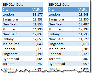
Chart visualizing top 100 cities
Here is a chart I prepared from this data.

This chart (well, a glorified table) not only allows for understanding all the data, but also lets you focus specific groups of cities (top % changes, new cities in the top 100, cities that dropped out etc.) with ease.
Download top 100 cities visualization – Excel workbook
Click here to download this workbook. Examine the formulas & formatting settings to understand how this is made.
How is this visualization made?
Here is a video explaining how the workbook is constructed. [see it on our YouTube channel]
The key techniques used in this workbook are,
- SUMIFS, INDEX + MATCH formulas for figuring out data
- Sorting data by a particular column
- Conditional formatting to show % change arrows
- Form controls for user interactivity
Since the process of creating this visualization is similar to some of the earlier discussed examples, I recommend you go thru below if you have difficulty understanding this workbook:
- Suicides vs. Murders – interactive Excel chart
- Gender Gap chart in Excel
- Visualizing world education rankings
- Analyzing survey results with panel charts
How would you visualize similar data?
Here is a fun thought experiment. How would you visualize such data? Please share your thoughts (or example workbooks) in the comments. I & rest of our readers are eager to learn from you.


67 Responses to “How to use XLOOKUP in Excel?”
Sure it's a nice new command. It would be useful if everyone had access to it. But if there is any chance you will be sharing the file with someone who has a onetime payment Office license, or an older version of Office you can't use it.
That is my biggest gripe with many new features MS is launching. With such vast userbase and existing spreadsheet "systems", all of these formulas are going to create more trouble than imagined. That said, we should learn new things, especially if you move to a new job chances are you will be using a different version of Excel there.
I love to learn new things, like this new command. But I can't afford, literally don't have the money, to keep paying for 365.
This is the thing that especially offends me about the Office 365 pricing scam/scheme. Sure, if they want to milk more money from users using the rental scam, fine I know I don't have to fall for it. But restricting new "features", like new commands to 365 is offensive. It makes one-time payment users "second class" customers, especially anyone who has paid for Office 2019. At least in the past new features/commands came only came out every few years, with new versions so there was some logic to the separation. But now the new features are coming every few months and there is no real separation between 2019 and 365, but still they limit the new features to 365. Even 2016 is close enough. MS "accidentally" pushes a few new features to 2016, when they feel like it or when they are too lazy to do the extra work to prevent them from going to 2016.
I agree with Ron I have MS Office 2019 which I used for Charity work but a pensioner I find the cost of the MS365 unaffordable. Perhaps there is some way for a Ms Guru to perhaps create 3rd party update for the stand alone versions.
I will however continues with Ms 365 this year as I have just renewed the subscription
thanks very much for keeping us abreast of latest developments and also the excel community for their useful feed back
regards Brian 18/03/2024
Good point. I suggest using the free MS Office online (you just need onedrive account) to maintain old files and work on them. The only limitation is that it is browser based, so you won't be able to do many advanced things. But it is better than the alternative of shelling out $100+ every year.
Yes, of course this is the latest and excellent update from Microsoft but this feature will take years to come in the market because most of the people or offices are still using Office 2007 or 2013.
Dear Chandoo Sir
Thank you for updating latest idea this idea is centralized lookup formula all about.
this idea is realy impressive and samart
I couldn't observe any benefit, over MATCH+INDEX.
Hmm, the base scenario is similar to index+match, but XLOOKUP makes life simple with single formula and default "exact match" setup. Plus I find the "lookup from last" and "less than" "greater than" options very useful and less cryptic than MATCH options.
Thanks for sharing, it added some excitement to my Friday morning! I don't have 365 but am still excited to be aware of the existence of these features! I know that vlookup on larger sets of data can really take up some resources--it makes sense, it's performing a lot of operations for us while we sit and sip on coffee. 😉 However, I'm wondering if you've you noticed a difference in performance with xlookup? Is it slower, faster, or pretty much the same in terms of calculation speed?
I haven't tested it against VLOOKUP or INDEX+MATCH. If anything, I would guess that the performance should be similar as they could all use same logic internally. I will try this and share some outcomes later.
I would love to know the results. We're crunching a ton of data and I love the simplicity of XLOOKUP, but we can't handle the sluggishness of VLOOKUP. I hope XL is faster!!!
I believe XLOOKUP has been written to deliver exact matches at the same speed as a binary (vlookup's approximate) search.
Here is a nice overview of differences in performance of different lookup formulas. Unexpected, but XLOOKUP is not always fastest.
https://professor-excel.com/performance-of-xlookup-how-fast-is-the-new-xlookup-vs-vlookup/?amp#What_is_the_8220binary_search_mode8221_of_XLOOKUP
You can use an if logic to wrap around a vlookup with a TRUE argument to speed up lookups.
A nice addition to the function list. Very usefull and easier to use then INDEX + MATCH.
Since XLOOKUP is in beta testing, it would be great if Microsoft development team added a 5th. argument: if_na. That is: if XLOOKUP returns #N/A, an alternate value could be returned instead. Therefore, it wouldn't be necessary to do =IFNA(XLOOKUP(...), value_if_na).
Good idea. But I feel this can be a dangerous precedent as no other formula in Excel has fail-safe option (other than IFERROR and IFNA ofcourse). So may be leave it to return error.
Don't overlook the new FILTER function. That has a final [if_empty] setting.
Although I don't have and expecting to be around soon in EXCEL 2019, my question is there a way to work around the new function "xlookup" but not the old ones.
However it is appreciated tip,thanks
Chandoo
You can also use XLookup like
=Sum(xlookup():Xlookup())
Refer the example 4 at:
https://support.office.com/en-us/article/xlookup-function-b7fd680e-6d10-43e6-84f9-88eae8bf5929?ui=en-US&rs=en-US&ad=US
This makes it hugely powerful as it is returning an address like Index can do
Great point Hui. I am yet to find a practical use case for summing between lookups, but I am pretty sure others will find this useful.
Here is an idea.
If you wish to analyse data for a given month, the relevant portion of the Sales table (sorted by date) is given by
= XLOOKUP( EOMONTH(month,0), EOMONTH(+sales[Date],0), sales,0,1 ) :
XLOOKUP( EOMONTH(month,0), EOMONTH(+sales[Date],0), sales,0,-1 )
which can be referred to as a named formula 'selected'. Being a reference to the original table, range intersection with columns works. Hence
= XLOOKUP( MAX(selected sales[Net Sales]),
selected sales[Net Sales], selected sales[Sales Person] )
provides an answer to
Who had most sales for February?
Caution: The formula requires 7 separate searches of the data but they are very fast.
I use VLOOKUP a lot with named ranges, are you able to reference those in XLOOKUP?
@Hamish... you should be able to use any reference styles that work with other formulas in XLOOKUP. So yes for names, structural, cell and references to other sheets / workbooks.
Hamish, Yes it all works perfectly. That includes cases in which the data table does not comprise raw data but rather is made up of dynamic arrays. Naming the anchor cell of each dynamic array allows expressions such as
= XLOOKUP( MAX(selectedNetSales#), selectedNetSales#, selectedSalesPerson# )
Conversely, if the returned field is comprised of anchor cells for separate dynamic lists (e.g. employment data for the specified salesman) then the list can be returned by adding '#'
=XLOOKUP(0,sales[Net Sales],EmployeeInfo,1)#
Since the documentation says it returns a reference array, could you write formulas that could answer questions that need to perform a function upon a result set that contains multiple rows such as:
1. What is the total Profit/Loss for SalesPersons named [Jamie]?
2. What is the MAX/MIN Net Sales for SalesPersons named [Jamie]?
3. What was the Average Net Sales for everyone that had exactly [8] Customers?
I think the answer to your question is 'no' unless you are willing to sort the table so that the records you wish to aggregate form a continuous range. That is, the formula
= SUM(
XLOOKUP(salesPerson,sales[Sales Person],sales[Profit / Loss],,,1):
XLOOKUP(salesPerson,sales[Sales Person],sales[Profit / Loss],,,-1))
only works if the data is sorted by Sales Person.
Otherwise it looks like SUMIFS (and similar) offers the best solutions with FILTER a close second.
= SUMIFS( sales[Profit / Loss], sales[Sales Person], salesPerson )
= SUM( FILTER(sales[Profit / Loss], sales[Sales Person]=salesPerson ) )
XLOOKUP allows us to look for a variable in a column and return a value from a row: combining VLOOKUP ad HLOOKUP in essence.
I watched a video last night in which the presenter showed an example that returned an error. The solution that the presented was using is this: =XLOOKUP(A4,B7:B9,C6:E6)
To see the problem in action, put a b c in the range B7:B9 and 1 2 3 in the range C6:E6 and in A4 enter a or b or c
I solved this problem in this way:
=XLOOKUP(A12,B15:B17,TRANSPOSE(C14:E14))
I have also set up a financial analysis example in which I wanted to find, for every line item in an income statement, which month was exactly equal to the mean of that row or which was immediately below the mean or immediately above it. Or Median, or Standard Deviation ...
I used XLOOKUP() and IFS() together with Data Validation (although that is optional) and while the formula is a little unwieldy, again I am effectively combining vertical and horizontal lookups.
Excellent find and tip Duncan 🙂
Hi,
Can you please tell me if there is any way to return multiple values with a single match.
Thanks in Advance
when will be in excel 2019
Thanks
Never.
"New features" like the XLookUp() command are only added to Office 365. They will never be added to Office 2019. They may show up in Office V-Next, when ever it comes out, in the near future. MS has not yet announced a new version. If they follow the pattern in the last few versions that would be fall 2021. But that is only a guess.
I have it now in office 2021
I downloaded your sample spreadsheet and three of your first seven examples are incorrect. Then I stopped.
Which version of Excel are you running? XLOOKUP doesn't work in any version except Office 365.
Hi, Chandoo.
Great tips, thanks!
In example #11, "What is the 'net sales' for Johnson? = 1540" the formula only takes into account the first match for Johnson (D10)?
In row 21 Johnson appears again so the correct answer should be 4192 (D10 + D21).
Imagine a DB with hundreds of records!
How can we deal with duplicates using XLOOKUP?
Thanks.
Is there an easy way to handle if the cell is blank in the data table to prove the result of a blank? With VLOOKUP, previously to get this result, I had to do:
=IF(VLOOKUP($B2,data,6,FALSE)="","",VLOOKUP($B2,data,6,FALSE))
I am hoping that I don't have to resort to the same lengthy format. I did try the "Value Not Found" example you provided (love it). However that is when the search value is not listed, not when the search value is found and the result value is a blank cell.
Thanks for everything you do!!!!
Hi Sherry,
Are you using the IF formula to show "" instead of 0 ?
If so, you can use this structure
=XLOOKUP($B$2, data[col1], data[col6]) & ""
This will force 0 to convert to empty space. It won't impact other results though, (assuming column 6 is text)
column 6 is a date.
A bit longer, but to force the 'value not found' you could remove the entry from the lookup array
= XLOOKUP(lookupValue,
IF(data[col6]"", data[col1]),
data[col6], "Missing data")
Hi Chandoo,
I've been waiting for this function for months so that I could replace all my INDEX / MATCH / MATCH statements. However, I have hit a snag with using nested XLOOKUPs as replacements. If the inner XLOOKUP can't find a value, then whatever value I specify as the [if not found] value causes the outer XLOOKUP to fail and return #VALUE. So the [if not found] functionality works if a single XLOOKUP can't find the search value, but it causes nested XLOOKUPs to fail. Can you see any way around that?
Thanks
Hey Stuart... Can you share an example of what result you are expecting in nested case? One option is to use a single IFERROR outside all the nested functions.
@Stuart
Do not limit yourself to thinking of [if_not_found] as being a text string, e.g. "Oops"; it can be a formula in its own right, returning a default row from the original table or even a lookup from an alternative table.
What it must return is an array in order to form a valid parameter for the outer XLOOKUP.
Hi Peter,
You've got it! As you suggest, by setting the inner XLOOKUP to return an array full of zeroes (or whatever) solves the problem. The outer XLOOKUP can of course just have 0, or whatever, stated its if_not_found value.
I am surprised that I haven't come across this issue or solution anywhere else. There are lots of blogs / videos which mention using nested XLOOKUPs as a replacement for INDEX / MATCH / MATCH. I can't say I've read or watched them all, but the ones I have don't mention this issue. I suspect there are / will be a lot of people getting #N/As or, worse, #VALUES depending on what they specify as the inner function's if_not_found.
Thanks for your help!
I am trying to lookup a date and name and return the number of hours from another worksheet? If I'm mixing text and dates, will this still work?
Great article. But,...two questions:
1) I do have Office 365. Yet, the XLookup is not recognized by Excel. Your sample file displays a #NAME? Why?
2) In your samplefile you have a leading '_xlfn.' in front of the formula. Why is that?
Hi Michael...
Can you confirm what is your current version of Excel is? Also see if you can update to newer version. You can do both from File > Account.
Great Job..
My values that I want to join are not exact, i.e.
000025868 and 0000258 68 Total
Is there a way to join the data?
Interesting. Assuming the space is in the lookup column, try this:
=xlookup("000025868", substitute(lookup_col, " ",""), result_col)
Getting a #N/A as the results.
Is there a way to convert "0000258 68 Total" to 000025868 (or visa versa) before I run the =XLOOKUP?
If you just want to remove the word "total" at the end, use SUBSTITUTE for that. If there can be other words, you are better off first running the data thru Power Query so you can clean it.
One thing that is possible is to take a numeric lookup value and convert it to text before searching a text lookup array. For example
= XLOOKUP(TEXT( value, "0000000\?00\*" ), array, return, , 2 )
will perform a search with wildcards that allow "Total" to be appended or any character to be inserted two digits before the end of the number.
That would pick up
"0000258 68 Total"
but you would need an alternative test to match the number 25868, itself.
Check the reference, while selecting data the xlookup function automatically starts from new line. Try changing it to the first row and it would work.
YOU ARE THE EXCEL KING!
Thank you
Hi Chandoo,
I have 2 sheets with 5 columns. data in columns A:C is similar except that changes are made in columns A and C. I want to lookup in column C in Sheet2 and update Sheet1 columns A:C.
for example
Sheet1
ColA ColB ColC
123 AB12 One
234 BC23
323 CB22 Six
Sheet2
ColA ColB ColC
123 AB12 One
234 BB22 Two
323 CB22 Six
I don't think we can claim that XLOOKUP "replaces" INDEX+MATCH. Yes, it provides a suitably powerful alternative, and is absolutely a full replacement for VLOOKUP and HLOOKUP, but it can't easily play some of the "math" games that are possible with INDEX+MATCH and sometimes even necessary when the data isn't in a convenient layout.
What if you needed the row above or below the match or if the data was laid out in repeating sections where you first needed to know the location of the section header and then the location of a given item within each section? Both of those problems can be solved with plus/minus shifting of the number returned from the MATCH.
So I would argue that INDEX+XMATCH are the true replacement for INDEX+MATCH, thus taking full advantage of the X -- defaulting to exact matches, virtual sorting, and so on -- while preserving the ability to "shift" the match as needed.
I'm looking for a price in a multiple column price list. With Vlookup, I specified the entire table and for the column, looked at the user selected model/column. In Xlookup, how to specify the column number and the range up and down or can I just specify the column number only?
One advantage that VLOOKUP retains over XLOOKUP is the ability to supply a lookup column number dynamically, as a purely numerical result of a calculation. To replicate this functionality using XLOOKUP, you would need seperate logic to calculate the column reference (i.e. the column's number, range name or range address) and pass it to the XLOOKUP formula. You could do this inside the XLOOKUP function by setting up the 3rd param of XLOOKUP to be based on your "user selected model/column".
Using Xlookup with "match mode" = -1 and "if not found" = "ABC"
Now if the lookup value is not found in the lookup_array excel gives the the highest value from the return_array.
This is not what I expect from xlookup.
It should return "ABC"
Can you explain why?
Chandoo,
I am having trouble with XLookUp. How do I get it to return multiple values such as employees with salary greater than $45,000 or to sum all the sales in the East region? Are these more pivot table inquires?
Is XLOOKUP more useful for finding one record than multiple records?
Thank you,
Jennifer Jeffords
Hi Chandoo,
Is it possible to use XLOOKUP to return a status such as "Checked" and "NoCheck"(something similar to IF stmt)
Thank you.
I used the index and match to look up the hourly rate for a job classification as a part of a drop down. Now, I want to calculate the hourly rate multiplied by hours worked and the cell will not calculate. What might be the problem? The results cell of the look-up is formatted to be currency?
You show return array can be more than 1 column but what about Look up array? What if I want to find a value than can be in 1 of 3 columns and then return one value from another column.
You can use XLOOKUP for such things too.
For example, if you have three columns: home phone, cell phone and email address
and a column with customer name
and you want to lookup the name of the customer when you specify any value from one of those 3 columns,
you can use the below XLOOKUP.
=XLOOKUP(TRUE,BYROW(C3:E22=I2,LAMBDA(a, OR(a))), B3:B22, "No record found!")
Here I2 contains the search criteria (either home phone, cell phone or email)
B3:B22 have names
C3:E22 have the home / cell / email values
Hi my name is Musawir Rasool i am from India in a state of jammu and Kashmir I love watching your videos and lot from your videos
Thanks
And one more can u teach me full power bi?
Hi Chandoo,
I was referring to your xlookup-examples file, and in that I saw your formula for Sl. 8 - Who has least sales? You wrote formula =XLOOKUP(0,sales[Net Sales],sales[Sales Person],,1) but I think a more better way would be to write =XLOOKUP(MIN(sales[Net Sales]),sales[Net Sales],sales[Sales Person],,1). This is because your formula would not reliable unless you're specifically looking for a salesperson who has exactly 0 in sales, which is not the same as the least sales — unless 0 happens to be the lowest. Also, the 1 as the last argument means "approximate match in ascending order," which could return wrong results if 0 isn't found.