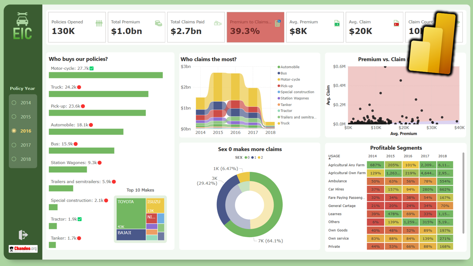
Creating KPI Dashboards in Microsoft Excel is a series of 6 posts by Robert from Munich, Germany.
This 6 Part Tutorial on KPI Dashboards Teaches YOU:
Creating a Scrollable List View in Dashboard
Add Ability to Sort on Any KPI to the Dashboard
Highlight KPIs Based on Percentile
Add Microcharts to KPI Dashboards
Compare 2 KPIs in the Dashboards Using Form Controls
Show the Distribution of a KPI using Box Plots
The Challenge – Sorting
With the post KPI Dashboard – Setting up a Scrollable Table we started a little series of posts on how to create interactive dashboard tables with Microsoft Excel. Showing an extract of a longer list of items and enabling the user to scroll up and down was only the first step. Allowing deeper data analysis on the executive dashboard definitely needs more features. One of the most simple but common techniques for data analysis is sorting. Again we want to enable the user to select the sort criteria and see the results immediately without leaving the dashboard. That is: no need to go to the sheet with the raw data, no need to select ranges, no need to use the sort commands on the Excel menu or ribbon. And of course we want to do this without using VBA.
The Solution
The table on our KPI dashboard looks almost the same as the first one, except the 5 option buttons to select the sort criteria beneath the column headers and the fact that the selected column is highlighted with a darker fill color.
Download the excel file with KPI Dashboards – Scroll and Sort and read below to find how it is done.
The implementation
After some smaller changes on the dashboard, like adding the option buttons, linking them to the same cell and adding simple conditional formatting to the columns, the interesting part is the sorting algorithm on the sheet “calculations”. There are various solutions for sorting in excel using formulas. Most of them are use array formulas, definitely the most elegant way of doing this, but hard to understand. The step-by-step solution with several “help columns” may not be as elegant as an array formula, but it will probably be easier to understand.
This is how the dashboard sorting works:
- Get the relevant data (depending on the sort criteria) by using the function OFFSET (column E)
- Make sure to have a list with unique entries by adding a very small number (column F)
- Sort the list using the function LARGE (column G)
- Use MATCH to find the corresponding position of every value within the unsorted list (column H)
- Put together the whole data table in a sorted form by using the results in column H and OFFSET (columns (J to O)
We are almost there. All we have to do now is changing the starting references in the OFFSET-functions on the dashboard (refer to row 9 on sheet calculation instead of row 5 on sheet data). That is all.
Final remarks
If you are using Excel 2007, you will notice that the conditional formatting of the cells underneath the option buttons will behave somehow strangely when clicking on another button. If you scroll down until the range is out of sight and scroll back again, everything looks fine. This doesn’t happen with Excel 2003, so it seems to be a bug in Excel 2007.
What next?
Download the KPI Dashboards Excel and learn
Read the next post in this series: Part 3: Highlight KPIs Based on Percentile
Also, Checkout our Excel Dashboards Page for more examples and resources.
Update on Aug 28, 2008 Justin commented that it would be better if the sort order could be reversed so that you can analyze bottom 10 of any KPI using the dashboard. Robert is kind enough to oblige the request. He sent me another excel with sort enhancement. Download it if you want to see this.
Chandoo‘s note: Robert is a regular reader of this blog. Leave your comments / questions / love here and I am sure he will respond during free time.
15 Responses to “A Gantt Chart Alternative – Gantt Box Chart”
That's a great idea.
Maybe the planned End Date should be highlight more.
I don't know how it would look like (nor how to do it yet), but what if instead of finishing the bold line to the best case End Date, it finishes to the realistic End Date?
The idea is ok, I think other project management tools have this, already? Maybe not.
Gantt charts in my view are about the signal most unless thing in the world, theres no way you can look at one thats more that a little complex and understand what it's telling you. I'm going to write a diatribe on project management at some point, its one of my pet areas I think!! 😉
The issue I have with this chart Chandoo, is that Tasks need to be linked to each other, so they should inherit the uncertainty, which would mean the as you moved down chart the lines would be miles apart for later tasks, and you might have to add lots of lines for subsequent tasks to cover the various outcome of it's parents.
Having said that, for the high level board summary, it's a nice way to go, it it appeals to the management 😉
thanks Chandoo, great post.
Ross
Whoooa !!! That's a very clever idea Chandoo. I really love it.
I think i'll update my gantt project sheet with that idea soon (remember my template ?)
@ross : you can link start date to the end date of the previous task in your data. The only problem I still se is to which end date (real ? planned ? best ?) in order to have average amount of information.
If best end date, you'll tend to increase uncertainty at the end of chain, although if you link to real end date, uncertainty will be decreased too much, leading in both cases to wrong management direction.
Maybe planned till the task is finished then real will do the job ?
Hey chandoo, this looks good and this would definite add value in production planning / scheduling. Uncertainity in finishing a task is very high in production scheduling and this could give an insight or a bird eye view of possible shipments we can have....
I've always been frustrated by the limitations of gantt charts. Will definitely use this, I've always struggled with how to succinctly communicate the uncertainty of certain tasks without confusing stakeholders.
I like this, I think it's a very effective way of showing how a timeline can change and which parts of a project need close attention.
@Cyril / @Ross: I would intially link the the start date to the planned end date of the previous task, with the chart updating when a task has been completed to reflect the true end date.
Or what about giving a drop-down selection box to allow the user to see the chart based on planned/best-case/worst-case end dates?
Like the idea. Have found that Excel is more flexible than MS Project for graphical solutions. The "Best Case"\"Worst Case" metrics are theoretically appealing but once the project and\or phase commences their reliability diminishes. A chart like the above that showed Planned Start, Planned End, Replan End Start, Replan End Date, Number of Replans the Start and End Dates, and Actual would provide an active, actionable view of each task\phase. It would also highlight the areas which are riskiest.
It is always amazing how flexible excel can be.
My question is how would the chart show a scenario where the date moved up? If a task is dropped or the duration of the task is significantly reduced by applying more people or machinery to the task, the dates will move up.
The gantt chart has been around for a long time, but it is still quite useful to show progress.
Cheers,
B
I like the idea but seems bit complicated in case of long projects involving numerous activity.
Also, reading and explaining is required hence not feasible where plans are just send to audience for approval.
Cheers
SY
Great idea Chandoo,
When I was reading this idea regarding delivery dates, another thought popped into my mind, how can you show the uncertainty with MONEY!!
In this case, applies to cost management or even a normal budget, you think?
Would Box Chart and Gannt Chart help to understand the best case, middle case and worst case when money is spend or planned with these three risks are involved?
I imagine that this chart could help people who write their budgets get a better understanding of risks affecting their spending.
Peter
Chandoo,
I like it. How would you display an entry once it has been completed (actual)?
Thank you,
Matt
From what you have shown so far I think that this box Gantt chart is awesome! I think that this could be an extremely useful tool.
I can't wait to learn how to make my own charts in Excel.
Will the methods that you are going to teach us work in 2003 as well?
[...] Firday, we proposed a new chart for showing project plans. I chose an ugly name for it and called it Gantt Box [...]
You need to read Eli Goldratt's Critical Chain. The uncertainty you are looking for should be accounted for in a project buffer. Not at each task level.
Further you should spend time understanding Agile Development. This would have you plan only in 1-3week iterations. This allows you to embrace changes to work not yet started, and for your customer to re-direct your course at regular intervals (after each iteration) throughout your project. keyword search: Agile Scrum
These items will show you that you are solving a tracking problem for something that you can entirely avoid!
[…] Chandoo.org’s Gantt Box Chart. […]