All articles with 'tutorial' Tag
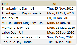
How to Find Dates of Public Holidays using Excel

Lets celebrate these holidays in PHD Style. By learning few excel formulas that you can use to find out dates for some of the popular public holidays like – labor day, memorial day etc. When is Labor Day (US) in 2010? Labor day (the US variant) is celebrated on first Monday of every September. It […]
Continue »Waterfall Charts using Excel

Learn how to create waterfall charts in Excel in this tutorial. Our guest author, Aaron, explains how to create cool looking waterfall charts with connectors. Waterfall charts are great, especially for visually showing the contribution of parts to a whole.
Continue »Generating invoice numbers using excel [reader questions]
![Generating invoice numbers using excel [reader questions]](https://chandoo.org/img/l/invoice-numbers.gif)
Learn how to generate invoice numbers, tax codes etc. using Microsoft Excel. In this example we will take a real life example shared by Michelle and findout how we can generate invoice numbers using excel formulas. Read more to learn and download the example workbook.
Continue »Create a number sequence for each change in a column in excel [Quick Tip]
![Create a number sequence for each change in a column in excel [Quick Tip]](https://chandoo.org/img/n/sequence-number-with-row-change-th.png)
Here is a quick formula trick you can use to generate sequence numbers that only increment when there is a change. Assuming the sequence of values are in column C from C3, you can write the following formula in B4 onwards (B3 will be 1, wake up…) =IF(C4=C3,B3,B3+1) Now just copy paste the formula over […]
Continue »Employee Satisfaction Surveys using MS Excel

Today we will learn how to make an employee satisfaction survey and consolidate the data using excel.
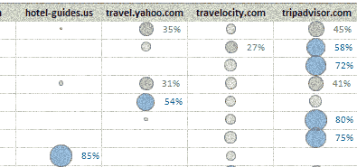
Continue »Visualizing Search Terms on Travel Sites – Excel Dashboard

Microsoft excel bubble chart based Visualization to understand how various travel sites compete search terms
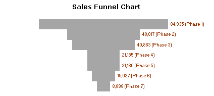
Continue »Sales Funnel Charts in Excel – Tutorial

Sales funnel is a very common business chart. Here is a simple bar chart based trick you can use to generate a good funnel chart to be included in that project report.
Continue »Custom Views in Excel – Save filter and header settings for quick reference

PHD reader and commenter Vishy contributed this post through e-mail. Thank you so much Vishy for this very useful tip. The Problem: You have created a specific view of your data in Excel (say by filtering, zooming out, changing column width, hiding specific rows, customizing window settings, print settings etc.). This is your reference point […]
Continue »Brick Charts in Excel – an Alternative to Gridlines
Grid lines provide great help in understanding values in a chart. Here is a handy trick you can use in the next bar chart to spice it up. Here is how you can get this type of chart (we will call it a brick chart) First we will make a regular bar chart Now, let […]
Continue »What is camera tool and how to use it? [spreadcheats]
![What is camera tool and how to use it? [spreadcheats]](https://img.chandoo.org/excel-camera-tool-thumb.png)
Camera tool is your way of creating visual reference in an excel sheet. It is one of the useful and hidden features of excel. Here is how it works. You specify a rectangular area in your workbook and camera tool creates a mirror image of that area as a drawing object. You can move it or resize it. And whenever the contents of original rectangular area changes (charts, drawings or cell values) the mirror image changes too.
Continue »Every Monday PHD shares some of the best excel related articles around the web so that you are up to date with discussions and new ways to be productive. Here is a list of links recommended for this week.
Continue »Advanced Data Validation Techniques in Excel [spreadcheats]
![Advanced Data Validation Techniques in Excel [spreadcheats]](https://chandoo.org/wp/wp-content/uploads/2008/11/data-validation-change-lists.png)
Data validation is a great way to keep your users informed about possible values in a cell and guide them to select something appropriate. As part of the spreadcheats series, in this post we will discuss 2 advanced data validation techniques that can help you when you are modeling a complex worksheet.
Continue »![Adding Box Plots to Show Data Distribution in Dashboards [Part 6 of 6]](https://chandoo.org/wp/wp-content/uploads/2008/10/box-plot-excel-dashboard-visualization-thumb.png)
This is a Guest Post by Robert on Visualization Techniques for Excel KPI Dashboards. This 6 Part Tutorial on Management Dashboards Teaches YOU: Creating a Scrollable List View in Dashboard Add Ability to Sort on Any KPI to the Dashboard Highlight KPIs Based on Percentile Add Microcharts to KPI Dashboards Compare 2 KPIs in the […]
Continue »Sports Dashboards in Excel – A Tutorial

One of my favorite cricket player, the GOD – Sachin Tendulkar has become highest test run scorer. What do I get if Sachin becomes highest scorer, you may ask. In order to celebrate this occasion I have created a cool sports dashboard in excel with some of the top test cricket players’ statistics. And, you […]
Continue »
One of the most frequent tasks for any manager is “planning”, be it putting together a hiring schedule or designing a jumbo jet, it all starts with a simple project plan and gantt chart is simple and intuitive representation of the same. But how to make a gantt chart in excel without writing too many […]
Continue »

