All articles with 'screencasts' Tag
How to Get “Either-Or” Condition in Data Validation?

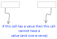
In a recent consulting assignment I had a tricky data validation problem. The customer wanted to have an either-or condition in the data validation, like this: My initial reaction to this requirement was “hmm… that is not possible“. But before shooting the email back to client, I got curious and checked if excel data validation […]
Continue »Making a Dynamic Dashboard in Excel [Part 3 of 4]
![Making a Dynamic Dashboard in Excel [Part 3 of 4]](https://chandoo.org/img/ed/moving-objects-with-vba.gif)
In this post we are going to look at a simple example of the VBA behind the Dynamic Dashboard. Essentially we will learn to write macros for doing this. Read the rest of this post to find code samples and downloadable files to play with.
Continue »Budget vs. Actual Profit Loss Report using Pivot Tables

This is continuation of our earlier post Preparing Quarterly and Half yearly P&L using grouping option. You can also do budget v/s actual comparison using Pivot Tables. For this we will use calculated items feature of Excel PivotTables.
To begin, we have to add one more column to our data. I have added column Data Source to the end of data table. Existing data is marked as Actual and I have added more data rows which are marked as Budget. You can download new file with updated data and basic Pivot P&L.
Continue »Survey Results in Dot Plot Panel Chart [followup on Incell Panel Chart]
![Survey Results in Dot Plot Panel Chart [followup on Incell Panel Chart]](https://chandoo.org/img/vp/incell-dot-plot-panel.gif)
In a follow up to last week’s how to visualize survey data in excel, we will explore how you can create an incell dot plot panel chart. Please follow the links in the article to get more commentary and insights from established persona in the visualization world (including Stephen Few, Naomi, Jon etc.)
Continue »
We all know that legend can be added to a chart to provide useful information, color codes etc.
Today we will learn how to make the chart legends smarter so that they provide more meaning and context to the chart, like this:
This type of legend can be more useful than a plain legend as this provides more useful information without taking up too much space.
Continue »Use CTRL+Click to speed up your formula entry [Quick Tips]
![Use CTRL+Click to speed up your formula entry [Quick Tips]](https://chandoo.org/img/q/faster-formulas-with-ctrl-click.gif)
Sometimes we think there is very little we can improve in something and then we come across an idea that would change our perceptions. I have been writing excel formulas for such a long time that it was easier to remember when I first shaved than when I first wrote a formula. (may be, because […]
Continue »Automatic Rolling Months in Excel [Formulas]
![Automatic Rolling Months in Excel [Formulas]](https://chandoo.org/img/f/dynamic-starting-month-demo.gif)
Often when we are making spreadsheets for forecasting or planning we would like to keep the starting month dynamic so that rest of the months in the plan can automatically rolled. Don’t understand? See this example: This type of setup is quite useful as it lets us change the starting month very easily. We can […]
Continue »![How to Visualize Survey Results using Incell Panel Charts [case study]](https://chandoo.org/img/cb/survey-results-panel-chart-example.png)
A panel chart (often called as trellis display or small-multiples) shows data for multiple variables in an easy to digest format. It lets users compare in any way and draw conclusions with ease.
Today, I want to discuss how the principles of panel chart can be applied to visualize a complex set of survey results. For this we will use the recent survey conducted by Gartner on how various customers use BI (Business Intelligence) tools.
Continue »Making a Dynamic Dashboard in Excel [Part 2 of 4]
![Making a Dynamic Dashboard in Excel [Part 2 of 4]](https://chandoo.org/img/ed/excel-dynamic-dashboard-final-th.png)
In part 2 of Excel Dynamic Dashboard Tutorial, we will learn how to set up various dynamic charts that are part of the dashboard. We start with a simple dynamic pie chart that shows the sales distributions and then move on to sales trend line charts. These charts use various excel formulas to pull in the information based on user selection.
Continue »How to Check whether a Table is Filtered or not using Formulas

Let us start the week with a simple formula (well, to be fair, let us start the week with a strong cup of coffee, then this formula).
Often when we have large data sets, we apply data filters to select and display only information we want to see.
Some of you know that whenever we apply filters on a dataset, we can look at status bar area to find out if any filter is applied on the current worksheet.
But, what if you need a way to show “filtering” status thru formulas? Like this…,
Continue »Quarterly & Half-Yearly Profit Loss Reports [Part 5 of 6]
![Quarterly & Half-Yearly Profit Loss Reports [Part 5 of 6]](https://chandoo.org/img/ea/quarterly-half-yearly-profit-loss-reports-excel.png)
This is continuation of our earlier post Exploring Pivot Table P&L Reports.
We have learned how to change our P&L report on various data elements. We have seen how the P&L report can be changed with just few clicks.
In this post we will be learning some grouping tricks in PivotTables. We will cover grouping of dates, text fields and numeric fields. You will need to start with Monthly P&L report prepared in previous post. We will also learn some really clever tricks and hacks on how to group data in Pivot Tables. So read on…,
Continue »![Making a Dynamic Dashboard in Excel [Part 1 of 4]](https://chandoo.org/img/ed/excel-dynamic-dashboard-final-th.png)
In this and next 3 posts, we will learn how to make a Dynamic Dashboard using Microsoft Excel.
At the end of this tutorial, you will learn how easy it is to set up a dynamic dashboard using excel formulas and simple VBA macros.
Continue »Annual Goals Tracker Sheet [awesome ways to use excel]
Marko, who is a long time PHD reader and an excel ninja sent this via email, I work at an insurance company in Slovenia. At the beginning of each year we have a conversation with our superiors to review our work in the past year and to set new goals (main activities) that we’re gonna […]
Continue »Adding Calculated Fields to Pivot Table P&L [part 3 of 6]
![Adding Calculated Fields to Pivot Table P&L [part 3 of 6]](https://chandoo.org/img/ea/profit-loss-report-with-calculated-fields.png)
This is part 3 of 6 on Profit & Loss Reporting using Excel series, written by Yogesh Data sheet structure for Preparing P&L using Pivot Tables Preparing Pivot Table P&L using Data sheet Adding Calculated Fields to Pivot Table P&L Exploring Pivot Table P&L Reports Quarterly and Half yearly Profit Loss Reports in Excel Budget […]
Continue »Use Paste Special to Speed up Chart Formatting [Quick Tip]
![Use Paste Special to Speed up Chart Formatting [Quick Tip]](https://chandoo.org/img/q/use-paste-special-in-charts.png)
Excel Paste Special is one of my favorite features. So I was naturally thrilled when I discovered that you can use paste special to paste formatting from one chart to another. When we have multiple charts, ensuring consistent color schemes, fonts etc. is very important. Often we individually format the charts because they have different […]
Continue »

