All articles with 'scatter charts' Tag

Slope line is very useful for spotting which values have changed from two sets. You can add a slope line to XY chart (scatter plot) using simple techniques. In this post, learn how to add them.
Continue »Creating a Masterchef Style Clock in Excel [for fun]
![Creating a Masterchef Style Clock in Excel [for fun]](https://img.chandoo.org/c/mc/master-chef-clock-demo.gif)
Jo (wife) likes to watch Masterchef Australia, a cooking reality show every night. Even though I do not find contestant’s culinary combats comforting, occasionally I just sit and watch. You see, I like food.
The basic premise of the program is who cooks best in given time. To tell people how much time is left, they use a clock that indicates how much time is left (much like a stop clock, with a small twist).
One day, while watching such intense battle, my mind went
It be cool to make such a clock using hmm… Excel?
While I cannot share my snapper (or pretty much any other food item) with you, I can share my Masterchef style Excel clock with you. So behold,
Continue »How would you Visualize World Education Ranking Data [Homework + Video]
![How would you Visualize World Education Ranking Data [Homework + Video]](https://chandoo.org/img/vp/world-education-scores-excel-chart.png)
Here is a charting challenge to begin your Christmas week. Recently Guardian’s Data Blog released World Education Rankings data and a sample visualization. Now your challenge is to make your chart visualizing World Education Rankings data.
You can see the chart I have constructed above. Read the rest of the post to find out how I made this chart and download the workbook.
Post your submissions using comments.
Continue »Official FIFA World-cup Soccer Balls since 1930 in an Excel Chart [Excel Fun]
![Official FIFA World-cup Soccer Balls since 1930 in an Excel Chart [Excel Fun]](https://chandoo.org/img/vp/official-fifa-worldcup-soccer-balls-from-1930.png)
The FIFA World-cup 2010 edition is around the corner. Like millions of people around the world, I too am an ardent fan of football. (although, I have played only one game of soccer in which I waited near opponents goal post as I was too lazy to run around. And when my team mates kicked […]
Continue »Make a Bubble Chart in Excel [15 second tutorial]
![Make a Bubble Chart in Excel [15 second tutorial]](https://chandoo.org/img/l/bubble-chart-excel-tutorial.png)
A Bubble chart displays circles (or bubbles) at given X and Y co-ordinates. Bubble chart is a very good way to show 3 dimensional data (for eg. Region-wise product sales) without confusing users. In this tutorial, we will learn how to create a bubble chart using excel.
Continue »Excel Links – Bacon bits are good edition
In this edition of Excel Links, we feature a new excel blog on the blog, named bacon bits. We also share links about interesting articles like generating tinyurls using vba, making maps using xy charts, designing filters for your dashboards and more.
Continue »A Good Chart is a Story [Charting Principles]
![A Good Chart is a Story [Charting Principles]](https://chandoo.org/wp/wp-content/uploads/2009/05/obesity-vs-eating-time.png)
A good chart tells a story. Here is a fantastic example of what a good chart is. The chart itself is very simple and easy. But it brilliantly juxtaposes two interesting pieces of data : Obesity rates in countries and Time spent eating per day, to tell a story.
Continue »How Many Bubbles are Too Many Bubbles?

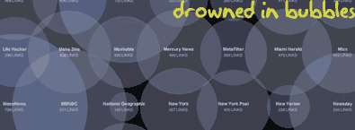
In How Many Links are Too Many Links, O’Reilly radar shows us this unfortunate bubble chart. Read the rest to see why the chart is unfortunate.
Continue »![KPI Dashboards – Compare 2 Decision Parameters [Part 5 of 6]](https://chandoo.org/wp/wp-content/uploads/2008/10/excel-dashboard-visualization-tips-thumb.png)
This is a Guest Post by Robert on Visualization Techniques for KPI Dashboards using Excel. This 6 Part Tutorial on Management Dashboards Teaches YOU: Creating a Scrollable List View in Dashboard Add Ability to Sort on Any KPI to the Dashboard Highlight KPIs Based on Percentile Add Microcharts to KPI Dashboards Compare 2 KPIs in […]
Continue »

