All articles with 'reader contributions' Tag
CP033: There is an Easter egg in this podcast!!!

Podcast: Play in new window | Download
Subscribe: Apple Podcasts | Spotify | RSS
In the 33rd session of Chandoo.org podcast, let’s turn the mic to our listeners and hear their tips. What is in this session? This session has 2 things. A surprise Easter egg (an Excel tip hidden in the podcast audio) Collection of Excel tips recorded & submitted by Chandoo.org readers Listen to this session Click here […]
Continue »Transpose a table quickly using Copy – Paste [Quick tips]
![Transpose a table quickly using Copy – Paste [Quick tips]](https://img.chandoo.org/q/transpose-a-table-quickly-using-copy-paste.png)
On Friday, we learned how to transpose a table of data using Excel formulas. Today lets learn a quicker & easier way to do this by just using copy, paste, find & replace.
Continue »To-do List with Priorities using Excel

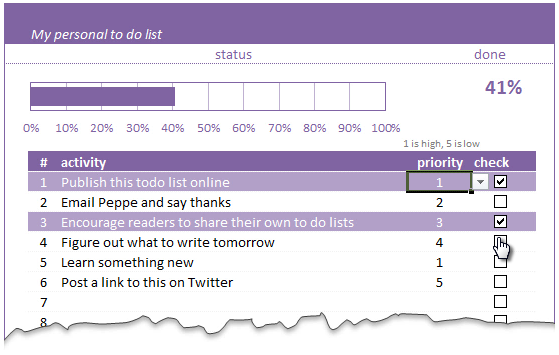
A while ago, we published a new year resolution template. This was a hit with our reader with thousands of you downloading it. During last week, Peppe, one of our readers from Italy, took this template and made it even more awesome.
The original template had tasks and completion check mark. As you finish each task, you can see the progress bar moving.
Peppe added priorities to this. With his new version, progress is measured based on how much priority we assigned that particular task. Pretty neat eh?!?
Continue »Monitoring Monthly Service Levels using Excel Charts [Example]
![Monitoring Monthly Service Levels using Excel Charts [Example]](https://img.chandoo.org/c/service-levels-7-years-excel-chart.png)
Recently, I wrote a tutorial on tax burden in USA chart.
Jared, One of our readers liked this chart very much. Jared works as a workforce scheduler and has data similar to our chart. So he applied the same technique to analyze monthly service levels for last 7 years & sent me the file so that I can share it with all of you.
First take a look at the demo of Jared’s chart. And read on to know how this works.
Continue »Analyzing Performance of Stocks using Excel [Example]
![Analyzing Performance of Stocks using Excel [Example]](https://chandoo.org/wp/wp-content/uploads/2011/09/stock-analysis-in-excel.png)
Last week, we learned how to visualize Suicides vs. Murders data using Interactive charts in Excel. William, one of our readers, took this technique and applied it to Stocks. He emailed me because he has some formula issues with the stock data. Once I solved the problem, I asked him, “Can I share this with […]
Continue »

