All articles with 'line charts' Tag
{ 18 Comments }
Best Charts to Compare Actual Values with Targets – What is your take?
Published on Dec 18, 2009 in Charts and Graphs, Featured
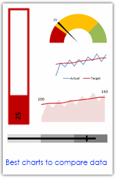
Comparing values is one of the main reasons we make charts. Yesterday we have a post on using thermometer charts to quickly compare actual values with targets. Today we follow up the post with 10 charting ideas you can use to compare actual values with targets. Check out how bullet charts, thermometer charts, traffic lights, gauges, column charts, area charts can help you compare targets with actual performances. A review of best charting options when you need to compare.
Read the rest of the post to see the options and participate in poll.
Continue »{ 7 Comments }
Dashboard Best Practice – Google Analytics Intelligence Report
Published on Nov 4, 2009 in Charts and Graphs, Cool Infographics & Data Visualizations
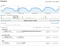
Yesterday while checking my website analytics reports on Google analytics site, I have noticed a new beta feature called “Intelligence”. Out of curiosity I clicked on it. It took me to a an intelligence alert dashboard. Ok, lets just back up for a minute and understand what “intelligence dashboard” is before moving on. In the […]
Continue »
Yesterday I read about interaction plots on junk charts where he points out the merits of an interaction plot. Interaction plots show interaction effects between 2 factors. For eg. you can show how your product sales have changed between year 1 and year 2 using an interaction plot like the one shown aside.
Continue »![Project Management Dashboard / Project Status Report using Excel [Part 6 of 6]](https://chandoo.org/img/pm/project-status-dashboard-th.png)
Project management dashboards, project status reports help stakeholders, project sponsors and team-members can understand project status very quickly. In the last installment of project management using excel, learn how to make project management dashboard using excel in this tutorial. Also download the excel project status dashboard template.
Continue »{ 31 Comments }
Issue Trackers & Risk Management using Excel [Project Management using Excel – Part 5 of 6]
Tracking issues and risks is where most of the project management time goes. Once the project planning and organizing activities are in good shape, most of the project management activities are around risk management and issue tracking. In this installment of project management using excel, we will learn how to create a simple issue tracker template using excel and how to analyze issues using excel.
Continue »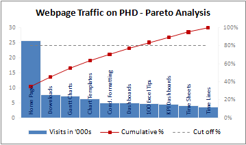
A Pareto chart or pareto graph displays the importance of various factors in decreasing order in columns along with cumulative importance in a line. Pareto charts are often used in quality control to display most common reasons for failure, customer complaints or product defects. The pareto chart is a great way to do the pareto analysis. Today, we will learn how to use excel to make a pareto chart.
Continue »{ 26 Comments }
Dynamically Grouping Related Events [Excel Combo Charts with Pizzazz]
Published on Aug 27, 2009 in Charts and Graphs
![Dynamically Grouping Related Events [Excel Combo Charts with Pizzazz]](https://chandoo.org/img/n/dynamic-event-grouping-charts-th.gif)
Yesterday we have posted how to use excel combo charts to group related time events. Today we will learn how to change the event grouping dynamically using form controls.
This effect can be easily achieved with a cup of coffee, one combo box form control and the good old IF formula. Read more to learn how to do this.
Continue »{ 10 Comments }
Using Combo Charts to Group Related Time Events [Charting Goodness]
Published on Aug 26, 2009 in Charts and Graphs
![Using Combo Charts to Group Related Time Events [Charting Goodness]](https://chandoo.org/wp/wp-content/uploads/2009/08/excel-combo-chart-th.png)
In his latest book, Now You See It, on pages 165 and 166 of the book, Stephen Few discusses how grouping related time intervals can facilitate analysis of data. As an illustration he explains that when viewing data of daily website visits, it helps in separating weekdays and weekends to differentiate expected traffic during these periods. The use of this technique would make it easier for the analyst to identify any anomalous movement in ether the weekend or the week day.
Fortunately excel combo charts can help you do that. In this guest post, Paresh explains to us how to do this.
Continue »{ 106 Comments }
Waterfall Charts using Excel
Published on Aug 10, 2009 in Charts and Graphs, Featured

Learn how to create waterfall charts in Excel in this tutorial. Our guest author, Aaron, explains how to create cool looking waterfall charts with connectors. Waterfall charts are great, especially for visually showing the contribution of parts to a whole.
Continue »{ 28 Comments }
Use burn down Charts in your project management reports [bonus post]
Published on Jul 21, 2009 in Charts and Graphs
![Use burn down Charts in your project management reports [bonus post]](https://chandoo.org/img/pm/burn-down-chart.png)
A burn down chart is a good way to understand the progress of a project. It is like a run chart that describes work left to do versus time. In this tutorial we will learn how to make a burn down chart using excel. This is a bonus installment to the project management using excel series.
Continue »![Project Management: Show Milestones in a Timeline [Part 3 of 6]](https://chandoo.org/img/pm/project-timeline-chart-excel-th.png)
Learn how to create a timeline chart in excel to display the progress of your project. Timelines are a good way to communicate about the project status to new team members and stake holders. Also, download the excel timeline chart template and make your own timeline charts.
Continue »{ 19 Comments }
Use min-max charts to show the spread of data – Charting Best Practice
Published on Aug 11, 2008 in Charts and Graphs, Learn Excel
Next time you want to make a chart to tell how your sales (defects, customer calls, page views, number of clicks, walk-ins etc.) are doing over a period of time, consider showing them in a min-max chart. For eg. a min-max sales chart for the last 12 months tells average, minimum and maximum sales per […]
Continue »
