All articles with 'large' Tag
![How to Visualize Survey Results using Incell Panel Charts [case study]](http://chandoo.org/img/cb/survey-results-panel-chart-example.png)
A panel chart (often called as trellis display or small-multiples) shows data for multiple variables in an easy to digest format. It lets users compare in any way and draw conclusions with ease.
Today, I want to discuss how the principles of panel chart can be applied to visualize a complex set of survey results. For this we will use the recent survey conducted by Gartner on how various customers use BI (Business Intelligence) tools.
Continue »{ 24 Comments }
Top X chart – Show Top X values of a chart Interactively
Published on Nov 12, 2009 in Charts and Graphs, Learn Excel
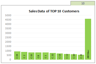
Two charting principles we hear all the time are,
- Sort your data in a meaningful order before plotting it.
- Show only relevant information, not everything – because un-necessary information clutters the chart.
Today we will learn a dynamic charting technique that will mix these two ideas in a useful way. I call this a Top X chart.
Continue »It is no exaggeration that knowing excel formulas can give you a career boost. From someone starting at the long list of numbers, you can suddenly become a data god who can lookup, manipulate and analyze any spreadsheet.
So when our little excel blog hit the 5000 RSS Subscriber milestone, I celebrated the occasion by asking you to share an excel formula through twitter or comments with rest of us. And boy, what an excellent list of formula tips you have shared with us all.
Here is the complete list of entries for the twitter formula contest.
{ 61 Comments }
Highlight Top 10 Values using Excel Conditional Formatting
Published on Mar 17, 2009 in Excel Howtos, Learn Excel

In excel conditional formatting basics article, we have learned the basics of excel conditional formatting. In this article we will learn how to highlight top 5 or 10 values in a list using excel as shown aside. We will use LARGE excel formula and conditional formatting to do this.
Continue »Creating KPI Dashboards in Microsoft Excel is a series of 6 posts by Robert from Munich, Germany. This 6 Part Tutorial on KPI Dashboards Teaches YOU: Creating a Scrollable List View in Dashboard Add Ability to Sort on Any KPI to the Dashboard Highlight KPIs Based on Percentile Add Microcharts to KPI Dashboards Compare 2 […]
Continue »
