All articles with 'infographics' Tag
Make info-graphics with shape fill technique [Charting Tip]
![Make info-graphics with shape fill technique [Charting Tip]](https://chandoo.org/wp/wp-content/uploads/2019/07/make-info-graphics-in-excel.png)
This is a quick, fun and elegant way to make impressive charts. You can easily create info-graphic style charts in Excel using shape fill technique. Something like this:
Continue »![May the POWER BI with you [Star Wars Day Viz]](https://chandoo.org/wp/wp-content/uploads/2018/05/star-wars-power-bi-infographic.png)
It is star wars day. Let’s celebrate the ultimate nerd day of the known universe in a way that resonates with us. Let’s dress up as storm troopers and make exploding 3d pie charts.
Just kidding. Let’s just make a cool visualization in Power BI instead.
Continue »Sachin Tendulkar ODI Stats – an Excel Info-graphic Poster

Sachin Tendulkar is undoubtedly the best cricketers to play One Day International Cricket. He is a source of inspiration and joy for me and many others. So, naturally I was jumping with joy when I heard that he scored the highest ever runs in a single match on 24th of Feb. He scored 200 runs […]
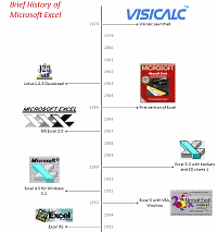
Continue »A Brief History of Microsoft Excel – Timeline Visualization

Timeline charts are great for providing quick snapshots of historical events. And hardly a day goes by without some one making a cool visualization of a time line of this or that. Time lines are easy to read, present information in a logical manner and mostly fun.
So yesterday, I set out to mimic the iconic gadgets of all time in excel, just for fun. Then it strike me, why not make a visual time line of Microsoft Excel ? So I did that instead.
Continue »Nightmarish Pie Charts [because it is weekend]
![Nightmarish Pie Charts [because it is weekend]](https://chandoo.org/img/cb/pie-chart-on-piecharts.png)
Nothing like a weekend making fun of something worthless. So we will pick on some of the plump, overloaded and visually disgusting pie charts featured on various extremely popular websites. As a bonus, you get to see my hand-drawn pie chart on the usage of pie charts.
Continue »Starting this week I will post cool infographics from around the web, 4-5 of them a week to inspire , to give more ideas on presenting information and to provide some eye candy for awesome readers @ Pointy Haired Dilbert. Go ahead, click through these awesome graphics: California Walkability Score Heat Map Lee Byron took […]
Continue »

