All articles with 'group ungroup' Tag
{ 33 Comments }
Show Months & Years in Charts without Cluttering
Published on Nov 17, 2010 in Charts and Graphs

We make charts with date axis all the time. So, today we will learn how to set up axis settings in Excel so that Months & Years are shown neatly structured without cluttering your chart. See the example next to understand.
Continue »{ 17 Comments }
Budget vs. Actual Profit Loss Report using Pivot Tables
Published on Apr 21, 2010 in Learn Excel, Pivot Tables & Charts
This is continuation of our earlier post Preparing Quarterly and Half yearly P&L using grouping option. You can also do budget v/s actual comparison using Pivot Tables. For this we will use calculated items feature of Excel PivotTables.
To begin, we have to add one more column to our data. I have added column Data Source to the end of data table. Existing data is marked as Actual and I have added more data rows which are marked as Budget. You can download new file with updated data and basic Pivot P&L.
Continue »{ 5 Comments }
Quarterly & Half-Yearly Profit Loss Reports [Part 5 of 6]
Published on Mar 24, 2010 in Learn Excel, Pivot Tables & Charts
![Quarterly & Half-Yearly Profit Loss Reports [Part 5 of 6]](http://chandoo.org/img/ea/quarterly-half-yearly-profit-loss-reports-excel.png)
This is continuation of our earlier post Exploring Pivot Table P&L Reports.
We have learned how to change our P&L report on various data elements. We have seen how the P&L report can be changed with just few clicks.
In this post we will be learning some grouping tricks in PivotTables. We will cover grouping of dates, text fields and numeric fields. You will need to start with Monthly P&L report prepared in previous post. We will also learn some really clever tricks and hacks on how to group data in Pivot Tables. So read on…,
Continue »{ 14 Comments }
Group Project Activities to Make Readable Gantt Charts
Published on Feb 11, 2010 in Charts and Graphs, Learn Excel
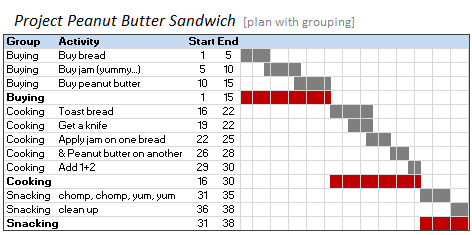
In Excel Gantt Charts part of our project management series, we have discussed about how using Conditional Formatting and Formulas we can make a gantt chart like this: But when you have large project plans, gantt charts like above can get pretty intense and hard to read. So a better approach is to group various […]
Continue »{ 75 Comments }
What is Excel SUBTOTAL formula and 5 reasons why you should use it
Published on Feb 9, 2010 in Learn Excel
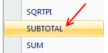
Today we will learn Excel SUBTOTAL formula and 5 beautiful reasons why you should give it a try.
SUBTOTAL formula is used to find out subtotal of a given range of cells. You give SUBTOTAL two things – (1) a range of data (2) type of subtotal. In return, SUBTOTAL will give you the subtotal for that data. Unlike SUM, AVERAGE, COUNT etc. which do one thing and only one thing, SUBTOTAL is versatile. You can use it to sum up, average, count a bunch of cells.
Continue »{ 12 Comments }
Collapse, Expand Excel Charts using this hidden trick
Published on Jan 12, 2010 in Charts and Graphs
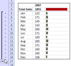
Do you know that you collapse or expand excel charts? Don’t believe me? Me neither. When I first realized that we can collapse / expand charts without writing any macros or lengthy formulas, I couldn’t wait to share it with all of you. This is such a simple yet powerful trick. See it for yourself.
The trick lies in using group / un-group data feature and carefully aligning charts with the cell grid. The whole process takes just about 2 minutes and produces wow factor worth a week. Go check it, now. Also, a downloadable template is included in the post.
Continue »{ 115 Comments }
Grouping Dates in Pivot Tables
Published on Nov 17, 2009 in Learn Excel, Pivot Tables & Charts
Do you know you can group dates in pivot tables to show the report by week, month or quarter? I have learned this trick while doing analysis on a pivot table today. In this online lesson on pivot tables, I will teach you how to group dates in pivot tables to analyze the data by month, week, quarter or hour of day.
Continue »
