All articles with 'donut charts' Tag

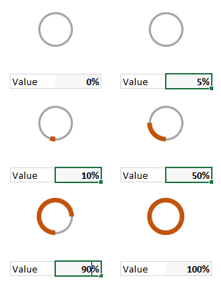
I have been playing Zelda: Breath of the wild a lot these days and I LOVE the game. Considered one of the BEST video games all time, BOTW is beautifully designed and offers a lot of entertainment. Don’t freak out yet, Chandoo.org hasn’t suddenly branched into a video gaming blog. Instead, I am here to talk about Stamina Wheel Chart.
Continue »Source vs. Use of Funds – 14 charting alternatives

Let’s say you manage a fund or charity. You get money from various places and you use that money for various reasons. How do you tell the story of source vs. uses of funds? In this post, let’s review 14 charting options. Source vs. Use of funds – Sample Data for this problem Let’s say […]
Continue »I won’t eat donut with a thread inside, but lets make one anyway!

Today lets take a stroll outside what Excel can do and make something fancy, fun and may be useful.
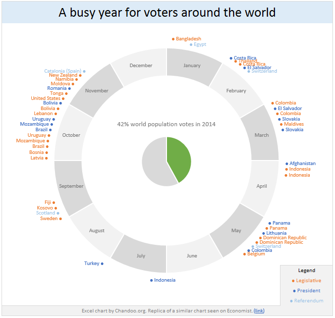
Nowadays, many newspapers, websites and magazines are featuring info-graphics. An info-graphic is a collection of shiny, colorful & data-full charts (or often pieces of text.) In many of these info-graphics, you can see threaded-donut charts. Not sure what that is..? It is not same as the blasphemy of spoiling a soft, sweet, supple donut with a piece of string. No one should be excused for an offense like that.
What I am talking about is shown above
Continue »42% of the world goes to polls around a pie chart – Like it or hate it?

Today lets have a poll. Lets debate if this pie chart about world elections in 2014 is good or bad.
First lets take a look at the chart
This chart, published by The Economist talks about how 42% of the world population is going to vote this year. Take a look and read on to learn how you can re-create this in Excel.
Continue »
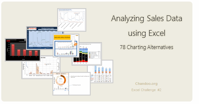
Recently, I ran a contest asking you to analyze a bunch of sales data and present your results in charts. We received a total of 78 charts from 45 people. The contest entries had a mind-boggling variety of excel charts, techniques and ideas. It took me a while to go thru all the files and compile the results. Thanks for your patience. In this post, you can find all the charts along with my comments & links to download files.
Continue »Lets Pimp a Gauge Chart [Chart Porn Friday]
![Lets Pimp a Gauge Chart [Chart Porn Friday]](https://chandoo.org/wp/wp-content/uploads/2009/11/fancy-excel-gauge-chart-th.png)
Egil, one of our alert readers from Norway sent this to me in e-mail, which I swear, I am not making up – A Fancy Gauge Chart. See the e-mail and chart yourself. I’m having a lot of fun with your gauge template 🙂 To make it more industrial-like, I’ve added: 1. Brushed metal background […]
Continue »Recipe for a Donut Bar Chart

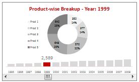
We all know that bar charts can be used to display values spread across various categories or times and pie charts / donut charts can be used to display percentage breakup of various quantities in a sum total. How about mashing up both to create a Donut Bar chart?
In this tutorial, you can learn how to make a donut bar chart and linking it to a form control to display Product-wise sales breakups spread across several years.
Continue »Asset Allocation Chart Turns Zombie [ChartBusters #1]
![Asset Allocation Chart Turns Zombie [ChartBusters #1]](https://chandoo.org/img/cb/bad-asset-allocation-chart-donut.png)
In this installment we take a look at Asset Allocation Chart that looks like it is hexed. Our reader DMurphy submitted this.
Continue »RSS Icon using Donut Charts – Because it is Weekend
RSS Icon using Donut Charts – Because it is Weekend
Continue »![Polar clock using donut chart [Excel Visualization fun]](https://chandoo.org/wp/wp-content/uploads/2008/08/donut-clock-in-excel-thumb.png)
Smashing Magazine is one of daily hangouts for new design ideas, inspiration and ogle fun. When they featured Pixel Breaker’s Polar clock last Friday on Top 10 creative ways to display time, I knew this could be an interesting visualization to do in excel. So I have created a donut chart in excel that can […]
Continue »

