Project Management Dashboard / Project Status Report using Excel [Part 6 of 6]

Share

Facebook
Twitter
LinkedIn

This is the last installment of project management using excel series.

Preparing & tracking a project plan using Gantt Charts
Team To Do Lists – Project Tracking Tools
Project Status Reporting – Create a Timeline to display milestones
Time sheets and Resource management
Part 5: Issue Trackers & Risk Management
Project Status Reporting – Dashboard
Bonus Post: Using Burn Down Charts to Understand Project Progress

Communication is a very important aspect of project management. Communicating with stakeholders, sponsors, team members and other interested parties takes up quite a bit of project manager’s time.

In almost all the projects I have been part of, the first and foremost question anyone used to ask us is, “how is the project going?”. There is no one line answer to this. A project status dashboard or project status report can help us express the project status in a crisp yet effective manner.

In today’s installment of project management using excel series, we will learn how to make a project management dashboard using Microsoft excel. [related: Making Dashboards using Excel]

To make the project management dashboard, you must answer the following questions,

  • Who is the audience of this dashboard?
    • Top management or project sponsors or team members or other departments?
  • What are they interested to know?
    • Day to day issues or High level stuff or Plans or Budgets?
  • What is the frequency for updating the dashboard?
    • Weekly, Bi-weekly or Monthly or Once in a blue moon?

The answers to these questions will determine what goes in to the dashboard and how it should be constructed.

For our example, I have assumed the following scenario, but you can easily change the dashboard constituents based on your situation.

  • Audience of the report: Project Sponsorship Team
  • Interested to know: Project Progress wrt Plan, Blocking issues, Overall timeline and Delivery Progress
  • Frequency: irrelevant (could be weekly or bi-weekly)

Step 1: Make an outline sketch of the dashboard

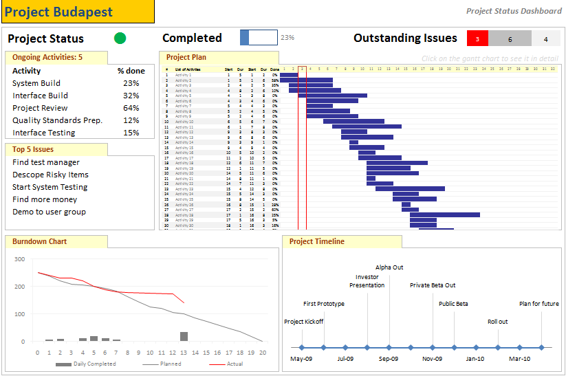
Based on the above answers, we vaguely know what should go in to the dashboard. Based on this, we should make an outline sketch of the dashboard. This will help you structure the dashboard on an excel spreadsheet. For our example, this is the outline I have prepared.

Project management dashboard - outline sketch

the finalized dashboard will look like this: (click here for a bigger version)
Project Management Dashboard

Step 2: Get the data to be placed on dashboard

Making a dashboard in excel is a complex and intricate process. Knowing the outline of the dashboard is only the 10% of work. Getting your data to calculate the dashboard metrics (or KPIs) is the most vital part of any dashboard construction.

In our outline, the sections 1,2 and 3 are purely data and 4,5 and 6 are charts prepared from data.

To facilitate this, first, let us create a worksheet named “data” where we can capture user inputs. These inputs can be further manipulated to make the dashboard.

For our dashboard, we need the following inputs,

  • Overall project status and progress
  • List of ongoing activities and issues

We will derive other inputs from the following,

Step 3: Put everything together and make a dashboard

[PS: I have greatly simplified the process of dashboard construction to keep the article readable. Please note that this step usually takes a few of hours and has lot more detail]

Now that we have all the bits of our data ready, we just need to bring them together to make a dashboard.

We will use the following excel concepts,

  • Excel Camera Tool to get a live snapshot of the project gantt chart
  • Conditional Formatting to show Red, Green or Amber traffic light to depict the project status
  • Thermo-meter chart to show the project progress against 100% total
  • We will create a stacked bar chart of outstanding issues by using SUMIFS formula. [counts for issue status=”open” and issue priority=”high”, issue status=”open” and issue priority=”medium”, issue status=”open” and issue priority=”low”]

Let us place the remaining pieces of dashboard from already constructed charts and available data,

  • Burn-down chart to show the project deliverable status
  • Project Time line to show the project milestones over a period of time
  • We will create references to the “issue” and “activity” data and show only the first 5 items.

See the below illustration to understand how each part of the dashboard is constructed.

Project Status Report / Dashboard - Construction

That is all, our dashboard is ready now.

Download the project management dashboard excel file

Unlike other downloads on Chandoo.org, this file is locked. You can purchase unlocked version along with 23 other project management templates – Click here to buy it.

  • To download the locked version of project management dashboard excel file click these links:  excel 2003, excel 2007
  • To get an unlocked version of the dashboard along with 23 other templates, click here.

Tell us about your Project Management Dashboard / Status Report

Tell me about your project management dashboard, project status report formats and how it is constructed. Do you use excel or some other tool (like powerpoint, word) to prepare the report? How the report / dashboard generated? Is the process automated or manual? What have you learned from using / making such status reports?

Resources for Project Managers

Check out my Project Management using Excel page for more resources and helpful information on project management.

Also check out below posts to make your project management files awesome.
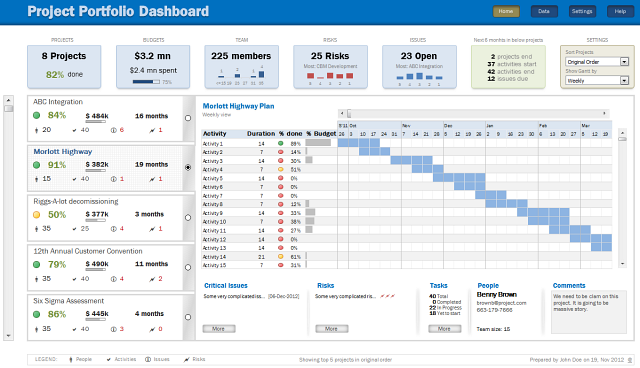
What next?

This is the last installment of project management using excel series. I am looking for ideas to extend this series in useful manner. Please use comments to tell me what other activities of project management can be made easy using Microsoft Excel. I will try to write follow up posts if the topics are interesting.

Thanks a lot for reading the series and suggesting valuable inputs to make it better. I have learned a lot about project management and excel writing this series. I hope you have picked up few concepts too.

Tell me your feedback using comments.

Project Management Templates for Excel

Facebook
Twitter
LinkedIn

Share this tip with your colleagues

Excel and Power BI tips - Chandoo.org Newsletter

Get FREE Excel + Power BI Tips

Simple, fun and useful emails, once per week.

Learn & be awesome.

Welcome to Chandoo.org

Thank you so much for visiting. My aim is to make you awesome in Excel & Power BI. I do this by sharing videos, tips, examples and downloads on this website. There are more than 1,000 pages with all things Excel, Power BI, Dashboards & VBA here. Go ahead and spend few minutes to be AWESOME.

Read my storyFREE Excel tips book

Overall I learned a lot and I thought you did a great job of explaining how to do things. This will definitely elevate my reporting in the future.
Rebekah S
Reporting Analyst
Excel formula list - 100+ examples and howto guide for you

From simple to complex, there is a formula for every occasion. Check out the list now.

Calendars, invoices, trackers and much more. All free, fun and fantastic.

Advanced Pivot Table tricks

Power Query, Data model, DAX, Filters, Slicers, Conditional formats and beautiful charts. It's all here.

Still on fence about Power BI? In this getting started guide, learn what is Power BI, how to get it and how to create your first report from scratch.

15 Responses to “A Gantt Chart Alternative – Gantt Box Chart”

  1. Kenjin says:

    That's a great idea.
    Maybe the planned End Date should be highlight more.
    I don't know how it would look like (nor how to do it yet), but what if instead of finishing the bold line to the best case End Date, it finishes to the realistic End Date?

  2. ross says:

    The idea is ok, I think other project management tools have this, already? Maybe not.

    Gantt charts in my view are about the signal most unless thing in the world, theres no way you can look at one thats more that a little complex and understand what it's telling you. I'm going to write a diatribe on project management at some point, its one of my pet areas I think!! 😉

    The issue I have with this chart Chandoo, is that Tasks need to be linked to each other, so they should inherit the uncertainty, which would mean the as you moved down chart the lines would be miles apart for later tasks, and you might have to add lots of lines for subsequent tasks to cover the various outcome of it's parents.

    Having said that, for the high level board summary, it's a nice way to go, it it appeals to the management 😉

    thanks Chandoo, great post.

    Ross

  3. Cyril Z. says:

    Whoooa !!! That's a very clever idea Chandoo. I really love it.
    I think i'll update my gantt project sheet with that idea soon (remember my template ?)
    @ross : you can link start date to the end date of the previous task in your data. The only problem I still se is to which end date (real ? planned ? best ?) in order to have average amount of information.

    If best end date, you'll tend to increase uncertainty at the end of chain, although if you link to real end date, uncertainty will be decreased too much, leading in both cases to wrong management direction.

    Maybe planned till the task is finished then real will do the job ?

  4. Vijesh says:

    Hey chandoo, this looks good and this would definite add value in production planning / scheduling. Uncertainity in finishing a task is very high in production scheduling and this could give an insight or a bird eye view of possible shipments we can have....

  5. PK says:

    I've always been frustrated by the limitations of gantt charts. Will definitely use this, I've always struggled with how to succinctly communicate the uncertainty of certain tasks without confusing stakeholders.

  6. Andy says:

    I like this, I think it's a very effective way of showing how a timeline can change and which parts of a project need close attention.
    @Cyril / @Ross: I would intially link the the start date to the planned end date of the previous task, with the chart updating when a task has been completed to reflect the true end date.

    Or what about giving a drop-down selection box to allow the user to see the chart based on planned/best-case/worst-case end dates?

  7. Eric says:

    Like the idea. Have found that Excel is more flexible than MS Project for graphical solutions. The "Best Case"\"Worst Case" metrics are theoretically appealing but once the project and\or phase commences their reliability diminishes. A chart like the above that showed Planned Start, Planned End, Replan End Start, Replan End Date, Number of Replans the Start and End Dates, and Actual would provide an active, actionable view of each task\phase. It would also highlight the areas which are riskiest.

  8. Bob says:

    It is always amazing how flexible excel can be.

    My question is how would the chart show a scenario where the date moved up? If a task is dropped or the duration of the task is significantly reduced by applying more people or machinery to the task, the dates will move up.

    The gantt chart has been around for a long time, but it is still quite useful to show progress.

    Cheers,
    B

  9. Shyam says:

    I like the idea but seems bit complicated in case of long projects involving numerous activity.

    Also, reading and explaining is required hence not feasible where plans are just send to audience for approval.

    Cheers
    SY

  10. Peter says:

    Great idea Chandoo,

    When I was reading this idea regarding delivery dates, another thought popped into my mind, how can you show the uncertainty with MONEY!!

    In this case, applies to cost management or even a normal budget, you think?

    Would Box Chart and Gannt Chart help to understand the best case, middle case and worst case when money is spend or planned with these three risks are involved?

    I imagine that this chart could help people who write their budgets get a better understanding of risks affecting their spending.

    Peter

  11. Matthew Galman says:

    Chandoo,

    I like it. How would you display an entry once it has been completed (actual)?

    Thank you,

    Matt

  12. Phil says:

    From what you have shown so far I think that this box Gantt chart is awesome! I think that this could be an extremely useful tool.

    I can't wait to learn how to make my own charts in Excel.

    Will the methods that you are going to teach us work in 2003 as well?

  13. [...] Firday, we proposed a new chart for showing project plans. I chose an ugly name for it and called it Gantt Box [...]

  14. TommyZ says:

    You need to read Eli Goldratt's Critical Chain. The uncertainty you are looking for should be accounted for in a project buffer. Not at each task level.

    Further you should spend time understanding Agile Development. This would have you plan only in 1-3week iterations. This allows you to embrace changes to work not yet started, and for your customer to re-direct your course at regular intervals (after each iteration) throughout your project. keyword search: Agile Scrum

    These items will show you that you are solving a tracking problem for something that you can entirely avoid!

  15. […] Chandoo.org’s  Gantt Box Chart. […]

Leave a Reply