How-to highlight maximum value in Excel charts? [Quick tip]
Ever wanted to highlight maximum value in charts? Then this tip is for you.
Hello, Namaste & Kia Ora. Welcome to Chandoo.org.
My name is Chandoo. My mission is to make you awesome in Excel and Power BI.
I do this by sharing Excel & Power BI tutorials, examples, tips, videos and articles on this website. I live in Wellington, New Zealand with my beautiful wife Jo & our twins Nishanth & Nakshatra. Take a minute to browse various topics of the site to see how I can help you.
Thank you and welcome.
Ever wanted to highlight maximum value in charts? Then this tip is for you.
Let’s say you are starting at a large dataset with multiple columns. You need to make a pivot report from it for a client or manager. How would you go about it?
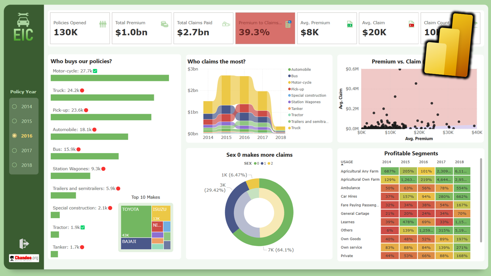
Do you know that you can apply conditional formatting rules to visuals in Power BI? In this post, let’s learn how to conditionally format visuals in Power BI. Something like this:
This is an Excel replica of excellent Tableau visual on Tour de France winner data made by Marc Reid.
Last week I saw a stunning visualization on Tour de France using radial charts. I wanted to replicate it in Excel. So here we go.
This is a quick, fun and elegant way to make impressive charts. You can easily create info-graphic style charts in Excel using shape fill technique. Something like this:
Can we predict cricket match score in Excel? Using machine learning, ensemble modeling, multiple regression and Excel formulas we can. This tutorial explains how.
I recently went to Sydney to conduct some training programs on Advanced Excel and Power BI. While I was there, I met my good friend
Say you want to combine multiple Excel files, but there is a twist. Each file has few tabs (worksheets) and you want to combine like for like, ie , all Sheet1s to one dataset, all Sheet2s to another dataset…
To make matters interesting each sheet has a different format.
What now?
Of course Power Query to the rescue.
for more videos…
BeginnerTables & Structural Referencing
Cell referencing
Excel operators
IF
IntermediateSUMIFS, COUNTIFS
XLOOKUP NEW
VLOOKUP
INDEX + MATCH lookups
AdvancedMulti-condition lookups
Array Formulas
OFFSET
INDEX
Lists100+ Excel Formulas list
Top 10 formulas
15 Everyday formulas
Challenges & Home workExcel Homework
BeginnerExcel Pivot Table Tutorial
Multi-table pivots with data model
Advanced
Advanced Pivot Tables
Distinct count in Pivots
Ranking values in Pivots
GETPIVOTDATA
How to use slicers
Lists35 shortcuts & tricks for data analysis
Top 10 pivot table tricks
15 quick & powerful ways to analyze business data
ResourcePivot Tables Page
BasicsHow to pick right charts
Why bar charts should start at 0
Add a line to column chart
Correlation vs. Causation
ExamplesHand-drawn charts
Budget vs. Actual chart
Interactive charts
Chart typesHistograms & Pareto charts
Forecasting with charts
Gantt chart
Funnel chart
5 star chart
Indexed charts
Panel charts - Small multiples
AdvancedTarget vs. Actual progress - Biker on a hill chart
Stacked chart with indicators
Cropped chart - when some values are too big
Jitter plot
Joy plot
Step chart
Dynamic chart with check boxes
Lists & TricksCharting shortcuts & tricks
Using shapes in charts
Awesome chart titles with this trick
Use chart themes and styles
Use selection pane to work with charts faster
If you are new to Excel or have never used it, use below links to come up to speed.
Work with Excel a lot and know your game well? We have some very-advanced topics for you too.
Check out:
Excel challenges
Advanced Charting
Data Tables & Simulations
Power BI
Power BI is the most exciting thing to happen for your data since spreadsheets. If you are looking for a new skill to learn this year, I highly recommend Power BI. Check out below tutorials and get started today.
Learn how to work with data, make calculations, pivots, create amazing charts and powerful dashboards from scratch using Excel School + Dashboards program. Suitable for analysts, managers or professionals who need to use Excel often.
Use VBA to automate your tasks and build powerful spreadsheet based apps. In this course, learn all about how to program with VBA, how to use the language and object model to your advantage. Suitable for people who build a lot of things with Excel.
One email per week with Excel and Power BI goodness. Join 100,000+ others and get it free.
© All rights reserved.