CP006: How to be a better analyst? – Road map for getting better at Data Analysis & Improving your career prospects

Share

Facebook
Twitter
LinkedIn

In the 6th session of Chandoo.org podcast, we focus on making you a better analyst.

How to become a better analyst - Learn the road map to become better at data analysis and improving your career prospects - Chandoo.org podcast - Session 006

Before we proceed in to the session, let me remind you:

Subscribe to Chandoo.org Podcast

Do you know that you can subscribe and receive latest episodes of our podcast right to your ears? Use one of the below links to get started.

What is in this session?

One of the most popular questions I get, goes like this:

I recently became an analyst. I want to succeed in my work. How do I go about it?

So in this episode, lets explore the road map to becoming a better analyst.

Mindmap for becoming a better analyst - CP006 - Chandoo.org podcastIn this podcast, you will learn,

  • Announcement about Easter Egg hunt
  • Why become a better analyst?
  • The road map for becoming a better analyst – BETTER framework
  • B for Business Knowledge
  • E for Examining user needs
  • T for Thinking about analysis
  • T for Tools of Trade ie Excel
  • E for Expression
  • R for Refining yourself
  • Conclusions

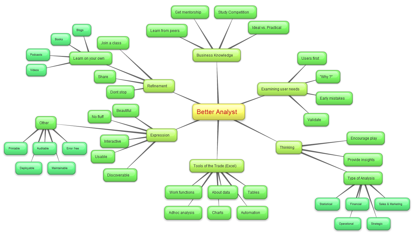
See the mind-map aside (click on it to expand) to understand the BETTER framework.

Go ahead and listen to the show

Links & Resources mentioned in this session:

Easter Egg Hunt:

Courses mentioned:

Case Studies

Resources to learn Excel

Making Interactive Charts in Excel

Spreadsheet Errors & Auditing

Transcript of this session:

Download this podcast transcript [PDF]

Are you becoming better analyst?

As a CEO of a small company, most of my time is spent on analysis & decision making.  So I am always looking for ways to improve my skills.

What about you? How do you become better at your job. Please share your tips, ideas & inspiration in the comments.

Facebook
Twitter
LinkedIn

Share this tip with your colleagues

Excel and Power BI tips - Chandoo.org Newsletter

Get FREE Excel + Power BI Tips

Simple, fun and useful emails, once per week.

Learn & be awesome.

Welcome to Chandoo.org

Thank you so much for visiting. My aim is to make you awesome in Excel & Power BI. I do this by sharing videos, tips, examples and downloads on this website. There are more than 1,000 pages with all things Excel, Power BI, Dashboards & VBA here. Go ahead and spend few minutes to be AWESOME.

Read my storyFREE Excel tips book

Overall I learned a lot and I thought you did a great job of explaining how to do things. This will definitely elevate my reporting in the future.
Rebekah S
Reporting Analyst
Excel formula list - 100+ examples and howto guide for you

From simple to complex, there is a formula for every occasion. Check out the list now.

Calendars, invoices, trackers and much more. All free, fun and fantastic.

Advanced Pivot Table tricks

Power Query, Data model, DAX, Filters, Slicers, Conditional formats and beautiful charts. It's all here.

Still on fence about Power BI? In this getting started guide, learn what is Power BI, how to get it and how to create your first report from scratch.

29 Responses to “Customer Service Dashboard using Excel [Dashword Week]”

  1. Tom Quist says:

    Looks good, Mara. Keep up the good work!

  2. William Solera says:

    Thx Mara, your work is great, congratulations...

  3. Francis Chin says:

    wow ! Great stuff Mara !!
    I am amazed on the work you did !

    What I like about your dashboard
    1. The first impression is the colors used. Very smart use of colors that matches each other, easy on the eye - make people wants to find out more !

    2. Clear message shown for the tweetboard for Quick overview on the state of situation.

    3. Use of creative titles for your charts "Information Desk".

    4. Clear and uncluttered charts. Gives reader a clear perspective with good use of charts colors too.

    5. Good use of Legend to describe what color meant "Highest Sales out of the three months"

    6. Of course, good use of Check boxes and Slider bar to offer interactiveness on your charts.

    Suggestions
    1. You may want to consider formatting your Y and X axis labels to show thousands, in $500K format instead of $500,000, so you can even made your chart look much neater.

    2. Budget Variant Chart - This one is special...I took a second look and try to understand it. I am not sure if this is the best chart to visualize Sales VS Budget and Variances. And the Variance of 16.19% is positive, so u may want to use conditional formatting to make it green color, red if negative.

    Overall is Great Work and Great Effort !!! Keep it up and I am so proud of you !

    Francis Chin
    http://www.francischin.com

  4. Sabrina says:

    Great Work Maya, just wondering if "5" Scrollable list of various gift shop items, can compare the previous 2 and current month selected in the above picklist, just one more suggestion if we can use top 5 gift category by using donut and bar mix chart to show sales mix for different months

  5. Sabrina says:

    Chandoo I would like to thank you for posting such helpful tricks for creating dashboards, I have learned a lot from your KPI Dashboard demo, I have created one dashboard to compare performce of Sales Associates, thaks a lot again

  6. Fred says:

    Thanks for the idea! Great job! You are giving me a lot of inspiratons!

  7. Mara says:

    Thanks everyone for the nice comments. I'm such a novice at this so I was so grateful for Chandoo's class and for everyone who submits ideas on his blog.

    Francis: Thanks so much for your comments. You're an inspiration. For the budget variance chart, I actually got that idea from one of Chandoo's post on budget vs actual. There was one that was simple and easy to read so I learned how to do that and made it dynamic. I'm open to any other ideas you have for budget vs actual. I'm always looking for ways to improve.

    Sabrina: Thank you for you for your suggestion on the top 5.

  8. Bhushan Sabbani says:

    Dear Mara,

    Great work.

    But i one suggestion regarding the INFORMATION DESK graph is consist of month but which year it belong is not there if it would be there it would be great.

    Warm Regards
    Bhushan Sabbani
    +91 98208 26012

  9. Avni says:

    Thanks for this idea... Great Stuff !!

  10. Ravi Kiran says:

    Excellent dashboard Mara.
    The best I like about the dashboard is the choice of colors. They are cool and not distracting. Thanks for sharing the file.

    @Chandoo
    Thanks for the dashboard week Chandoo. I am learnt a lot in the last 2 days. I am excited over the next 3 days! 🙂

    Regards,
    Ravi.

  11. VIO67 says:

    Great work Mara ! Thanks for sharing .

  12. goa homestay says:

    Mara, I liked the line, "Need to be more helpful." Our government needs to print this line, laminate it and post it in all government offices for the staff to see.

  13. Darshan says:

    Hi there, i have been recently visiting this blog it is really great, the best one for Excel, wish Chandoo great success ahead.

    I have one query, if you protect the data sheet the chart with the checkbox gives and error saying the data is protected and cannot be modified, is there a way around. This is cause if we want to publish this to someone who should only see it and do no changes to the data, is it possible please guide.

    This could be a silly but bear me i am novice to excel 🙂

    Thanks.

  14. praveen says:

    nice work.

  15. praveen says:

    inspired me a lot, working on few dashboard projects...

  16. Jay says:

    dear mara
    looks great .any reason why you have not used the bullet chart for the actual vs target chart.on the whole it is simple and elegant .jay.

  17. Gautam says:

    Dear Chandoo,

    The word Dashboard in the heading is misspelt.

  18. Krrish says:

    Wow. Very Nice work Mara. Next week I am going to take the Course, I will try to post my work here.

    Thank you so much for your helpful blog. Always appreciated your tips and tricks.

    I am proud that you belongs to our Vizag City.

  19. Krrish says:

    The above comment, I forgot mentioned about Chandoo, those two paras is about Chandoo. 😀

  20. Azucena says:

    Thank you Mara!

  21. vishal says:

    Thx Mara, your work is great, congratulations…

  22. Nalini says:

    Great Work Mara!!!!!!!!!!!!!!!!!!!!!!!!!!

  23. Aayush says:

    Hi Chandoo,
     
    I had been following your blogs for tips and tricks on excel. I am working with Media agency and we collect the data. Now this data has several parameters based on several legends. For eg Class A - legend color red, classB - legend color green and so on. Class A has several characteristics and parameters and heading etc. Now everytime we gather data and make pivot then based on the data in the pilot tables - top 10 we need to insert those in charts manually and also need to change the colors of legends and also. We create nearly 300 slides every month sector wise and it takes nearly our 4-5 days in doing that. Do you have any sample dashboard which will be helpfull to us and we can create it in a day.

  24. Gowravan says:

    Thanks really amazing one,

    it helped me in desgining OTACE report

    Regards
    Gowravan M
    9980651792

  25. mukhtar says:

    Awesome Job done here .............

  26. Samuel Amankwah says:

    very good master piece but wont to know if you can design KPI's for a financial institution. Thank you

  27. tajdeed pharma says:

    I need help to make performance for our company

    we have about 10 products from 5 years old

Leave a Reply