All articles in 'Featured' Category
Data Tables & Monte Carlo Simulations in Excel – A Comprehensive Guide

If anybody asks me what is the best function in excel I am drawn between Sumproduct and Data Tables, Both make handling large amounts of data a breeze, the only thing missing is the Spandex Pants and Red Cape!
How often have you thought of or been asked “I’d like to know what our profit would be for a number of values of an input variable” or “Can I have a graph of Profit vs Cost”
This post is going to detail the use of the Data Table function within Excel, which can help you answer that question and then so so much more.
Continue »![How to Visualize Survey Results using Incell Panel Charts [case study]](https://chandoo.org/img/cb/survey-results-panel-chart-example.png)
A panel chart (often called as trellis display or small-multiples) shows data for multiple variables in an easy to digest format. It lets users compare in any way and draw conclusions with ease.
Today, I want to discuss how the principles of panel chart can be applied to visualize a complex set of survey results. For this we will use the recent survey conducted by Gartner on how various customers use BI (Business Intelligence) tools.
Continue »![Making a Dynamic Dashboard in Excel [Part 1 of 4]](https://chandoo.org/img/ed/excel-dynamic-dashboard-final-th.png)
In this and next 3 posts, we will learn how to make a Dynamic Dashboard using Microsoft Excel.
At the end of this tutorial, you will learn how easy it is to set up a dynamic dashboard using excel formulas and simple VBA macros.
Continue »
In October 2008, I have started an ambitious series of posts on this blog called – Spreadcheats. These are little tricks, nuggets, tutorials on using Excel that would make anyone a spreadsheet guru.
The spreadcheats series has been wildly successful. I am compiling all this useful information and articles in to one big post so that anyone can follow the links and become good in Excel. Read on,
[Note: This is not for beginners. If you know what a formula is, you would enjoy this 31 articles]
Continue »
I have a new community project for all the members of PHD. It is a simple yet intuitive challenge. Make your own country’s flag using Excel Charts. To start the project, I have made the Indian flag using a bar and pie chart. Go ahead and see the rest of this post to findout how this chart is made and then participate in the “flag project” by making your own country’s flag. All the best.
Continue »
Few weeks back I have invited all of you to share your excel keyboard shortcuts in a open thread. More than 50 people commented on that post and shared a hundred excel keyboard shortcuts with us. There were so many wonderful keyboard shortcuts and tricks buried in the comments section of that post. During the […]
Continue »Pivot Table Tricks to Make You a Star

We, data junkies, love pivot tables. We think pivot tables are solution for everything (except for may be global warming and that broken espresso machine down stairs).
Today, we are going to learn 5 awesome pivot table tricks that will make you a star.
Continue »Flu Trends Chart in Excel [Yes, we can edition]
![Flu Trends Chart in Excel [Yes, we can edition]](https://chandoo.org/img/p/flu-trends-chart-final-th.png)
Last week I have reviewed Google’s flu trends chart and told you that is it is very well made. Out of curiosity I made a similar chart in Excel. In this post, I am going to share the experience and results with you. Interested? Read on…
Continue »
Today we will build a mortgage payment calculator (and amortization schedule) using excel. But we will not build a boring excel sheet, we will build a mortgage calculator that is easy to play with.
A mortgage payment is a monthly installment that you pay towards a loan. Any mortgage loan will typically have, (1) loan amount, (2) duration of the loan in years, (3) interest rate per year
Given these 3 parameters, we can easily determine the monthly installment amount (this will be the same amount for all months during loan tenure)
We are going to use Excel’s form controls (more on this below) to build a mortgage payment calculator like this.
Continue »Sales Dashboards – Visualizing Sales Data – 32 Dashboard Examples & Implementations

Sales reports and dashboards are very common in any company. There are several ways in which you can visualize sales data to understand the trends and sales performance. So in November, I have asked you to visualize sales data using sample data. The visualization challenge #2, sponsored by Zoho Reports generated a huge buzz around the community and fetched 32 incredible entries. The response was so overwhelming that it took me almost 24 hours to write this post. Thanks everyone for participating and making this a huge learning experience for everyone. Personally I have learned several useful dashboard and charting tricks. I will be sharing some of these lessons with all of you in the coming weeks.
Continue »Best Charts to Compare Actual Values with Targets – What is your take?

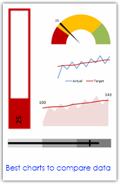
Comparing values is one of the main reasons we make charts. Yesterday we have a post on using thermometer charts to quickly compare actual values with targets. Today we follow up the post with 10 charting ideas you can use to compare actual values with targets. Check out how bullet charts, thermometer charts, traffic lights, gauges, column charts, area charts can help you compare targets with actual performances. A review of best charting options when you need to compare.
Read the rest of the post to see the options and participate in poll.
Continue »![2010 Calendar – Excel Template [Downloads]](https://chandoo.org/img/n/2010-calendar-thumb.png)
Here is a 2010 new year gift to all our readers – a free 2010 calendar excel file (a little secret: just change the year in “outline” sheet from 2010 to 2011, to get the next years calendar. It works all the way up to year 9999). You can even get a Printable PDF Calendar. There are 14 different sheets in the calendar file. First one is an outline calendar for the entire year. The next 12 are monthly calendars. And the last sheet shows a mini-calendar for the year 2010.
Read the rest of this post to know more and download the calendar.
Continue »What is Excel SUMPRODUCT formula and how to use it?

Today we will learn a new and exciting excel formula – the all powerful SUMPRODUCT.
At the outset SUMPRODUCT formula may not seem like all that useful. But once you understand how excel works with lists (or arrays) of data, the SUMPRODUCT’s relevance becomes crystal clear.
Continue »
We all have atleast one story of how that one time the boss / co-worker / classmate / cat ruined the carefully crafted excel spreadsheet by mucking up the formulas or disturbing the formatting. Read this post to learn 10 awesome excel tips to make better and boss-proof excel sheets.
Continue »
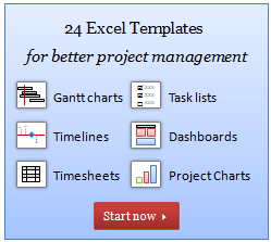
I have a super exciting news for all our members. During the last several weeks, I have been working on making 24 strikingly remarkable and easy to use excel templates for better project management. Finally the bundle is ready. You can get a copy of the bundle starting today.
Continue »

