
Welcome back. In part 2 of Making a Customer Service Dashboard using Excel let us learn how the data & calculations for the dashboard are setup.
Designing Customer Service Dashboard
Data and Calculations for the Dashboard
Creating the dashboard in Excel
Adding Macros & Final touches
Data for the Customer Service Dashboard
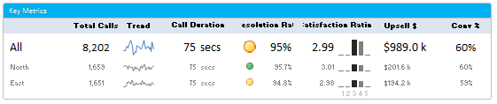
We have seen a snapshot of the data last week. This is how it looks:

Let us quickly understand what each column contains:
- Call ID: Unique identifier for each call.
- Date Time: Date and time of the call when we received it.
- Product: The product category to which this call belongs.
- Region: Region to which the call belongs.
- Customer type: Type of the calling customer
- Call duration in seconds
- Resolved: Whether the reason for call is resolved or not.
- Satisfaction rating 1 to 5
- Up sell in $s.
- Agent who answered the call
Calculations needed for the dashboard
All the calculations for this dashboard are kept in a worksheet named Calcs.
At last count, there are 4,000+ cells with formulas in this dashboard. If we try to look and understand all of these formulas, we might end at Christmas. So, instead let me list down the key calculations we need to do and the formulas behind them.
A look at the variables that drive the dashboard
The information & charts displayed on the dashboard depend on these key variables (value that we can change):
- Starting date: Entered in cell R2 in dashboard, this used to calculate all the summaries, chart data for 4 week period.
- Comparison type: This is selected from a combo-box in dashboard and tells us what is the option we want to compare – can be one of products, customer types, regions or agents.
- Comparison Option #1 & #2: These are 2 things we want to compare. For ex. Agent Vinod with Agent Mary, Desktops with Laptops etc. The actual selections are determined by VBA and placed in 2 named cells – valOption1, valOption2.
- Chart type: The type of chart we need to show. Can be one of the , Calls by day, Talk time by day, Resolution Rate by day, Satisfaction by day, Upsell $s by day.

Important Names that we need
Before taking a look at the actual calculations, we need to understand a few names that I have defined.
- cs: This is the table name which contains all call center data. So if you write cs[Region] it refers to all the 14832 region values from which we got the calls.
- lstChosen: This name refers to the column in cs that is chosen for comparison. So if you select Products in dashboard to compare, this contains cs[Product]. If you select Region, this contains
cs[Region]. - lstCallDates: Since we are only using date portion of the date & time for calls, I have created a named range, lstCallDates that refers to just Date portion of the date & time. This is done with the formula
=INT(cs[Date Time])
Apart from these 3, there are 16 more names I have defined to simplify various calculations. You can see all the names further down this post.
Fetching the data for 4 weeks starting given date:
The first step in our calculations is to fetch only a portion of data for the given 4 week period, starting the date entered in R2 cell in dashboard (dashboard!R2)
I have created a table like this, with 16 columns. First column with date, and next 3 columns for Total calls (all calls, calls for option 1 & option 2 that user picked), next 3 columns for talk time, next 3 columns for resolution rate, next 3 for satisfaction rating and final 3 for up-sell $s, like this:

This table is in the range calcs!B10:Q37
Filling the dates is easy part. We just load the first cell with dashboard!R2 and then add 1 to next date.
To count total calls received on each date, we can use SUMPRODUCT, like this: =SUMPRODUCT(--(lstCallDates=given_date)). Here given_date refers to the date in first column.
To count total calls received for selected option 1, we use =SUMPRODUCT((lstCallDates=given_date)*(lstChosen=selection1)). Here selection1 refers to the first selection made by our user.
To count total calls received for selected option 2, we use =SUMPRODUCT((lstCallDates=given_date)*(lstChosen=selection2)). Here selection2 refers to the second selection made by our user.
We can use similar SUMPRODUCT formulas to calculate total hours of talk time, resolution rate, satisfaction rating & upsell $s.
Calculating the summaries
Once all the data for 4 week period is fetched, calculating summaries becomes a breeze.
To get the total number of calls in a 4 week period we use: =SUM(C10:C37) as column C contains the total calls received by date for each of 28 days.
To calculate the averages (average call duration etc.), we divide the SUM with count of calls.
Calculating the distribution of satisfaction ratings
This is an interesting part. We are showing how the satisfaction rating is distributed from 1 to 5. To get these numbers, we use a variation of SUMPRODUCT. The calculation output is shown below:

Just use your imagination to figure out how the distribution is calculated.
All the names used in our Customer Service Dashboard
Now that you have seen all the important formulas, here is a detailed list of names defined to get our dashboard done. While you have already seen some of these names used in various formulas, the rest will be used while creating the charts & adding final touches.
[if you cannot see the names list below, click here]
| # | Name | Definition | Purpose |
| 1 | lstAgents | =Data!$P$6:$P$11 | List of all unique Agents |
| 2 | lstProducts | =Data!$M$6:$M$11 | List of all unique Products |
| 3 | lstRegions | =Data!$N$6:$N$10 | List of all unique Regions |
| 4 | lstCtypes | =Data!$O$6:$O$9 | List of all unique Customer Types |
| 5 | lstCallDates | =INT(cs[Date Time]) | List of Call Dates – INT makes the time portion zero |
| 6 | lstCharts | =calcs!$J$2:$J$6 | List of all charts |
| 7 | lstChosen | =CHOOSE(calcs!$C$4, cs[Product],cs[Region], cs[Customer Type],cs[Agent ID]) | List of values chosen for comparison |
| 8 | lstMaxCallDurations | ='sp1'!$C$4:$C$31 | Maximum call duration by day |
| 9 | lstMinCallDurations | ='sp1'!$B$4:$B$31 | Minimum call duration by day |
| 10 | lstWaysToCompare | =Data!$M$5:$P$5 | List of ways to compare |
| 11 | lstWaysToCompareV | =calcs!$L$2:$L$5 | List of ways to compare (vertical) |
| 12 | rngSel1 | =Dashboard!$B$18:$D$23 | Range of options to compare on left side in dashboard view |
| 13 | rngSel2 | =Dashboard!$Q$18:$R$23 | Range of options to compare on right side in dashboard view |
| 14 | selChart | =CHOOSE(valChartToDisplay, calcs!$C$73:$H$81, calcs!$C$84:$H$92, calcs!$C$95:$H$103, calcs!$C$114:$H$122, calcs!$C$125:$H$133) | Selected Chart – range has the chart – used in picture link / camera tool output |
| 15 | selection1 | =calcs!$E$4 | Selected option #1 |
| 16 | selection2 | =calcs!$G$4 | Selected option #2 |
| 17 | valChartToDisplay | =calcs!$H$4 | Which chart to display |
| 18 | valHelpStatus | =calcs!$O$3 | Whether to display help or not |
| 19 | valOption1 | =calcs!$E$3 | Number of selected option #1 |
| 20 | valOption2 | =calcs!$G$3 | Number of selected option #2 |
| 21 | cs | =Data!$B$6:$K$14837 | Table of all call data. Dynamic. |
Download the Final Customer Service Dashboard
Click here to download the dashboard workbook so that you can examine these formulas and learn better. Change the drop-downs, date values in dashboard sheet to see how the formulas work.
What Next? – Creating the Charts & Sparklines
Now that we have done all the ground work, in the next installment, learn how to create the charts & sparklines that go in this dashboard. Also learn how to use Conditional Formatting to create alert icons etc.
How would you design dashboard for this data?
Since all the data for this dashboard is included in the downloadble workbook, why don’t you go ahead and create your own dashboard? If you want, go ahead and add an extra column or two to capture additional data. Create a dashboard and share with us in comments.
Also tell me how you like the dashboard? Please share your opinions using comments.
References & Related Learning
If you are looking for examples, information & tutorials on Excel dashboards, you are at the best. At Chandoo.org we have elaborate examples, tutorials, training programs & templates on Excel dashboards, to make you awesome. Please go thru below to learn more:
- Customer Service Dashboard Example
- KPI Dashboards in Excel – 6 part tutorial
- Excel Dashboards – Information, Examples, Templates & Tutorials
- Excel SUMPRODUCT Formula – what is it, how to use it and detailed examples. (more on sumproduct)
- Excel School Dashboards Program – Learn how to create this and other dashboards in Excel in detail


21 Responses
the downloadable file contains no charts
It should. The file opens only in Excel 2010 or above as we use features like sparklines.
Ok, I only have 2007 at my disposal.
Thank you,
Looks Great!
I’m looking forward to read the remaining two parts. I’m waiting for the follow-up when do you expect to publish them?
Thanks for sharing
/Torsten
Chandoo I have a Dashboard that I would like to unveil to you. It is so cool!!!! Might be front page worthy. :D.
Also I’m just out of college, 23, and everything I learned was because of this site.(a few others, but this is where I got my footing!)
Hi Andrew,
Can you email me the workbook and a short write up on the dashboard? I would love to share it with our readers.
My id is chandoo.d @ gmail.com
another great post.
I am struggling with data size with my dashboards…so many SQL data pulls and formulas to generate the Dashboard, the entire file is massive and sluggish. Perhaps a few tips from Chandoo Master for all us rookie dashboard designers regarding how to minimize file size and maximize calc speeds.
Thanks for all you do! Mike
I’m no chandoo, but I know a lil bit:
The trick, surprisingly enough, is to figure out what’s making it sluggish:)
Sometimes it’s something as simple qualifying things like sumproducts and the like with actual ranges or dynamic ranges rather than A:A. Other times, it requires a little more ninja work in just making a better query (or even just making several good queries) in place of a single bulk query.
Tell us more….
I also Would like tips on how to make my dashboard file sizes more lean/smaller file size/faster. The smaller the better. : )
Hi Andrew, have you tried saving the file as an xlsb? This is a binary format that you can choose from the menu in excel. I’ve started using it about a month ago, and it has most of the functionality of an xlsx file, but it is dramatically smaller…I think it doesnt support XML, which isnt a problem for me, as I havent used it before!
Hi,
how do make this background area of dashboard page, so that only Columns A:T and ROWs 1:28 are visible?
@marpal: You highlight the first row that you don’t want to see (row 29 in this case), hold shift, ctrl and arrow down. Right click and hide. That’s all the magic
@marpal: You highlight the first row that you don’t want to see (row 29 in this case), hold shift, ctrl and arrow down. Right click and hide. That’s all the magic 🙂
Hi Chandoo ,
will you continue with this tutorial?
cant wait to part 3 and 4…
Thanks
In the calc sheet for the above mentioned dashboard how do you display a blank cell if sumproduct is 0 without any special formula or special formatting?
.God Bless You Chandoo!!! The Best!!!
how can i add the the bottom selChart i tried to to add it by this Definition (=CHOOSE(valChartToDisplay,calcs!$C$73:$H$81, calcs!$C$84:$H$92, calcs!$C$95:$H$103, calcs!$C$114:$H$122, calcs!$C$125:$H$133)) but the result was #value
Hello Chandoo,
Would you share the dashboard without anything? I mean, without all those formulas, just the initial dashboard (the original database dashboard).
I’m asking you this because I just can donwload the “finals dashboards”, and I need the initial (or original) to begin to do the tutorial.
Thanks !
hello i need help in solving something in excel, i have a call center and i need to create a dashboard that will include agents metrics , i update this every day with different reports in excel whoc an help in creating this to implement