
 Here is the big hairy question of the week. What is your opinion on Pie Charts?
Pie charts are one of the most used charts in the world. And for obvious reasons: they are simple to create and easy to understand.
When it comes to pie chart, I have no clear opinion. Part of me says use them, the other says avoid them. The debate about pie charts is not just internal. Last time when Seth Godin included pie charts in his 3 laws of great presentation,
The problem with bar charts is that they should either be line/area charts (when graphing a change over time, like unemployment rates) or they should be a simple pie chart (when comparing two or three items at the same scale).
there was so much furor in the data visualization blogosphere that Seth even did a follow up post comparing bars with pie charts, where he says,
The pie chart contains far less data, but the point is obvious: Trolls are where we should focus our energy.
That’s why you use it. …
I stepped on the toes of many data presentation purists yesterday, so let me reiterate my point to make it crystal clear: In a presentation … the purpose of a chart or graph is to make one point, vividly. Tell a story and move on.
Personally I think pie charts provide great utility at very little cost:
- They are very easy to create
- Very very easy to understand (provided the data has some contrast, if your numbers are like 43,44,45,46, there is little chance that anyone can understand the resulting pie chart and make out which one is large and which one is small)
But, I also think they are easy to abuse (one reason why you see way too many pie charts compared to other charts).
Here is what I think cripples a pie chart from being effective:
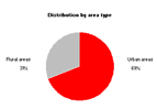
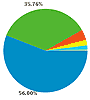
- Too many data points. A pie chart would probably be effective up to 4 values, anything more and you better have a strong story behind it for people to read and interpret. For eg. the pie chart shown to the right is used in Google Analytics reports. This compares browsers used by visitors of a site and even though there are probably hundreds of browsers, only 2 are prominent, so the pie still works.
 Poor use of color. The purpose of color in most visualizations is to bring contrast. To separate apples from oranges. To throw light where your story lies. But most programs that are used to generate pie charts have poor (and often scary) color choices. When you use poor color combinations, the result will be drastic. But this blame is not on the person making pie charts, but on the pie chart software. See the example aside from clearlyandsimply to see what contrast means.
- Making Pie charts that are difficult to compare. The purpose of pie charts is to provide comparison. So when we make a pie chart that has poor ability to compare, we are already lost. That means we should avoid all the flashy formatting, 3d pie charts, 3d donuts and layered donuts etc. Also, whenever possible, try Using data labels, using color and if nothing works, try using other types of charts for comparison. After all, we are not selling pie charts, we are selling our stories.
Ok, now the ball is in your court (or the pie is in your plate).
What do you think about pie charts?
Do you prefer them or do you consciously avoid them ?
How do you think pie charts can be put to better and greater use ?
Your turn…
Earlier on pie charts: Why no one likes your pie & what to do about it? | In cell pie charts | 22 beautiful pie chart templates for excel


13 Responses to “Gantt Box Chart Tutorial & Template – Download and Try today”
Hi Chandoo
As one of your students I have followed your detailed example through with great success. However, Excel is acting in an unexpected way and I wonder if you could take a look?
http://cid-95d070c79aef808e.office.live.com/self.aspx/.Public/Gantt%20Box%20Chart.xlsm
On my version, I have to type 40239 (Which equates to 2 Mar 2010) to get the chart to display 31 May 2010 (which should be 40329)!!??
Have I done something wrong or is Excel acting up?
Thx
Oli
PS Your example file in 2007 displays correctly.
Hi,
I like this idea a lot, but I agree the name is a little drab.
As an American I may just be seeing things, but to me the combination of lines and bars on your chart looks like a bunch of cricket bats.
Maybe you could work that into a catchier name. 🙂
Cheers!
Here is some code I use to keep the axis synched.
It may be useful to some of your readers
It is based on a comment I saw on Daily Dose of Excel.
Function SynchGanttAxis(Cname, lower, upper)
'Sets the X min and X max for Category axis
Application.Volatile
On Error Resume Next
'
'Top Horizontal Axis
With ActiveSheet.Shapes(Cname).Chart.Axes(xlCategory, 1)
.MinimumScale = lower
.MaximumScale = upper
End With
'Bottom Horizontal Axis
With ActiveSheet.Shapes(Cname).Chart.Axes(xlValue, 2)
.MinimumScale = lower
.MaximumScale = upper
End With
End Function
Function SynchVerticalAxis(Cname, lower, upper)
Application.Volatile
On Error Resume Next
' Excel 2007 only
'Right hand vertical axis
With ActiveSheet.Shapes(Cname).Chart.Axes(xlValue, 1)
.MinimumScale = 0
.MaximumScale = upper
End With
End Function
@Oli.. Can you check your file again.. I see 40329...
@Dave: Even I saw things.. the bars actually looked like lollipops. How about calling this lollipop chart - now that would be yummy and goes along the tradition of naming charts after eatables (bar, pie, donut...)
@Bob: Superb stuff... thanks for sharing 🙂
Hi Chandoo
This looks really good and I think it can also be applied to show project phases / milestones.
Question: Thinking further could this be amended to display a project lifecycle (Idea through to Implementation say 7 phases) on one bar / row? Just imagine 20 projects within a programme all on one chart one bar each showing their respective lifecycle stages i.e. on one page.
Idea: As the Gantt Box Chart this is quite intensive to set up re formatting etc how about the added extra of once you have completed this to "Save as template" i.e. saves the formatting and layout of the chart as a template so you can apply to future charts. Simple to do and will save the time formatting etc again and again and again.
Therefore tip: Click on your chart demo and then click on Save As template icon (2007) - edit file name and click on save. Ready to use / apply via Templates in Change Chart Type window.
Thanks and be very interested if the lifecycle question can be resolved
Mike
How embarrassing.
I was obviously suffering from numerical dyslexia. I was one of those days.
@Mike H: You can easily make this chart to work like a generic project lifecycle plan chart. All you have to do is,
1. in a separate sheet define the steps of lifecycle and various dates in a table (with 5 columns for each of the projects you have).
2. now use a control cell to input the project name you want to show in the chart
3. based on the input, use OFFSET Formulas to get the correct data
4. Rest is same as the tutorial above
For more info on the dynamic charting visit http://chandoo.org/wp/tag/dynamic-charts/ and http://chandoo.org/wp?s=OFFSET
Your solution is really smart but in the en Excel isn't meant to do stuff like this. I, as a former PM, always thought is was frustrating that you had to do stuff like this for something simple like a Gantt chart. So I built Tom's Planner. And would like to plug it here. I think it really solves the problem you are trying to solve in the most efficient way. Check out http://www.tomsplanner.com for a free account or play around with the demo.
Hi there,
Chandoo - this is really a very nice and helpfull chart - I adopted it, so I can report a forecast or the delay of a certain task (coming from my role as an auditor for projects).
One topic I´m currently struggeling with: I do have a project lasting for lets say 12 month. For a management reporting, I want to have kind of snapshot, lets say one month back and 2 month in the future. I tried with the offset formula, but failed. Any idea?
Thx
Lopi
[...] Ein viel geliebter Klassiker ist die Erstellung von GANTT-Diagrammen mit Excel. Wir hatten das Thema wiederholt schon hier. Chandoo.org hat sich mal wieder mit einer neuen Variante hervorgetan: Das GANTT-Box-Chart. [...]
[...] [...]
Hi Chandoo - fantastic xls. One thing I can't figure out how to do is adjust the alignment of the vertical axis. I would like to left align so that I could indent to represent sub tasks. Can that be done? Or is there a better way?
I've been trying to work out if there's a way to show weekends on the graph. The closest thing I've got is to add them on a secondary axis, but then I haven't been able to keep both axis lined up together! Any ideas?
Following on from this - is it possible to show things like holidays?