
This post is part of our spreadcheats series – 30 Excel and Charting Tips & Hacks aimed to make day to day spreadsheeting fun and productive.
One of the most common charts is “YoY Growth Rates of Our Superawesomekickass Product”. While not everyone may have a superawesomekickass product, most of us in fact make a YoY (Year on Year) growth rate charts for various types of data.
A simple label formatting hack can improve the effectiveness of these charts by adding color to differentiate positive vs. negative growth (or mediocre vs. sky rocketing growth rates). See this example:

You can get this effect by applying custom number formatting to the data label. It is one of my favorite tricks in excel and I have written about it in introduction to custom cell formatting in excel, number formatting in excel using custom codes, showing decimal values only when needed articles.
How you can get colors in Axis Labels
First apply data labels to your chart and now select the data labels and press ctrl+1 (aww, come on now, you are reading this blog, you should what ctrl+1 means) and go to numbers tab. Select “custom” as category and specify the formatting code like this:
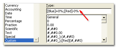
[blue]+0%;[red]-0%
Now, that was easy, isn’t it. But you might think, “Chandoo, what the heck the above format code is doing?”
Well, it tells excel to apply red color and add a minus symbol if the data label value is less than zero and apply blue color and add + symbol if the value is above zero. You see the custom number formatting codes have 3 parts in them, like this:
formatting for positive numbers ; formatting for negative numbers ; formatting for zero values
If you are noob (hi noob!) and lost in all these codes and square brackets, you may want to checkout our post on introduction to number formatting in excel to learn more about custom codes.
Ok, that was fun, What else you can do?
You can do much more using custom codes to format data labels. For example, a code like [Red][<0.15]0%;[Blue][>=0.15]0%; will, Oh, forget it, you can guess that. Just remember that excel allows only 3 parts in custom codes. So go nuts, but just thrice.
Like this post, I mean REALLY like it?
Awesome, You should sign up for e-mail updates or get our full RSS Feeds so that you never miss a post.
Why you should never miss a post? Because my friend, one of the posts might help you make your product superawesomekickass.


32 Responses to “Colors in Chart Labels [Quick Tip]”
I've been looking for a way to include colour-coded chart labels without applying the formatting manually. Great tip!
Chandoo, it is possible to format the bar colors in the chart based on the values?
Cheers,
Dhar
Sumit, the trick is to use lateral thinking and create two bar series: one colour is when you want it blue and zero when you don't, and the other colour is the other way round.
@Sam: thanks
@Sumit: as Derek suggested, the trick lies in creating multiple series and completely overlapping them so that you see color as per your need.
Superb tip! Thanks!
Derek / Chandoo,
Thanks for your inputs.
Cheers,
D.
Chandoo,
Can you provide an example of this:
"@Sam: thanks
@Sumit: as Derek suggested, the trick lies in creating multiple series and completely overlapping them so that you see color as per your need."
Thanks!
David
@David: Sure, I will make a note of this topic and write about it in the coming weeks 🙂
[...] flashy formatting, 3d pie charts, 3d donuts and layered donuts etc. Also, whenever possible, try Using data labels, using color and if nothing works, try using other types of charts for comparison. After all, we [...]
A few weeks ago, Chandoo posted some Excel Tips and mine was one of those tips. I created a KPI spreadsheet that changed the format of numbers and the colors of the chart based on the table of data below the chart. (See original post: http://chandoo.org/wp/2009/05/11/excel-tips-by-you-1/). Maybe this would be helpful. I still want to post a blog entry on this but due to budget problems in our state, I don't have the time. Soon...
Hi Chandoo!
Is there a way I can make the labels show white doing this? I tried [White]-0.0% but it gives me a white font with a black background... I wanted the labels to be "invisible" in case it is less than zero!
@Vanessa.. you can do that by using a formatting code like 0.0%;;0% (the middle portion of the formatting code tells how negative numbers should be shown, and we are telling excel to show nothing if the number is negative)
Also, the if you want use the WHITE color, then you need to set the label background color to transparent. This can be done by selecting labels, hitting format labels option, and then in the label background color area (from font tab) you can set the background color to be transparent (the default value is automatic or something like that...)
hey!
Its very good
when I first saw it, I said: oh but this too, I could do it easily manually
but when I did it, I really saw the beauty that accompanies it.
Thanks
i want to setup conditional formatting on a chart label, based on a cell that is not a part of the data range. i.e. i want the 90% label on a bar chart to be bold and underlined when cell A1=1, when cell A1=0 no formatting.
is this possible? (excel 2000)
cheers
@Sonato: Thank you 🙂
@Jeremy: Welcome to PHD and thanks for commenting. I am not aware of a simple way to conditionally format axis labels. You can try using some macros though. But the best thing would be use as few colors as possible. This looks both aesthetically pleasing and takes less time.
With regard to this, I have a similar question. Is there a way to format the data label text based on a cell outside the data range for the chart? E.g. I have a scatter plot based on columns b and c (sales reps names in column a), and in column d I have a binary with whether the rep has been at the company for more or less than 3 months. Is there a way to incorporate column d into the conditional formatting?
Hi Chandoo,
I am making a line chart to display numbers between 0 and say 30. I have upper and lower limit lines at 4 and 10. What would be the easiest way to make numbers outside those limits display red while leaving the numbers between 4 and 10 green. I am new at this and tried entering custom functions/formulas but cant get it right.
Thanks
P.S. Excel 2003
[...] Number format codes + Chart Labels = Pure fun [...]
[...] 29: Showing Chart Labels in Different Colors – Charting Tricks [...]
[...] Show colors in Chart Labels, Axis Labels > Show symbols in Chart Labels, Axis > 5 Chart Formatting Tricks > More charting tutorials [...]
I greatly appreciate that you are sharing your considerable talent.
Quantitative information is useful and important. Your talent in showing how non-quantitative types can more easily read visual information is invaluable. Thank you.
I must add, that I have resisted learning excel for years. But, your friendly, bit size lessons are the best.
Jo Ann Goldberg
1st - Thank you for having this awesome blog! It totally rocks.
2nd - I've done the data labeling as mentioned here and it works, but when i use the XY Data Labeller, i cant format the labels anymore. How would i be able to format the data labels after adding the labels using XY Data Labeler?
Thanks!!
Maddy
I REALLY like this tip.
WHOA!
Thanks!
Greetings from Brazil!
Hi Chandoo,
is it possible to change background label color on chart depending on the value?
Thanks for help !
@Paul
No and Yes
No, Not natively
Yes, There are two techniques of which only 1 requires VBA
1. To change the background of the chart you need to use VBA and base that on an event that recognises when a particular cell changes
2. Position the cell over some cells , make the chart and background transparent, ie: No Color, Then apply a Conditional Format to the cells based on the cell you want to monitor.
@Paul
The two techniques are now discussed in a post at:
http://chandoo.org/wp/2015/03/27/conditionally-format-chart-backgrounds/
Thanks for the great tip!!
I would like the label to be red if 100% and blue otherwise.
I try: [Red][1]0%;[Blue]0%
But it got auto corrected to [Red][1\]0%;[Blue]0%
And I didn't achieve what I need.
How can I do it? Many thanks.
Oh, the symbols in my qn get truncated.
I would like to label red if values are less than 80% or more than 100%, blue otherwise. Thanks.
Hi Chandoo,
Ctrl+1 is not opening the dialog box for formatting for the dat label in Excel 2016.
Do you have any work around?
Arindam
Hmm, not sure why. You can also right click on the labels and choose "Format" to format them.
Great tip!
Now, how do I apply a color to a label that isn’t based on the value of the plotted point? For example, in the Covid graph at https://imgur.com/a/d5xYhYU the positivity rate is shown in different colors and is an independent value to the “confirmed cases". It would suffice if the end point was in a color reflecting the positivity rate. Many Thanks!