
ABC analysis is a popular technique to understand and categorize inventories. Imagine you are handling inventory at a plant that manufactures high-end super expensive cars. Each car requires several parts (4,693 to be exact) to assemble. Some of these parts are very costly (say few thousand dollars per part), while others are cheap (50 cents per part). So how do you make sure that your inventory tracking efforts are optimized so that you waste less time on 50 cent parts & spend more time on costly ones?
This is where ABC analysis helps.
We group the parts in to 3 classes.
- Class A: High cost items. Very tight control & tracking.
- Class B: Medium cost items. Tight control & moderate tracking.
- Class C: Low cost items. No or little control & tracking.
Given a list of items (part numbers, unit costs & number of units needed for assembly), how do we automatically figure which class each item belongs to?
And how do we generate below ABC analysis chart from it?
![]()
That is what we are going to learn. So grab your inventory and follow along.
(related: ABC Analysis page on Wikipedia)
ABC Analysis using Excel – Step by step tutorial
1. Arrange the inventory data in Excel
Pull all the inventory (or parts) data in to Excel. Your data should have at least these columns.
- Part Name
- Unit cost
- # of units (if this is blank, just type 1 in all rows)
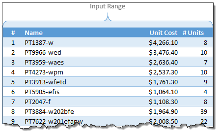
Once the data is in Excel, turn it in to a table by pressing CTRL+T. Lets call our data as inventory. You can set the table name from Design tab.
(Related: Introduction to Excel Tables)
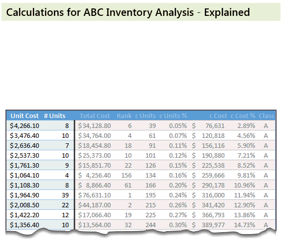
2. Calculate extra columns needed for ABC classification
Now comes the fun part. Crunching the inventory data with formulas. Yummy!
Total Cost: This is just a multiplication of unit cost & # of units columns
Rank: We need to figure out what rank each total cost is (in the total cost column). We can use RANK formula for this.
=RANK([@[Total Cost]],[Total Cost],0) will tell us the rank for each total cost.
Cumulative Units: Once we know the rank of each item, next we need to figure out how many total units are needed for items ranked less or equal.
For example, The number (#) of the third part (PT3959-waes) is 3. Cumulative units for this is 91. This means, 91 is the total number of units for first three ranked parts (parts # 8, 9, and 16).
The formula for this is, =SUMIFS(['# Units],[Rank],"<="&[@['#]])
Remember, [@[‘#]] refers to running numbers (1,2,3….4692,4693)
Cumulative Units %: This is a percentage of cumulative units in total. The formula is simply,
=[@[c Units]]/MAX([c Units])
[Related: using structural references in Excel – video]
Cumulative Cost & Cumulative Cost %:
These are similar calculations (instead of units, we calculate cost)
Explanation of these calculations:
See below animation to understand how the numbers are crunched.
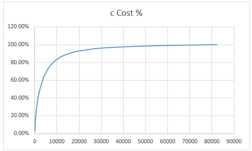
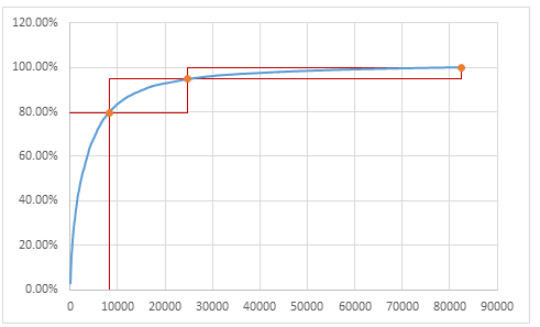
3. Create Inventory Distribution Chart
Select cumulative units & cumulative cost % columns and create an XY chart. Make sure cumulative units is on horizontal (X) axis and cumulative cost % is on vertical (Y) axis.
Our curve should look something like this.
4. Set up ABC classification thresholds
Now we need to decide what is the threshold for classes A,B & C.
For most situations, Class A tends to be top 10% of the items.
Class B would be next 20%
Class C would be the last 70%.
But these numbers may change depending on your industry, manufacturing settings.
Lets say, some where in our spreadsheet, user has defined the thresholds for the classes in a range like this:
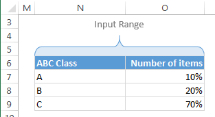
So $O$7:$O$9 contains the thresholds.
Next to this range, calculate additional numbers (for plotting A, B & C markers and boxes) like this:
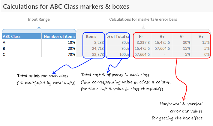
Examine the download file for exact formulas.
5. Add the ABC items & % total cost columns to chart
Add the extra data to the chart (by right clicking on chart and going to select data box & clicking “Add” button).
Once the new series is added, make sure you format it as markers only so that we get something like this.

6. Add Error bars to the ABC markers to get boxes
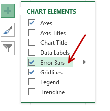 This step involves adding error bars to ABC marker series and customizing them.
In Excel 2013: Add error bars by clicking on the + button next to chart
In earlier versions: Do this from layout ribbon
Once error bars are added, customize them (select and press CTRL+1). Set error amount to Custom and select the calculated error values as shown below.
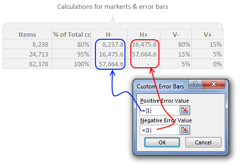
Once added, format the error bars to show no cap and change line color to something pleasant.
Now we have boxes on the chart.
7. Clean up the chart, add labels & titles
This is where get creative. After some clean up, we can arrive at something like this.
![]()
Download ABC Inventory Analysis Template Workbook
Click here to download ABC Inventory Analysis workbook. It contains sample data & chart. Examine the formulas & chart settings to learn more. Or if you are in a hurry, replace the sample data with your inventory details and get instant results.
Do you use ABC analysis for inventory tracking & control?
I will be honest. I have never worked as inventory controller in a super-car manufacturing plant. That said, I run a business and we do have inventory. Not physical but digital inventory. So I often use analysis like ABC or pareto to quickly figure out where I should focus my efforts.
What about you? Do you use techniques like ABC analysis to narrow down to a few items that matter most? How do you do it in Excel? Please share your tips & experiences using comments.
Add few more techniques to your inventory
Feeling low on your Excel skills inventory? Stock up with below goodies.
- Pareto Analysis in Excel – How to & tutorial
- Analyzing competition using charts – case study
- Track employee vacations & productivity [dashboard & tutorial]
- Track annual goals & achievements


162 Responses to “Top 10 Formulas for Aspiring Analysts”
Awesome!! Thanks for sharing. I can't thank you enough for your posts. They really help me become awesome in MS Excel.
Your stuff is fantastic & more than that your helping & sharing attitute is really appreciated. Not everyone will do that.
may you be blessed by the triple gem of Lord Buddha
Asoka I agree!
This is a great post, thanks sooo much for it.
I guess I probably knew all of these Formulas/formulae already, but to see them all in 1 post just makes it easier.
How about SUMPRODUCT()? It's a very powerful and flexible function.
You are right. SUMPRODUCT is very versatile and powerful. That said, for a budding analyst, it might be a huge roadblock. If someone has access to Excel 2007 or above, it is better to use SUMIFS / COUNTIFS / AVERAGEIFS for most things. When SUMPRODUCT has to be used, then just learn it 🙂
UNLESS... you are using Solver with constraints! Sumproduct is absolutely essential!
SUMIFS / COUNTIFS / AVERAGEIFS do not take arrays, only ranges. I prefer to use SUMPRODUCT instead because it's universal, flexible and I do not have to remember the sequence of arguments.
Rather than just SUMIFS, I'd say all of the -IFS formulae as a group (AVERAGEIFS, COUNTIFS..). Not to mention array formulas so that you may IF other functions where the IF(S) version doesn't exist, like MIN(IF(, MAX(IF(, SMALL(IF(
@PPH & Chiquitin: I agree. I did not mention the other IFS / IF formulas as they all have similar syntax and use. Once you know SUMIFS, you know the rest.
Thats one of the greatest things I learnt trough this short period i am in Excel school that I can IF almost any function using array formulas as mentioned in PPH syntax. Thants Chandoo!
After reading this comment, despite late from the conversations period/year I agreed and asked, what about using array formulas to do IFS instead of only one IF(condition) as I didnt see troughout the lesson....? Bu t at this stage i could rapidly answer by putting in my excel sheet a list of random numbers in the range $H$36:$H$43 like this {10,50,21,23,35,20,8,3}, and asked me what is the smallest number between 20 to 30 in the list?.
1st tried to use SMALL(IF(AND( combination that didnt work!!!! like this : ={SMALL(IF(AND($H$36:$H$43>20,$H$36:$H$4320,IF($H$36:$H$43<30,$H$36:$H$43,""),""),1)} ....returning 21 as the result.
Thanks Chandoo for the lectures, I can see the change in my view about the power of a spreadsheet.
Luis Ganje
Something went wrong copying/pasting the formulas:
1st: the array formula that did not work is:
=SMALL(IF(AND($H$36:$H$43>20,$H$36:$H$4320,IF($H$36:$H$43<30,$H$36:$H$43,""),""),1)
Thanks Chandoo, If someone knows how to use FUNCTION(IF(AND to multiple conditions please convey it to me as I believe that should be simple and shorter way that nesting IFS.
Luis Ganje
=SMALL(IF(AND($H$36:$H$43>20,$H$36:$H$43<30),$H$36:$H$43,""),1)
doesnt work!
=SMALL(IF($H$36:$H$43>20,IF($H$36:$H$43<30,$H$36:$H$43,""),""),1)
works perfectly!
I would add the following functions for Analysts:
Basic Statistical Functions
Linest(), RSQ(), Slope()
Forecast/Trend Functions:
Forecast() and Trend()
All are described in:
http://chandoo.org/wp/2011/01/24/trendlines-and-forecasting-in-excel/
http://chandoo.org/wp/2011/01/26/trendlines-and-forecasting-in-excel-part-2/
http://chandoo.org/wp/2011/01/27/trendlines-and-forecasting-in-excel-part-3/
DataTable:
http://chandoo.org/wp/2010/05/06/data-tables-monte-carlo-simulations-in-excel-a-comprehensive-guide/
I would also recommend understanding Averages and Weighted Averages
http://chandoo.org/wp/2010/06/15/weighted-average-excel/
Thank you, Hui. I think it would surprise a lot of people new to the business world just how often average vs weighted average has to be explained.
I am looking for a good explanation of average vs weighted average.
@Pam
The average of 10 and 20 is 15
That is the arithmetic average
Lets now say we sold 6 Item A at $10 and 4 Item B at $20
Total sales is 60 + 80 = $140
we sold 10 items
So the average price per item is $14 ($140/10)
https://support.microsoft.com/en-us/help/214049/how-to-calculate-weighted-averages-in-excel
Pretty simple indeed. Thank you.
Awesome post. Really, If you master these formulae you can do almost anything with excel.
But I miss one formula: COUNTIFS
Regards from Spain.
I consider myself pretty awesome with Excel, but you always show me there's a zillion things I still don't know.
I'm wondering about the % under #6 - Basic Arithmetic Expressions. How does 'Divide with 100' make 2/4% = 50? I don't understand what the % is doing.
As always - excellent post!!
Hi. It seems it takes precedence over the "/". So it will do "4%" first. = 4 / 100 as % divides by 100. It gives 0.04.
Then 2 is divided by that result to give 50.
Hi,
Shar, use "Evaluate Formula" to understand formula behavior.
I would add also that it's good to get used to the boolean side of things, they can replace IF(), particularly when making calculated helper columns in data tables to use later in pivot tables
Thanks for the post! More financial modelling tips would be much appreciated!
Disregard my previous post ... it's just a percent (ie /2% = /.02). It's just worded strangely.
I have offset() as one of my primary formulas & I would include indirect() as well. Most of that is for creating automated reports/dashboards but invaluable for this.
Didn't know indirect() function. Thanks for the tip!
Thank you. This is perfect!
In healthcare, I can't live without the unique count =IF(SUMPRODUCT(($c$2:$C2=C2)*($d$2:$D2=D2))>1,0,1)... with huge reports of patient activity, I need sometimes to identify and discard duplicates easily either with conditional formatting to highlight or filter out the zero value.
I would love to share this with my co-workers in a monthly newsletter. Can I get your permission to do so if I give you full attribution and include a link back to your site? (If not I understand)
Thanks for all your great tips/tricks/knowledge sharing!
Mark
Thanks Mark. Please proceed. You can include a short excerpt & A link back to this page.
regarding the segments of the vlookup formula... I believe that the final segment of the formula snytax is asking you to input "True" if returning the nearest match is ok or "False" if you require exact matches only... not whether or not your list is in ascending order as presented below...
VLOOKUP Formula
Pop quiz time ….
Which of the below things would bring world to a grinding halt?
A. Stop digging earth for more oil
B. Let US jump off the fiscal cliff or hit debt ceiling
C. Suddenly VLOOKUP formula stops working in all computers, world-wide, forever
If you answered A or B, then its high time you removed your head from sand and saw the world.
The answer is C (Well, if all coffee machines in the world unite & miraculously malfunction that would make a mayhem. But thankfully that option is not there)
VLOOKUP formula lets you search for a value in a table and return a corresponding value. For example you can ask What is the name of the customer with ID=C00023 or How much is the product price for product code =p0089 and VLOOKUP would give you the answers.
The syntax for VLOOKUP is simple.
=VLOOKUP(what you want to lookup, table, column from which you want the output, is your table sorted? )
Example:
=VLOOKUP(“C00023?, customers, 2, false)
Lookup customer ID C00023 in the first column of customers table and return the value from 2nd column. Assume that customers table is not sorted.
Click here to learn more about VLOOKUP Formula.
Bonus: Comprehensive guide to lookup formulas.
You are right. Most people would find nearest / exact match switch confusing (as your list needs to be sorted in ascending order for nearest match to work). So I used plain English version of it in the syntax.
In 1998 I went on an Excel Data Analysis & Reporting course. One of the things covered was vlookup - I could immediately see a use for it in creating a price book for my company.
In the 15 years since, this has become my most used formula. At the course we also learnt about if statements, and scenarios and pivot tables & lots of other things but it was the vlookup that grabbed me ....
It has only been in the last few months, since starting to work on excel 2010 that I have managed to master pivot tables. Back in 1998 I couldn't see how they were of any use, now I love them - especially with the use of slicers (and they are so much easier to construct now)
I will slowly work through mastering some of your other Top 10 Formulas - thanks for sharing them in such a clear way.
Sally
Well, this is really a great post, i need to re-learn some of them, like OFFST and Match. How about Date, Year, Month, Day formula, they are very useful as well.
Chandoo: Your list is absolutely must with if formulas added
Good day Chandoo
Can I please borrow your chrystal ball. (Not sure how else you do it). Everytime I start a new project you publish what I need to get it done. Thank you so much for this great site and your information sharing. With your help I am now one of the "Guru's" in my division and people come to me for help.
I knew you are going to ask, so I already mailed it you. Give it a few days to arrive.
Jokes aside, I am so glad you are learning and growing in your work. More awesomeness to you.
Am new here in the platform wanted to learn more as a beginner of excel Microsoft and am in love with your teaching
great List - I crunch lots of data for mailing lists - one sort of "text" field I use constantly with imported data is =value() to turn what should be numbers in numbers. Much easier to use with large numbers of rows than filling down with the tag.
I don't often find myself trying to convert text numbers into numbers, but I have always just multiplied the cell by 1 (= A1 * 1). The new cell is recognized as a number. I was unaware of the Value() function. Thanks for the new info.
I use a lot of data exported from other systems where the number values come across as text. Rather than adding another column to convert the text (e.g., =--(A1) ), I lke to use the Data/Text to Columns feature to convert text to numbers in place.
In fact I found that I use it it enough that I wrote a little macro that I keep in Personal.xlsb just to perform this task. One limitation is that it o (note that like the text to columns tool, it will only convert one column at a time.
Sub ConvertToText()
' convert selection to text
' cjhx 1/9/2012
'
' SHORTCUT: ctrl + shift + t
'
Selection.TextToColumns , DataType:=xlDelimited, _ TextQualifier:=xlDoubleQuote, FieldInfo:=Array(1, 2)
End Sub
Your list is well thought out... I was originally just looking for 10 things to teach to a new co-worker
Thank you!
A great and comprehensive list. I think the $ deserves its own post because when used effectively an analyst is much faster and also less error prone.
Great list, some of my personal favorites are listed. I would consider adding in the bonus area something about using absolute vs relative cell references (as mentioned by Jon). I transformed from someone who was just good at Excel to a SME when I learned how to use the $. For all of the formulas mentioned above, the $ can make pasting across rows/columns much more efficient and effective
I think its pretty unfair to leave out ROW() and COLUMN() which help you to iterations in a formula
Countif is surely very helpful in a lot of cases. Sumif would be second, and the combination of offset and match functions so that they can be used as vlookup on the left side of data is also helpful.
Thanks,
Anand Kumar
My sister claims that learning vlookup helped her get three promotions. At my own job it has helped me become "The Magic Report Guy".
Small and Large... I beat my head against the wall for ages trying to find a function that did that.
I know these are not formulas but pivot tables and basic macro creation and editing can make you appear to be a genius. I thought one guy was going to cry when I created a macro that automated a report he spent about a week every month doing by hand. After that my boss stopped giving me grief about surfing the net to look at Excel sites.
vlookup is great, but I've switched to index & match for pretty much everything. After using vlookup for so long the syntax seemed weird at first, but once I got used to it I didn't want to go back.
Consider the difference here:
=VLOOKUP($G4,$A2:$D13,2,FALSE)
This looks at the value in G4 and finds a match in the range A2:A13, then when it finds a match it returns the value in the 2nd column on the match row.
=INDEX(B2:B13,MATCH($G4,$A2:$A13,0))
This gets the same result, it's just formatted a little differently.
One significant difference here is that with vlookup, if you copy the formula and paste it one column to the right, it returns the same result. In order to return the value from the third column, you need to change that 2 to a 3. When you're dealing with large amounts of data you end up copying/pasting the formula, then doing find/replace to change the ",2,"s to ",3,"s, then in the next column to ",4,"s, etc.
Using the index/match method, you just copy/paste the formula over to the next column and you're done.
Whichever method you use, you need to be sure the $s are in the right places for absolute referencing.
Another significant difference is that not only does index/match not require the lookup value to be in the far left column, but it doesn't even require that the lookup values and return values are in the same rows. You can have A2:A5 be the return values and ZZ32:ZZ35 be the lookup values.
Yeah, I never ever use VLOOKUP and actually find it annoying, particularly when I have to review and edit someone else's work that uses it extensively.
This works well. It is a little more work to set up but I really like that the columns returned increment unlike they do with vlookup. I have never understood the reason that they don't. They want to increment the search column instead. I hate to think how much time I have spent redoing column return values in vlookup. Thanks!
With column references in vlookups - if I need to do a number of consecutive columns, I use the column() function with a constant to retrieve the column so that the vlookup becomes fully dynamic....
=VLOOKUP($G4,$A2:$D13,column() + 3 ,FALSE)
i am excited though not tested. i think this is what i have been looking for
Sir I like your site very much especially my father like most because he use always in excel.
Can you give me some tips that how can I earn from my website at your level.
@Ravi
Start with the Beige box at teh top of the main Chandopo,.org web page
It has a section called " Welcome to Chandoo.org. New here?"
In there there is a whole section on Learn Excel Topics and Courses
Consider exploring both
[...] Top 10 Formulas for Aspiring Analysts [...]
It's wonderful to have all this functions in a great compilation, it helps me a lot to start learning the functions I am not familiarized with. Personally I felt in love with VLOOKUP and MATCH functions, they simplified my life a lot and increased the productivity very fast. Excel is full of surprises and awesomeness is just around the corner.
[...] Top 10 Formulas for Aspiring Analysts by Purna “Chandoo” Duggirala. [...]
This is a great post and I feel honoured to contribute to it. A combination I get excited about when I get a chance to use it is SUM and IF in an array. The format goes like this:
{=SUM(IF(E5:I5=E5,IF(D6:D15=D9,E6:I15)))}
It allows you to sum across a range, E6:I15 in this case, based on reference values in both your row and column headers. It's like a two-dimensional SUMIFS. It works left to right or right to left, up or down, like INDEX MATCH. It will also sum based on the same reference value in two different columns, which I'm not sure SUMIFS will allow you to do.
The list is pretty much what I would recommend for budding analysts - but I have a criticism about terminology.
VLOOKUP, SUMIFS, etc are not formulae but Excel FUNCTIONS.
Formulae in Excel are algebraic statements (expressions) which use a combination of mathematical operators and at least one or more of the following:
constants, range references, functions
to return a result. Many formulae in a model may not even contain a function!
Many will see this as pedantic, but to avoid confusion Function anf Formula should NOT be used interchangeably.
I agree. "Function" and "formula" should not be confused.
User Definable Distinct rows formula.
Hi Chandoo, I meant to respond last week with this formula but forgot. I almost always use this formula in a helper column to identify distinct rows. I then use them in Pivot tools:
Column D: If(sumproduct(($a$2:$a2=a2)*($b$2:$b2=b2)*($c$2:$c2=c2))>1,0,1)
However, I usually create 2 helper columns as follows:
Helper Column 1
Column D: =a2&b2&c2
Helper Column 2
Column E: =If(sumproduct(($d$2:$d2=d2)*($d$2:$d2=d2))>1,0,1)
LeonK
I have used the vlookup function for 15+ years, but I still remember how excited I was when I first discovered it. I have tended to move away from it more now though.
One thing I have always found usefull in functions like vlookup, sumif etc, is when you want to match values across multiple columns, to make a lookup value column, by adding the apporopriate columns together.
eg: to find "John Smith", when the name is stored in two columns as FirstName, Surname. In the LookupValue column just use =FirstName & " " & Surname, and then look up on this value. It's a simple concept but one that took me years to realise.
Several thoughts:
1. LOOKUP is simpler and more useful, in most cases than =VLOOKUP. The main reason to use =VLOOKUP is if you need to do an exact match through unsorted data. Otherwise, the constraint of having to put in a column offset with VLOOKUP makes it less useful than LOOKUP.
2. Being able to work with real dates is essential in a financial model. As such, it's important to know how add days or months to a date. So, the date number format is important, as well as the DATE function, and also the EDATE and EOMONTH formulas.
3. Once you have your cashflows and dates, running an XNPV or XIRR is fundamental. They allow you to be much more precise in your return calculations than NPV or IRR, which assume regular cash flows.
4. Data Table functions (by this I mean "Data/Data Table" and not the Excel 2007/2010 feature called "Tables")are essential for automating sensitivity analysis. Also, it's much more important to be able to do a one factor data table than a two factor.
Wow! I just discovered your blog. You're an awesome person for putting this valuable resource for others to see. Thank you and I look forward to increasing my nerdy ways through Excel.
hi...
chandoo,it's amazing using sumifs, thanks for it.
Are you aware of any Excel macros that compute the Probability of Acceptance for double sampling plans, such as, n1, c1, n2, c2?
Thanks a ton for sharing...
We can use "ASAP uitilities" (readymade Micro) which helps in solving many Complicated excel operations like identifing Duplicates, Fill In, and many more....
Appreciate your great explanations as always. Working with Excel in Search Engine Marketing, sometimes I'll download a list of Keywords & I'll need to add a + sign in front of them. For example, one of my keywords may be "Green Shoes", & I may also have "Black Shoes", etc. I may have 500 keywords & will often need to add a + in front of all of them. Basically I need something that will add a character to all of the individual characters in a cell. Any formula suggestions?
I tried ="+"&B8&"+" for example, but that puts the + in front of the first word and behind the last one. I need the plus in front of both.
Thanks!!
Hi,
You can try this. Use Text to columns to separate your key words, add + with & formula before all the words and again join them by "concatenante". It might look a little lenghty but you can write a macro to automate it.
Enjoy!
Hello,
Thank you for providing tips for Excel.
I have a query for changing the text in upper or lower case.
When we change the text in upper or lower case with the formula: =upper(C4), the case of the text changes. However, when we delete the text in the origional cell, the cell where the changes were made also gets deleted automatically.
Please provide assistance in how to save the text with the changed case and delete only the origional text.
Thank you.
You can copy the cells with the upper formula then paste over them using paste special/values, then the origin cells can be deleted. As long as there is still an active formula referencing them, deleting the origin will mess up the result.
Are Pivot Tables formulas too? I would put them on this list.
Top 10 Formulas for Aspiring Analysts | Chandoo.org - Learn ...
Jan 16, 2013 ... They really help me become awesome in MS Excel. ..... macros that compute the
Probability of Acceptance for double sampling plans, such as, ...
http://chandoo.org/wp/2013/01/16/top-10-formulas-for-aspiring-analysts/
The above was an entry on a web search, but I couldn't find anything on "Probability of Acceptance for double sampling plans" as mentioned in the entry. Please advise
Why does the following VBA Code give an error, "A value used in the formula is of the wrong data type" ??
'Function to Compute Probability of Acceptance for Dodge and Romig Type Double Sampling Plans
Function DRDSPa(N, P, N1, C1, N2, C2)
Dim i As Long
Dim D As Long, PA1 As Long, PA2 As Long
D = N * P
' PA1 is Probability of Acceptance on First Sample
PA1 = Application.WorksheetFunction.HYPGEOM.DIST(C1, N1, D, N, True)
PA2 = 0
For i = C1 + 1 To C2
PA2 = PA2 + Application.WorksheetFunction.HYPGEOM.DIST(i, N1, D, N, False) * Application.WorksheetFunction.HYPGEOM.DIST(C2 - i, N2, D - i, N - N1, True)
Next i
DRDSPa = PA1 + PA2
End Function
@Qualitist
I suspect that your first line should be
Function DRDSPa(N as Double, P as Double, N1 as Double, C1 as Double, N2 as Double, C2 as Double) as Double
Is it possible for you to upload the file as I suspect it is the lack of definition of the data types or the data itself that is at error
Hi,
Thanks a ton for sharing.....
Can you light on "Macro", as they help a lot and saves time. Most of the time we do the same operations daily just the data base changes, and even if you know formulas it takes a lot of time to save the time and get accuraccy Macro is the solution.
Thanks in Advance...
Regards,
Pankaj from INDIA
this is a great list that everyone who uses excel should have. I've had issues teaching people the basics of SUMIF. with SUMIFS, SUMIF should just be eliminated.
one thing to note:
trim does NOT take care of internal spaces (above it references "middle" of text), but substitude can do it just fine.
also, thank you for introducing me to trim, it would have saved me several minutes over the last few years, but now i know!
Can u please give us some more no of examples on "Nested formulas"
What a great set of Excel functions. Thank you so much. Are you happy for me print and share these with my Maths and IT students? I am certainly going to keep them at my side when analysing large speadsheets. Cheers
@David... You are welcome to share the article with your students as long as you make no changes and leave a credit link at the bottom.
no. 1 is awesome .
New functions are added or renamed / improved in every Excel version.There are almost 500 functions in Excel 2013.
By using the most appropriate function for your task, you will get the most accurate results possible, plus your Excel models will be easier to maintain and audit.
You can navigate to any function help webpage using the navigation (unlocked VBA) Add-in created with the innovative Ribbon Commander framework. See link:
http://www.spreadsheet1.com/syntax-and-usage-navigation-add-in-for-excel-2013-functions.html
[…] Top 10 formulas for analysts [Visitors: 65,638] Employee vacation tracker [Visitors: 42,659] Interactive chart in Excel – How to make it? [Visitors: 42,416] Angry Formulas game… [Visitors: 36,392] Learn top 10 Excel features [Visitors: 25,723] To-do list with priorities – Excel templates [Visitors: 19,947] Introduction to Power Pivot [Visitors: 21,298] Best new features in Excel 2013 [Visitors: 21,539] How to create interactive calendar in Excel? [Visitors: 17,478] 5 Keyboard shortcuts for writing better formulas [Visitors: 18,577] […]
sir I really enjoying ur tips but I must say that you should post vidios as well regards
Your website make my projects go from good to amazing! I think me should also add date functions to this list along with text. . And of course substitute and find.. they work best for searching text in cells
Hi Chandoo,
This is a very useful compilation... Thank you and God Bless!
I have found the countifs along with Named Ranges very useful.. The operators to be used inside the countifs for comparison, along with refering value using the & operator might be a topic for a future post, if not already done.
Regds, Suresh
Hi Chandoo,
Thanks for all the tips.
I wnat to know if there is any excel tool that can convert the excel image into excel table. I know there are some optical tool called "OCR" that we need to buy from internet, but I want to know if excel 2010 can convert this so that I don't have to buy this program.
Love this post and love your blog - the 2014 Easter Egg hunt was fun! On item #2 in this list, did you know that there's a typo in the attached image? It says:
"vlookup("John",list,2,false) = finds where Jon is in the list and returns the value in the 2nd column"
The equation is looking up the name John with an H and the explanation references Jon without an H. In vlookups where EVERYTHING matters (i.e. spaces, periods, commas, etc), that could be misleading.
Thanks agian for all the info! Great stuff!!
Hi,
I agree with most of the comments.
But I think one formula missing in the comment section is "IFERROR" formula. Because its the presentation that matters in the end.
Krishna
I would add one of the simplest built-in functions to the list:
Ctrl-H i.e. Find and replace. Bringing data out of places like SAP and other text-formatting products it would take hours and days to clean it up if you didn't have "Find and replace" in your toolbox.
Thanks for a great list!
a lot of thanks and hat's of to you for this awsome job
Thank you , this is the best post regarding those formulas.
hI CHndoooo...
Really Awsome Formulas..but i dnt take a rightanswerin SUMIF How when i put a righr formula
I use Range Names very frequently.
In healthcare, I use the Rand() function to provide clinical reviewers with random patient information pulled from SQL database for chart reviews. It's a great function!
Cool stuff. Very interesting and motivating.
I use the rand() and int() functions to randomly pull out a name from a list of names. Excel is awesome!
SUM IF is so important for my work as i am using in another way and right and left is always using as well. thank you and most helpful.
This site is very very useful site ever i have found in internet.
Description,logic,solving of problems etc. are marvelous.I am fond of this site and use to follow this site very often.
thanks CHandoo.org.....you are great.
I am very impressed with the awesome informaion in one place. One function I use to present the analysis is the rept(). If I have use the formula =rept(, "|") down the whole column, it will show as a bar chart in the cell. To enhance, rotate the text and copy at the bottom of a table to show a vertical bar chart in each cell.
Please, give me answer for my Question. In a class, the name start with Maung, Saw, Min & Khun are Male and Ma, Nan,Mi are Female. How to separate Male or Female using excel 2007. I work at Education office in Myanmar and I need this formula. Thank you.
[…] Build and summarize your information from your data worksheet(s) using formulas and pivot tables. You are going to summarize information in a way that provides answers and solutions to your questions or problems in step 1. Here is a list of formulas that you may want to consider learning as per Chandoo’s Top 10 Formulas for Aspiring Analysts: […]
It's not an Excel formula, but I think the most useful line of code for Excel is the VBA snippet
iLastRow = ActiveSheet.Range("a10000").End(xlUp).Row
It's amazing how many times I use this each week! I always seem to find myself needing to loop through a column of data and I'm too lazy to scroll down and manually find the last row.
Hi Chandoo,
Can you help me in providing coding in VB for creating Macros in Excel for the problem on which there are some lines that are discontinued for the complete first line and in the next line it is continuing but I need altogether in one line without using the cut and paste since there are more lines where you cannot do for all.
the below example which needs to be placed the two line into one line without cut and paste formula as there are so many lines identified like that.
dep 20/05/2015 kumar 125.00 10
sep 10%
Hi Chandoo
Very useful post. Thanks. somehow I was not very comfrotable with VLookup. One more fromula an analyst may often require is LOGEST which gives exponential(compound) growth rate instantly.
[…] one of the most prominent Excel bloggers, included the IF function in his list of top 10 formulas for aspiring analysts and stated that “if you are able to write IF formulas for any situation, then you are bound to be […]
Hi mate,
Just wanted to say your posts are truly awesome. Thanks all the way from Australia =)
Regards,
Nev
AWESOME
I use RAND, RANK and VLOOKUP to sort a list of items - e.g. 52 playing cards - in random order with no duplicates. First a col A of 1-52 as index. Then a column B of 52 random numbers (RAND() These are RANKed in the next col C, resulting in a list of numbers in random order. The objects I want to rank e.g. card names, AceOfHearts etc. are in the next col D. The last col E VLOOKUPs the index numbers (1-52) in the range of randomised ranks and objects ($C$1:$D$52) and returns the objects in the second col of the range i.e. VLOOKUP($A1,$C1$:$D$52,2,FALSE). NB watch the $s!
Is there a way to modify the networkdays to account for a flex schedule? We work a 36/44 schedule so one week is 4 9 hour days (Friday off) and the next is 4 9 hour days and an 8 hour Friday. It would really help if you can teach me a formula to see how many days till end of fiscal year or until my funding expires...
Dear Hi,
please help me below I am not understand in which formula used for below action
"Suppose we have 3 teacher and he teaches different subject how to use formula to take teacher name againts of subject and divide by equal.
For example
Teacher name subject name
Jitendra Science
ravi
sushil
sunil
amit
Dear Hi,
please help me below I am not understand in which formula used for below action
“Suppose we have 3 teacher and he teaches different subject how to use formula to take teacher name againts of subject and divide by equal.
For example
Teacher subject name
Jitendra Science
ravi Hindi
sushil English
sunil Math
amit Drawing
I need formula to used automate taking teacher name againts of subject.
suppose fill Hindi then show ravi
Jitendra,
Assuming teacher names are in column A and subject names in column B, you could enter =index(A2:A6,match("Hindi",B2:B6,0)) Or replace "Hindi" with a cell where the subject you're looking for is, say C2, then you can type whatever subject you want in C2 and the formula will return the teacher name.
The match part is simply looking for "Hindi" in cell range B2:B6. If finds it in the 2nd cell in the range, so it returns a 2. The index part returns the contents of the 2nd cell (because match returned 2) of range A2:A6, which is ravi.
Dear Chandoo,
I understand your formula but I need other type formula
Suppose we have 10 Reviewer (it means 10 candidates) & they review 100+ clients (It means they do 100 clients works)
So I need which formula to take automate reviewer name against of clients and also need to divide by equally.
Suppose we have data in sheet 1st.
Reviewer name Clients name for all reviewer
A total 1 to 100
B ''
C ''
D ''
E
F
G
H
I
J
but i need 2nd sheet automatic take reviewer name & divide by equally
and 2nd sheet we have only clients not reviewer
for example
clients name review name
1
2
2
3
4
54
5
2
so i need reviewer name by automatic & also divide equally.
Equally means
suppose we have 100 client so 100/10
it means 10 clients per reviewer
Thanks,
Jitendra sharma
explanation in simple and v. good way.... I can see that u have made effort and explained in your way rather than doing cut-paste from other web site...
thanks
it may have been mentioned previously, but I have found index/Match/Match to be the number 1 time saving formula for me. once you've mastered you almost start looking for ways to use it - to me it's that efficient (adn flashy too :O)
very useful formulas... thanks...
[…] Main 10 formulas for trying analysts & supervisors […]
All the formulas that you pointed out in the list above is indeed very useful. Especially VLOOKUP, INDEX and MATCH, which has recently I applied in the analysis of concrete testing data. Thank you very much for all your effort and kindness. GBU.
My boss shared this site with us and I am so excited with how much I am learning. I do a lot of work in SPSS and this actually makes data management so much easier! These formulas are awesome and the comments as well! Thanks so much!
Good list of formulas used everyday. I would also add GETPIVOTDATA, I use this a good 70% of my day when building complex models
sir, what is formula for this problem?
sir when i was enter some integers in excel, automatically it will return to the next row?
I vote for IFERROR and Index-match as the most important. Iferror makes pivot tables practical as reporting engines (so you do not have to repeat the getpivot formula twice in the alternative, an if statements. And index+match is a flexible lookup method that can accommodate changes in the source field list and field arrangement, ie. the usual midsize dataspace. Thanks!
Hi Chandooo
The Given Formula Tips is really very helpful but i need some examples of small,large and rank formula.(Downloaded examples sheet)
Thanks & Regards,
Abhilesh Kori.
I just bought a new computer and would like the same settings I have on my other computer. How do I go about doing this? The one thing I want to change in firefox on my new computer is when I type a website in the address bar I would like it to show my history instead of my bookmarks. I changed it before but I can't remember what I did..
Like most everything Chandoo, this is great. I would like to know more about the "Power of opetator", though. Is that a function that is too hot to hold?
Hi Chandoo,
Your site has greatly helped me in mastering Excel skills. I keep learning something new every time I visit. I am stuck in a situation where I am not able to get results using either SumIfs, SumProduct. Only way i made it is using Array formulas.
Assume you have 3 columns - Deal_Country, HQ_Country & Revenue.
My intention is to sum up revenue when my interested country (eg: India) is either in Deal_Country OR in HQ_Country. Both SumIfs & SumProduct gives me wrong output. The reason I think is as soon as 1st condition is evaluated, the range gets locked. i.e. It end up calculating revenue for instances where both Deal_country & HQ_country is India.
Above is just simple situation. Assume you evaluate for multiple countries.
I have got results using Array like this {Sum(If(conditions)}. But interested to know if I can get same using SumIfs or SumProduct.
Kindly Advise.
@Avanish
The solution will be something like:
=SUMPRODUCT((A2:A100=Deal Country)*(B2:B100={HQ Country 1, HQ Country 2})*(C2:C100))
=SUMPRODUCT((A2:A100="Dubai")*(B2:B100={"Germany","Australia"})*(C2:C100))
Hui,
I guess I couldn't put across my question correctly as I am not getting desired results using suggested formula by you. Plus it required me to hard-code the country names which is not ideal.
I have worked out a file and will send you if you can share your email id.
Thanks.
Hui,
Below is the simple dummy data. I want to calculate total revenue wherever "Asia" appears in both columns below. Expected answer is 70, which i derived using array formula as
{=SUM(IF(((A2:A11=$G$11)+(C2:C11=$G$11)),E2:E11,""))}
G11 refers "Asia"
Can we get this output (70) using SumIfs or SumProduct ?
Dummy Data below:
DealCountry HQCountry Revenue
APEA Asia 25
NZ APEA 20
America Europe 15
Asia Asia 10
APEA Asia 05
Asia APEA 10
Pacific APEA 15
Asia NZ 20
Pacific America 25
Australia America 30
@Avinash
I would try:
=sumproduct((A2:A11=$G$11)*(C2:C11=$G$11)*(E2:E11))
In this data set there is only 1 Row where Column A & C = Asia Row 5 and hence the answer is 10
That is what =SUMPRODUCT((A2:A11=$G$11)*(C2:C11=$G$11)*(E2:E11)) gives me
Thanks Hui,
I have tested this before I put my question here. Unfortunately it doesn't work. As I mentioned in my first comment, SumProduct locks the range as soon as it evaluates 1st condition. The answer I am getting using above is 10.
Below is how the range gets restricted when using SumProduct and it returns 10 as answer.
Deal_HQ HQ_Country Revenue
Asia -- Asia -- 10
Asia -- APEA -- 10
Asia -- NZ -- 20
Thus I feel - Array Formulas should also be in an Analyst's Arsenal. They work when everything else fails.
Can you please post the question on the Forums with a sample file
Hui, I didn't find any option to attach sample file. Should I reply to notification email with attachment ?
You have to register
Goto http://forum.chandoo.org/
Select the appropriate forum
Post New Thread
Upload a File
or email me the file
Click on Hui...
email address at the bottom of the page
@Avinash
Will this work for you:
=SUMPRODUCT(SIGN(($A$2:$A$11=$G$1)+($B$2:$B$11=$G$1))
,$C$2:$C$11)
Hi Chandoo,
I've just started with excel and find it more confusing,
The sumif formula whic you have explained in the above page, when I'm trying to practice, I'm getting the error as "you have entered too many thing"
Kindly confirm if my understanding below is correct
sumif(A12:A21,"pen",B12:B21,"North",C12:C21,D12:D21,"A")
Product Region Sales Customer type
pen North 50 A
pencil south 74 A
eraser East 15 C
compass west 25 D
scale North 50 E
scale East 55 E
compass South 58 D
compass North 66 D
eraser West 99 C
pen south 150 B
@Ramya
I think you are confusing Sumif() and Sumifs()
The criteria is similar but slightly different
=Sumif(Range, Criteria, [Sum Range])
The Sum Range is optional
=Sumifs(Sum Range, Criteria Range 1, Criteria 1, [Criteria Range 2, Criteria 2], [Criteria Range 3, Criteria 3], etc)
Note that you must have at least 1 Criteria range, but all others are optional
If I was to guess I suspect that your formula should be:
=Sumifs(C12:C21, A12:A21,"pen", B12:B21,"North", D12:D21,"A")
That will Sum Column C subject to the 3 criteria
Index Match and Sum Product work for me every time. Sumifs, Date functions and Lookups are of utmost help, but nothing beats the top two.
Thank you for the great post
[…] to Formulas Introduction to IF formula in Excel Top 10 formulas for aspiring analysts & managers 15 important formulas for everyone Excel formulas […]
Great Post Chandoo. This will definitely help people like me. Thanks 🙂
I recently discovered your site and am now hooked!
FYI : I have been caught out using 'IFERROR(VLOOKUP(….), “Value not found!”)' as this will return “Value not found!” if the value is legitimately in you lookup range but you have another error in your VLOOKUP formula.
I get around this by using the ISNA formula :
'=IF(ISNA((VLOOKUP(….)), “Value not found!”,VLOOKUP(….))'.
It does make the formula slightly longer but it guarantees the integrity of the result.
Good work Chandoo.
@Iain
G'Day from WA
The problem with =IF(ISNA((VLOOKUP(….)), "Value not found!",VLOOKUP(….))
approach is that Excel actually calculates the two VLookups() parts even if the first Isna() is True
A better approach is the =IFERROR(VLOOKUP(….), "Value not found!")
here it is only calculated once
This is not a big issue when it is a single formula but once this is copied thousands of times and the ranges are large it can severely slow down a workbook
Thanks a lot Chandoo ! Iam just a beginner in using the formulae. I find this more useful for me .More interested in drawing the site plan and water supply and sewer lines to scale using excel. could u help me on this - S.raghunath
I need most important fuctions of msexcel used in private banks may b as a cashier,retail branch,customer service
[…] Top 10 Formulas For Aspiring Analysts by Chandooo […]
Really very helpful, thank you so much.
Awesome
Hi, i am a finance practioner and deal with tons of procuremt data. How do i sieve out information as quick as lightning to identify different types of purchase orders that are raised with e same supplier on the same day.
And another scenario to identify quickly the number of A suppliers vs B suppliers.. thks!
Many thanks, excellent post. My biggest and recent achievement was to start using INDEX+MATCH properly. It solved a simple issue I was facing for some time now.
Please continue your solid contribution. Looking forward for more useful tips!
Regards,
Antonio
Really useful post which I've shared with a number of people. Another that I find useful at times is aggregate.
[…] At Chandoo.org, “Top 10 Formulas for Aspiring Analysts” […]
Excel is a powerful tools to do an analysis for any kind of data or activities.
Vlookup function, Sumifs, Index Match, Iferror, autosum, Pivot Table, If, Data Validation, Conditional Formatting, What if Analysis, Text, Networkdays, Networkdays.Intl, find & replace, Ctrl+G, Cell Referencing, Concatenate, Substitute, Text to cell, Countif, Averageif, Subtotal, Round, Remove Duplication, Upper, Lower, Proper function, etc etc.
I am using those in every case as an Analyst of a Group of Companies, Working in Bangladesh.
Really i am great full to Microsoft to introduce a software ..........EXCEL EXCEL......
Normally what are the excel formula used by finance manager.
Good work Chandoo.
Is it possible to have short list of excel formulas and what they do?
Example
VLOOKUP-looks for value in - and-End, that can be memorized
Thanks.
Perfetto, complimenti bravo continua cosi!!
I would like to get the VB code of breaking data into multiple files.
May I please get the solution to the answers of the SUMIFS sample file. There is a homework section which I am not able to solve.
Thanks, if I had a Nickle for every time a vlookup tripped me up, I'd be very rich. Thank you for sharing!