
Hello everyone. Stop reading further and go fetch your helmet. Because what lies ahead is mind-blowingly awesome.
About a month and half ago, we held our annual dashboard contest. This time the theme is to visualize state to state migration in USA. You can find the contest data-set & details here.
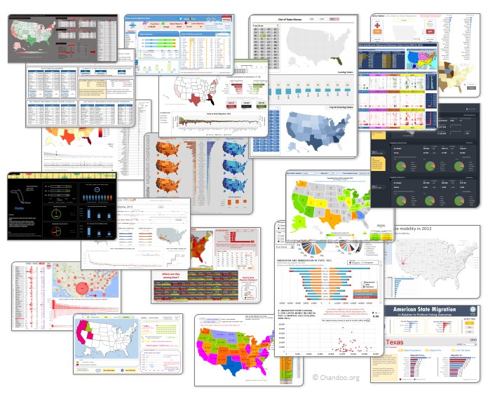
We received 49 outstanding entries for this. Most of the entries are truly inspiring. They are loaded with powerful analysis, stunning visualizations, amazing display of Excel skill and design finesse. It took me almost 2 weeks to process the results and present them here.
![]()
But first, let me apologize
Each of our contest participants spent a lot of time crafting their files. But due to unforeseen personal work, I could not set aside time to process the entries until last week of May. I sincerely apologize for taking this much time to showcase the entries.
What about the winners?
This week our panel of judges will be reviewing these 49 entries. Next week we will share short-listed entries for public voting. Once the voting is complete, we will declare the winner. This process should be completed with-in 2 weeks.
How to read this post?
This is a fairly large post. If you are reading this in email or news-reader, it may not look properly. Click here to read it on chandoo.org.
- Each entry is shown in a box with the contestant’s name on top. Entries are shown in alphabetical order of contestant’s name.
- You can see a snapshot of the entry and more thumbnails below.
- The thumb-nails are click-able. So that you can enlarge and see the details.
- You can download the contest entry workbook, see & play with the files.
- You can read my comments at the bottom. The comments are in 2 sections – what is good, what can be improved.
- Please take my comments on “what can be improved” lightly. I do not mean to offend any of the contestants.
- At the bottom of the box, you can find links to the key techniques used. Click on them to learn more.
Thank you
Thank you very much for all the participants in this contest. I have thoroughly enjoyed exploring your work & learned a lot from them. I am sure you had fun creating these too.
So go ahead and enjoy the entries.
PS: We had to disqualify 2-3 entries due to errors in VBA code or inability to open the file.
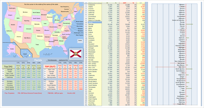
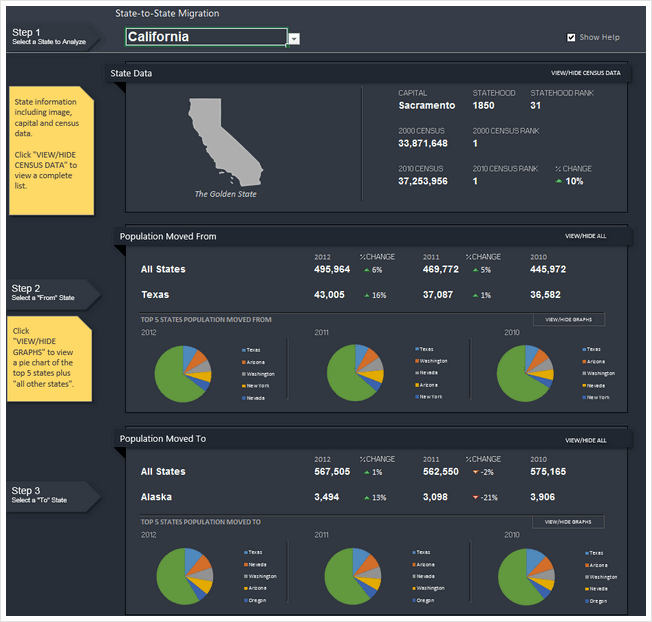
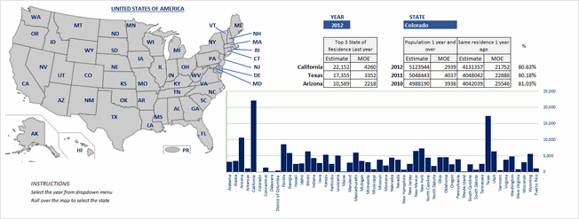
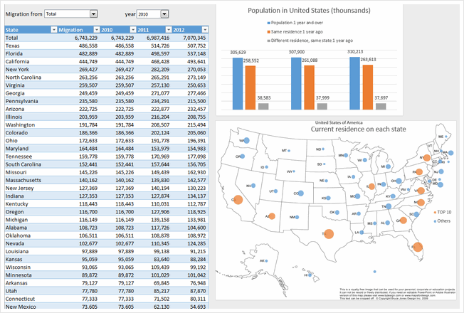
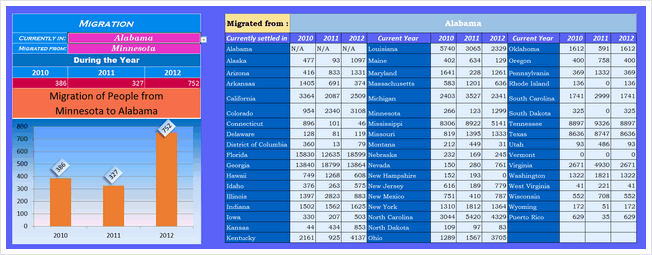
Migration Dashboard by Aditya Canay


- Good colors
- Easy to understand (built in help sheet as well)
- Interactive. Can ask questions & get answers
- Interesting facts & overall summary on top
What can be improved:
- Summary on top is static. It would be better to depend on year or state selected.
- State selection is clumsy. Could have used Active-x combo box or slicer
- Donut chart is not the best choice.
Techniques used:
Migration Dashboard by Aditya Srinivaasan


- Simple and easy on eyes
- Form controls with auto complete (Active-x combos)
- Added data on Cost of living, Crime rate & Tax rate. Helps understand what may have caused the migration.
What can be improved:
- Missing overall summary or header.
- Logarithmic scale on population breakup chart. Makes it unclear.
- Not sure which year’s data population distribution chart shows.
- Crime rate indexation assume same weightage for all crimes. Could have used a better measure.
Techniques used:
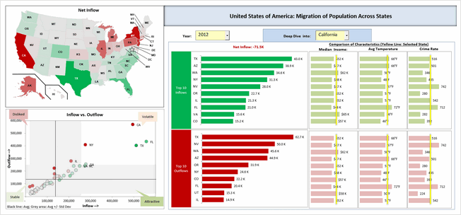
Migration Dashboard by Amit Ajmera


- Comprehensive dashboard with lots of detail
- Analysis of individual state, comparison with another state and overall trends
- Interactive. Can ask questions & get answers
- Analysis of any year or average of all 3.
- Shows a map of selected state.
What can be improved:
- Could use subtle and better colors. Also apply consistent colors.
- Alignment is off in few places.
Techniques used:
Migration Dashboard by Arnaud Duigou


- Clickable map to drill down to a state
- Overall statistics vs. Individual state focus
- Interactive. Can ask questions & get answers
- Interesting facts & overall summary on top
- Built-in help bubbles (that can be toggled)
- Analysis on factors for migration (by using additional data like per-capita income, unemployment rate and weather conditions)
What can be improved:
- Not sure how the tool tips button is supposed to work.
- Alignment is off in few places.
- Switching between state view & overall heatmaps seems clumsy. Also, the state selection combo box on top feels redundant
- Colors & fonts can be improved. Feels like too many of them are used.
Techniques used:
Migration Dashboard by Biju Chacko


- Simple charts with easy to understand colors
- Interactive charts to see migration trends per year
What can be improved:
- Could use a summary on top and few other metrics
- Bar charts have non-zero axis. Creates false impression
- Alignment can be improved. Lots of empty spaces that can be filled with useful insights.
Techniques used:
Migration Dashboard by Celso Garcia


- Clickable map to drill down to a state
- Color coded map & bar chart for easy interpretation
- Form controls to select year
What can be improved:
- Could use a header with summary statistics
- Map and bar chart represent the same data. Could have used other metrics in the bar chart to give more insights
Techniques used:
Become Awesome in Excel & VBA – Create dashboards like these…

- Learn how to create interactive dashboards & reports using Excel
- Develop your own macros & VBA code
- 50+ hours of video training
- Learn at your own pace
- Click here to know more
Migration Dashboard by Cesarino Rua


- Map with details on hover!
- Lots of details for selected state, include flag of the state, important cities etc.
What can be improved:
- Some of the tables feel like orphans. Could use titles (and overall summary or title or both)
- The bar chart on right is just repetition of data in the last of column of table before that. Could have used this space for something else.
- Feels like too much data. Need to zoom down to 80% to see everything. Consider using form controls or something else to make it easy on eyes.
Techniques used:
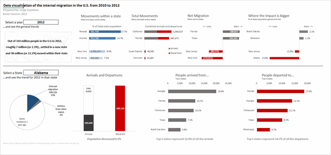
Migration Dashboard by Chris Newman
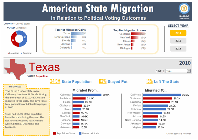


- Clear, dashboard style output with details in big fonts.
- Details of migration combined with political tastes of the state.
- Slicers for selecting year
- Good choice of colors, good alignment and layout.
- Built-in help bubbles
What can be improved:
- Poor choice of conditional formatting databar on top. Could have used regular bar chart with 0 axis.
- Giving a choice of additional measures could have added detail to state view.
Techniques used:
Migration Dashboard by Daniel Dion
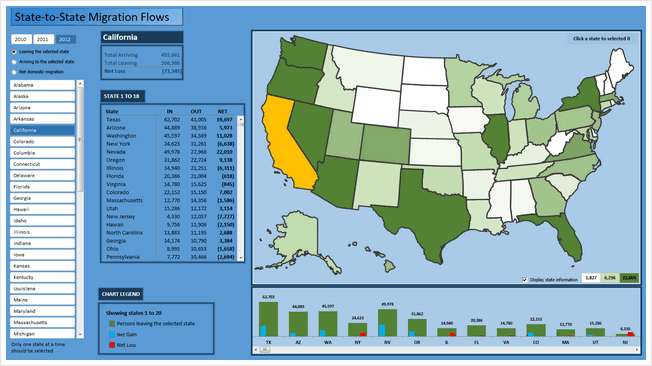


- Clickable map to drill down to a state
- Also, slicers to select a state
- Ability to select year, type of metric (leaving, entering, net gain) to view for the selected state.
What can be improved:
- Too many scrollbars. Especially both slicer & clickable map serve the same purpose. So, could have removed the slicer.
- The listing of states & column chart beneath the map are same data. Again this space could have been used for other insights.
Techniques used:
Migration Dashboard by David Hoppe
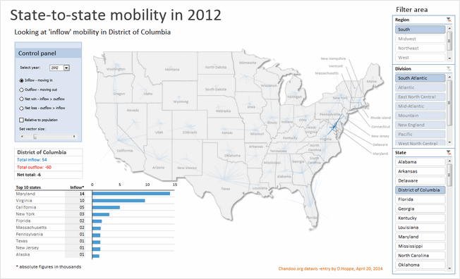


- Map with vectors indicating the movement
- Multiple statistics and ability to switch them (and years)
- Ability to analyze by absolute or relative population
- Slicers for selecting state (or region or division)
- Simple, clean layout with good colors and beautiful presentation
What can be improved:
- Could have added help or instructions
- Could have removed either region or division slicer (as they feel redundant)
Techniques used:
Migration Dashboard by Dwight Johnson


- Simple charts with easy to understand colors
- Data validation to select state
What can be improved:
- Could have moved the output to a blank sheet & cleaned it up
Techniques used:
Migration Dashboard by Fakhri Damdi

- No comments
What can be improved:
- Could have reduced the formatting and focused on insights
- Feels incomplete and rushed. Could have focused on answering some analytical questions instead of making charts from raw data
Techniques used:
Migration Dashboard by Gangadhar Yeligaty


- Simple dashboard with easy to understand layout and charts
- Interactive charts to see migration trends per year
- Scrolling area to see where people move from selected state
- Built-in help
What can be improved:
- Could have added header section with few statistics
- Could have used better formatting for the charts (labels & axis feels heavy)
Techniques used:
Migration Dashboard by Janet


- Dual map with ability to analyze by either leaving or entering state
- Ability to focus on various trends (with sortable table, year selection)
- Slicers for selecting year, state, type of sort
- Good choice of colors, good alignment and layout.
What can be improved:
- Sort order slicers are reversed (clicking on Ascending sorts the table in descending)
- Feels like too much data. Could have used 000s or millions notation for population numbers (and removed MoE numbers or have them toggled)
- Could have added help to understand what arrows meant in the last column.
Techniques used:
Migration Dashboard by Jean-MarcVoyer


- WOW
- Form controls, selectable cells to define analysis
- Good design and colors
- Excellent analysis (with ability to ask a lot of questions and get answers visually
What can be improved:
- Dark background makes it tricky to read numbers. Could have used white or dull background.
- The dashboard is very comprehensive. It could have benefited from help screen.
Techniques used:
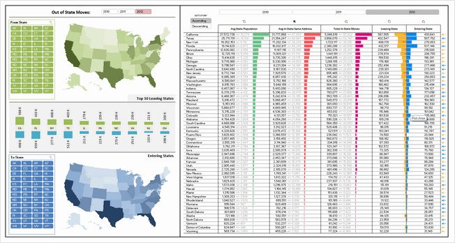
Migration Dashboard by Jeff Sawers
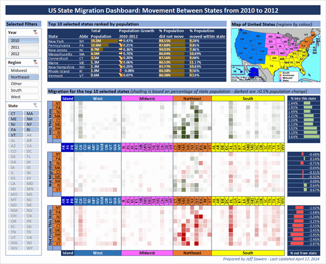


- A very interesting layout and selection mechanism (with slicers for year, region and state)
- Focus on top 10 states with-in selection and where people moved using databars & heat maps
- Good alignment, colors and design.
What can be improved:
- The heatmap section is somewhat tricky to interpret. May be aggregating data at just region level would have made it easy to read.
- A little more analysis or explanation on what may have caused migration would make this even better.
Techniques used:
Migration Dashboard by Joey Cherdarchuk


- Beautiful and simple design
- Clickable cells for selecting year and state
- Simple colors and attractive maps
What can be improved:
- The labels on bar chart are hard to read. A better color or placement would have benefited.
- If the selected year’s map is highlighted, it would make interpretation of trends faster.
- A quick summary on what may have caused such migration trends would make this dashboard even better
Techniques used:
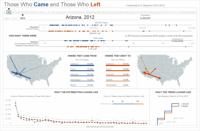
Migration Dashboard by Jon Schwabish
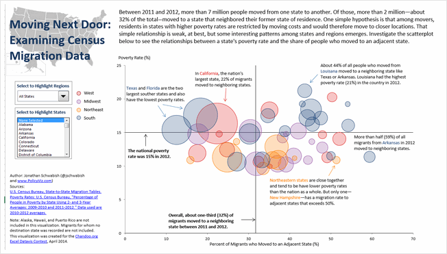


- Simple chart with interactive controls
- Uses the hypothesis that people in poor states move to neighboring states and tests it with the interactive charts & data.
- Good colors and simple design
What can be improved:
- Could have added overall statistics in header
- Could have displayed relevant facts for the selected region or state.
Techniques used:
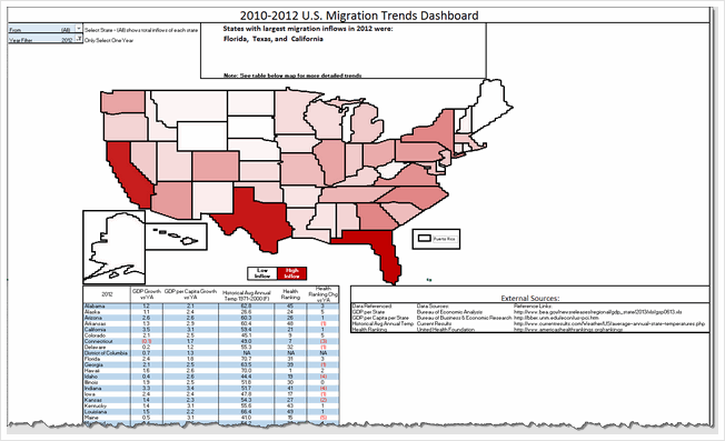
Migration Dashboard by Jorge L


- Simple & clear layout with summary on top and state details at bottom. Good colors too
- Interactive controls to select state and year.
What can be improved:
- Selecting state is tricky with data validation. Could have used a slicer or active-x combo box
Techniques used:
Migration Dashboard by Jude Shyju
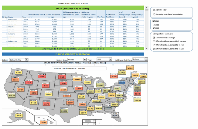


- Data & charts (map or table) in one view with ability to toggle fields & years
- Ability to drill down to a state and visualize inflow or outflow
What can be improved:
- Picture links create clumsy output. Could have used regular charts, tables and drawing shapes instead.
- Lack of alignment in few places.
- Although ability to turn off fields is welcome, it just results in a column with #N/A. Not useful as no space is gained.
Techniques used:
Migration Dashboard by Kevin Steiner


- Interesting visualization with very tiny cells making up US map, pivot table report filters used for selection
- Choropleth map with Excel cell grid!
- Ability to see the map & full data (as pivot report)
What can be improved:
- The cell grid map, although innovative, does not look perfect. Could have used regular map with a little bit of VBA to color it.
- Instead of presenting all the data in a table (pivot table), could have used charts. This saves space and helps create a better layout.
Techniques used:
Migration Dashboard by krishnakumar
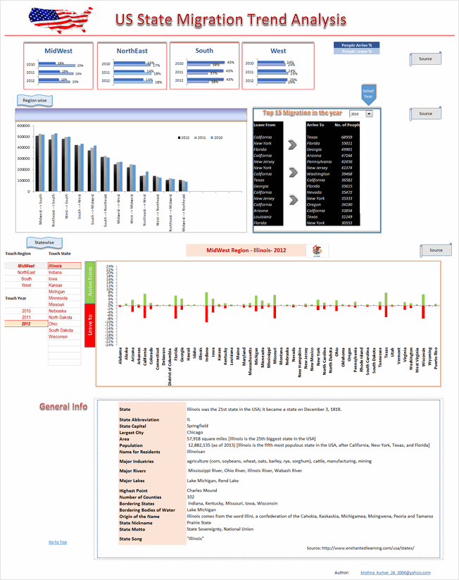


- Detailed analysis on regional migration trends (Midwest, northeast, south & west)
- Ability to drill-down to an individual state by selecting year, region and state’s name
- Interesting facts & details about state shown.
What can be improved:
- Regional migration column chart is tricky to read. Could have used a map or diagram for better effect.
- Too long. Requires 2 scrolls to see the full dashboard. Instead could have shrunk or removed a few charts to create a compact report.
Techniques used:
Migration Dashboard by krishnasamymohan

- Simple report on state migration
What can be improved:
- Too simple. Could have used some charts or conditional formatting to highlight interesting points
- Year selection does not seem to work.
- Gauge charts a poor choice for visualizing this type of data. Could have used alternatives
Techniques used:
Migration Dashboard by krishnateja


- Interesting layout and state selection mechanism (clickable map)
- Ability to analyze selected state’s migration flows
What can be improved:
- Instead of 4 charts depicting regional trends, one chart with selected region’s trends could be used. This creates space for more analysis.
- In-consistent colors and alignment
- Could have displayed a title & quick summary on top.
Techniques used:
Migration Dashboard by Kyle Tan
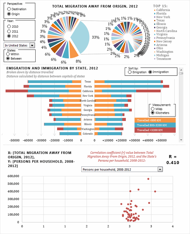


- Interesting presentation with ability to choose a variety of perspectives (destination vs. origin, year, entire USA vs. single state) and various measures for doing correlation analysis.
- Sortable, scrollable chart of state migration flows (with distance from origin!)
- I love the correlation analysis chart. But selecting right measure to analyze feels tedious. Could have pre-calculated or suggested measures based on state selection.
- Good, compact layout.
What can be improved:
- The exploded, grouped pie chart on top feels clumsy and poorly done. Should have used a simple bar chart for top 15 states alone.
- The VBA code feels buggy and sluggish. Could have checked it for errors and disabled screenupdating.
- Could have displayed a title & quick summary on top.
Techniques used:
Migration Dashboard by Mark Weber


- Superb colors, layout, chart selection and presentation
- Very easy to use with built-in help, lots of buttons to change / show / hide things you want.
- Analysis by state and state-to-state.
- 2 color themes – dark & light version.
- Subtle but powerful use of conditional formatting.
What can be improved:
- Could have added a top section with overall USA statistics.
- The analysis is limited to population numbers alone. Could have added additional metrics for richer analysis.
Techniques used:
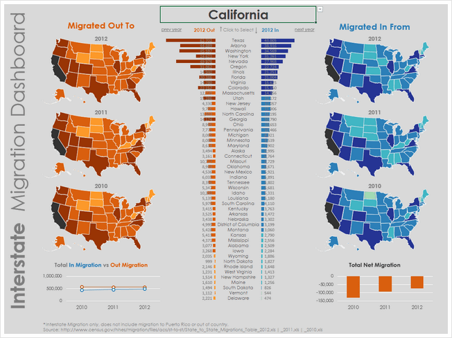
Migration Dashboard by Matthew Waechter


- Beautiful colors and layout. Feels well balanced and easy on eyes.
- Ability to select state & year to understand migration flows. The selection choice feels slick (clickable cells with arrow indicator)
- Interesting ladder / waterfall chart to explain net gains in population.
What can be improved:
- The dot plots on top feel cryptic. Could have added help or title to explain that they are migration numbers for all 50 states.
- The analysis is limited to population numbers alone. Could have added additional metrics for richer analysis.
Techniques used:
Migration Dashboard by Michael Bellot
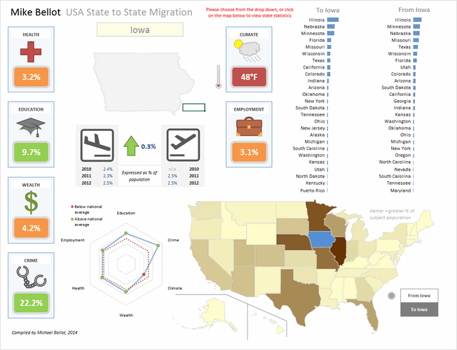


- An elegant dashboard with subtle colors, interesting shapes and clever layout
- The clickable map is a very user-friendly way to explore the information.
- Additional metrics like health, education, wealth, crime, climate etc. help explain migration reasons
What can be improved:
- Could have added data labels to the bar charts (or to the map) to make it better.
- The radar chart, although looks pretty, just repeats the data on the shapes. Could have used it for something else.
- A little more clean-up on dashboard sheet is needed. It shows some calculations and data on the right (which could be hidden)
- It is not sure for what year the map & bar chart data is displayed. An year selection mechanism can also be added.
Techniques used:
Migration Dashboard by NA Horansil


- Wow, cell grid used to create a giant map of USA. Then conditional formatting is used to highlight state’s cells based on migration numbers.
- Ability to select state & year to understand migration flows.
- Sortable migration trends chart (although in a separate sheet)
What can be improved:
- While the cell-grid map looks neat, could have used a regular map with VBA for color-coding. This provides better fidelity and forces us to focus on numbers rather than technique.
- The work books has 3 sheets with dashboards / charts. Contest rules specify one chart or dashboard. Could have integrated all to one page.
- Could have displayed a title & quick summary on top.
Techniques used:
Migration Dashboard by Nathaniel Mahoney


- One more cell grid map, this time at zip code level. Looks interesting although stretched.
- Ability to select state & year to analyze migration trends
- Uses pivot tables & additional data.
What can be improved:
- The map gets stretched and looses clarity due to cell grid approach. Could have used a regular map with VBA.
- The dashboard (?) has no title, no additional numbers and has minimal legend. Could have added a title, quick summary and few more charts.
- How the zip code level migration data is obtained is not clear. Could have added instructions & pointed to sources.
- Requires Data > Refresh once selection is made. Could have automated that with VBA.
Techniques used:
Migration Dashboard by Nhut Vo


- Simple report on state migration
- Ability to select state, year for analyzing migration flows. Ability to sort the list of states based on inflows or outflows.
What can be improved:
- The chart on the right (state-wise distribution) feels busy. Could have shown only top 10 states as sorting is already available.
- The sorting buttons are confusing. Could have used a selection mechanism (or toggle button).
Techniques used:
Migration Dashboard by Niyaz Shaffi


- Clean layout with good colors and clear titles
- Slicers for selecting to & from state, year
- Forecast of migration flows
- Choropleth map based on state migration flows
- Ability to expand a chart (and see more data points, although for a poorly executed chart)
What can be improved:
- The radar plots are a poor choice for depicting top 10 states. Should have used bar / column charts
- The migration inflow vs. area bubble chart is not easy to understand. Should have added instructions.
Techniques used:
Migration Dashboard by Permana Zainal

- Clear, simple layout with bright colors
- A map with bubbles depicting migration trends.
- Ability to analyze by state, year and migration destination
What can be improved:
- The map / bubble chart is confusing with too many colors. Not sure what the state fill colors represent. The bubble colors are also distracting and useless (as the bubble size is what matters). Could have simplified with either Choropleth map or outline map with bubbles.
- The bar charts beneath donuts do not start at zero. This creates wrong impression of the data.
- Summary of total migrants / population chart needs axis labels and ability to sort.
Techniques used:
Migration Dashboard by Prashant Sharma


- Roll-over selectable map and ability to select year for analysis
- Simple dashboard with state migration analysis
What can be improved:
- The state-wise migration flows chart needs ability to sort.
- Could have added few more charts or analysis tables. The chart & tables are just a replica of original data.
- Could have added a title & quick summary at overall USA level.
Techniques used:
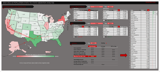
Migration Dashboard by Rajesh Sangati


- Map with ability to select state, type of migration and year (from drop downs)
- Answers questions like which states get most net migrations, contribute for 90% of outflows, inflows
- Simple layout and easy to use
What can be improved:
- The map feels hand-drawn. May be a better outline map or shapes would do justice.
- Labels on charts are difficult to read. Should have used 2 letter state code with horizontal orientation.
Techniques used:
Migration Dashboard by Richard Dutton


- Clear, elegant layout with lots of detail
- Can select a state (from drop-down), year to analyze migration flows.
- Sortable state-to-state migration chart
- Clicking on any state in the map shows further statistics.
What can be improved:
- The state selection drop-down is clumsy to use. Should have used either active-x or slicer or clickable map to make it user-friendly.
- The axis labels on state-to-state migration are hard to read. May be 2 letter codes or scrollable chart would do the trick.
Techniques used:
Form ControlsMaps + VBASortable TablesConditional Formatting
Migration Dashboard by Roberto Mensa


- Wow. A very colorful, clear and well designed report
- Slicers for selecting year, type of data and state are well placed and formatted. They look very natural.
- The map / bubble chart / xy plot is a clever piece of work and explains where people are heading or coming from.
- Interesting addition of Wikipedia links for state names, so that we can learn more by clicking.
What can be improved:
- Could have added a title on the top
- An outline map instead of geo-political map would have made the bubble + XY plot pop out more.
Techniques used:
Migration Dashboard by Roger Haragushiku

- A simple data table along with bubble chart depicting migration data.
- Ability to select a state and year for analysis
What can be improved:
- The map depicts data in the data table. Could have removed one and used the space for something else.
- Could have added a title and quick summary on top.
Techniques used:
Migration Dashboard by S Ramesh


- Interesting report. Start with a help screen and can speak the numbers upon selecting a state.
- A map where you can select a state for further analysis.
What can be improved:
- The map with radio buttons feels somewhat busy. Could have used a simpler outline map with clickable text-boxes for smooth layout.
- The charts which show details are on other sheets. The contest rules specify creating one chart or dashboard on a single page.
- Although built-in help is nice, there is no way to see it again. A help button would have been useful.
Techniques used:
Migration Dashboard by Shailesh Patwardhan
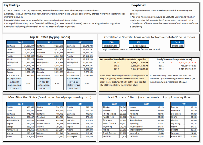

- A crisp, simple and number-only dashboard
- Tests a few hypotheses to explain the migration and explores what may have caused the movement
- Sections on key findings & unexplained are very useful
What can be improved:
- The precision of numbers seems excessive given the nature of them (and margin of error). Could have rounded numbers to nearest %, thousand or million as needed.
- A few charts could have made the insights pop out better.
- Could have added analysis by a selected state. This makes the dashboard personal and interesting.
Techniques used:
Migration Dashboard by Shamik Sharma
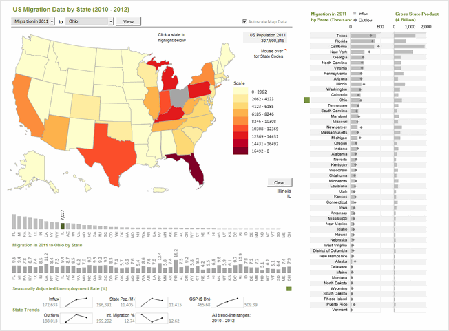


- Clear, elegant dashboard with lots of detail, interactivity and analysis
- Ability to analyze by selecting a single state, multiple states and year.
- Additional data on unemployment rate, gross state product (GSP), international migration helps understand the migration trends better.
- Very good colors, alignment, layout and feel.
- Built-in Help sheet to explain the dashboard
What can be improved:
- While the dashboard provides powerful analysis and ability to interact, a little bit of conclusions or summary text could have helped in interpreting it better.
Techniques used:
Migration Dashboard by Somalinga K


- A simple dashboard with ability to explore any given state’s migration trends and understand one state to another flows.
- Colorful and simple.
What can be improved:
- The data-validation in cell I2 was incorrectly setup (corrected it in download file)
- Instead of showing data as-is based on selection, could have added some analysis or exploration on why the migration may have happened.
- Should have used consistent fonts, alignment & colors and prevented errors thru IFERROR()
Techniques used:
Migration Dashboard by Srinivas Chilukuri


- Beautiful colors and layout. Enables quick analysis and exploration.
- Ability to select a state & year for deep-dive analysis
- Additional data median income, temperature & crime-rate helps understand migration better.
- Inflow vs. outflow scatter plot is interesting
What can be improved:
- The Choropleth map on top feels under-utilized. Could have generated map based on selected state instead of all states.
- Alignment is a bit off in few places. Also the charts on right could use grid-lines or repeated axis labels for better readability.
- The file is password protected (VBA code). This is against rules.
Techniques used:
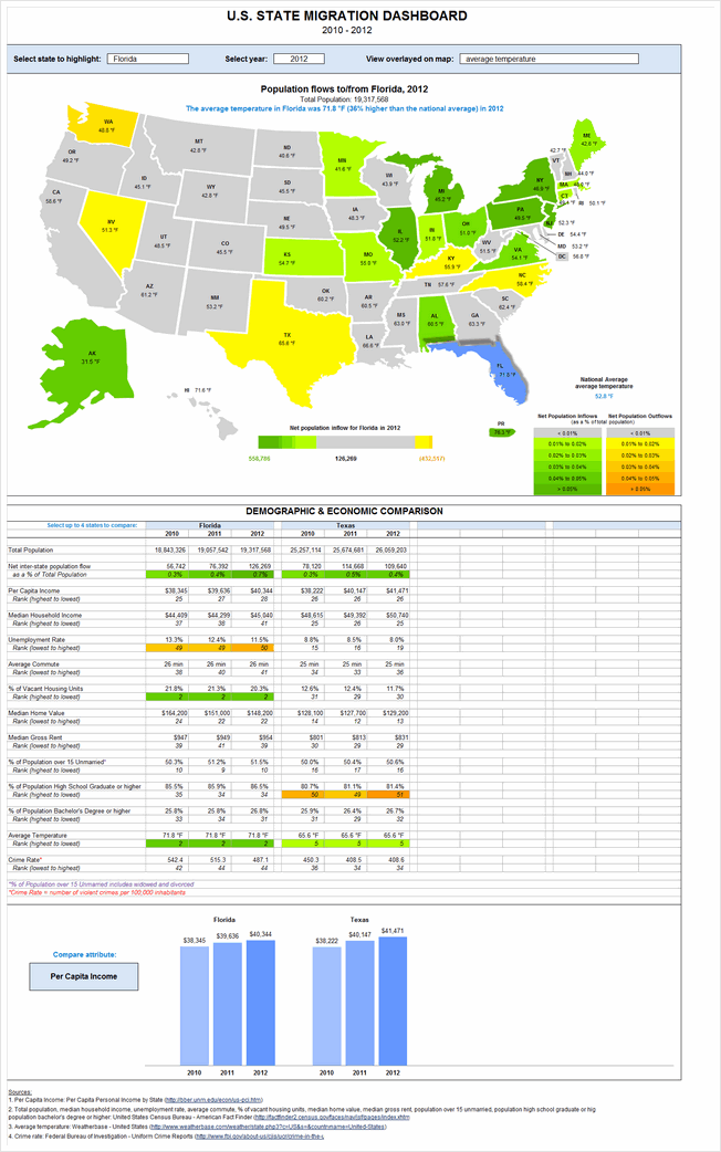
Migration Dashboard by Stacey Baker


- A very insightful & detailed dashboard.
- Ability to explore migration trends based on state, year, various metrics (crime rate, per-capita income, unemployment rate, median home value, median rent, % of unmarried population etc.)
- Ability to compare up to 4 states on various metrics to understand reasons behind migration.
What can be improved:
- The dashboard is too long. Could have reduced the map size and arranged everything on one screen / page.
- Reading the dashboard is tricky due to its length. A help sheet is needed.
Techniques used:
Become Awesome in Excel & VBA – Create dashboards like these…
- Learn how to create interactive dashboards & reports using Excel
- Develop your own macros & VBA code
- 50+ hours of video training
- Learn at your own pace
- Click here to know more
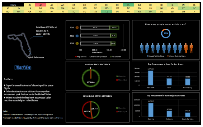
Migration Dashboard by Suriya Banu


- Unique design and interesting choice of colors & layout
- Ability to select a state by clicking on cells with state 2 letter codes.
- The neighbor state statistics is insightful. It shows consistent movement of people with-in neighboring states.
- Interesting facts about the state.
What can be improved:
- The home screen is drab and has no insights. Could have used it for overall summary and quick insights on migration trends.
- The pie charts are a poor way to depict data like this. Should have used column or bar charts.
- Year selection feels tricky. Should have used a more obvious method.
Techniques used:
Migration Dashboard by Thiruselvan
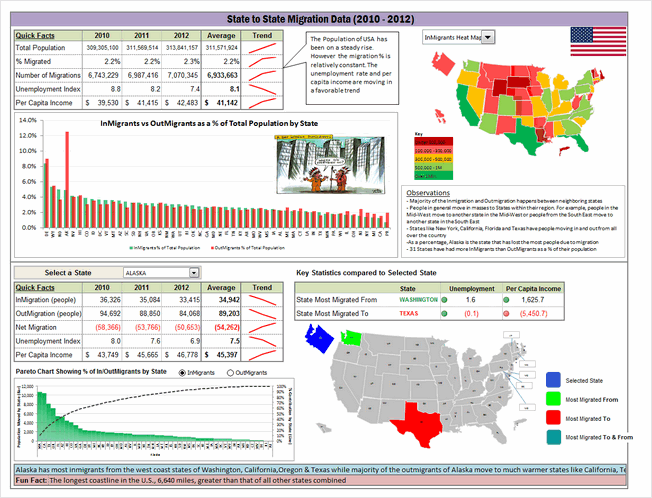


- Very insightful & interesting dashboard
- Good mix of charts, observations, fun facts and analysis.
- Ability to select a state for in-depth analysis.
- Pareto analysis to understand migration of a selected state.
What can be improved:
- The pareto analysis feels forced. It would have been better to test whether a pareto behavior is exhibited by the data before going this route.
- Some place the alignment, font sizes, border thicknesses and colors are a bit off.
- Could have used an Active-X drop down for state selection.
Techniques used:
Migration Dashboard by Trevor Eyre
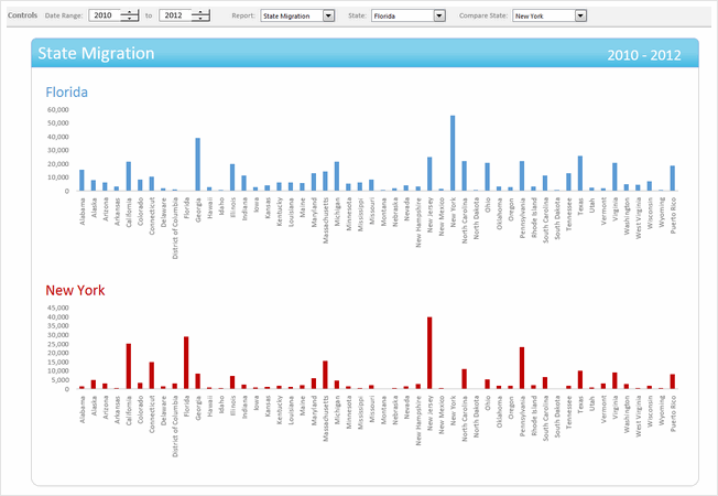


- Interesting dashboard with ability to compare 2 states for given time period on various parameters
- Simple & elegant design
What can be improved:
- The controls for date range selection feel un-necessary as we have only 3 years of data. The other controls should have been intergraded in to the dashboard to make it compact.
- The charts & analysis leaves one wanting for more.
Techniques used:
Migration Dashboard by Tyler Barr
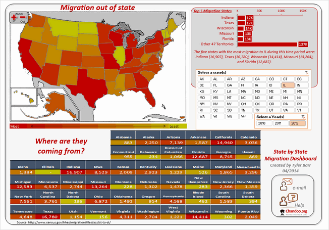


- A colorful, interesting design with built-in help
- Slicers for selecting state & year
- Ability to zoom the map view is an interesting touch.
What can be improved:
- The map, 50 state table at the bottom & top 5 migration states on top right all depict same data. Could have removed one of them and used the space for other types of analysis.
- Picture links make the “Where are they coming from” section a bit stretched. Could have used textboxes or regular cells.
- Alignment is a bit off in few places.
Techniques used:
Migration Dashboard by Vikram Krishnamurthy
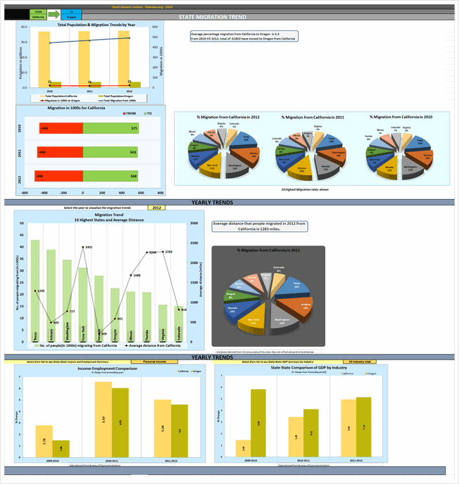


- A detailed dashboard to explore migration from one state to another
- Analysis by yearly trends, average distance from selected state. Also you can explore GDP, personal income and employment for the selected state.
What can be improved:
- Poor choice of charts & colors. The 3d pie charts, in-consistent colors and layout makes it tricky to gain insights from this. Could have used simple bar charts and subtle colors.
- Lots of white space and redundant charts make it hard to understand key points. Should have reduced the charts and made them in to a tight layout.
Techniques used:
Become Awesome in Excel & VBA – Create dashboards like these…
- Learn how to create interactive dashboards & reports using Excel
- Develop your own macros & VBA code
- 50+ hours of video training
- Learn at your own pace
- Click here to know more
Like all? Download one zip file with all dashboards
If you are planning to play with all these dashboards,
download this zip file [50 mb, ZIP file].
Make sure you close all other workbooks before opening these files as many contain VBA code.
How do you like these dashboards?
Quite a few of these dashboards are really impressive. Seeing them is just like watching a magic show or world-class ballet performance. I will share my views & our judges views next week.
Meanwhile, Tell us which entries you liked most? Go ahead and share your views.


69 Responses
I liked the dashboard of Roberto Mensa.
Awesome dashboards
Love to see what all techniques are used.
Happy to be a part of this
First of all, thanks Chandoo and your team! this is a good opportunity to showcase our work to a large audience.
Really a great work of all the contest participants! … I just had a look but I’ve seen a lot of interesting and brilliant ideas … I’m happy because there are many things that I can learn … I think it will be hard to find a winner … so good luck to all!
Hey Roberto.. awesome job here!! wishing you good luck
Hi Roberto,
Impressive dashboard.
I would be very grateful if you can write a tutorial on how you made your dashboards.
Regards,
Antoine
I Liked the Dashboard of Vikram Krishnamurthy, as it has detailed Analysis of Migration. from one states to other states due to diffrent factors.
Nice Dashboard
My favorite was the Migration Dashboard by Matthew Waechter. I really liked the selection mechanism, the color scheme was clean, subtle, and useful, and the proportionally sized arrows on the map were a nice graphical touch.
@Darin
I agree with you, the dashboard by Matthew is one of my favorites too, it is the first that I downloaded … I just want to add that there is no direct proportionality between the thickness of the arrows and the data or rather the thickness of the arrows is fixed. This does not mean that it would have been better if there had been proportionality but is just a clarification.
Now these entries really presented a challenge in determining the best, VERY difficult to say the least.
I ended up liking Newman and Mensa entries the best. Very clear presentations of a mountain of data. Really well done, each with its own very clever attribute.
Thank you!!
I really loved getting to see all of the ideas and different layouts. Thank you so much!
Very interesting indeed.
Could you do the same with the book ( Around the world in 80 Days), to illustrate the journey and incidents of Mr Fogg around the world?
I wish you could.
Joey Cherdarchuk, Mark Weber and David Hoppe are my favourites about the desgin. Very aesthetic and very nice !
Congratulations to everybody for this beautiful work.
Arnaud
Great dashboards. It is interesting to see how many different interpretations come to life from a data set. The different colors, the presentations, the use of Excel features and functionality etc… The beauty of the human mind
My favorite was the one done by Mark Weber. All of these gave me some great ideas of what to do and pitfalls to watch out for. I’ll be incorporating some of these in my future dashboards.
Hi,
Great job !
Please, just be careful Chandoo about public voting. I know that chandoo’s readers are honest and faithfull, but it is so easy now to vote twice, to create false votes in manu various ways.
Thank you so much !
Hi, Great job !
Please, just be careful Chandoo about public voting. I know that chandoo’s readers are honest and faithfull, but it is so easy now to vote twice, to create false votes in manu various ways.
Thank you so much.
Nat
Hi,
Great job !
Please, just be careful Chandoo about public voting. I know that chandoo’s readers are honest and faithfull, but it is so easy now to vote twice, to create false votes in manu various ways.
Thank you so much !
Awesome, I’m Luv the one done by Michael Bellot coz it’s eazy and cool.
To all participants…awesome! You all did a great job!
Excellent work by all participants…
Hope to learn and design something like this
I like Roberto Mensa Dashboard.
WOW…..
For an interactive Dashboard (without MAP view) my vote is for “Kyle Tan” and for Map specific I will chose “Jean-MarcVoyer” Dashboard.
Gratitude to all those who 49 masters who contributed??
Hi Chandoo,
Thanks for your feedback. Surely, will take your inputs & improve myself in next assignments.
With respect to your feedback.
Chandoo: Regional migration column chart is tricky to read. Could have used a map or diagram for better effect.
: Yes. I could try some other chart.
Chandoo: Too long. Requires 2 scrolls to see the full dashboard. Instead could have shrunk or removed a few charts to create a compact report.
: Agree. but try to give as much as possible information hence little long. May be I could think to give page deviation button to set each chart in one view instead of scrolling thru mouse.
Cheers!!!!!!
Super Awesome !!
love to drill down into each of the dashboard and lot of learning can we taken away from this dashboard.
Thanks Chandoo for sharing the dashboards.
Hi,
Great job by all participants…
Specially Jean-MarcVoyer, Mark Weber, Suriya Banu (love their work)
Very difficult to declare the 1 winner, so best of luck for all participants..
Thanks Chandoo for giving us another great opportunity to learn some very interesting things.
BR,
Khalid.
fabulous Dash Boards done by experts. Great efforts.
awesme dashboards…. i didnt knw dat axcel can do dat tings too
thnx to the team for their ideAS and effort…
reaLLY appreciable…….
They look like everyone has put a lot of work into them. I appreciate the opportunity to see Chandoo’s evaluation of them because it really helps understand what makes a good dashboard.
Thanx for sharing this!
thanks
they are very well
THE BAZAAR
Apart from the individual brilliance of the people who has created these dash boards, the greatness is in this act of sharing to public. This may be the story of “Cathedral vs. Bazaar” of Excel.
For normal people like me, just trying to replicate these shall make me to master of the dashboards. Chandoo may needs to address cannibalism of this exercise with his classes 😉
I wish the contestants for their much coveted no# spot.
Hi All,
Looking at all the dashboards, it just makes me want to create another dashboard taking all the awesome part of each dashboard. This is my first time in a competition. More than considering it as a competition, this really helps me as a knowledge sharing/getting ideas thing. My personal fav would be Mark Weber and Roberto Mensa… not considering mine. Just kidding 🙂
/Niyaz
Hi All,
I like the dashboard prepared by Aditya Canay. Easy & Simple to understand. has used subtle colors.
For all other participants…..Great Job!
Will there be more challenges like this in the future? I wish to take part in the next one!
Hello everybody,
Your all dashboards are mind blowing, nice efforts and mind implementation. Thanks to all.
Jaishankar Soni
I liked the dashboard of Celso Garcia, Jon Schwabish, , Mattew Waechter, Roberto Mensa and Suriuya Banu.
Thanks for sharing it Chandoo!
Cristiano Martins
São Paulo – Brasil
Great source of inspirations!
My top 5 list (due to clean dashboard design and smart use of different excel nuances):
Mark Weber
Matthew Waechter
Chris Newman
Joey Cherdarchuk
David Hoppe
Hi Chandoo
Another contest, another success. The works presented are all very good and I liked the observations and of strengths and weaknesses. I know that a lot of work to organize this kind of contest but in the end it’s really good to see the results.
Congratulations and here we wait for the next contest.
Cesarino Rua – Portugal
Wow guys, mindblowing entries. Thanks Chandoo for providing the platform for us Excel geeks – you make us shine!
I learned a lot from Roberto’s dashboard and Matthew’s dashboard worth mentioning too – original visualisations and intuitive user interface you made there!
hi,
veryyyyyyyyyyyyyyyy thank you
Hi,
very good initiativeI- I like – Niyaz Shaffi – dash board
Keep it up!
thank you very chandoo for creating this platform to make people awesome in Excel
To all the the people who participated, You are all champions.
i liked the all dashboard
Hi Purna..
Awesome collection.. of learning Dashboard design..
PS: Can you please find & replace .. just a typo..
“What cab be improved:”
@Deb.. this is done. Thanks for pointing out. My spellchecker obviously missed the typo. 🙂
awesome stuff! Go excelmaniacs! i only wish im able to create such awesome dashboards like you guys. well done everyone!
Why many dashboard does not work in 64bit system, like the dashboard of ArnaudDuigou ?
@Toguko
The dashboard by Arnaud Duigou uses some VBA which is incompatible with Excel 64 bit versions
To Fix
Open the file
Goto VBA, Alt F11
select the Preparation_Macros Code Module
Change the line:
Private Declare Function GetCursorPos Lib “user32” (lpPoint As POINTAPI) As Long
To:
Private Declare PTRSAFE Function GetCursorPos Lib “user32” (lpPoint As POINTAPI) As Long
Now save the file as a *.xlsm file type and
Reopen it
Hi Chandoo
Great exercise – more please. The file of NA Horansil seems to be corrupt and is not recognised as an excel spreadsheet. Could you please email me a version as I need an cell grid map like that.
Many thanks
Peter U
Hi Peter!
You may try this version http://we.tl/wKZUyo501D
Thank you kindly sir
Hi Chandoo..!
Really, a marathan work for your and your team! It’s very tough to decide which one is supreme! Every body put their hard work and time to present such a wf dbs…..I believe the ultimate winner is Chandoo.com. I liked the pleasant dbs of Roger Haragushiku , Krishnakumar & Shailesh Patwardhan.
Many thanks for conducting such a mega contests!
Krishnasamy MOhan:)
Niyaz Shaffi & Janet dashboards are good in visuals and data info, nice 🙂
hi,
downloaded all dashboards and started to compare all and would like to cast my vote to Amit Ajmera for maximum interactive information with choise to review data and non usage of VBA tools (as manjority of people are not familier with VBA).
With VBA tools my vote lies with Mathew.
with it, appriciation and congrats to all ….
Hi,
Thanks for sharing delightful and inspiring bits of Excel!
I’ve left puzzled over the button on Chris Newman’s dashboard: how does it work so that it unhides help boxes only while holding it? Couldn’t figure out the functionality behind it.
Thanks.
Hi Chandoo..!
Great exercise – more please.
I like – Krishnamurthy – dash board
Keep it up!
Ahsan Mohammad
Thanks…….
keep it up……….
Please give me macro code line
(new excel workbook will be open by default full screen)
Ashok Rathod
PLEASE, explanation to me
Whati I can made theses Dashboards, BUT using the BRASIL MAP,
becouse I leave in BRAZIL, in São Paulo city
answer to my e-mail address
thanks in advanced
bye bye
Awesome dashboards!
Lots of things that i never thought it would be possible work together.
Is there anything like it but in Europe map?
@Gabriel
I have uploaded an Excel set of maps here:
http://chandoo.org/wp/wp-content/uploads/2014/06/Europe-maps.xlsx
Hey @Hui, this is fast!
Thank you so much for your help and congrats for the delightiful work.
hello
how can I make a dashboard in excel 2013 with gauge and show that in the map. for example if I click in each state the gauge show the status of each state in gauge.
is it possible ?
please help.
Hi, I desire to subscribe for this blog to take most recent updates, thus where can i do it please assist.
This competition is very cool. I love to see your pros and cons feedback on these dashboards. Thank you for taking the time to do that. Delivering intelligence is much more than creating graphs… there is a thoughtfulness required that is touched on by many of your comments!
When is the next competition?
Brian
It was so hard to choose a favorite but I am going with my gut and choosing Chris Newman because he had a unique perspective that noone else showcased. It’s one thing to just display the data, and certainly some people did that in a very visually appealing and concise way, but it’s another to suggest reasoning, correlations and bring ideas together that go beyond just the surface level. Of course this dashboard would have to be for a specific purpose. If the stakeholders have no interest in political affiliation, it’s superfluous. But on the other hand, any of these dahsboards would have to condier what the stakeholders want and make some connection to their interests. Besides an interesting angle, I like the layout and colors of the dashboard. The colors are directly relevant to the subject, Red for Republican and Blue for Democrat. It’s easy on the eyes and I can understand the information. There is a lot too see without being overwhelmed.