Can we make a calendar using Pivot Tables?!?
Of course we can. Today let us learn a simple technique to create calendar style reports using Pivot tables.
Thanks to Rob for inspiration
Before making any progress, let me thank Rob from PowerPivotPro for the inspiration. Recently he wrote an article explaining how to use PowerPivot & DAX formulas to create calendar charts in Excel. I applied similar technique to Pivot tables.
Demo of Pivot Calendar
See a quick demo of pivot calendar chart before learning how to do this.
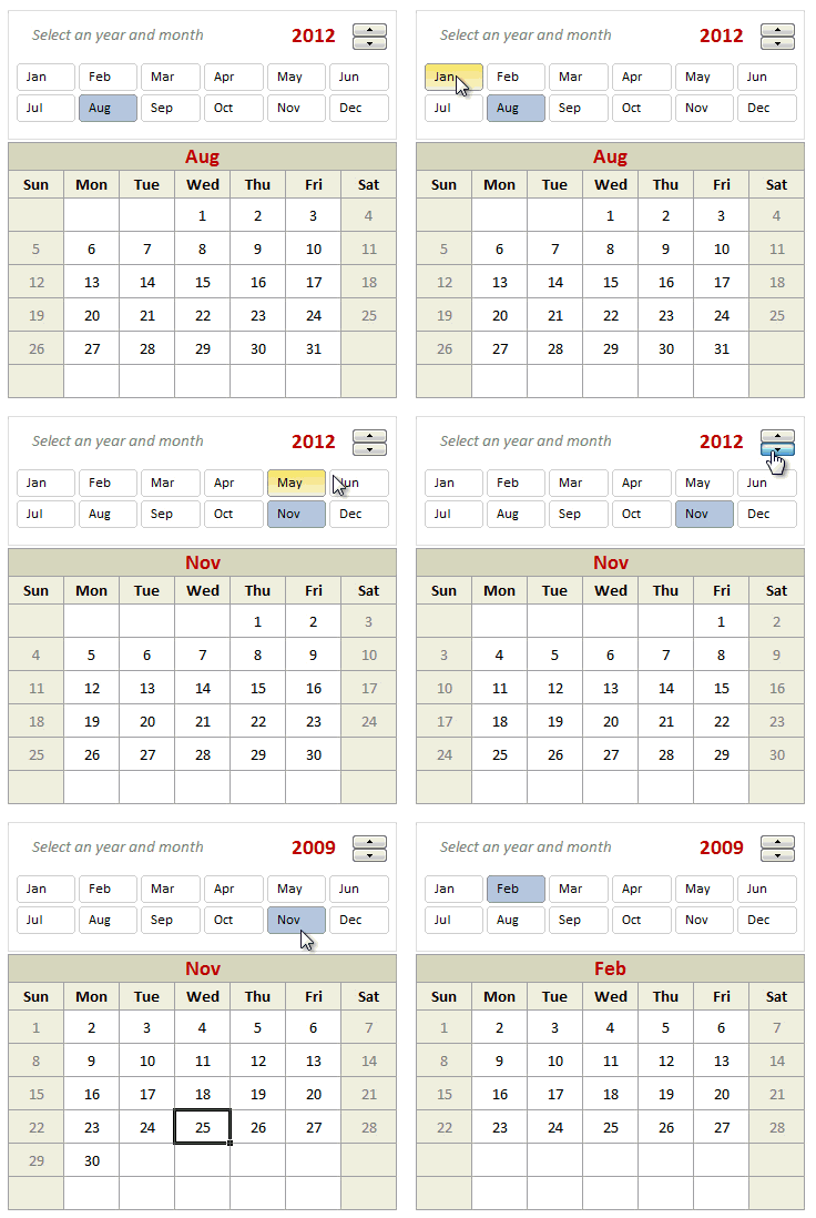
Creating a Pivot Table Calendar
Step 1: Set up an entire year of dates in a list
Lets assume, we want to make the calendar for year 2012. So write that in a cell (G3). Now, in a range of 366 cells, generate all the dates for the year (2012) using simple formulas.
- First date will be =DATE(G3,1,1)
- Next 365 dates will be previous date + 1
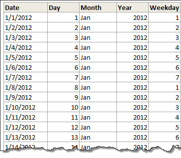
Step 2: Calculate Day, Month, Year and Weekday
Using DAY(), MONTH(), YEAR(), WEEKDAY() calculate the day, month, year and weekday for each of the 366 days.
Step 3: Determine the week number in a month
Now comes the tricky part. We need to find out which row each date should be displayed. First take a look at this illustration.
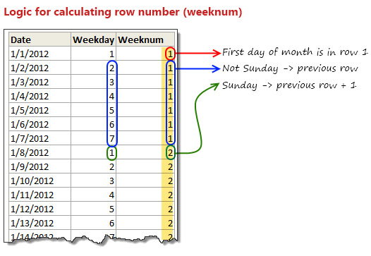
The logic for calculating row numbers is very simple:
- First day of a month is always in row number 1.
- If a day is not Sunday, we just use previous row number
- On Sundays, we just increment the previous row number and use it.
All of this can be expressed in a simple IF formula =IF(D7=D6,IF(F7=1,G6+1,G6),1)
- D7 contains this month, D6 is previous day’s month
- F7 contains weekday, will be 1 for Sunday and 7 for Saturday
- G6 contains previous row number (weeknum)
Step 4: Dealing with Leap years
So far we are good, except for a minor glitch. Certain years have 366 days (for example 2012) while others dont. That means, depending the year, we need to either use 365 rows or 366 rows of our data while generating the pivot report. To do this, we create a named range tblDates that refers to below formula:
=IF(Calcs!$D$3,Calcs!$B$5:$G$371,Calcs!$B$5:$G$370)
Note: D3 is TRUE when an year is leap year.
Step 5: Create pivot table that shows calendar
Now, we need to create a pivot table from the range tblDates.
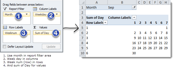
Set up your pivot table like this:
Step 6: Add a slicer
To enable users to select a particular month interactively, just add a slicer on months. For this,
- Select any cell in the pivot table and go to Options Ribbon > Insert Slicer
- Select Month as field to insert a slicer.
- Adjust slicer properties to show items in 6 columns (Slicer Options Ribbon > Columns)
- Done!
At this point, you can interactively select a month & see the corresponding calendar.
Related: More examples on Slicers
Further Enhancements
Now that the basic Pivot Calendar is ready, try these ideas:
- Use a spin button / slider control to interactively adjust the year. Remember, when you do this, you need to refresh the pivot table in background using a simple macro.
- Adjust week start to Monday: Likewise, you can modify your formulas to adjust weekstart to Monday or any other day you fancy.
Using Pivot Calendar as a Chart
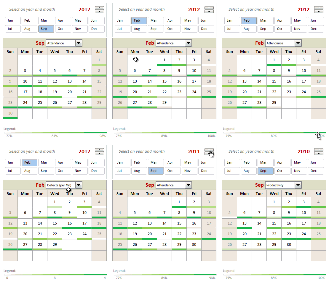
Of course, having a mere pivot calendar is not much fun. But you can apply this idea to create a calendar chart. See this:
Calendar Chart Demo:
How to create this Calendar chart?
To keep things simple, lets understand how to create this chart with just one metric – Employee productivity.
- Once the pivot calendar is ready, we add extra rows between each line in the calendar.

- Now, lets say, we have our employee productivity details listed by date in a table.
- Then, using lookup formulas, we fetch productivity for each day in the cell below.
- Once all the values are fetched, just select all these cells and add conditional formatting > color scale to them.
- Format the color scale settings so that you get desired colors.
- And you are done!
More on Conditional Formatting
Video Explaining Pivot Calendar & Chart
Like this concept? Watch below video to understand how the whole thing is made.
[watch this video on our youtube channel]
Download Pivot Calendar Template
Click here to download pivot calendar & calendar chart templates. Play with them. Plug your own values and see what happens.
PS: You need Excel 2010 to view this file. Please enable macros to get full effect.
Do you like Pivot Calendar Idea?
I am very excited to try this out in a client project sometime soon. I think a set up like this can be used when analyzing monthly data like employee attendance, vacations, productivity, shipments, meeting schedules, project milestones etc. Since such data is represented in calendar format in real life, your audience would find calendar metaphor easy to understand. That said, any data like KPI trends, sales, visits, calls etc. should always be represented as a line /bar charts rather than calendar charts.This way, we can spot trends quickly and understand data better.
What about you? Do you like this idea? Are you planning to use a pivot calendar / calendar chart sometime in future? Please share your thoughts using comments.
Calendars & Similar ideas:
Please go thru below links to learn more about calendars & visualizing data:


