Archive for December, 2009
Use Shapes and Images to make Prettier Charts [Dashboard Tricks]
![Use Shapes and Images to make Prettier Charts [Dashboard Tricks]](https://chandoo.org/img/c/use-shapes-to-make-better-dashboard-charts.png)
One of the annoyances of charts is that they all look like boxes (except for pie charts, they just look wrong). Boxes might be ok when you are making 1 or 2 charts. But a whole dashboard of boxes can look little rigid. So how can we make the charts peppy without loosing any effect? Like these charts below:
Very simple, we use drawing shapes in MS Excel to draw whatever we want and overlay the chart on top.
Continue »50% off on ExcelUser’s Dashaboard Kit [2 days only]
![50% off on ExcelUser’s Dashaboard Kit [2 days only]](https://chandoo.org/wp/wp-content/uploads/2009/12/exceluser-dashboards-th.png)
Charley at Excel User is running a sale on the excel dashboard kits. It is too good to be true. You get the plug and play dashboard kits for half the regular price. Go here to avail this offer and read on, if you are not sure what the dashboard kit is.
For a long time now, I have been an advocate of Excel User’s dashboards. Charley is a pioneer when it comes to excel based dashboard reporting. He has popularized several techniques like using sumproduct formula, using camera tool etc. I have been such a fan boy of his work that I even interviewed him once on this blog.
Continue »Group Smaller Slices in Pie Charts to Improve Readability

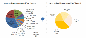
Jon Peltier can stand on his roof and shout in to a megaphone “Use Bar Charts, Not Pies”, but the fact remains that most of us use pie charts sometime or other. In fact I will go ahead and say that pie charts are actually the most widely used charts in business contexts.
Today I want to teach you a simple pie chart hack that can improve readability of the chart while retaining most of the critical information intact.
Continue »Recently I have conducted a survey on my blog to find out your pulse on PHD. Quite a few survey respondents have told me that PHD needs a topic-wise archive so that you can learn excel easily. So over the weekend I have prepared a webpage where you can find topic-wise posts on excel and […]
Continue »

