Archive for July, 2008
Google Maps adds directions by Public Transport – Wow
Wow, this is awesome. Google maps has added directions by public transport. Sometime back when they integrated public transport timings along with bus-stop / train station icons, it was pretty cool, but adding directions based on bus / train routes is totally awesome. Try it for yourself, click here to see a sample direction.
Continue »We have been debating whether or not to buy iPhone. For one, we are not on any cellular contract and free to go. But the sheer cost of $400 one time (one for my wife and one of me) and a monthly bill of ~ $150 is holding us back. Our current mobile bill is […]
Continue »Excel Bullet Graphs

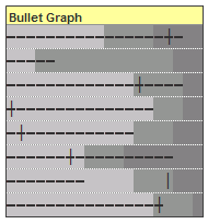
Bullet graphs provide an effective way to dashboard target vs. actual performance data, the bread and butter of corporate analytics. Howmuchever effective they are, the sad truth is there is no one easy way to do them in excel. I have prepared a short tutorial that can make you a dashboard ninja without writing extensive […]
Continue »Photographic Fridays #5 – Dawn
During my evening jogs I go past this place, its a patch vast open space in the midst of the urban land. I made a mental note to shoot here during early morning as I would get very good view of sky. Yesterday I woke up early and drove there to took some shots. The […]
Continue »Awesome folks at flickr introduce instant zoom for photos
Wow, this is one of the coolest features on flickr, you can use instant zoom to see finer details of pics (the ones which have all sizes allowed for anyone).
Continue »
In response to Making Incell charts better article, reader Tony mailed me an excel sheet in which he has modified the charts to display colors and negative values. This is pretty cool. Take a look at the chart below: The trick lies in displaying the charts in 2 rows, one for positive values and another […]
Continue »Environmental Graffiti should get the award for “worst possible bar chart ever” for this unbelievable piece of art… Who said bar charts are only for serious data interpretation, they can be used to have such fun 🙂 Also read Garr Reynold’s comments on this as well. Happy Thursday.. 🙂
Continue »Bingo / Housie Ticket Generator in Excel

I am fascinated by board games. They provide immense fun, anyone can enjoy them, they are unpredictable and best of all they are great value for money. That is why whenever I get sometime I experiment with simulating games to know them better. So, out of curiosity I have created an excel sheet that can generate bingo / housie (housey) tickets – 24 of them at a time. To get new set of tickets you would hit F9 (recalculate).
Continue »
I can never get tired of in-cell charts, whenever I get sometime, I try to experiment something on them. Here is an idea to design true incell column charts without using any add-ins or installing fonts. These charts can be fun to have on your project report or annual news letter or memos, they take […]
Continue »Each of us have our mechanisms to track how we spend money. We use Excel, various online sites and software like Quicken or Microsoft Money to track how we spend our bucks. The bottom line is to track where each penny / paisa / cent is going. So, how great would be it be, if […]
Continue »How geeky are you? Show off your geekness to others with this kickass room decor ideas, Just click the images to follow up. live geek, love geek 😀 1. Lets start with the door. You can experiment with the door locks to create your own puzzle: 2. Now that you are in how geeky would […]
Continue »What does your sky look like?, originally uploaded by Chandoo. We went to a near by amusement park for the July 4th weekend. Even though it was raining they had a decent turnout and we enjoyed alot going on the rides, playing with water, watching the parades and finally the fireworks. I tried capturing many […]
Continue »One of the latest news is that Yahoo has launched BOSS (Build your Own Search Service) using which you can build search based apps. Being a part geek who loves to show off my part knowledge to other part geeks during parties, I went to their website to register for my own app. The registration […]
Continue »Jon @ Peltiertech has taken a critical look at the partition charts suggested yesterday. You can read his review of the partition charts here. One of the commenters on his site said, Jon, the partition chart is not that bad. It just needs to be defragmented… 🙂 So I de-fragmented my partition chart, this time […]
Continue »![Partition Charts in Excel – alternative to pie charts [visualization hack]](https://chandoo.org/wp/wp-content/uploads/2008/07/partition-charts-in-excel.gif)
Next time you had to create a pie chart, consider building a partition chart as these charts can reveal trend information along with how much each pie is contributing. What more? They are as easy to create as eating a chocolate chip cookie dough ice cream 🙂 I made a sample partition chart based on […]
Continue »

