Awesome chart to visualize Salary Increases for 3,500+ people [Tutorial]
Game for some charting awesomeness?
Off late, I have been doing a lot of data analysis and visualization on performance ratings, salary hike, gender pay equality etc. Today let me share you an awesome way to visualize massive amounts of data.
Scenario: Your organization of 3,686 people recently went thru annual performance ratings & review process. At the end of it, everyone was offered some salary increase (from $0 to $24,000 per year). You have 7 business groups. How do you tell the story of all these salary hikes in one chart?
How about the one above?
Ready to know how to create this in Excel? Read on.
Joyplot in Excel
Over on Twitter, I came across this beautiful chart, aptly titled – Joyplot. It is the kind of chart that makes you all curious and awed. So I did what any Excel nerd would do. Recreated it in Excel of course. This post takes you thru the process.
Take a look at final outcome above. Read on to learn more.
Mapping Spread of Obesity [Chart Critique and Alternatives]
Over at Flowing Data, Nathan has published an interesting visualization about spread of obesity.
While the above chart is quite interesting, it doesn’t offer much insight in to the data. There are a few drawbacks,
- Understanding obesity trends for a given state over the years is hard due to the layout and format of the chart.
- Finding which states are experiencing most obesity growth rates is not possible
- Ironically, the chart itself is obese. It takes too much space to explain the data.
Nevertheless, the chart looks cool and can be reused with smaller data-sets (quarterly trends or just for a few years). So let’s recreate the same in Excel. While we are at it, let’s also build an alternative visualization to explore the obesity data.
Fish Eye Effect for highlighting selection – Is it effective? [Advanced Charting]
A few days back, WSJ ran a visualization titled “What’s your pay gap?” It depicts median pay gap between female & male workers in 422 different professions in USA. The chart uses fish eye effect to highlight the selected profession. See below demo to understand the effect.
“How Trump happened” in Excel [visualizations]
During last week, an alert reader of our blog, Jørgen emailed me a link to “How Trump happened“. It is an interactive visualization by Wall Street Journal. Jørgen asked me if we could replicate the visualization in Excel. My response: “Making a new chart in Excel? Hell yeah!”
Read on for awesome visualizations and full explanation.
Is this a FIFA worldcup of late goals? Lets ask Excel
Just like millions of viewers around the world, I too have been spending hours watching FIFA world cup football matches on TV. I don’t like spending hours watching TV. But when its FIFA world-cup time (which is once every 4 years), I am glued to the idiot box. Blame it on PaWaRa, my school teacher in 8th grade who instilled this passion.
So while watching the match day before yesterday (it was Holland vs. Chile), the commentator said, “This has been a world-cup of late goals” as both teams maintained 0-0 until 77 minute mark when Leroy Fer scored a goal for Holland.
That got me thinking,
Is this really a world-cup of late goals?
But I quickly brushed away the thought to focus on the match.
Later yesterday, I went looking and downloaded all the goal data for 2006, 2010 & 2014 FIFA world-cup matches (2014 data for first 36 matches).
Lets examine the hypothesis “2014 has been a world-cup of late goals”.
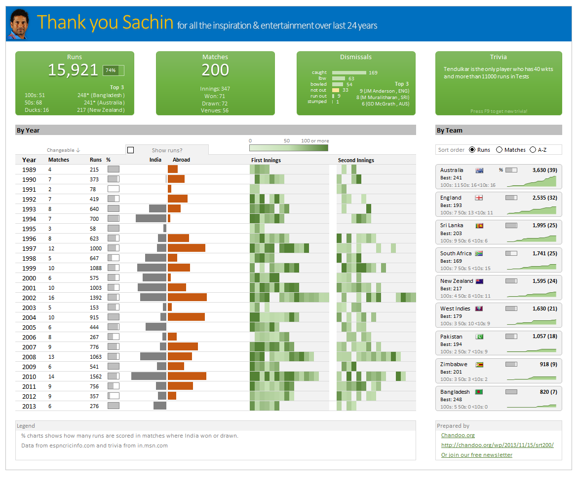
Thank you Sachin [a small tribute]
Lets talk about people who inspire us. People who show us that anything is possible. People who prove that commitment, hard work and perseverance are true ingredients of a genius.
I am talking about Sachin Tendulkar. Those of you who never heard his name, he is the most prolific cricketer in the world. He is the leading scorer in both tests (15,921 runs) and one day matches (18,426 runs). Read more about him here.
Tendulkar has been an inspiration for me (and millions of others around the world) since I was a kid. The amount of dedication & excellence he has shown constantly motivates me. It is a pity that the great man is retiring from test cricket. He is playing his last test match (200th, most by any person) as I am writing this.
So as a small tribute, I have decided do something for him. Of course, I have never been a cricketer in my life. Once in college I was reluctantly asked to be a stand-by player in a game with seniors. I did not get a chance to pad up though. That is the closest I have been to a cricketer. So I did what I do best. Create an Excel workbook celebrating Sachin’s test career.
Thank you Sachin – his test career in a dashboard
Here is a dashboard I made visualizing his test cricket statistics. It is dynamic, fun & awesome (just like Sachin).
(click on the image to enlarge)