
 Bullet graphs provide an effective way to dashboard target vs. actual performance data, the bread and butter of corporate analytics.
Howmuchever effective they are, the sad truth is there is no one easy way to do them in excel. I have prepared a short tutorial that can make you a dashboard ninja without writing extensive formulas or installing unknown add-ins. So get out your shinobigatana and join me in a fresh excel sheet arena.
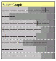
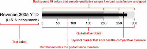
Before we create our first bullet graph, let us spend a few moments understanding these graphs. Stephen Few proposed bullet graphs as way to provide crisp view of “target vs. actual performance” numbers. Shown below is a sample bullet graph and how you would read it.
Read up more on this at PTS blog and on a Gauge chart that actually works.
Let us create your first bullet graph
Click here to download bullet-graph template excel sheet so that you can see while reading
Our technique of involves conditional formatting and simple formulas applied to a cell grid. Just follow these 4 easy steps:
Step 1: Prepare your data for charting
 Since we are going to plot bullet graphs on a cell grid, we first need to normalize our data. I have chosen to plot each bullet graph on 20 cells in a row as shown in the raw grid shown to the right:
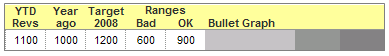
Assuming we have fictitious sales data like this:
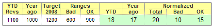
You can normalize YTD sales figures using a simple formula like this : ROUND(YTD-sales/target*20,0)
Now that we have our data steaming hot, lets brew the graphs
Step 2: Lets make the raw grid formatted based on data
Now we will take the raw 20 cell grid in each row and conditionally format these cells so that we have background of the bullet graph drawn on them.
For eg. If the normalized sales data for Bad range is 7 and for OK Range is 15 then,
We will highlight first 7 cells lighter shade of gray, next 8 cells gray and last 5 cells with darker shade of gray.
I have shown the conditional formatting applied to these cells below:
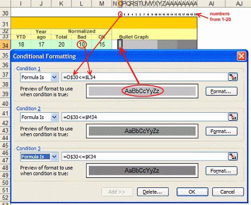
When we are done, a sample row looks like this:
We have our cell grids ready now, lets shoot some bullets. 🙂
Step 3: Plot bullets on our graph canvas
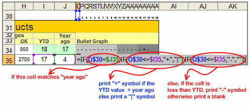
Our final step involves print a bullet symbol (either – or + or | ) in each cell depending on one of the following conditions:
1. If the cell position (1,2,3 … 20) is equal to Year ago value and cell position is less than YTD value print a + symbol
2. If the cell position is equal to Year ago value and cell position is more than YTD value print a | symbol
3. If the cell position is less than YTD value print a –
4. Else print a blank
See the formula below:
Download the excel template for bullet graphs to understand this formula better
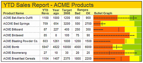
Step 4: Show off your bullet graphs, awe your boss or colleagues, bask in your Ninja glory
Unfortunately, I cannot tell you how to do this. I can only teach you to be a Ninja, but you have to be one to charm people with your tactics. 🙂
Shown below is another variation you can try. Also, you can experiment with the symbols printed (instead of + – | you can try other ASCII characters, for more download the excel sheet containing bullet graph templates)
Also try: Partition charts, Incell Graphs and much more.


36 Responses
Interesting approach. I need to examine it a bit further. It looks easier to set up then a bullet chart in an actual chart, and it takes no effort to aling the charts in a table, because they’re already part of each row.
This is a nice tip! I am going to have to look at it and try to create on my own.
P.S. – I just ate your RSS.
@Jon.. Thanks for your review comments 🙂
@Tony: welcome to PHD blog. Sure let me know if you have any comments after trying this.. and thanks for subscribing to my blog 🙂
Very nice tip… easy to implement and to share (no macro).
Here is another option : http://sparklines-excel.blogspot.com/
Regards
Wow, just what I’ve been looking for. Hopefully the concept will work for what I need. I’m trying to dashboard when my process moves out of control to 1, 2 or 3 standard deviations above the mean. If it works, you’ve made me a ninja hero
Great and easy way to do a bullit chart. However, it would be much nicer in terms of graphical presentation if the lines would be continous istead of ‘broken’.
I tried to look for a true type font to help me on that but could’t find it. Anyone else maybe?
good tip! thanks!
Great work & inspirational stuff again.
However, I’ve downloaded the bullet graph template sheet to see how it’s put together, but when I ‘tab’out of the cells with the ROUND formulas in the figures below change (and the lines begin to distort).
How come this happens, and what have I done wrong?
Thanks.
First of all Happy Birthday Chandoo,
Landed here because of your birthday post …and man…i can’t believe i have been missing this from my dashboards till now.
Thanks a lot !!
excellent chandooji! i wish to excell at work place your tools
…Thanks- Regards
k.udayshankar
hi dear chandoo.
can you send me a help with pictures for excell bullet graphs . your page doesnt have any pics and i dont understand.
so , so , so , thanks for your site and your helps!
Hi Chandoo
Have been following you for a while, but my first post.
Why are you using 20 to normalise?
Great work Chandoo. Keep it up. God bless.
A great class of a master in excel. My doubt is when the target is extremely under or over dimensioned compared to the YTD Revs because, in this case, the normalization exceeds the limit 20. What should i do?
Have y’all seen the Freeware bullet graph app from Aculocity?
http://www.aculocity.com/BulletGraph.aspx
I found it quick to use, useful for my needs, and, you know, FREE.
oh my god this is so worth atidying chandoo! tq so much for the idea and tutorial. i have a few hundreds construction projects to analyze and present in 10 minutes session. this probably will help! gonna try now
Hi. I love this tutorial! I just have one question: what if I have only two measures of Revenue and Target (with no Year ago measure), then how do I go about creating the same thing?
Really cool… I thought I knew a thing or two but you always surprise me… great job.
Interesting approach.
However it doesn’t work if the Year ago > Target (I know it doesn’t make sense to have a lower target, but it happens. Doesn’t it?)
Also, it cannot fulfill the “demand” of many “detail” persons who expect the bullet stops just to the left of the target line for 99% achievement; and to the right of the target line for 101% achievement… ;p
Nevertheless, I like your out-of-the-box thinking!
Is there a way to make the horizontal cumulative score line appear to be thicker and continuous, i.e., to make it look more like a horizontal bar? I refer to the first chart in the accompanying downloaded workbook.
How may I convert dashes in the performance score measurement to appear as a continuous bar?
Very nice representation!
Wud like to understand how to use this to represent a situation where the target has been overachieved.