
Recently, I saw this chart on Economist website.
It is trying to depict how various cities rank on livability index and how they compare to previous ranking (2014 vs 2009).
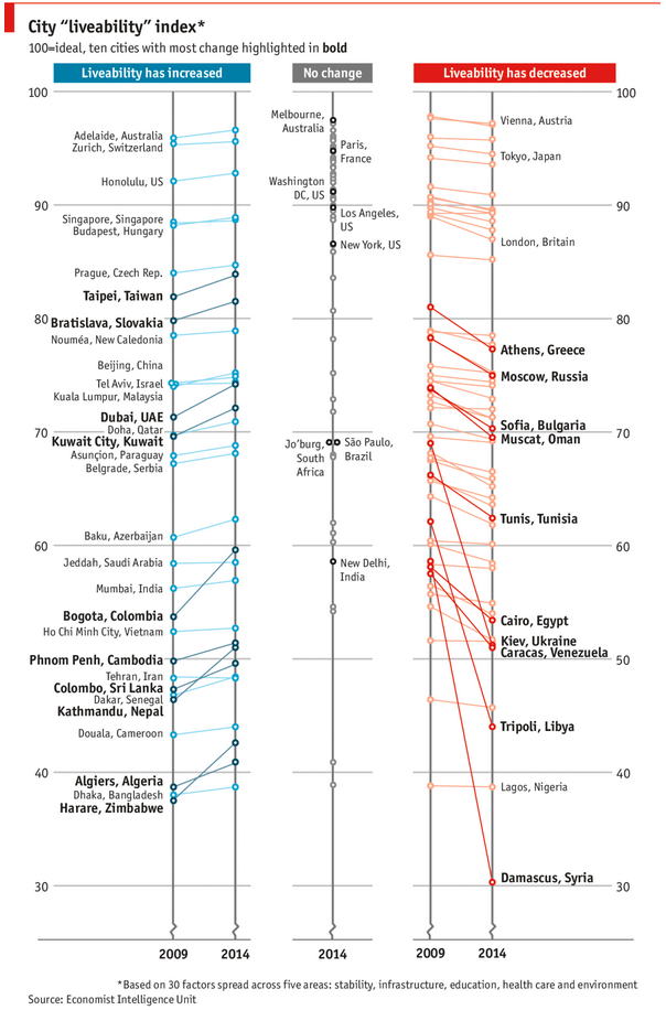
As you can see, this chart is not the best way to visualize “Best places to live”.
Few reasons why,
- The segregated views (blue, gray & red) make it hard to look for a specific city or region
- The zig-zag lines look good, but they are incredibly hard to understand
- Labels are all over the place, thus making data interpretation hard.
- Some points have no labels (or ambiguous labels) leading to further confusion.
After examining the chart long & hard, I got thinking.
Its no fun criticizing someones work. Creating a better chart from this data, now thats awesome.
So I went looking for the raw data behind this graphical mess. Turns out, Economist sells this data for a meager price of US $5,625.
Alas, I was saving my left kidney for something more prominent than a bunch of raw data in a workbook. May be if they had sparklines in the file…
So armed with the certainty that my kidney will stay with me, I now turned my attention to a similar data set.
I downloaded my website visitor city data for top 100 cities in September 2014 & September 2013 from Google Analytics.
And I could get it for exactly $0.00. Much better.
This data is similar to Economist data.
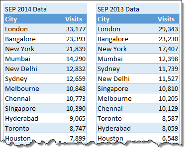
Chart visualizing top 100 cities
Here is a chart I prepared from this data.
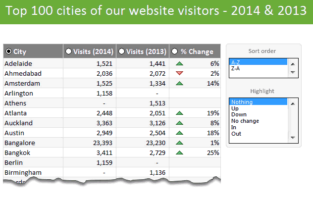
This chart (well, a glorified table) not only allows for understanding all the data, but also lets you focus specific groups of cities (top % changes, new cities in the top 100, cities that dropped out etc.) with ease.
Download top 100 cities visualization – Excel workbook
Click here to download this workbook. Examine the formulas & formatting settings to understand how this is made.
How is this visualization made?
Here is a video explaining how the workbook is constructed. [see it on our YouTube channel]
The key techniques used in this workbook are,
- SUMIFS, INDEX + MATCH formulas for figuring out data
- Sorting data by a particular column
- Conditional formatting to show % change arrows
- Form controls for user interactivity
Since the process of creating this visualization is similar to some of the earlier discussed examples, I recommend you go thru below if you have difficulty understanding this workbook:
- Suicides vs. Murders – interactive Excel chart
- Gender Gap chart in Excel
- Visualizing world education rankings
- Analyzing survey results with panel charts
How would you visualize similar data?
Here is a fun thought experiment. How would you visualize such data? Please share your thoughts (or example workbooks) in the comments. I & rest of our readers are eager to learn from you.


13 Responses
Hi Chandoo,
This is a great chart (table). I can make good use of this in my dashboards, especially when adding a scroll-bar form control.
regards,
Herbert
Thanks for the article, that’s a nice interactive table, kudos.
When improving charts, I like to take a step back and try to figure out the chart’s purpose. Should it tell a story? If yes, what is that story? Or is it just there to make a single, concise point? As we know, the same data can be expressed in a wide variety of charts.
Chandoo’s solution is a hearty “let the user decide,” which is valid. It certainly encourages playing with the data and exploration.
I think the fun lies in trying to figure out the intention of the original chart and improving on it. In this example, the authors apparently couldn’t really make up their mind if they wanted to focus on *change* or on *ranking*. That’s why Chandoo’s solution is so ingenious.
I wonder if we tried to focus on showing *change* and tried to chart this question expressively, what we could come up with…
… continuing my thoughts from yesterday:
Actually, slope graphs can be quite suitable to show change, e.g. slope graphs are good to identify the exceptions of a general trend. Unfortunately, in the above example, there is simply too much going on, so the authors split it in 3 parts, by which they forfeit some good reasons for drawing a slope graph in the first place. Slope graphs can be, if not too busy, good in identifying differences in magnitude of change (something done by giving numbers in Chandoo’s table).
One way to improve on the original chart would be to make one slope graph per region or continent, and put them all next to one another on one page. Also, don’t show any data points that currently don’t have a label, and make only one slope graph per region (not 3 for up, unchanged, down).
This chart would show several things:
– Do particular regions have particular trends (i.e. do the cities of these regions develop in the same direction, or do ups and downs seem random within one region).
– How do the trends (if any) between the regions compare?
– Are there exceptions to trends within one region (where e.g. a particular city goes down while others go up, or one city goes up or down much stronger than others)
– If these are the top X cities, which continents are overrepresented, which are underrepresented.
Here is a quick sketch to give an idea (the layout is pretty rough):
http://schuderer.net/pub/experiment_slope_graph_cities.png
Chandoo,
Been following you for awhile now. Love the tips.
I love this exercise. It’s a great example of taming an over ambitious infographic.
When making these types of tables I always start with pivots, so here’s a rework of your workbook using only pivots and no controls. I started by reorganizing your data into a table with a year field and then using pivots to do a lot of what you did with the extra calcs and tables in your data. Let me know what you think.
http://nickehrlich.com/Top10Cities_nge.xlsx
I loved the new table. I especially liked how it did not use macros, but was fast and effective and displaying the data. One question. I have something similar I need to do, but it also has to filter data selected by the user. So, if the user only wanted to look at cities with visits over 10,000, would there be a way to add that into this model? Thanks in advance. Love this site!
@Matt Johnson: Here’s a solution that adds several switches (two as calculated fields in the first pivot and one as a calculation field in the table range) that provide for filtering on predetermined thresholds. If you wanted the user to enter their own threshold in you could add a named cell for user input and have the calculation reference that threshold in the formula. I’ve included both methods in the following update, but I’d only choose one method before rolling out to users. Having both a hard coded switch and a variable switch would probably cloud up the UX.
http://nickehrlich.com/Top10CitiesV2_ngeV2.xlsx
Nick, your solution using pivots and slicers has the advantage of being used through Microsoft onedrive online with Android devices where a model with object controls cannot be; they are stripped out on opening. This affords a greater degree of flexibility and brings data modelling up to date with some of the mobile technology in the workplace. IOS cannot, as far as I can tell, utilise slicer controls. I’ve tested on a Nexus 7 2nd Gen and iphone 6 with ios8 both using the office.com site and a onedrive account – not conclusive but it’s what I have.
One could argue that you’ve just pushed the barriers out that little bit further. As modelers, we should be finding ways to implement new features of Excel to create faster solutions that are easier to support and flexibly delivered to where they can be used by the biggest audience.
No one has a monopoly on good ideas and, Nick, your solution is a very good one. Thank you for sharing it. I will be building on the concept in my workplace.
Cool. I like your way to self-make the “Slicer” for selection by using Form Control + Shape. Nice. 🙂
Here’s a source of some U.S. City data
http://livability.com/best-places/top-100/2015/ranking-data
http://livability.com/best-places/top-100/2014/ranking-data
have two software outputs in excel to integrate and import data see below
Sheet 1 (My data Dictionary column names for soft1 and soft2 )
Soft 1 —– Soft2
Code ——— codenumber
Fname ——- first name
IDCODE——– id
Soft2 data sheet columns
Codenumber : First name :id
I want vba to pick column names from softdata2 sheet and find soft1 equivalent and replace in soft2 data ;
Hi All
I would like to learn how to create the form control on the report tab, is there any Youtube tutorial or website materials that you can point me to?
Thanks
I’ve recently been revisiting files from old posts just to reconsider them with Excel 365 in mind and noticed that the City sort doesn’t quite work for the item that should be at the top/bottom. Ascending leaves Abu Dhabi at the bottom while descending leaves Zurich at the bottom when they should be at the top in those respective cases.
Also, the secondary/tertiary sorting seems inconsistent. For example, when sorting by Visits (2013) ascending, Nairobi and Quezon City are tied with 1,084 with Nairobi listed first. This initially seems to make sense because it comes first alphabetically and even has a lower 2014 value (zero). But then cities like Granada, Tel Aviv, Warsaw, Brussels, and more all tied with zero for 2013 and are in descending order by their 2014 value. A similar situation exists with Dublin/Moscow for Visits (2014) descending compared to Berlin/Boardman and then Johannesburg, Athens, Doha, Colombo, and others.
Given that this file predates Excel 365 and thus lacked more modern options at the time, the incorrect alphabetization for Abu Dhabi and Zurich are the only things I’d really label as wrong. But to offer a 365 solution that tries to address those as well as the inconsistent sorting, here’s where I landed.
=LET(
city,UNIQUE(VSTACK(cities.2013[City],cities.2014[City])),
visits2013,XLOOKUP(city,cities.2013[City],cities.2013[Visits],0),
visits2014,XLOOKUP(city,cities.2014[City],cities.2014[Visits],0),
chg,IF((visits2013=0)+(visits2014=0),NA(),(visits2014-visits2013)/visits2013),
opt,CHOOSE(data!O4,1,-1),
tmp,HSTACK(-1,opt,-1,1),
out,HSTACK(city,visits2014,visits2013,chg,CHOOSE(data!O3,–ISNUMBER(chg),–(visits2014>0),–(visits2013>0),–ISNUMBER(chg))),
ord,SORT(out,CHOOSE(data!O3,1,{5,2,3,1},{5,3,2,1},{5,4,2,3,1}),CHOOSE(data!O3,opt,tmp,tmp,HSTACK(DROP(tmp,,-1),-1,1))),
IFNA(DROP(ord,,-1),””)
)