
Today, lets learn how to create an interesting chart. This, called as network chart helps us visualize relationships between various people.
Demo of interactive network chart in Excel
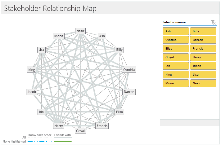
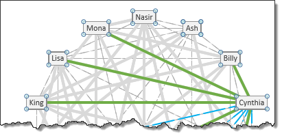
First take a look at what we are trying to build.
Looks interesting? Then read on to learn how to create this.
Note: thanks to Hans whose email question inspired me to create this chart.
Tutorial to create interactive network chart in Excel
Note: This tutorial requires intermediate-to-advanced Excel knowledge. So if you are beginner, learn the basics & advanced concepts first and then comeback for this.
In order to create this chart in Excel, we need to first understand various ingredients of it.
As you can see, the chart contains these parts:
- A set of dots, each representing one stakeholder
- A set of grayish thick & dotted lines representing all relationships between people.
- A set of green thick & blue dotted lines representing relationships for the selected person.
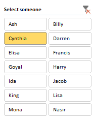
- A slicer for person selection (can be replaced with list box or clickable cells in Excel 2007 or below)
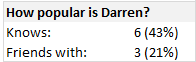
- Summary statistics of the selected person
Getting started with the relationship data
To simplify our tutorial, lets assume we are talking about relationships between just 4 people, named Ash, Billy, Cynthia & Darren.
Our relationship matrix looks like this:
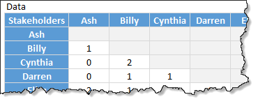
- 0 means no relationship
- 1 means weak relationship (for example: Ash & Billy just know each other)
- 2 means strong relationship (for example: Cynthia & Billy are friends)
The downloadable workbook is created to take up to 20 stakeholders.
Geometry of the network chart
If we draw the relationships between these 4 people (Ash, Billy, Cynthia & Darren) on a paper, it would look like this:
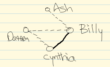
The 2 things we need to determine are,
- The location of dots (where person names are printed)
- The lines (starting & ending point of lines)
Plotting dots around circle
We need to plot our dots in such a way that gap between each dot is same. This will create a balanced chart.
What shape satisfies our need for such equal gaps? A circle of course.
Hey wait, I don’t see a circle in the chart you have shown…?
Thats right. We don’t need to draw a circle. We just need to plot dots around it.
- So we have 4 stakeholders, we need 4 dots
- If we have 12 stakeholders, we need 12 dots
- If we have 20, we need 20 dots.
Assuming the origin of our circle is (x,y), radius is r and theta is 360 divided by number of dots we need,
the first dot (x1,y1) on the circle will be at this position:
x1 = x + r*COS(theta)
y1 = y + r*SIN(theta)
[Related: How to create a spoke chart in Excel]
Once all the dots are calculated & plugged in to an XY chart (scatter plot), lets move on.
Plotting the lines
Lets say we have n people in the network. So that means, each person can have a maximum of n-1 relationships.
So the total possible lines in our chart are n*(n-1)/2
We need to divide it by 2 as if A knows B, then B knows A too. But we need to draw only 1 line.
My network chart template is set up to work with up to 20 people. So that means, the maximum number of lines we can have will be 190
Each line requires a separate series to be added to the chart. That means, we need to add 190 series of data just for 20 people. And that satisfies only one type of line (either dotted or thick). If we want different lines based on type of relationship, then we need to add another 190 series.
This is painful & ridiculous.
Fortunately there is a way out.
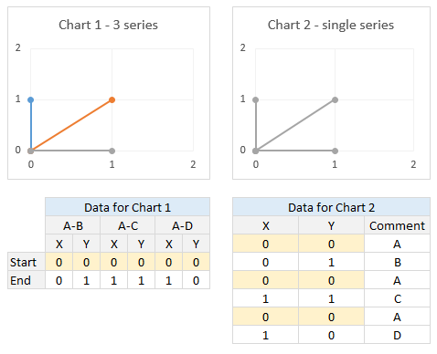
We can use far fewer series and still plot the same chart.
Lets say we have 4 people – A B C & D. For the sake of simplicity, lets assume the co-ordinates of these 4 are
- A – (0,0)
- B – (0,1)
- C – (1,1)
- D – (1,0)
And lets say, A has relationships with B, C & D.
That means we need to draw 3 lines, from A to B, A to C & A to D.
Now, instead of supplying 3 series for the chart, what if we supply one long series that looks like this:
(0,0), (0,1), (0,0), (1,1), (0,0), (1,0)
That means we are just drawing one long line from A to B to A to C to A to D. Agreed that it is not a straight line, but Excel scatter plots can draw any line as long as you provide a set of co-ordinates.
PS: This is a trick I learned from Roberto of E90E50. He used this trick in the winning entry of our recent dashboard contest.
See this illustration to understand the technique.
So instead of 190 series of data for the chart, we just need 20 series.
In the final chart, we actually have 40 + 2 + 1 series of data. This is because,
- 20 lines for weak relationships (dotted lines)
- 20 lines for strong relationships (thick lines)
- 1 line for highlighted person’s weak relationships
- 1 line for highlighted person’s strong relationships
- 1 set of no line & just dots for the people
How to generate all the 20 series of data:
This requires following logic:
- Assuming we need lines for the relationship of person n.
- That person’s dot location will be (Xn, Yn) and already calculated earlier (in the plotting dots around circle)
- We need total of 40 rows of data
- Every odd row will have (Xn, Yn)
- For every even row
- Divide the row number by 2 to get person number (say m)
- (Xn,Yn) if there is no relationship between n and m
- (Xm,Ym) if there is a relationship
We need MOD & INDEX formulas to express this logic in Excel.
Examine the download workbook to understand how its done.
Once all the line co-ordinates are calculated, add them to our scatter plot and format.
I used a macro to automate the formatting. It can be done manually too, just takes a little patience.
Slicer for selecting a person
This works only in Excel 2010 or above.
Select the first 2 columns of relationship matrix & create a pivot table.
Now, insert a slicer on Person name column.
Using simple IF formula, extract the selected person name from pivot table (examine download file for the logic).
And using the name, extract the subset of line data to separate range (2 sets of data – one for weak & one for strong relationships)
Add this new data to our scatter plot and format.
Format the slicer (using slicer styles) so that it looks slick.
Related: formatting slicers using styles.
NOTE About Slicers: If you change or add any data, you must refresh (from Data ribbon) to update the slicer. This can be automated with a macro, but I want to keep this file macro free.
[Alternative] Selecting a person with form controls
You can use either a list box or a range of clickable cells. See the 2003 compatible download file for an example of this.
Summary statistics
Using simple formulas extract statistics for the selected person and show them near the chart.
Adding labels to the chart (person names)
In our chart, we are showing person names instead of regular label like X or Y value. This is done with value from cells label feature in Excel 2013.
For earlier versions of Excel, I recommend using Rob Bovey’s excellent XY Chart Labels add-in.
Putting it all together
Once everything is ready, clean up the chart, slicer and other elements, put them together. And we are ready to go.

Download Network Relationships Interactive Chart Template
Click here to download the chart template workbook. The download is a ZIP file and it contains 3 workbooks – compatible with Excel 2013, 2010 & 2003+. Use the version that you need.
Please examine the formulas & chart settings to understand how it is constructed.
Note: Hit Refresh from Data ribbon to change slicer once you have added or modified data.
When to use network relationship chart?
A network graph is a good place to explore relationships between people in a project or team. It is especially useful when selecting a sub-set of people from large group to closely work on a project.
Any alternatives?
There is a popular Excel Add-in named NodeXL that can help you visualize and analyze relationships between people in a more in-depth fashion.
Check out Chord diagram & Cosmograph from E90E50 site for other ways to present this data.
Do you use these kind of charts?
I have used network charts earlier to depict relationships between various people or things. But I have never created such charts in Excel, I always used either Power Point or some other drawing program to create them. That is why I am excited about this chart. Figuring out the formula & graphing logic was fun.
What about you? Have you used such charts before? How do you like the network chart presented here? Please share your thoughts using comments.


47 Responses
O this looks cool!
Cool ideas! My first job was to build a social network analysis program. We investigated NodeXL but ultimately went to building something in Java using the JUNG library (http://jung.sourceforge.net/). We used in-degree tests for popularity as you did here, but also this other one called eigenvector centrality, which is very similar to google’s pagerank.
I am looking to trace and visualize multi-level parent-child legal entity relationships and aggregate ownership percentages across a global banking organization in a re-usable template. The data I have is entity & immediate parent, but need to link together to understand full ownership chain. Is this a plausible solution (above)? There are approximately 10k entities.
Great Post!
But I have an unrelated question. I am always curious how to make an interactive excel tutorial demo?(like your first demo at the beginning of this post)
Does this something that can be showed in PPT as well?
I always make presentations and this kind of demo is a great show to the audiances.
Thank you!!!
@Iceplant
The video’s you see here are created with Camtasia Studio
Camtasia records video and sound and can export it in many file formats
The Demo at the top of the post is an Animated Gif
But I am sure that PowerPoint can display a number of other file formats and Camtasia will have an export filter for that
Wow~ good to know. Thank you for sharing! 🙂
Iceplant,
Do you now of the recording tab in Power Point. You can screen record your sessions with it as a seperate video or put it in your presentation.
Hope this helps!
looks good!
Hi Chandoo,
Great post and great idea!
Thank you for mentioning our (Roberto’s :-)) work!
We downloaded your file and played a bit with it. We created a dynamic version where the labels are easier to add and refresh dynamically.
We used pie chart and rotated the “network” chart accordingly.
Here is a link to the file:
https://sites.google.com/site/e90e50charts/files/xlsx/stakeholder-chart-2010_with%20pie.xlsx
This solution has a positive side-effect: the chart plot area becomes a perfect square as we discussed here:
https://sites.google.com/site/e90e50fx/home/perfect-square-plot-area-perfect-square-gridlines
Have a nice day,
Cheers,
Kris and Roberto
The FrankensTeam
General question to the group, would not this be useful to dynamically show correlation between variables as well?
I have an Excel forecasting model with income statements, balance sheets, cashflow analyses, etc. I would like to create a map like the one shown here, but I don’t have any ideas of how to apply it to my model.
Any ideas out there?
I recon this chart would be very handy to display a persons technical ability, range of colours available for a product, or to show which ingredients can make a drink/meal. Eg change the names around the edge to names of code like SAS VBA C# etc and leave the selector as people’s names. If your a project manager you could use this to identify the best person for a particular job. Or if your tending bar you could put the mixers and ingredients around the edge then select the name of the cocktail your making to show the ingredients you need to put it together.
Cool Post! Great idea!
Have a nice day,
Its simply awaesome.
First off this is absolutely brilliant. There are quite a few cool ways of using excel charts that go out of the box, this blows them away. Truly awesome.
I’m curious as to whether the percentages in the “How popular is…” box should be dividing by the total number of people minus one? As is, instead of counting the possible number of people Mona (for example) knows, it’s counting the possible number of people plus one (Mona).
Could you leverage this to show the relationships between a) individuals and b) trade groups to identify gaps or “over-subscription” versus the relationship between a small set of people like this?
If I wish to extend this to over 20 stakeholders, how would I go about modifying it? Thanks in advance, would be a huge help!
Hello I have a quesiton regarding the chart. How is it possible to highlight in a different colour the selected person? I see that in the “Data&Calc” coloumn Z18 we have the highlighted person but how this can be reflected in the chart?
is it linked with the XYChartlabel addin?
thanks for your feedback!
Hey John,
Did anyone every answer you about how to modify this to more (or less) than 20 stakeholders?
Thanks!
Alyssa
This is awsome chandoo..
The relationship between people are bi-directional (e.g. i know you, so you know me). How would you create a chart of country politics as in:
“I like you but you don’t like me back ???”
I’ve been trying to resolve this for a while so please let me know if you have any suggestions.
THX
Thank you for presenting your stakeholder graph. It is really good. I can’t wait to get it sync’d up with my VBA programs.
I have a couple of questions.
1) In your example you have the slicer floating over the graph on the “output” worksheet. I can only get the slicer to be on the “Data & Calc” worksheet. How do you get a slicer on the “Output” worksheet?
2) My slicer has a button labeled “(blank)” at the bottom. Your slicer does not. How do you remove that button?
Excel 2010.
Thank you.
hi.
how can I put more dots on the graph ?
thanks
Hi everyone, it’s my first payy a visit at this
web page, and post is actually fruitful designed for me, keep
up posting these types of articles.
How many rows (horizantal lines) do you need for 42 people? If you used 39 for 20 people in your data set for weak and strong, how do you calculate it?
I am only doing one relationship line to show collaborations. Some points are not showing up as connecting though when they are two names next to each other, though. I wonder if I don’t have enough data points…
thanks!
Cool tool. I’ve been interested in SNA for awhile now, but this is the simplest way I’ve seen to play with it.
An important question: I was able to add names (and data) to the “Data & Calc” tab, but how do I get those names to appear as buttons on the “Output” tab? The added names show up in the network diagram, but without named buttons, I can’t select those (new) names in order to highlight their connections. Please advise.
Is it possible to import this chart in PowerPoint presentation and save functionality of the buttons?
Hi Chandroo
This website will be my go-to for any Excel chart ideas! It’s amazing, thanks Chandroo.
Can I ask you, or anyone else, if they know of a way to make the relationship lines appear as curves, rather than straight lines?
Thanks for any tips and advice.
Regards
Henry
Really looking to see if we can increase the number of stakeholders over 20, how could i modify this?
Thanks for the great content and references.
Thank you – very impressive, exactly what I was looking for to map identities.
I know two people have already brought this up, but is it possible to display more than 20 data points on the graph? I need up to 100 points, but have had a hard time extending the template.
I hope someone knows how to change this.
Thanks in advance
I’m here with the same question! I don’t suppose you managed to get anywhere? This is way beyond my expertise!
Impressive !!
Always puzzled by Excel possibilities.
My team and I are observing relationship in a group of animals on a daily basis. Your routine is nearly what we need with the addition of having a number of interactions instead of categories of relation (absence, weak, strong).
Do you know how we can get the width of the connector proportional to the number of interactions observed ?
Thanks in advance
Hi Martin,
The line thickness is not something you can control directly. You need to set up different series, one per thickness (based on the relationship level), just as I have shown in the example.
All the best.
Hi
We’re using the core of this to help model student relationships – it’s a great piece of Excel work – thank you
Ian
So I’ve managed to expand out all the tables to create a template for up to 100 users. Problem I now have is that the lines aren’t matching to the name labels in the graph. I assume this is something to do with the radius value? Any ideas? Happy to share where I’ve got to so far if anybody is interested in helping me through the final steps?
Hi Chris,
I only need to go up to 40 people. How do I do that? Thanks,
Rob
Is there a way to have the points line up on a worldmap, and show instead of people the relationship mapping between countries?
See this… https://chandoo.org/wp/state-migration-dashboard-contest-entries/#option_37
Is there a way to export this to ppt?
Not possible as this is an interactive chart.
Is there a way to change the text of “Select someone” in the selection panel?
You can edit the text in the file