
Today lets close some gaps.
Recently I saw this interesting chart on Economist Daily Charts page. This chart is based on World Economic Forum’s survey on how women compare to men in terms of various development parameters. First take a look at the chart prepared by Economist team.
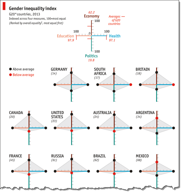
So what are the gaps in this chart?
This chart fails to communicate because,
- All country charts look same, thus making it difficult to spot any deviations.
- We cannot quickly compare one country with another on any particular indicator.
- It does not provide a better context (for eg. how did these countries perform last year?)
But criticizing someone’s work is not awesome. Fixing it and making an even better chart, that has awesome written all over it. So that is what we are going to do.
Fixing the gaps in Gender Equality chart
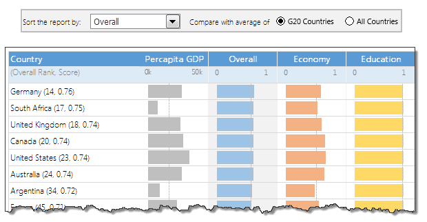
First take a look at the improved chart. Play below video.
Step 1: Getting the data for this chart
Although folks at Economist have not included source data, the good people at WEF have provided detailed PDF reports (2013, 2012) where all the data is naked and waiting for us, analyst to pounce and go nuts.
I copy pasted table in to Excel.
While 2012 data loaded alright, 2013 loaded in a weird fashion.
So we move to step 2.
Step 2: Cleaning the data
I feel dirty every time I clean a piece of data 😉
But I also like it (cleaning part, not feeling dirty part). I learn some techniques when I am working with messy, sticky and disorganized data sets.
The 2013 data is pasted in to Excel in this format.
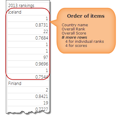
From this, we need to transform our data to:
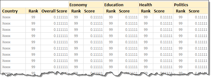
If we know magic, we could point our wand at the table and say something like, Mobiliarbus Datum.
Alas. We are muggles. So lets rely on the most potent magic we know: Excel formulas. Using INDEX + MATCH combination, we can easily convert 2013 data to the format we want.
The actual formula to fetch overall rank (2nd item in the list for each country) is,
=INDEX(gaps2013,MATCH($B5,gaps2013,0)+1)
Explanation:
- gaps2013 is the range where all the 2013 gender gap survey data is copied
- B5 contains the name of the country for which we want the data.
- +1 because we want to get rank, not country name.
For more, read how to get VLOOKUP + 1 item.
Step 3: Set up form controls
Now that we have sparkling clean data, lets create necessary form controls on our output sheet.
![]()
 We need 2 controls.
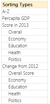
- A combo-box (drop-down) control so that user can select what field to sort the report on.
- A set of option buttons to specify which average to compare.
The combo-box is set up to use the list of values shown aside.
Related: Introduction to Excel Form Controls.
Lets link these to 2 cells, named sortCol & avgType on a different sheet. Call this sheet as calculations. All our formulas will go here.
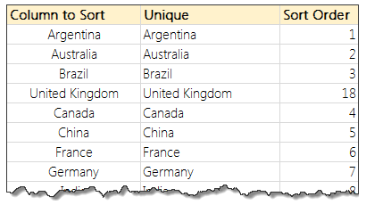
Step 4: Find sort order based on the selected column
This is the tricky part. I am going to give highlights here and point you to a link where you can learn more.
- Fetch the column we want to sort in a range of cells.
If sorting a number column:
- Make the column unique by adding a very small running fraction.
- This ensures that if our data has duplicates, still our formula works.
- Find the sort order of each item using RANK() formula.
- Refer to Sorting KPIs using Formulas article for more on this technique.
If sorting a text column:
- Find the sort order using COUNTIF() formula.
- Refer to sorting text using formulas article.
Step 5: Re-arrange all data in the sort order
Using INDEX formula, rearrange all data according to the sort order.
Step 6: Calculate % change values
Based on 2012 & 2013 scores, calculate % change and place them in the last 5 columns.
Step 7: Calculate averages
Calculate averages (both G20 & all country values) for all the columns and place them somewhere on your calculations worksheet.
Related: Calculating the average of every nth item.
Step 8: Create charts
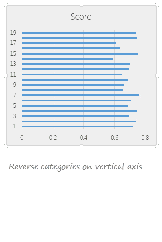
Here is the process for creating chart for Overall Score (2013). The same process is used to create all the charts.
- Select all the numbers in overall score column.
- Create a bar chart
- Select vertical axis and press CTRL+1 to format it.
- Select “Categories in reverse order.”
- Adjust series gap to 25%
- Set horizontal axis min to 0 and max to 1 and remove the axis.
- Remove vertical axis, grid lines
- Remove title
- Fill chart background & plot background with no color.
- Set chart outline to no outline.
- And you are done!
See the demo aside to understand the process.
Step 9: Add average as secondary series to the chart
Calculate which average to use in the chart based on the avgType value. And fetch that number to a cell.
Now add average to the chart as a line. This can be done by,
- Adding average point to the chart as second series
- Converting this series to scatter (XY) plot.
- Adjusting the X & Y values of the average point.
- Adding 100% positive (or negative) error bar
- Formatting the error bar to make it look like a line.
- Removing any axis, grid lines added in the process.
Step 10: Oh wow, this is getting long. Have a coffee
I guess this is now a fairly long process. But closing gender gaps (or gaps in the gender gap chart) is never easy. So have a cup of coffee or tea. Rejuvenate and come back.
Step 11: Create all other charts
Follow the same process and create rest of the charts.
One easy way to create rest of the charts is,
- Copy the first chart and paste it elsewhere.
- Select the bars and edit the range address in the formula bar.
- Select the average point and edit that too.
- Adjust axis if needed.
- And you are done!
Step 12: Put everything together
Create a nice table like structure in your output tab and put everything together. Re-size and position the charts as needed. Make sure the colors are nice. Add conditional formatting to highlight column being sorted and you are done!
Missing Steps
I have deliberately omitted a few steps in this process to keep it simple. For those of you with a keen eye:
- Using conditional formatting data bars for the % change column.
- Turning on / off last column in the report based on sort selection using conditional formatting.
- Adding data labels to the country names based on the sort selection.
Download this Excel chart
Click here to download this Excel chart. Play with it. Explore the chart settings, formats, formulas and controls to understand it better.
Conclusions – What does the Gender Inequality Chart say?
After all this analysis, 2 things are clear.
- In most countries, women have high equality with men when it comes to health or education.
- The real gap seems to be in politics & economical development of women.
While this may seem like common sense, it also means, World Economic Forum people should measure inequality on some more parameters. There is little point tracking and analyzing indicators related to health or education (especially in OECD or Western countries).
What do you think?
Want to fill gaps in your Excel knowledge
While no one appreciates gender inequality, we all love awesomeness inequality. There is nothing wrong in wanting to be more awesome than your peers. And here is how you can be unmatched…
- Using Panel charts to understand data
- Spot matrix charts – alternative to radars
- Analyzing performance of stocks using charts
- Suicides & Murders data – interactive analysis
- Visualizing world education rankings
- Survey data analysis with in-cell charts
Want some challenge… How would you analyze this data?
If you want some challenge, go ahead and download the file. It has all the data for 2012 & 2013. Analyze it and share with me your charts. You can email me at chandoo.d@gmail.com or upload your files somewhere and post the links in comments. I would love to see how you can analyze and present this data.


8 Responses to “Closing gaps in this Gender Equality Gap chart…”
Fantastic teaching, Chandoo.
Note to would-be ninjas willing to spend time learning: follow the steps and recreate Chandoo's chart (all the steps, mind), and while there'll never be more tan one Chandoo you will be well on your way to awesomeness!
- Juanito
Very nice work, Chandoo.
Thanks Chandoo, yet another briliant article.
Hi Chandoo,
nice job. But why not adding the data labels to the bars and to the average? Would be quite good to be able to read all values exactly.
Joerg
Hi Chandoo,
Great stuff. Would it be possible to do this in excel 2003 as well?
Henk
Great chandoo
Awesome article.
[…] Closing gaps in this Gender Equality Gap chart […]
what is holi in india & how it look like