
A while ago, we published a new year resolution template. This was a hit with our readers with thousands of you downloading it. During last week, Peppe, one of our readers from Italy, took this template and made it even more awesome.
The original template had tasks and completion check marks. As you finish each task, you can see overall progress too.
Peppe added priorities to this. With his new version, progress is measured based on how much priority we assigned that particular task. Pretty neat eh?!?
Personal Todo list with Priorities – Demo
First take a look at Peppe’s todo list.

How is this made?
Using lots of Excel goodness of course. The basic components of this todo list are,
- Check boxes – to mark each activity as done (or not done)
- Data validation – to assign priority (1 to 5) to each activity
- Conditional Formatting – to highlight a row when the activity is marked as done
- Thermo-meter chart – to show the progress as you mark each activity done
- Formulas – to calculate % done based on how many activities are done & their priorities.
Since first 4 items are already explained on Chandoo.org, let me focus on the formula part.
Calculating % completion based on priorities:
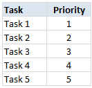
To understand this problem, lets imagine, we have 5 tasks & priorities like below:
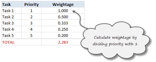
Step 1: Calculating weights
First step is to calculate how much weight each task should get. This is a simple job of inverting priority values (1/priority value). We will get this.
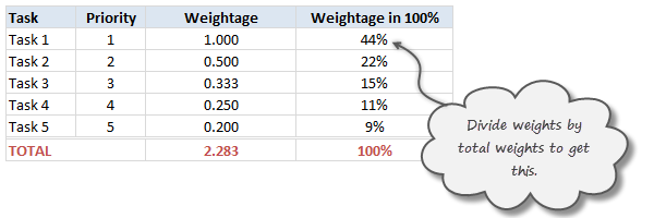
Step 2: Calculate weights to 100%
Next, we adjust the weights so that their total is 100%. To do this, we just divide a task’s weight by total of all task weights.
Step 3: Calculate % done only if a task is marked as done
Now, we just use TRUE / FALSE values generated by the check boxes to calculate % done. For this, we just need to multiply 100% weights with TRUE or FALSE values.
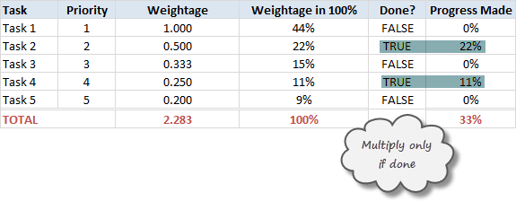
The total of this column gives us how much % of all tasks are done.
Note on weights for priorities
In this approach, we are assuming that doing one priority 1 task gives same output (%done) as doing two priority 2 tasks, three priority 3 tasks etc.
That means the weight enjoyed by priority 1 task is twice that of priority 2 task.
Some other possibilities are,
- Priority 1 is 1, 2 is 0.8, 3 is 0.6…
- A mapping table telling us how much each priority weighs
Read weighted averages in Excel to understand more.
Download this todo list template
Click here to download this template and chase that todo list in style. Examine the formulas in hidden column to understand this better.
Thank you Peppe
I find this template quite simple, yet powerful. It shows how much we can do with Excel by using a little creativity, simple features (conditional formatting, form controls etc.) and a some motivation.
Peppe, Thank you so much for sharing this with us.
If you enjoyed this todo list template, go ahead and say thanks to Peppe.
Also, use comments to share how you handle to dos & pending tasks using Excel. Share your tips & ideas with all of us.
Update
Over in the Chandoo.org Forums, Asshu has updated this witha VB Interface
Have a look and use if from: http://chandoo.org/forum/threads/to-do-list-vb-interface.28973/
More todo lists: Simple todo list in Excel, To do lists & Project Management


7 Responses to “Project Dashboard + Tweetboard = pure awesomeness!!!”
I would like to see actual hash-tagged DM tweets go out to the specific information consumers. That would be an interesting way to communicate the key daily data to interested parties.
A Twitter-like secure application like Yammer might be a good fit with this.
For example, how about daily tweets to selected user groups (secure) that would display sales, bookings, cash receipts, cash disbursed and a second version that would show the same info for MTD, QTD or YTD figures.
@Dan, it would be great. I did not taught about implementing it on this dashboard because twitter is blocked to the whole intranet here. However, there's a discussion here about how can we send these tweets to blackberries (probably through e-mail) automatically. (I'd like to see this implemented on a jabber restricted network as well, but here it'll probably not happen)
The wrap-up versions you mentioned doesn't apply to my particular scenario, but on a sales tweetboard it would be a great tool indeed - choosing who will receive which message according to hashtags. I'll think on something, thanks for the advice. 🙂
(Ah, btw, I'm Fernando... 🙂 )
@Dan: That is a fun idea. Instead of tightly integrating twitter functionality with a dashboard, i think it would be cool if we have a "tweet this" button that users can click after selecting a range of cells. We can easily show a dialog with the concatenated output of the selected cells and ask user to edit the text and eventually "send to twitter".
For eg. you can select the annual sales figure cell and click on "tweet this" button upon which a dialog will show the value. Then you can pre-pend it something like "DM @boss look at our sales this year: "
@Aires.. thanks once again.
Wow it looks really good. Not sure though how much the tweet facility would help in real world project management, but certainly having a dashboard on a project should be a key deliverable when learning how to manage a project
The other use of this is during the software development life cycle especially when you have parallel streams of development and testing going on. Using a dashboard is a quick way for everyone on the team to see where the project is at and how it all fits together.
Regards
Susan de Sousa
Site Editor http://www.my-project-management-expert.com
Hi Chandoo,
I purchased the project management toolkit but the dashboard shown above with the imbedded scroll bars. Is it included in the project pack??
Thanks
Sue
The gantt chart section of this dashboard is similar to one I have recently created: http://xlcalibre.com/hr-dashboard-gantt-chart-traffic-light-reportIt has a similar approach with scroll bars, but has a couple of additional features. I've tried to incorporate a traffic light report element, and also allow the timescale to adjusted so that can view it by days, weeks or months.I really like the other tables that you've incorporated, I may well try to replicate them to improve my version!
I am a monitoring and evaluation consultant in international development, and one of the services I offer is to help non-profits and foundations develop performance dashboards. I often advise them to develop dashboards for ongoing programs, rather than for one-time or pilot projects, because of the time involved. I am trying to find out from a few people how long it takes you to develop a project management dashboard, and to what extent the indicators vary from one project to the next.