
Congratulations to you if your job does not involve dead lines. For the rest of us, deadlines are the sole motivation for working (barring free internet & the coffee machine in 2nd floor, of course). So today, lets talk about a very familiar problem.
How to highlight overdue items in Excel?
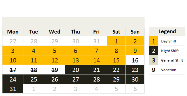
The item can be an invoice, a to do activity, a project or anything. Here is an example of overdue, upcoming activities highlighted.

The problem – Highlight due dates in Excel
Lets say you work at Awesome inc. and you have list of to-do items as shown below.

And your problem is,
- Highlight items & due dates, subject to these conditions

- And of course start working on the items that are due
The Solution – Conditional Formatting
As you can guess, highlighting the due items is easier than actually doing them. First lets look at the solution and then learn why it works.
Lets assume that,
- The data is in the range – B6:D15, with Items (column B), Due date (C) and Completed?(D)
How to apply conditional formatting rules
We need to apply 3 rules. Follow below steps:
Highlight overdue items:

- Select the entire range (B6:D15) and from home ribbon select conditional formatting
- Click on New rule
- Select the rule type as “use a formula…”
- Write =AND($C6<=TODAY(),$D6<>”Yes”)
- And set fill color to red & font color to white.
Highlight upcoming items:

- Add one more “use a formula…” rule
- Write =AND(MEDIAN(TODAY()+1,$C6,TODAY()+7)=$C6,$D6<>”Yes”)
- And set fill color to green.
Completed items rule:

- Add another “use a formula…” rule
- Now write =$D6=”Yes”
- And set font color to dull gray from formatting button.
Now, the items will be highlighted based on the current date (TODAY) and change colors as you make progress.
Why does it work? – Explanation
At this point you may have 2 burning questions.
- Why does this work?
- How the heck am I supposed to ship 100 units of smile.
Lets talk about the solution & understand why it works.
Understanding the highlighting conditions
We have 3 conditions in our highlight table (shown above).
- If done show in dull gray color
- Not done & due in next 7 days show in orange color fill.
- If not done & already due show in red fill, white color
Rule for completed items:
The first condition is easy to check. We just see if a todo item is completed and then highlight the whole row dull gray color. So we write =$D6=”Yes” as the condition. We use $D6 (not D6) because we want Excel to look at column D (completed?) even when we are highlighting other columns (B – Item, C – Due date).
If not done & due in next week:
This is tricky. We need to check,
If completed is not yes
AND
If due date is with in next week
So we start with an AND formula. We write =AND($D6<>”Yes”
Then to check if due date is in next week, we use MEDIAN formula, like this MEDIAN(TODAY()+1,$C6,TODAY()+7)
So the condition becomes =AND(MEDIAN(TODAY()+1,$C6,TODAY()+7)=$C6,$D6<>”Yes”)
If already due:
This is another simple AND formula =AND($C6<=TODAY(),$D6<>”Yes”)
Remember:
We need to use $D6 & $C6 (instead of D6, C6) because we want Excel to check Completed & Due date columns. By removing the $ Excel will check relative columns and the conditions would not work!
More: Using relative vs. absolute references in Excel formulas
Now that we understand how this works, give me a big smile. And repeat that 99 more times & you know how to ship 100 smiles 🙂
Highlight overdue items – Video
If you are still confused about the conditional formatting rules for highlighting overdue items, check out this video. Watch it below or see it on my YouTube channel.
Download Example File
Click here to download example file. Break it apart, play with it to understand the whole highlight if due thing.
Note: I use random formulas to generate due dates & completed values. Press F9 to get fresh set of dates. Start typing your own values to remove formulas.
How do you handle dead-lines?
Do you use conditional formatting to see which items are due? I use conditional formatting for this all the time. What techniques you use? Is your dead-line criteria very different than shown above? Please share your tips & ideas with us using comments. I would love to learn from you.
Using Conditional Formatting & Dates – More Examples
Here are a few useful articles if you use Excel to track to do items & reminders.
- Conditional formatting & Dates – an introduction – Must read
- Working with date & time values in Excel – a complete overview
- Another ovredue items example – activities by employee
- Christmas shopping list in Excel: conditional formatting to track budgets, bought items etc.
- Employee shift calendar in Excel: Using dates, shift data to show busy & dull times.
- Annual goals tracker: Track goals by % completed


53 Responses to “Conditionally play sounds when a cell value changes”
There is another alternative of doing this quite easily: Yes, Excel is able to talk to you!
Assume you are having a calculated or otherwise changing value in cell A1 (e.g. =RANDBETWEEN(0,100)), a threshold in cell B1 (e.g. 50) and a text in cell C1 (e.g. "Threshold exceeded").
Go to the VBA-editor (ALT-F11) and copy the the following procedure into the corresponding sheet:
Private Sub Worksheet_Calculate()
If Range("A1").Value > Range("B1").Value Then
Application.Speech.Speak (Range("C1").Value)
End If
End Sub
Excel will read the text in cell C1, whenever the value in cell A1 is large than the threshold in cell B1. Turn your speakers on and play with cell C1. It sounds a bit funny sometimes, especially when you try to make Excel read texts in other languages than English. But it works...
I'm trying to use UDF and the speech aspect. I want a cell to calculate character total and when it reaches a limit it will speak the value. For some reason I can't get any UDF to show up in the list or work. I've tried simple ones such as:
Function BeepOnce()
Beep
End Function
with: =If (B3>30, BeepOnce(),"") in the cell but it gives errors. Confused.
When a cel char count reaches 30 and I'm typin gfast, it will report the number.
Im a blind writer and this would be very helpful. I can't get any to work though. Can't get any UDF to show up anywhere.
I tried keying in the code exactly as you have:
Private Sub Worksheet_Calculate()
If Range("cx15").Value > Range("cy15").Value Then
Application.Speech.Speak (Range("cz15").Value)
End If
End Sub
When I try to run the condition, I get a compliation error.
The formula in my excel spreadsheet in cx 15 is: =IF(CO15>120,1,0)
cy 15 = 0
cz 15 = "Less than 120 days"
I'm driving myself crazy - HELP!!
@Mary
The code you supplied and below works as it should in Excel 2007
===
Sub Worksheet_Calculate()
If Range("CX15").Value > Range("CY15").Value Then
Application.Speech.Speak (Range("CZ15").Value)
End If
End Sub
===
There are 2 reasons it maynot be working
1. Make sure it is on a Worksheet Object in VBA for the page you are working on not in a general code module
2. Make sure the " characters are real, often you can copy and paste text from here and although the " mark look ok, they are not the correct characters, If it isn't working retype them all
Hi Hui,
The SPeech VBA is working...but it reacts to all the changes that is taking place in various cells in the sheet. I need this speech vba to react to only when changes happen in a particular cell (A1) and particular sheet...is there a vba that can help me find a solution. Thanks in advance for your assistance.
@Anil
Some of the comments above discuss that requirement
Please read those first
YEAH - thanks so much Hui. I had it in the general code module.
Another question?
Can I have this function check a range of cells in Excel?
The code as it is now is checking cells CX15, CY15 and CZ15
I need it to check from rows 15 - 45?
@Mary
Sub Worksheet_Calculate()
Dim myText as String
For Each c In Range("CX15:CX45")
If c.Value > c.Offset(0, 1).Value Then
myText = "Row" + Str(c.Row) + " " + c.Offset(0, 2).Text
Application.Speech.Speak (myText)
End If
Next
End Sub
I keyed in the code exactly as above and I get a runtime error 1004 - application defined or object defined error.
Sub Worksheet_Calculate()
Dim myText as String
For Each c In Range(”CX15:CX45?)
If c.Value > c.Offset(0, 1).Value Then
myText = “Row” + Str(c.Row) + ” ” + c.Offset(0, 2).Text
Application.Speech.Speak (myText)
End If
Next
End Sub
The formula in my excel spreadsheet in cx 15 is: =IF(CO15>120,0,1)
cy 15 = 0
cz 15 = “Less than 120 days”
The code is in a VBA worksheet - any thoughts as to what I'm doing wrong?
Mary
you need to be very careful copying text of the web
There are times where a character " will copy and look like a " but is in fact not a "
If you have copied the above go through the code and manually replace all the " characters with a " character
Also make sure the code is on the code page for the sheet you are working on, not a code generic module page in VBA
The above string works wonderfully - however, every keystroke in Excel initiates the function. Is there a way I can set it to run on command?
Mary
The following will run whenever there is only a change in the area CX15:CZ45
.
Private Sub Worksheet_Change(ByVal Target As Range)
Dim myText As String
Dim TR As Integer
Dim TC As Integer
TR = Target.Row
TC = Target.Column
If TC >= 102 And TC = 15 And TR c.Offset(0, 1).Value Then
myText = "Row" + Str(c.Row) + " " + c.Offset(0, 2).Text
Application.Speech.Speak (myText)
End If
Next
End If
End Sub`
.
Otherwise you can go back to the following code and add a Button or a Shape to your worksheet and link the macro to it so that it only runs when you click on it
.
Sub Speak()
Dim myText As String
For Each c In Range("CX15:CX45")
If c.Value > c.Offset(0, 1).Value Then
myText = "Row" + Str(c.Row) + " " + c.Offset(0, 2).Text
Application.Speech.Speak (myText)
End If
Next
End Sub
Hey Hui,
I came across this site by mistake.
Man this is so COOL.
Will this also work as
Column A has all Names, Column B is Blank.
When a Cell in Column B is not Blank ("") then speak the corresponding name in Column A
It doesn't make any sense to write multiple if-then statements to make it work.
I know I caught this few months late, but I could really use this
Thanks
@Amin
Try the following
Copy and paste it into a Worksheet Module for the Worksheet in VBA you are working on
Hui,
It works but it repeats all name as:
Cell A1=John, A2=David, A3=Lisa.
When Cell B1 is not Blank then is speaks John.
Next when Cell B2 is not Blank it speaks John and David. Second time it should only speak David (fyi B1 and B2 both are not blank)
example: I want it to speak when certain individual logs in. But procedure, when someone logs in it speaks all the people who have already logged in.
how should I change that?
Thanks for assistance.
@Amin
Try this modification
Thanks Hui that worked perfectly.
How do I make it work with 4 sets of columns
Same as before but with 8 columns
Columns(A,C,E,G) have names.
Columns(B,D,F,H) are blank to start with.
I tried to few ideas my way but nothing worked
@Amin
I need a Excel Speaking code for the below condition
If I3 ="Buy Alert" ' If I3 cell has Buy alert Text then, sound should be like " Vivek Buy Alert For Infosys(next cell text) and
If I3 ="Sell Alert" ' If I3 cell has Buy alert Text then, sound should be like " Vivek Sell Alert For Infosys(next cell text)
Please help me to fix this in my excel
This is soo cool. Im looking for a similar thing
Source B1:B200 have an output in Range C1:C200 every cell in the range C1:C200 checks the condition in D1:D200 and with conditional formating change color when value in C1>D1
How can I play a standard windows sound when C1>D1 and another sound when C1<D1
hi hui,
i am a trader in stock market
i can export stock rate to excel sheet from my trading software..
is it possible that when stock rate changes the cell speaks means, e.g.( if stock rate is 25 and if it changes to 26 then cell should speak twenty six,if it further changes to 26.50 it speaks twenty six point fifty)
hope u can understand my problem.
waiting for your reply
@Viral
Have a look at: http://chandoo.org/wp/2008/08/04/play-sound-when-cell-value-changes/
HI
I HAD A LOOK AT YOUR SUGGESTIONS BUT UNABLE TO UNDERSTAND
I AM USING OFFICE 2003,
I TRIED THIS
"""""Assume you are having a calculated or otherwise changing value in cell A1 (e.g. =RANDBETWEEN(0,100)), a threshold in cell B1 (e.g. 50) and a text in cell C1 (e.g. “Threshold exceeded”).
Go to the VBA-editor (ALT-F11) and copy the the following procedure into the corresponding sheet:
Private Sub Worksheet_Calculate()
If Range(“A1?).Value > Range(“B1?).Value Then
Application.Speech.Speak (Range(“C1?).Value)
End If
End Sub""""""
BUT I DON'T UNDERSTAND WHAT TO CALCULATE IN ("C1")?? WHICH RANGE TO BE GIVEN TO ("A1")
BASICALLY I DONT GETTING IT PROPER
WHAT I WANT IS IF LAST TRADED PRICE (LTP) IN CELL CHANGES THE EXCEL SHOULD SPEAK THE VALUE WHICH IS IN THE CELL
MEANS IF LTP IS 26.60 AND IF CHANGES TO 26.70 IT SHOULD SPEAK TWENTY SIX POINT SEVENTY AND IF IT CHANGES FURTHER TO 26.80 IT SHOULD SPEAK TWENTY SIX POINT EIGHTY
PLEASE HELP ME....
I am using the following code for sound. It was working well but has suddenly stopped respondig. Could u help relating to the matter
Private Declare Function PlaySound Lib "winmm.dll" _ Alias "PlaySoundA" (ByVal lpszName As String, _ ByVal hModule As Long, ByVal dwFlags As Long) As Long
Function Alarm(Cell, Condition) Dim WAVFile As String Const SND_ASYNC = &H1 Const SND_FILENAME = &H20000 On Error GoTo ErrHandler If Evaluate(Cell.Value & Condition) Then WAVFile = ThisWorkbook.Path & "\sound.wav" 'Edit this statement Call PlaySound(WAVFile, 0&, SND_ASYNC Or SND_FILENAME) Alarm = True Exit Function End If ErrHandler: Alarm = False End Function
Hey Hui, Great stuff really helpful, Although I am having the same issue as Amin, where any keystroke entered prompts the text to speech. I tried fitting in your fix for Amin but I didn't have success, below is the code I am successfully using, however each keystroke prompts the voice, and the voice lists each cell that qualifies the formula I am using.
Sub Worksheet_Calculate()
Dim myText As String
For Each c In Range("bf4:bf45")
If c.Value = 1 Then
myText = c.Offset(0, -57).Text
Application.Speech.Speak (myText)
End If
Next
End Sub
I tried
Private Sub Worksheet_Change(ByVal Target As Range)
If Target.Column = 1 Then Application.Speech.Speak (Target.Offset(0, -57).Text)
End Sub
any Mods to limit the speech to only what was most recently qualified?
@Elliot
Try:
Private Sub Worksheet_Change(ByVal Target As Range)
If Target = 1 And _
Target.Column = 58 And _
Target.Row >= 4 And _
Target.Row <= 45 Then _ Application.Speech.Speak Target.Offset(0, -57).Text End Sub
Hi Hui,
I tried that code
Private Sub Worksheet_Change(ByVal Target As Range)
If Target = 1 And _
Target.Column = 58 And _
Target.Row >= 4 And _
Target.Row
Thanks
Seems like the previous cut off the rest of my message, anyways above code the object module didnt allow me to step inot it, I keep getting a pinging, while on the same object module I inserted the previous code I had running and it allows me to step in! Confusing.
Thanks.
Hey Hui,
So the code works, I discovered the code does not recognize the column because each cell in the column is an if then formula with a returned value, such as "1" for true "0' for false, it only works when I remove the formula and insert a 1 in a cell, any vba fixes for this, or I can try a temp. workaround.
Hey Hui,
Disregard the above. The code works, however only after I hit enter in the target column, When the column updates by itself the code doesn't fire.
Hi Hui,
Amaze to see all the above information. I hope even I get a solution to my problem.
I am trying to use this excel as a token machine. I have linked up this token sheet with other sheet which shared by four users. If any off the users changes the token number, it gets change in our main display but the problem it doesnt say the token number. WHAT I EXACTLY WANT IS AS THE VALUE GETS CHANGED IN ANYONE OF THIS SPECIFIED CELLS (B4, B5, B6 & B7 THE EXCEL MUST ANNOUNCE THE NUMBER. For example If in cell B4 the number 7 comes, so the excel should tell " TOKEN NUMBER 7", after that in cell B7 is updated 21, so its should again tell as " TOKEN NUMBER 21"... and so on it should keep doing the same.
I hope I get my solution at the earliest.
Thanks
Raj
Dear Sir,
I read your blog, it's very nice. I am a trader, & need a help from your side.
If my stock goes below -5.5 % ( column is = L,M,N,O) then it has to automatically change it's color & make a beep sound or alarm. Please write the code for this query.
Thanks in advance,
Warm Regards,
Nagesh
@Nagesh
Try the following
Private Sub Worksheet_Change(ByVal Target As Range)
If Target.Value < -0.055 And Target.Column >= 12 And Target.Column <= 15 Then Application.Speech.Speak Target.Text Target.Interior.Color = 123456 'Change to suit End If End Sub
hi sir,
i tried your coding today,It works for color and sound didn't come for below -0.055!
but getting the below error
Application.Speech.Speak Target.Text ( it's in yellow color in vb code sheet). Also got error like run time error, application defined or object error! I am using ms excel 2003.
please advice me
@Nagesh
That won't work in 2003
I'll see what options there are tomorrow
It's sleeping time here
ok sir,
See you tommorrow, Sleep tight, sweet dreams, bye
nagesh
@Nagesh
I think the blog software removed some details
The code as posted was
Private Sub Worksheet_Change(ByVal Target As Range)
If Target.Value LTE -0.05 And Target.Column GTE 12 And Target.Column LTE 15 Then
Application.Speech.Speak Target.Text
Target.Interior.Color = 123456 'Change to suit
End If
End Sub
Replace GTE with >=
Replace LTE with <=
Hi Hui,
Thanks for your kind reply. I will try this ..
Regards,
nagesh
Hi Hui Sir,
I tried your updated coding, again it's showing same error. Sir, i will make you things clear as follows"
1) I am using MS EXCEL 2003 & It's a part of MS OFFICE STANDARD EDITION 2003.
2) I'm new to this excel, I need formula for the excel and coding for vb .
3) Sir, Below is the Data needs to play sound when the Number comes down -5.5%. It's in L,M,N,O, P Column of Excel Respecitively!
%Total 1 = L Column; Optional = M Column; Calc=N Column, Final=O Column, Additn = P Column in Excel Respectively!
%Total 1 Optional Calc Final Additn
1.0664851 -5.567 -0.499205809 -0.198547765 1.76
4.44350551 -0.1267561 -0.348579275 -0.237667688 2.66
-2.2927545 -2.651762402 -2.472258486 -2.562010444 -2.24
1.194029 0.608955224 0 0.304477612 0.1
Sir please advice me, It's very impt to me to play sound when it comes down -5.5 %, Once it's done, i'll be very happy.
Also, i want to learn online excel vb from your end if you providing excel training, please tell me fees structure and discounts for the excel training.
Expecting Solutions for my queries and hope you solve.
Thanks for your kind reply for my previous mails.
Warm Regards,
Nagesh
Hi Hui Sir,
The code you adviced me is :
Private Sub Worksheet_Change(ByVal Target As Range)
If Target.Value = 12 And Target.Column < = 15 Then
Application.Speech.Speak Target.Text
Target.Interior.Color = 123456 'Change to suit
End If
End Sub
It's working fine, but only problem is :-
1) It's speaking for all numbers like, -1 %, -2 %, -5%.etc.., I need only for -5.5%.
2) In Cell "A" , I HAVE LIST OF MEDICINES like "Ranbaxy - A2 ", "Cipla - A3", "Micro Labs - A4" upto "A 168". If the data in "L,M,N,0,P" Column comes down in b/w -5.5 % to -20.5 % then , Ms Excel 2003 has to Say: Ranbaxy -5.5 %, Cipla - 6.6 %, Micro Labs - -10 % etc..
@Nagesh
The code I posted is:
Private Sub Worksheet_Change(ByVal Target As Range)
If Target.Value LTE -0.05 And Target.Column GTE 12 And Target.Column LTE 15 Then
Application.Speech.Speak Target.Text
Target.Interior.Color = 123456 ‘Change to suit
End If
End Sub
Replace GTE with >=
Replace LTE with <= If this isn't clear, please post a file in the Forums http://chandoo.org/forum/
Hi Hui Sir,
i'm trying to post file in the forum : http://chandoo.org/forum/, it's not taking there. Please Help me the below, Please sir, please
The code you adviced me is :
Private Sub Worksheet_Change(ByVal Target As Range)
If Target.Value = 12 And Target.Column < = 15 Then
Application.Speech.Speak Target.Text
Target.Interior.Color = 123456 'Change to suit
End If
End Sub
It's working fine, but only problem is :-
1) It's speaking for all numbers like, -1 %, -2 %, -5%.etc.., I need only for -5.5% to -20.5%
2) In Cell "A" , I HAVE LIST OF MEDICINES like "Ranbaxy – A2 ", "Cipla – A3", "Micro Labs – A4" upto "A 168". If the data in "L,M,N,0,P" Column comes down in b/w -5.5 % to -20.5 % then , Ms Excel 2003 has to Say: Ranbaxy -5.5 %, Cipla – 6.6 %, Micro Labs – -10 % etc..
Requesting last last help from your end, my work almost done with your valuable time and advice. Please help me sir,
nagesh
@Nagesh
This is the code, I have posted 3 times
Private Sub Worksheet_Change(ByVal Target As Range)
If Target.Value LTE -0.05 And Target.Column GTE 12 And Target.Column LTE 15 Then
Application.Speech.Speak Target.Text
Target.Interior.Color = 123456 ‘Change to suit
End If
End Sub
Replace GTE with >=
Replace LTE with <= If the Forum isn't working your file is too large Compress it or save to a dropbox etc style account or email me directly, click on Hui and email is at bottom of the page
Here is a copy of part of my Dash Board:
Alert Summary
EM 22.8%
FIN 22.1%
ENERGY 18.1%
SPX 24.0%
NDX 27.0%
RUSSELL 23.5%
Each of the percentages is a link to a separate page in the work book. For example, the 22.8% is actually =+EM!D10 which is the answer to the following formula =((ABS(G7/((F7+F6)/2))))
I want some sound alert that will tell me when the value is greater than 35%. Since the spread sheet dlynamically update every second, I would assume that a ding ding ding repeating would work fine.
Can you give me a step by step on creating an appropriate macro that I can run when I am afc. I have no programming skills but can cut and paste or retype with the best of them 😉
Thanks in advance for any help you can give me. BTW the range on the Dash board that I want to cover is b10...b15
Dear Huai,
is there a way to have a vba code to make a sound alert dynamically when a condition is met without running the module or have a button? I tried the options above and beep now commands but no luck.
More explicit instruction are required. Where exactly does one put:
Function beepNow()
Beep
End Function
??
Dear Sir (Hui),
Pls help me to provide such a excelmacro code so that I can easily heard a specified Sound of the text which I want when the criteria or the condition happened.It may be Hello/Congratulations etc.
Suppose A120=SUM(A5:A119) &
D120=SUM(D5:D119)
G120=A120-D120
Condition:IF(G120=0,"hello"/"congratulations "
Otherwise "Sorry" / "be patience"
Please help if possible.
@Nazmul
Please ask this in the Chandoo.org Forums http://forum.chandoo.org/
Please attach a sample file to simplify the task
@Hui,
I can not find the attachment option & message option in chandoo.org site after sign up.Please help.
@Nazmul
You have to be registered
Then goto: http://forum.chandoo.org/forums/ask-an-excel-question/ and select Post a New Thread
Complete the form
Next to the Submit button is an Add Attachment button, or simply drag the file onto the screen
Hi,
I need a code for the cells speak
auto matically with a regular interval of 10 min.means after every 10 min my cells speak.
Hi Hui,
Hope you are in good health and doing well. I was surfing the internet for some excel solutions for my workbook and I came across some very good solutions by you. Hence, I am writing to you to get some insights to my problem
So here it goes,
I have a software which gives me live stock prices in excel and I have added all my analysis to that file so that I can get Long and Short Calls for the scrips I analyze. Now, there are around 200 companies that I analyse and the calls appear as the stock price change and reach my buying or selling levels.
I need my excel to say the companies name which is in cell C2 when "Long" / "Short" text appears in my cell B2 which has my analysis formulas. Current market price is in A2
Also I need this for a range as I mentioned I have 200 companies.
I really hope you can help me with this.
This is what I have tried uptill now, but this works for one cell and not a range
Private Sub Worksheet_Change(ByVal Target As Range)
If Target.Address = "$A$2" Then
If Range("B2").Value = "50" Then
Application.Speech.Speak (Range("C3").Value)
End If
End If
End Sub
Please Find me a Solution
Thank You,
Best Regards,
Nishant Shah
@Nishant
Can you please ask this question in the Chandoo.org Forums http://forum.chandoo.org/
Please attach a sample file to simplify the solution