
We can take any Excel workbook and format it until Christmas, and we would still not be done. But not many of us have so much of time or energy. So, today, lets talk Excel formatting Tips.

1. Use tables to format data quickly
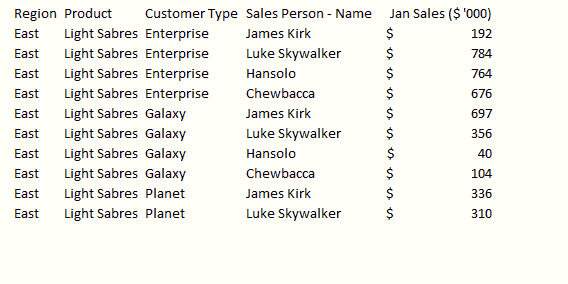
Excel Tables are an incredibly powerful way to handle a bunch of related data. Just select any cell with in the data and press CTRL+T and then Enter. And bingo, your data looks slick in no time. This has to be the best and easiest formatting tip.
Learn more about Excel Tables.
2. Change colors in a snap
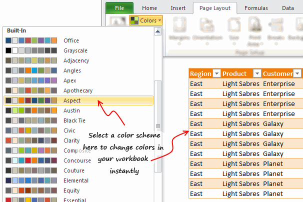
So you have made a spreadsheet model or dashboard. And you want to change colors to something fresh. Just go to Page Layout ribbon and choose a color scheme from Colors box on top left. Microsoft has defined some great color schemes. These are well contrasted and look great on your screen. You can also define your own color schemes (to match corporate style). What more, you can even define schemes for fonts or combine both and create a new theme.
3. Use cell styles
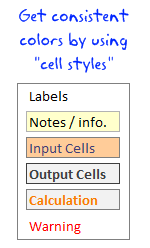
Consistency is an important aspect of formatting. By using cell styles, you can ensure that all similar information in your workbook is formatted in the same way. For example, you can color all input cells in orange color, all notes in light gray etc.
To apply cell styles, just select all the cells you want to have same style and from Home ribbon, select the style you want (from styles area).
Learn how to use cell styles in Excel.
4. Use format painter
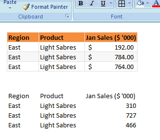
Format painter is a beautiful tool part of all Office programs. You can use this to copy formatting from one area to another. See below demo to understand how this works. You can locate format painter in the Home ribbon, top left.
5. Clear formats in a click
Sometimes, you just want to start with a clean slate. May be it is that colleague down the aisle who made an ugly mess of the quarterly budget spreadsheet. (Hey, its a good idea to tell him about Chandoo.org) So where would you start?
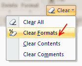
Simple, just select all the cells, and go to Home > Clear > Clear Formats. And you will have only values left, so that you can format everything the way you want.
6. Formatting keyboard shortcuts
Formatting is an everyday activity. We do it while writing an email, making a workbook, preparing a report, putting together a deck of slides or drawing something. Even as I am writing this post, I am formatting it. So knowing a couple of formatting shortcuts can improve your productivity. I use these almost every time I work in Excel.
- CTRL + 1: Opens format dialog for anything you have selected (cells, charts, drawing shapes etc.)
- CTRL + B, I, U: To Bold, Italicize or Underline any given text.
- ALT+Enter: While editing a cell, you can use this to add a new line. If you want a new line as part of formula outcome, use CHAR(10), and make sure you have enabled word-wrap.
- ALT+EST: Used to paste formats. Works like format painter (#4)
- CTRL+T: Applies table formatting to current region of cells
- CTRL+5: To
strike thru. - F4: Repeat last action. For example, you could apply bold formatting to a cell, select another and hit F4 to do the same.
More: Formatting shortcuts for keyboard junkies
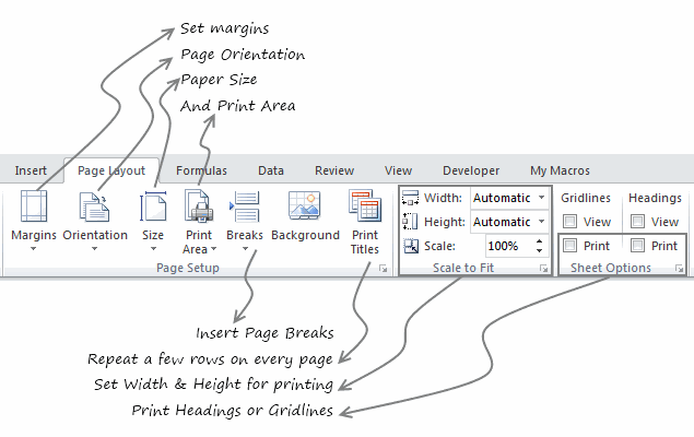
7. Formatting options for print
What looks great on your screen might look messed up, if you do not set correct print options. That is why, make sure that you know how to use these print settings. All of these can be accessed from Page Layout ribbon. For more, you can also use print preview and then “page settings” button.
8. Do not go overboard
Formatting your workbook is much like garnishing your food. No amount of plating & garnishing is going to make your food taste good. I personally spend 80% of time making the spreadsheet and 20% of time formatting it. By learning how to use various formatting features in Excel & relying on productive ideas like tables, cell styles, format painter & keyboard shortcuts, you can save a lot of time. Time you can use to make better, more awesome spreadsheets.
10 Formatting Tricks only Excel experts would know
In addition to the above 8 formatting tips, I made a video explaining more tips. Watch it to learn 10 super cool, secret format tricks to take your spreadsheet game to next level.
- Merging without merging – centre across selection
- Merge multiple cells with “Merge across”
- No decimal points for large numbers with Custom cell formatting
- Showing numbers in Thousands or millions with Custom cell formatting
- New line in a cell with ALT+Enter
- Copy widths alone with paste special
- Skip zero in chart labels with custom cell formatting
- Align & distribute charts with alignment tools
- Show total hours with [h]:mm custom code
- Text format for very long numbers
What are your favorite Excel formatting tips?
Formatting (or making something look good) helps you get great first impression. I am always looking for ways to improve my formatting skills. While a great deal of formatting skill is art (and personal taste), there are several ground rules to follow as well. Applying ideas like consistency, alignment, simplicity and vibrancy goes a long way.
What formatting tips & ideas you follow? Please share them with us using comments.
Learn how to make better spreadsheets
- 10 tips to make spreadsheets that your boss will love
- 5 conditional formatting basics to master
- 12 Rules for making better spreadsheets
- More tips on formatting, conditional formatting, custom cell formatting & chart formatting
Join Excel School & Make awesome Excel sheets
In my Excel School program, we focus not just on teaching Excel, but also teaching you how to make awesome Excel workbooks. You can see how I format my data, charts, dashboards & reports and learn hundreds of tips on formatting.
Even the lesson workbooks are beautifully formatted & packed with fresh ideas for you to try.
Consider joining our Excel School program, because you want to be awesome in Excel.


30 Responses to “18 Tips to Make you an Excel Formatting Pro”
For my 2 cents worth:
Less is more !
Keep styles simple and in line with the corporate requirements of your employer/client
The table formatting is really useful, but I have found two sticky points:
1. Cannot move or copy a sheet with a table in it.
2. Cannot 'table format' multiple sheets at once.
May be ways around these issues, but these are what keep me from using the table format more than I already do.
Remove gridlines in sheet
Use dotted lines as internal borders in tables
And just keep it simple - it's the substance that matters and there's already way too much eye candy out there
I write a lot of financial reports conveying complex data in a userfriendly manner. I don't use colour (as it costs 7p/sheet verses B/W at 1p/sheet). The trick is to generate a table that someone will skim over for "the story" and then can refer back to understand it. very muck like Ulrik said, keep it simple.
Some simple guidelines that I use:
(a) align headings based on data (if data is text that means left, if data is numbers that means right)
(b) do not align central numbers (unless all similar) i.e. how hard is it to read a column of numbers that contains €1.25 and €125
(c) use borders to group columns and rows, don't format every line/column but allow the data to draw your eyes along it. "White lines" are as useful as borders
(d) thin borders are better than fat borders - the fatter they are, the more they draw the eye... so use them to draw attention to key numbers (like a total) only.
(e) use units to make numbers easier to read. Generally people cannot skim numbers with more than 3 d.p or 5 significant figures. so report in millions/thousands (or the other way as in ml)
(f) avoid making text too small or too big. too small (less than 10) and people can't read it. too big (>14) and people struggle to skim over it (their eyes have to move too much)
......I don’t use colour (as it costs 7p/sheet verses B/W at 1p/sheet).....
Not necessarily..
Don't compromise on how good a sheet can be made to look on monitor. To print black and white, simply configure in page setup to print in black and white.
Like This post !!
I m always using ALT + EST, not verymuch confirtable with cell style. will try to use color schemes (new feature)
Regards
!$T!
Hi Stephen,
Do you have some non-proprietary samples you may share on drop box or Windows Live SkyDrive?
Thanks
w
Great post!
Which key ist EST from the shortcut "ALT+EST".
I am using a german keyboard layout and have never heard something about an EST key.
Thanks
Carsten
Hi Carsten...
If you are using English version of Excel, then press ALT+E then leave the alt key, E key and then press S, then press T
For German version of Excel, the keys would be different. I am not sure what they are.
it was nice MS come up with all the color schemes. However, corporate culture (or your boss) sometimes dominate or predetermine what style a spreadsheet should look like. So I hardly get a chance to use #1 to #3 shown above.
Most of the times, it is someone else who wants a certain report or analysis gets to decide how s/he wants it to look like. I see myself more like a line chef or engineer. Others get to be the architect and I'm just a builder transforming a design into a real home. I don't get much say in it unless they are asking me to build a multistoried building on a single tooth pick as foundation.
Hi Chandoo,
thank you for your reply. Now I understand. It's something like searching for the ANY Key, because some program is displaying "Press any key to continue..."
But to find the german version of this shortcut:
ALT+E calls the Edit-menue? And for what are the S and T. Just tell me the english names of the menueitems, please.
I think then I will find it.
Carsten
@Carsten
Alt+EST is
(E)dit;
paste (S)pecial;
forma(T)s
Excellent post guys!
@Carsten,
Try to know how to find the shortcuts in the excel menu bar itself.
You click Alt + any of the underline character in the menu bar, then excel will take you to that particular menu field.
Now you can find different options in the dropdown menu. And each option has the name. Each name has underline in any of the characeter. That underline character is nothing but the shortcut key to execute that option.
Like this you can find in excel all the options and their shortcut keys.
Coming to the above example..
Once you click alt + E, it will take you to the "EDIT" drop down menu. Under Edit there are so many options like cuT, Copy, Paste, paste Special, fIll.... etc., I think you can find underline under 't' in cut..'p' in paste..'s' in paste Special. You need to click the underlined character for the required options...Here the 'S' underlines for Paste Special option...
Once you click 'S' it will open paste special options box...again you will find the same underlines in each of the names...here you can find different opetions like All, Formulas, Values, formaTs...etc. 'v' is nothing but Values option. Once you click V in the key board..it will execute paste special values option.
As Summary Alt + (E)dit + paste (S)pecial + (V)alues
Now you can find the shortcuts your own. all the best.
Regards,
Saran
lostinexcel.blogspot.com
You can also customize the quick access toolbar.. Once you find the icon you regularly use, right click and then select Add to quick access toolbar and once you are done, when you press Alt key it will be highlighted 1,2,3,4 etc depending upon the sequence of the icon..
Ctrl-ES is sooooo 2003.
Ctrl+Alt+V all the way baby!!!
You can DOUBLE-CLICK Format painter button to copy the formatting multiple times. Once you are done, press ESC key.
//
Jinesh,
This is a great tip that I use multiple times daily. People are always in awe when they see this one!
Jesse
Hi,
How to apply the custom styles for cells from the sql table, by using c# program.
Thanks & Regards,
Satheesh
[…] You can use the Page Layout section in Excel to apply colour themes to your reports. Chandoo.org has some useful Excel tips. […]
[…] http://chandoo.org/wp/2011/12/05/excel-formatting-tips/ […]
Hi i want to print a page which have bottom line to print on each page end how to do that pls explain
Thanks Sir
Thanks alot
Very useful thanks
thank you too much
your tips are awesome.
How to show a table with around 20-25 columns in the dashboard in the first page itself? I mean, within the dashboard area.
Is there anyway we can add a horizontal scroll bar for the table?
@Kiran
You never add tables directly to a dashboard
You add cells that reference a table
By reference I mean it gives you the ability via Formula or VBA to scroll up/down, Left/right or re-order the data
Think of it as a window into the table
This is discussed regularly in Chandoo's dashboard samples
Have a look at the 2 links in Item 1: http://chandoo.org/wp/welcome/
I'd then suggest asking a specific question in the Chandoo.org Forums and attach a sample file for a specific answer.
love it!!!!!!!!!!!!!!!!!!!!!!!!!!!!!!!!!!!!!!!!!!!!!!!!!!!!!!!!!!!!!!!!!!!!!!!!!!!!!!!!!!!!!!!!!!!!!!!!!!!!!!!!!!!!!!!!!!!!!!!!!!!!!!!!!!!!!!!!!!!!!!!!!!!!!!!!!!!!!!!!!!!!!!!!!!!!!!!!!!!!!!!!!!!!!!!!!!!
I have a table of value for a month, with no data for few dates.
I created a chart basing on above data.
In the chart I find calendar dates, even though few dates with no data are not available in the table.
How to remove the dates in the chart for those without data?