
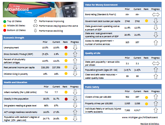
Any Tom, Dick and Sally can make things complex. It takes guts and clarity to simplify things. That is why I was pleasantly surprised to see this dashboard prepared by Michigan State. You can see it below:
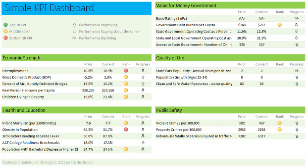
Linda, one of My Excel School students shared this dashboard link with me and asked if I can show how to construct something like this. Here is my version of the dashboard.
[Click here for larger version]
There are 2 parts in construction of a dashboard like this.
- Defining the vision, layout & metrics that you want.
- Creating the dashboard in Excel (or any other tool)
While it does not seem so, it is the Step 1 that takes a lot of time and hard-work.
Step 1: Defining the dashboard metrics, layout & vision
This is the most time consuming part of any dashboard. There is no one way to do this step. So I am going list a set of guidelines for you to follow.
- Speak with your audience & define what they want: For any dashboard, you will have some audience. So speak with them, understand what their information needs are. List down everything they want to know. Some parameters you want to consider are,
- Metrics / KPI they are interested
- Frequency of the need (weekly, monthly or yearly etc.)
- Granularity of the information (example: person level, department level, company level)
- Type of the need (information, analytical, mission critical etc.)
- Understand the sources of data: Another tricky part of a dashboard development is to get right data. In corporate environments, your data sources may be spread across and follow their own formats. So you need to plan ahead for all these differences, otherwise, you will end up doing lots of extra work.
- Prioritize the information: Once you have listed down various metrics, KPIs, information pieces to be used in the dashboard, list them down in the order of priority. Metrics or KPIs that are most important and indicate the overall health of the system (or project, initiative or company) should be on top.
- Remove ruthlessly: Now comes the tricky part. You must remove items, metrics and information that is low on value from the end dashboard. This is where your persuasion, negotiation skills come in handy.
- Make a rough sketch of the dashboard: Even before you make something in Excel, just make a rough sketch using pen and paper (or MS Paint or PowerPoint). This way, you can validate the design with end users and get buy-in early. (related: use excel for screen prototyping)
There are more ideas and tactics you can follow. But if you follow the above guidelines, then 80% of your work is done.
Step 2: Designing Excel Dashboard
This step becomes easier once you have clarity of vision and listed down what you want (and what you dont want). And if you find this difficult, there is always help.
In this, let us learn how to construct the particular dashboard you see above.
- Arrange the data: For a simple dashboard like this, you can arrange the data in this fashion.

- Create Dashboard Layout and Load data: Once the data is in-place, create a blank layout. You can follow any template. I liked the Michigan State Dashboard template and created something like that.
Once the layout is ready, link to the source data (using Copy & Paste as links).

- Use Conditional Formatting & Formulas to Display Icons: Once the data is loaded, next step is to show icons. This can be done easily with Conditional Formatting and simple formulas. (tip: display alerts in dashboards using conditional formatting)
- Format: Now format everything so it looks awesome.
That is all. You are done!
Download Simple KPI Dashboard Workbook
Click here to download the workbook & play with it.
Special thanks to Michigan State website for the inspiration & Linda for sharing the link.
Do you like this dashboard?
I really liked the simplicity of this dashboard. The Michigan state government folks have done fine job of listing down the metrics and carefully capturing them and presenting the outlook in a crisp fashion.
What about you? Do you like the ideas shared in this article? How would you approach a dashboard project? Please share your tips & ideas using comments.
Want to Learn Dashboards? Go thru these resources:
If you want to learn dashboards, then you have come to the right place. Click thru below links to access a ton of information, ideas & material.
- KPI Dashboards in Excel – 6 part tutorial
- Project Management Dashboard in Excel
- Sales Dashboards in Excel
- More on Dashboards
- Join our Excel School Dashboards Program


21 Responses to “Simple KPI Dashboard using Excel”
I think the arrow icons for 'Performance Staying about the same' and 'Performance Declining' are mixed up.
i think that it would be so easy to build in additional information to allow someone to make sense of the numbers... and that in the rebuilt Excel dashboard you should have. for example, the 24.7 to 24.6 change is that real or just statistical vagary? Why does it get a down arrow, why not unchanged arrow? Under quality of life, population growth of the indicated age demographic... what triggeres up/down arrow designation - change between periods or the fact that both are negative? maybe it would be good to have less of this demographic group. the "rank" makes no sense at all... why is it applied to some but not all measures? what does rank mean? what are the time periods?
A good dashboard is about telling a story. It is about accurately communicating what has happened, and maybe even provide a reason for why. A dashboard should prompt more questions than it answers, it should have enough detail to provoke discussion, yet not too much to put people off. A tall ask I here you say? Definately doable, and Chandoo my man, I think this is a really good example of a simple, yet effective dashboard. I have always been a fan of KISS (Keep It Super Simple) and this applies every so much to the world of dashboards. Like you say, it is imperative to understand what you're audience expects and wants to see, and that means talking to them! Mind you, we have just learnt about the range.speak method in VBA classes, so maybe I can talk to my dashboard recepients via VBA....!!!!
Interesting use, thanks for sharing.
Can you explain how to enter the special symbols in the formula bar for the following
Cell J7=IFERROR(IF($H7*E7>$H7*D7,"ñ",IF($H7*E7=$H7*D7,"ó","ò")),"ó")
Dave - The special characters can be created using the Character Map in Windows or by learning the keyboard shortcuts (displayed in the corner of the Character Map). Alt+0241 is the keyboard code for an "ñ".
@Dave... I just inserted these symbols in to a cell, then selected the cell contents (F2, select all) and copied them. Then I went to the formula cell and pasted them and moved around.
@Vicki.. good tip on ALT code 🙂
@Bill.. They do have detailed views of each of these sections on the Michigan State website (here: http://www.michigan.gov/midashboard ). We can easily implement such drill-down functionality in this dashboard and redirect viewers to other sheet tabs.
realy enjokyed
Whenever I am given what seems to be an impossible task in Excel, the first thing I do is go to Chandoo.org. Again! and Again, you have provided just what I needed! You are so right that this template is beautifully "Simple".
Since the requirement for our Executive Staff is by Group Location, I added a Drop Down List Validation Box with VLOOKUPs to view the data by Group. It was easy to also add Conditional Formatting to the Progress Indicators.
I can't thank you and the originator of this Dashboard enough for sharing and helping me to continue to build my Excel Skills.
Can you explain where the Rank & Metric Typr derived from?
I made some tweaks to automate the Rank Calculation to display R-A-G for Red, Amber & Green based on two Helper Columns with the Metric Thresholds...and a Unique Key Field for a VLOOKUP...
1 - Insert a Column to the right of Rank and call it Calc
2 - Insert two "Helper" Columns after the Change Column with the % Values for Amber and Green
3 - For a metric where the Metric Type is -1 insert this formula in the Calc Column:
Where a higher % indicates lower performance...
=IF(E5>K5,"R",IF(OR(E5<=L5),"G","A"))
4 - For a metric where the Metric Type is 1 insert this formula in the Calc Column:
Where a lower % indicates lower performance...
=IF(E12=L12),"G","A"))
5 - In the Rank Column, changed the formula to simplify the R-A-G:
=IF(F4="","",IF(F4="R",3,IF(F4="A",2,1)))
6 - Manually change the Metric Type to a -1 or 1, per your KPIs.
7 - Link the values in the new Calc Column to the Rank (=G5). For some reason the Rank (R-A-G) Stoplights would not work based on the from the formula, but worked when linked.
This is how the inserted and Helper columns line up:
Unique Key,Group,Metric,Prior,Current,Rank,Calc,Metric Type,Rank,Change,Amber%,Green%
The new Dashboard already has a new name "KeyPIR". (Key Performance Indicators Review)
Hello,
Where could have find the template for The new Dashboard already has a new name “KeyPIR”. (Key Performance Indicators Review) ?
Thank you
Lucile
Reply
Hi Chandoo,
For some reason when I download via the link it advises it is not in excel format - is it possible to get the example workbook emailed directly?
Thanks.
Hi really nice work.
but correct me if I am wrong here. is Prior and Current flipped?
because if I have 10% in Prior and 50% in Current then it is showing down arrow instead of up.
even the arrow indication showing wrong down says Performance Staying about the same
and left right arrow says
Performance Declining
Zuber - you need to understand the measure to know whether up is good or bad. Personal Income going up is good, crime rate going up is bad. The arrows are an indicator of good and bad or as the column heading says "Progress".
What is Metrics Type 1 and -1. Could anybody explain me what they are
Hello,
Where could have find the template for The new Dashboard already has a new name “KeyPIR”. (Key Performance Indicators Review) ?
Thank you
Lucile
Hi,
I am looking to automate an existing dashboard with a data feed from an oracle database. What is the best practice for this.
I'm using Excel 2016
and Oracle 10g
Many Thanks
Dale
This article is simply amazing. I love your ideas on weight loss. typically it just takes some effort and the right diet schedule/ know how. i'd be interested in link to your article from my FB page as i think it will serve my audience well. I would not be alble to induce my purpose across as well as you most definitely did here. Thanks again.
Hi Team,
I am looking for a score card dashboard for my team with various KPIs mapped and also the process wise performance.
I have 20 processes divided amongst 10 team members.
Want to prepare a team member / process wise KPI achievement vision.
This will priomarily be for quality related KPIs like, CQ achievement, C-SAT Achievement, Team attrition, initiatives taken, performance etc
Kindly suggest
kindly share the copy of this excel file.
thanks,
Jawwad.
I too am looking for a score card dashboard for a small team to map 5 KPIs and also performance.