
This is the second installment of project management using excel series.
Preparing & tracking a project plan using Gantt Charts
Part 2: Team To Do Lists – Project Tracking Tools
Project Status Reporting – Create a Timeline to display milestones
Time sheets and Resource management
Issue Trackers & Risk Management
Project Status Reporting – Dashboard
Bonus Post: Using Burn Down Charts to Understand Project Progress
Why Team To Do Lists as a Project Tracking Tool?
Projects are nothing but a group of people getting together and achieving an objective – like building system or constructing a bridge. While it is important to have a overall project plan and vision, it is equally important to understand how various day to day project activities are going on. This is where to do lists can help you a lot.
How to create a team to-do list to track project progress using Microsoft Excel
Microsoft Excel has a very good way to share a workbook with a team of people. We can use this feature to create a team to-do list. Here is a step by step tutorial to create a team todo list:
- First we will create a to-do list in excel in the following format:
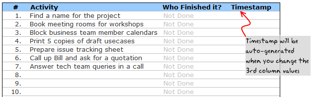
Note, depending on the type of project and the kind of activities involved, your team to do list can look differently.
- In order to facilitate tracking, we have the following features:
- A column where the team member can specify his / her name. This should be done when the activity is done. A simple alternative could be to automatically load user’s name based on windows login ID. For more on this, see this article on DDoE.
- Another column where we generate a time stamp when the user enters the name. Please read this article to generate time stamps in excel
- The formula for time stamp is like this:
=IF(AND(D6<>"Not Done",D6<>""),IF(E6="",NOW(),E6),""). As you can guess, it is a circular formula. So we should enable iterative calculations from calculations options in Excel. Learn more about circular references here. - Using above 2 columns, we can track and measure how team members are working various activities and who has done what.
- When we are done, the todo list for project tracking looks like this:

- Once the list is created, first we should save it a network location where the list can be accessed by everyone.
- If your team is spread across the globe and cannot access one network, try the following options,
- Use Excel 365, it supports shared spreadsheets
- Sharepoint, If you have a sharepoint site that can be accessed by everyone, post the file there
- Use google docs spreadsheets. Google docs spreadsheets is a free alternative to MS Excel with several collaboration and team features. It is very intuitive and simple to use.
- You can create multiple copies of the to do list and share it with your team members and consolidate all the spreadsheets on frequent basis. This is a painful process as any format changes can create problems to your consolidation process.
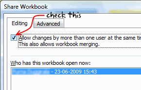
- Once you place the file on network, we should enable sharing of the workbook. See the below screenshots to understand how to share a workbook.

- Now go get some work done.
- When you finish the task, just open the shared workbook and mark the task as done by entering your name. Excel will automatically fill in the time stamp when you marked the activity as done.
Download the To Do List Template and Use it to track your projects
Go ahead and download the excel team to-do list template and use it as a project tracking tool.
Download 24 Project Management Templates for Excel
Next Steps
You can use VBA macros to automatically remove the finished to do items. I have written an article on simple to do list app using excel sometime back. Check it out to get some ideas.
In the next installment, learn how to prepare a project time line that can display various key project milestones. If you haven’t already, read the previous part of the project management using excel series – Project Planning using Gantt Charts.
Resources for Project Managers
Check out my Project Management using Excel page for more resources and helpful information on project management.
Your thoughts and suggestions?
I am not a project management expert. In fact, I know very little about project management, that is why I started this series, so that I can share the little I have picked up in the last few years and learn more from you. Please tell me your feed back using comments. I would love to hear from you.


28 Responses to “Team To Do Lists – Project Tracking Tools using Excel [Part 2 of 6]”
[...] & tracking a project plan using Gantt Charts Team To Do Lists - Project Tracking Tools Part 3: Preparing a project time line [upcoming] Part 4: Time sheets and Resource management [...]
the templates are great (I bought the combo).
What I'm missing is a way to have the project gantt chart and reporting with the data per resource, in such a way that I can also show the occupation per resource on an extended gantt chart.
So with hours entered per person per project or sub-activity, to show a gantt chart of how many hours/days a person spent on which project (or plans to spend).
[...] from: Team To Do Lists - Project Tracking Tools using Excel [Part 2 of 6] 25 Jun 09 | [...]
Hi Chandoo,
Funny I have a post on the value of MS project lined up which I will post when the current monster project I'm working on finishes and I get some free time!
I'm not sure this would help with any of the projects I've worked on, closing down a to do list seems like more effort than it's worth, but it might be useful for some things. I guessing it doesn't, but does the time stamp not update when you recalculate the work book?
keep up the good work!
Ross
@Ross.. Thanks for sharing your ideas... I think to do lists are a great way to keep up with project activities and ensure accountability from individual team members, when they are implemented right.
"I guessing it doesn’t, but does the time stamp not update when you recalculate the work book?"
Your guess is right. When you change the calculation mode to "iterative", excel takes care of the nittygritties and retains older values in circular references in formulas.
[...] Project Management in Excel [New Series] - Gantt Charts | To Do Lists [...]
[...] & tracking a project plan using Gantt Charts Team To Do Lists - Project Tracking Tools Project Status Reporting - Create a Timeline to display milestones Part 4: Time sheets and Resource [...]
Hi Chandoo,
The template give me lot of convenience to monitor the thing to do. It simple. Thank You
[...] & tracking a project plan using Gantt Charts Team To Do Lists - Project Tracking Tools Project Status Reporting - Create a Timeline to display milestones Part 4: Time sheets and Resource [...]
[...] make sure you have read the first 4 parts of the series - Making gantt charts [project planning], team todo lists [project tracking], project time lines chart [reporting] and Timesheets and Resource Management using Excel. Also [...]
Chandoo,
I really do not see any befit to this function in Excel unless it was somehow tied into some other chart. That is say a scheduled activities % complete is based on the to-do list.
The only way this chart would be useful is if no one was assigned none dependent task that could be done by anyone. The cases were both of these conditions are true are so few and far between it really makes this chart worthless.
@Brian... Once you have a todo list up and running, it is easy to get metrics out of it. I didnt propose it as it might look a bit too micro-management-ish.
I am able to understand what you meant by "The only way this chart would be useful is if no one was assigned none dependent task that could be done by anyone. The cases were both of these conditions are true are so few and far between it really makes this chart worthless."
Can you explain?
"Chandoo"
What I mean is this. Lets say you have 10 task which are part of one activity/WBS that is in your schedule. One there are very few cases were many people would be assigned to complete this one scheduled activity with no direction being given who should what of the 10 task. It is poor management, and the task 90% of the time would not get done in a timely manner if say 4 people were responsible. Secondly, you are assuming all 10 task are independent of each other. You might need to do task 1 thru 3 before you can do task 4, and to do task 7 you might need to do 4 and 6. Thirdly, the time it would take to compile and then fill out the to-do-list even in limited applications is really not worth it.
I just see almost no applications why a team would need to inform others separate from the schedule that they have completed a task on a to-do list unless anyone of the 4 people could of completed that task.
My point is, there might be a few very limited applications for this type of list but this list would be worthless as a Project Management tool in every other case.
However, change this from a to-do-list to a document change log and it is perfect. Instead of to-do it is the documents name or summary of what changed in the document. The person is who edited the document, and the time stamp is when they checked it in. But I do not know why you would use excel when there is free software you can use commercially that is 10 times better that does document management.
I think using excel to do Project Management over a real Project Management application is a bad idea. Unless you are running a very small, simple project, the time and effort is a lot more to use excel compared to the cost of the Project Management software.
This comes back to my point, I love your site, however, just because you can do something in excel does not mean you should do it. To often the time it takes to use excel is wasted 10 times over from the cost of doing it in an application designed to for the specific application.
@Brian: The todo list mentioned here is meant to keep track of all the tasks for which detailed planning is not necessary but some sort of tracking is needed. These are not be confused with project activities (a la gantt chart).
I like your suggestion about using this as a document tracker. Pretty cool use.
Coming to your point about excel as a real project management tool, well, I have my views, but in a serious project environment, it would surely payoff to have a dedicated project management application.
[...] & tracking a project plan using Gantt Charts Team To Do Lists – Project Tracking Tools Project Status Reporting – Create a Timeline to display milestones Time sheets and Resource [...]
Chandoo,
Wonder how the timestamp column will maintain its previous data. Both Today() and Now() functions will update as and when the next timestamp happens.
[...] Preparing & tracking a project plan using Gantt Charts Part2: Team To Do Lists – Project Tracking Tools Part3: Project Status Reporting – Create a Timeline to display milestones Part4: Time sheets and [...]
I've combined this with the issue tracker since I like the automatic date stamp, but one thing I'm noticing is that I can't replicate the chart that goes along with the issue tracker because the cells that are referenced have the formula that inserts the time stamp instead of a the actual date value. All the dates of the last 30 days display 0 when they should have a value.
Is there a way around this?
I have edited the chart so that my team members can update the percentage completion of the assigned tasks. When the cell is updated, i would like the time stamp to update. How would I manipulate the formula to update whenever the drop-down list is changed?
[...] … ??? To Do List [...]
Excel is great however sometimes you need to get a better idea of what tasks each person on your team is working on at any given time. We've developed a web app that can do just that! Each person has a list of tasks, listed in the order they have to complete them.
HII,
I want to expand the database through excel where i am working on 11 cities as of now and i want to expand it upto 50 cities and hence forth the data related to it will also expand so i want to make it precise where i can get updates also that this work is required to be done at that particular day or date
Thanks for making all of this information available for free. I am currently using excel to track everything for the first time. I later plan to output our information here with a more visual presentation. Wish me luck!
Can some one point me out to some additional direction on the "Who Finished it?" column? Something more 'basic' for a newbie excel guy? lol I got everything else working on this tutorial but that column. I can't seem to recreate it and I know a lot of it is due to lack of knowledge with VB code. I'd like to recreate this column very much 🙁
Dear Chandoo,
Thanks for the team to do list, kindly let me know how to set the column who " finished it " from another work sheet
Hi Chandoo,
Unable to download it - can you please check the link and confirm.
Great inhisgt! That's the answer we've been looking for.
Hi Team,
I know u all are the best programmers in the world!!! that's I am here to rectify my issues. here is my question please ans me as soon as possible before 8-3-2017 its really urgent.
I have a project named the production tracker.
1) I require the user form which shows the names of the Associates which are linked to the different tracks. when the user is selected the particular track related details and dropdowns should appear.
2) I need to track the associate needs how much of the time to complete the particular task. with start stop and pause and resume timer.
3) It should display the daily count of the production and save the data to the another Excel file.
this production tracker should save all the data no matter how many people logs in into it.
Please help me for this it will be very appreciated.
you can directly email me on my mail ID: tusharkch694@gmail.com