
 Here is a little experiment to freak out excel.
Go to cell C3 and write =C3 and press Enter. Excel would throw up nasty message saying, “Microsoft did not know what to do. We have a sent a support engineer to your home, but he is stuck at the round-about near your house.”
Well, not really. But what you did when you wrote the formula =C3 in cell C3 was, you created a circular reference.
What is a Circular Reference & why use them?
A circular reference is created when you refer to same cell either directly or indirectly.
We use circular references when we need circular references.
Excel Circular Reference Example:
For eg. (borrowed from John Walkenbach’s Excel 2010 Bible), lets say you run a fictitious company named Sky is the Ltd.
And you have a strange policy of donation 10% of your profits after tax to charity.
But, in your country, charity donations are tax exempt (they are expenses).
So charity = 10% * after tax profits
after tax profits = (revenues - expenses - charity)*(1-tax rate)

By definition, charity refers to after tax profits, which refers to charity, thus creating a circular reference.
Now, how would you find out how much to donate to charity?
Simple, we write formulas with circular references, like this:

But wait, just when you press enter after writing the formulas, Excel would scream bloody and curse your entire family for having a circular reference in your worksheet.
Enabling Iterative Calculation Mode
You must enable what they call iterative calculation mode before the formulas work. For this we must go to Excel Options.
In latest versions of Excel,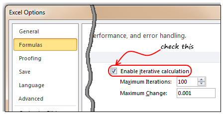
- Click on Office button
- Go to Excel Options, this is analogous to opening the bonnet of your car, but just a bit more confusing.
- Locate the “Formulas” on the left, click on it
- Now, check the “Enable iterative calculation”. This way you are telling Excel to evaluate references iteratively, up to 100 times (default).
- Click ok, close the bonnet. That is all.
In per-historic versions of Excel,
- Go to Menu > Tools > Options > Calculation Tab
- Check Iterative Calculation box. (see image)
Once you do this, your formulas will work nicely and you will find that the required charity donation to be made.
How to avoid Circular References?
As you can understand circular references are a pain in cell. You may want to get rid of them altogether. Thankfully, with careful inspection and a mug of coffee, you can reduce most circular references to simple formulas. For eg, in the above case, we can calculate charity amount directly by using the following equations.

But, keep in mind that, in few cases, circular references may be required. For eg. if you want to add timestamps to your workbook.
How to locate Circular References?
Do you know that you can find all the circular references in a workbook?
Whenever you see circular reference warning message, just go to formula ribbon and click on error checking options. You can see all the circular references there.

Note: In Excel 2003, you can see the same from circular reference toolbar (Menu > View > Tool-bars > Circular Reference)
Examples & More Resources on Circular References:
- Add timestamps to your workbook
- Team Todo List template in Excel
- Circular References & Other Repetitive Calculation Features in Excel
- Solve Circular References instead of using them
Do you do circular references?
I try to avoid circular references whenever possible. But in some rare cases, I think a circular reference gives elegant, shorter solution than a non-circular variation of it.
What about you? Do you use circular references often? What are the reasons / uses of them according to you? Please share your experience, tips thru comments.
PS: Here is a very useful link on circular references.
PPS: Monalisa pic source is here.


50 Responses
Oooo, love how you slipped that title in there: “ROUND up on CIRCULAR references”!
The most annoying thing about them is how Excel activates the help feature, so before you can get to fixing the error, you have to waste time getting rid of the pop-up.
On that, is there a way to deactivate the F1 key? It is so closely located to the much used F2 key, it is the bane of my excel existence…
Fuuuuuuuuuuulllllly agree.
how about physically removing F1 key from the keyboard.
as an alternative, consider Goal Seek.
The risk with circular references is that Excel only warns you once so an intentional one can mask an unintentional error circ ref.
Good article – thanks!
Chandoo –
Not only are you awesome, but you’re a mind reader. I was unsuccessfully trying to determine the cause of a circular reference when your e-mail came in. (It was on a report that I had open in the background. I wasn’t even looking there til I got your e-mail).
Thanks much!
Circular references are one of the most powerful but underated features of Excel. Circular references are one way to implement loops in this app (FOR, FOR NEXT , WHILE, DO WHILE), so they are great to design complex models that otherwise would be impossible to write in Excel without VBA. BUT you have to make some considerations: for example, circular references are solved in sequence, so your formulas locations ARE important.
Greetings from Panamá,
SE HABLA ESPAÑOL Y EXCEL!!!!!!!!!!!!!
Very nice circular reference on the “PS”. How many iterations are on the link?
If nothing else Chandoo you make me laugh (out loud….ok so I’m an Excel nerd too).
For a topic know for it’s popularity with bean counters, who are ‘boring’, as we all know, you are clearly breaking the mould.
Thank you,
Mynda
Head Bean Counter
@Steve… Welcome, I was expecting your comment 😉
@Glen: It should stop at 100.
@Mynda: I am glad you liked it…
@Rich… very good point. The help on circular refs always annoys me.
@Patrick: I agree, goal seek is much more elegant and simple. But there are some places where you just have to use Circular refs.
@Lucasini: Greetings and thanks for your point on “circular refs are most powerful …”. I agree. They are like recursion in programming. You need to know how to use it, then you can do wonders with it.
I come from an era where a circular reference was a big problem – very hard to find and no way to control the re-iterations so I avoid them and figure out a formula to get a result. Likewise in VBA I cannot hack the deliberate use of “on error” just because MS doesn’t include better interogative functions. In my view its just poor programming practice. “on error” should really only be used so the operator can retreat as gracefully as possibly!
Like using On Error to capture when you have reached the end of a collection…
thanks alot u realy help me
Hi Chandoo,
Can you give a more coverage on circular reference in your Excelschool training?
Can you include me in your blog post, please? I am in Analytics and find all the articles very useful.
This is a help, really.
I am trying to round a number entered into a cell to x significant digits. This entails circular reference. The cell is in a data entry form and I don’t want to add the data value into a secondary cell and have the function calculated into the primary cell (which does work by the way). I haven’t found a workaround to this yet.
Thanks.
@Royd
Have you tried =Round(cell Ref, No Digits)
eg: =Round(A2, 2) round the contents of A2 to 2 digits
Thank for the response Hui.
My problem is centered around circular reference as I want to enter a value into a cell that has an equation defining the number of significant digits, within that cell. The Round function works fine if the cell is referenced from a secondary cell. As I want to build this into a data input form, I don’t want extraneous columns of data, if I can help it.
@Royd
It can be done with a little VBA
.
Copy the following code into a Page Module in VBA
Alt F11 – Enter the VBA Editor
Double click the page you want to use
Paste the code in the right hand pane
.
= = = = =
Private Sub Worksheet_Change(ByVal Target As Range)If Target.Address = "$A$1" Then 'Change Range to suit
Application.EnableEvents = False
Range("A1").Formula = Range("A1").Value * 100 'Change Formula to suit your needs
End If
Application.EnableEvents = True
End Sub
.
= = = = =
Change Range to suit
thanx,so helpful
Thanks Hui. That’s great.
Very Helpful!
Hi, i need to round a circular answer, please help
I Want to create a formula for my pricelist, every time the prices goes up a certain %, I just want to edit the % sell, then my entire spread sheet needs to change accordingly. I have created a circular formula, but i am having trouble figuring out the round? i tried naming my circular sell, but even that creates ####### problems 🙁
Instead of trying to use circular references why not just setup a list of price increases
Say in Column A2:A100 add the price increases as numbers
say 5, 8, 2 as 5%, 8%, 2% etc
Then use a simple array formula
=Original Price * PRODUCT((1+(A2:A100)/100))Ctrl Shift EnterYou can now add prices rises as % to the list in Column A and the cumulative price rise will be calculated by the above formula
Thank you very much Hui
but i know very little about exel and i dont understand what you are telling me. i copied and pasted a part of my spread sheet. allow me to explain to you what i have done so far. 0.05 is in I5, 109.73 is in G7. this is the price after i have worked out the 5% increase. the formula i used goes like this (104.50)*(1+I5) the answer i got was 109.73. but i need to round it of to the nearest 5. say 109.75
the formula i used before this one worked out perfect but instead of 0.05 in sel I5 i had 5%. the formula i used was (140.50)+round(I5*G9,1.05) but if i take 104.50 and add 5% it gives me 110.00 instead of the desired 109.73, which is closer to the amount.
0.05
PER BOX: EXCL. VAT: EFFECTIVE DATE: DIST. DISC:
40 R 109.73 2011/06/13 -25%
25 180.80 2011/06/13 -25%
Hi Cornelia
Have a quick look at: http://dl.dropbox.com/u/65728154/Cornelia%20Example.xls
I am using the circular reference in shared workbook to get the start time and end time automatically. The problem is that the timestamp gets updated when the another user saves their data and my data(both the start & end time) changes to the saving time and difference of it gives zero.
Please help on me this issue.
Actually I require the circular reference formula in my sheet. But this sheet goes to the client as well and they get scared to see the circular reference warning. Is there a way, apart from the iteration tick thing, may be some code in VBA that can help me subside this warning sign?
I am in a new job that uses timecards for teachers that have references in additional pages of the worksheet. When I try to add cells for new students I get the circular reference. I don’t want to change the worksheet as it has been working well for the company so far. I just want to be able to add or subtract cells as needed. Is there a way? Thanks, Casey Combs
First of all thank you for this freely available lesson (though I came very late onto this).
But, the manual/normal arithmetic formula seems to be wrong. Acc to this very example, the formula gives the charity to be 13.08. While actually it will come to some/around 14.43. I think that is a BIG difference.
Hope you’ll clear.
P.S. Also, the 2nd line of formula (which shows the step: Pat= 7* (R-E-C/7) is very difficult to digest unless we tell the readers one fundamental equation (i.e. Profit after tax= Profit*(1-30% of Profit)
A very interesting and intelligent thread. Unfortunately Excel thinks we are idiots, because every time I generate a circular reference (usually from typo) Excel launches ‘Help’ whether I need it or not.
Is there a fix? Or do I just have to live with it, as I must with so much of Excel’s poor interface design.
Everybody experience same problems.
But Microsoft rarely listens.
Actually they have to force all their energy (and the money earned from people like us) to slander, fight and (try to) outdo Google!
What I found is that to get the recursive calling process going, Excel first needs to be fooled into thinking it has an actual value to work with. Example:
In cell A1 type: 10 (gives the cell that is going to call A1 a working value)
In cell A2 type: = 1 + 1/A1
Go back to cell A1 and type: = A2
Go to Excel Preferences and under the Formulas and Lists heading find “Calculator”. Then within Calculate Sheets select “Automatically”, and within “Iteration” select “Limit Iteration” then add your preferred number of iterations (use a low number for starters to see if it’s actually working as expected) and step size (modestly large helps at first).
Hit OK (Exit Preferences) and calculations should already have happened.
Hit Ctrl= to gain the results after another set of iterations.
The main aid is to initially give the intended-to-be-recursive call an actual value, then set up all else, and in the end go back and change that number to become a recursive call.
Under your Examples and More Resources, there is a bad link for:
Solve Circular References instead of using them
Jeff
Hi Chandu,
I am not able to execute Circular Referencing through the advised method. Nothing happens when I click on checkbox for Iterative Calculations. Please advise.
HELP!!
Feeling very frustrated. Is there not a way to format a cell to immediately multiply by a number?
I am trying to calculate the rebate of a total spend.
I would like to enter a total spend in the cell and have the cell immediately calculate 10 percent of that number. This information is being entered manually each month.
Any suggestions??!!
@Joanna
Unfortunately in Excel you can’t enter formulas into a cell and calculate the result in the same cell without using VBA
You can enter 100 in say B2 and in C2 have a formula =B2*90% and C2 will then display 90
What is the recommended procedure for finding “hidden” circular references? I have a very complex set of formulas (with IF, AND, OR, etc.) and only some logical paths appear to have circular references. And, the circular reference cell identifier isn’t necessarily the offending cell.
Hello,
Im new with this circular references. I have a problem I dont know how to fix. Im trying to do breakage count. In A1 cell i have price of an item, in A2 number of tems in stock, in A3 I was planing to put daily breakage count, and A4 cost is of breaking. Now I put simple formula in A2 cell (A2-A3), and in A4 I have put A1*A3+A4. So when I type 2 in A3 everything works well, BUT whatever I type and wherever i type cells A2 and A4 are changing their values for some reason. Doesnt matter if it is letters, numbers, signs or of it is in A5, K45 or Z88 it will change the value every time even after I correct it.please help!!! 🙁
Hello,
Thank you for the tutorial and it really helps me to understand circular references in excel. I’m writing a program and that’s similar to this. In the usual way, I would try to calculate the a single variable by avoiding reference. However, this time, I cannot do that because it has a special min() in my case. I’m wondering how to write these two equations by code? For now, I can only think like this:
for(int i = 0; i < max; i++){
if(i == (R – E – 0.1i) * 0.7){
i is the Charity.
0.1i is PAT
}
}
Sorry, my bad. i should be PAT and 0.1i is Charity.
Do you have other way for writing code?
Thank you very much!
You need to be a part of a contest for one of the most useful sites online.
I am going to highly recommend this website!
Hello,
Thank you for your shared informations on excel.
I am using the circular reference to get min and max value of an amount in a cell.
Regularly, I note the value of an investment (C1) and I want to retain the minimum (F2) and maximum (F3) values. Here are the formulas:
In F1: True (to initialize Min and Max) or False
in F2: =IF(F1,C1,IF(C1F3,C1,F3))
Everything works correctly with circular references
Best regards
I use an intentional circular reference in a pricing sheet where each option has a side list of incompatible options. When the user picks a model, it comes with pre-selected options. As the user picks new options, the incompatible ones de-select themselves. And at the same time, some options require other options, so when picking an option another will automatically select itself. This means all the options are watching each other. This worked using Vlookup. But with 100’s of options, I converted to Index/match and got goofy and unstable results. Why is Vlookup stable and Index not when confronted with circular references?