
Hurricane Sandy has taken front seat in all major news channels, papers, websites even in far off places like India. I hope & pray that our readers in US East coast are safe.
Today, lets understand the journey of Hurricane Sandy in this animated chart, prepared by Chris from Excel365.net.
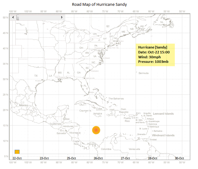
Hurricane Sandy Journey – Animated Excel Chart
How is this animated chart made?
The basic ingredients of this chart are:
- An outline map of Americas
- Data of the storm since it was tropical depression (22nd October) to the time it crossed the coast (30th October)
- Lat & Long of the storm
- Wind speeds
- Pressure
- A scroll bar form control that shows only a subset of this data
- A VBA macro that animates the chart
Since all these techniques are previously discussed on Chandoo.org, I am going to list down the process in high-level with links to learn more.
- Set up a scroll bar form control
- Based on scroll bar position extract first n values only in to another table. Learn more: OFFSET formula *
- Use an outline map & bubble chart to plot circles along storm’s trajectory. Learn more: Olympic medals by country since 1900
- Change scroll bar values from 1 to ‘n’ using a vba macro, when triggered. Learn more: Creating a clock in Excel
- You are done!
* Chris uses #N/A based technique instead of OFFSET ranges in the chart.
Download this and play with it
Click here to download the workbook & learn by breaking it apart. Examine macros & charts closely and add new techniques to your toolbox.
Do you love this? Say thanks to Chris
I really loved this idea. Very intuitive and timely. Thank you so much Chris for sharing this and teaching us something new.
If you loved this, say thanks to Chris. Check out his website (it is in Chinese) for some useful tricks.


45 Responses
WOW Amazing!!!!!!!!!!!!!!
Great !!!
Here is a motion chart with Pause button also.
https://skydrive.live.com/redir?resid=FE04913B8CACEC1E!240&authkey=!AGF1XgVbm8TgDuM
This is fantastic! I love that it is much smoother (trying to decode how this was done!).
The guy skilled in techniques of MS office, and he was willing to share good tips and files with us. Besides, i followed your blog for long time, and i loved to make Excel chart. I wish you would come my blog and leave your suggestion (http://rongson.blog.sohu.com/), if you had free time.:)
Cool chart! I’m alwasy fascinated by the animated charts people build and the stories they are able to tell.
Question, for my own curiosity:
On the data worksheet, what is the advantage of using a LOOKUP function in columns G:J rather than just doing a direct comparison between the date in col A and control cell, map!C3?
Currently:
=IF(A2=LOOKUP(map!$C$3,$A$2:$A$32),data!D2,NA())
Proposed:
=IF(A2=map!$C$3,D2,NA())
In my original design, the time interval of the chart animation is 1 hour, shorter than the time interval of column A in the in the ‘data’ sheet (it’s 6 hours). So I need to use Lookup to find the exact time point. But finally, I changed the design of the timer, but I did not change the formulas 🙂
So, if you want to slow down the speed of the animation, you can simply change the scroll bar’s maximum value, such as 180, and then modify the parameters of the formula in cell C3:
= “2012-10-22 15:00″+ B14/24
Done.
Ah, that makes sense. Thanks for the explanation!
Stunning in concept and execution!
Wonderful, creative chart. We have an Excel Users’ Group at my work. I would like to post this tremendous chart to our in-house sample folder as something to aspire to. May I have permission to post it?
Sure:)
Am I missing something? The map graphics do not change
Have you enabled the macro?
Yes
The screen annimation was so fast I could not see it…
Used comments below
This is really cool. Sandy wasn’t too horrible for me in Pennsylvania. I had no property damage and got two days off of work. The only bummer was having to take down Halloween decorations. I feel really horrible for all the wonderful places I vacation at the Jersey shore. I hope they recover quickly from the damage.
Great chart ! I am even considering use it to display evolution of expenses vs budget per office on the region….mut it might take a lot of coffee !!!!
Rgds,
Martin
Excellent work m8
Awesome!!!
Great work Chris. Thanks for sharing Chandoo!
It’s beautiful? It’s hell awesome man. beauty of Excel at its best. Wish it could play at 40% of the speed it is playing right now. I think easily possible in VBA with a controlled code execution or something.
You don’t need to modify the VBA code.
If you want to slow down the speed of the animation, you can simply increase the scroll bar’s maximum value, such as 72 (=30×2.4), and then modify the parameters of the formula in cell C3:
= “2012-10-22 15:00?+ B14*6/24/2.4
= “2012-10-22 15:00” + B14*6/24/2.4
Amazing..great work done.. as always..!! keep it up..!!!
Hi Chris,
Awesome chart of course, i was trying to decode the vba code, could you please explain the “playflag” variable declared as boolean do.
What is the purpose of this?
Thanks,
Mustafa
Playflag is used to stop the animation when you press the stop button. During the animation, it remains true, until someone clicks on the stop button. Then it will be false and the animation do loop exits.
Thanks Chandoo…
I’ll certainly get my head to figure it out….
Looking forward to more great stuff on animation….
I get a lot of annoying screen-blink. My colleagues don’t. Any idea why?
(Fantastic chart Chris!)
@Juanito
Do you have many other applications open, especially Web Browsers?
Close as much as possible and try again
Do you only have a small amount of memory and they have lots ?
Thanks Hui – tried with the browser closed and no difference. Colleagues have same PC as me. Annoying because it’s also happening with and interactive dashboard I’ve been developing. Any other ideas are welcome!
– Juanito
Hi ,
Is there any other method to slow down the animation…..i tried to replicate the chart, but the animation is too fast, using the same values….
Thank you for sharing it
Hello Chandoo
Thanks for suggesting ‘vlc’. I am now able to view the video offline as well.
You make a horrendous and difficult Excel chart so simple when you talk it through.
Thanks!
Chris –
Is there a way to visit your site in english (I know – us lazy americans can’t speak anyone else’s language)
Good work Chris, it helps to share the wisdom and expand knowledge with feedback.
Just curious, I would like to achieve the outline map for a council boundary as you have a map of America.
Any tips of doing that?
Thanks,
Peter.
WOW! Wonderful, creative chart.
Great visualization. I am only noticing it now because for some days after Sandy my Internet connection was down and I had other things on my mind! Fortunately my wife and I did not have injuries or serious damage, but life was excessively interesting for a while.
Great, say thank to Chris!
Great map!!!
This is so cool!!!! Well done!
Excellent!!
This so cool!. As a retired meteorologist, I love the overall visual. As a novelist, who is including a hurricane-packed story line, I would love to create this to track and position my imaginary hurricane so my timing it right for my characters. I have Excel from MS365 and need to expand my capabilities.