
Dot plots are a very popular and effective charts. According to dot plots wikipedia article,
Dot plots are one of the simplest plots available, and are suitable for small to moderate sized data sets. They are useful for highlighting clusters and gaps, as well as outliers. Their other advantage is the conservation of numerical information.
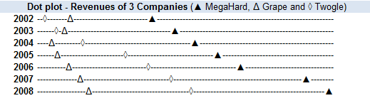
Today we will learn about creating in-cell dot plots using excel. We will see how we can create a dot plot using 3 data series of some fictitious data. We will create something like this:
Note: If you are new to in-cell charting, I suggest you read the incell bar charts article to understand the concept.
1. Take your data and massage it a bit
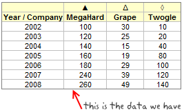
Since we are doing an incell variation of dot plot, we need to pre-process the data a little bit. Assuming we have data on revenues of 3 imaginary companies – MegaHard, Grape and Twogle like this:
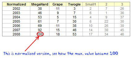
We need to normalize the data to some meaningful number like 100 (remember, incell graphs print some character for each unit in the data.) so that the in-cell dot plot looks meaningful.
After normalizing the data we will also need to calculate some helper columns so that we can develop the incell dot plot easily. The helper columns (3 of them) will show,
- Smallest value in each row – 1
- Next smallest value in each row – previous helper column – 2
- The largest value in each row – previous two helper columns – 3
Helper columns ?!? why are we doing this?
The helper columns (or intermediate values) are usual practice when we need to pre-process data for dashboards or charts. Once the chart is ready, I usually hide the helper columns as they do not really say anything.
In our case, we are using helper columns since the formulas for plotting the incell dot plot are rather long and we would make then even longer if we don’t use these.
2. Identify Symbols for Each Data Series
This is the simple job. In our case I have shown the symbols we are going to use in the above image. You can find some interesting symbols like triangles, rectangles, circles etc. in a regular font like Arial. Just go to Menu > Insert > Symbol (or Insert > Symbol in Ribbon) to find the symbols you like.
Let us assume the symbols are in the range C5:E5
3. Finally Write the Formulas That Generate the In-cell Dot Plot
Now comes the fun part. We have the normalized data in the range C16:E16, and the helper values in F16, G16, H16.
For the first row of the dot plot, the formula looks like:
=REPT("-",F16)&INDEX($C$5:$E$5,MATCH(SMALL(C16:E16,1),C16:E16,0))&REPT("-",G16)&INDEX($C$5:$E$5,MATCH(SMALL(C16:E16,2),C16:E16,0))&REPT("-",H16)&INDEX($C$5:$E$5,MATCH(SMALL(C16:E16,3),C16:E16,0))&REPT("-",100-MAX(C16:E16))
huh! it has to be one of the longest formulas I have written in a while.
I thought long and hard about how this formula can be explained and came up with the below illustration.

Once you have the formula for one row, we just need to copy paste it over the entire range to show dot plot for each year of the data. That simple!
Some formula help if you are stuck – REPT() | SMALL() | MATCH() | MAX()
How to Generate 2 Series Dot Plots?
The 2 series dot plots have even simpler formulas. So I am leaving it to your imagination. But when you finish it, the dot plot looks something like this:

Download the In-cell Dot Plot Template and Make your own Dot plots
The downloadable workbook has examples for 2 series and 3 series in-cell dot plots. Go ahead and play with it.
Further Resources on Dot Plots
Dot plots are not new, there is quite a bit of material and tools available for you to understand and make dot plots. They are proven to be very effective tools for communicating small to medium series of data. I suggest you to read few of these articles to learn more about dot plots.
Naomi’s Article on B-eye Network on Dot Plots
Excel Dot Plots using Bar Charts by Jon Peltier (Also try Excel Dot Plotter Add-in)
Excel User on Dot plots and why they are better
More on In-cell Charts
Incell Bar | Sparklines | Pie charts | Bullet Graphs | w/ Conditional Formatting


21 Responses
seems im having a blonde moment
ive tried following this but couldnt get the standardization to work so used the formula =B3/MAX($B$3:$D$9) * 100
some of the results come out as 11.5 which translates to 12 when removing the decimal places and i noticed that these are highlighted green on the example.
Would it be worth using =INT(B3/MAX($B$3:$D$9) * 100) ?
Cheers
@Jon.. I have used int just to ensure that we are sending integers to REPT(). But it works with decimal values as well. Excel highlights a cell with green color because it has inconsistent formula wrt. other cells in that region. When you paste the same formula (=B3/MAX($B$3:$D$9) * 100) over the entire region, you wont see the green highlights.
Also, if you know formulas well, you can even turn off this notification to save sometime. Just go to excel options > formula and turn it off.
This is a neat idea. Strictly speaking, I think we should use characters of equal width.
@Gerald.. that is a good suggestion…Triangles are good, so are several variations of circles.
Ah, thanks, and thanks for the formula tip too.
unfortunately i cant download the examples at work so next time ill wait till i get home and cross check there before posting 🙂
Chandoo, I’ve just landed yesterday in your page, and must say it’s awesome !!
question: I wanna take the incell a step further, and create a UDF called (surprise!!) incell, to which I’ll pass the range of numbers I want to represent.
a first approach is related to the length of the bars, as I’m not sure how to normalize any number as a representation in 10 bars (silly me…).
the second issue might be related to sign. I’d thought on adding spaces prior to positive bars, so when represented they should be “upper”, and the opposite to negatives, so they appear “lower”.
finally, this is what I’ve done so far (not including my previous considerations), starting from your example:
Function incell(rango)
Cadena = “”
For Each m In rango.Count
Cadena = Cadena & (application.WorksheetFunction.Rept(“|”, Round(m.Value / 3, 1))) & Chr(10)
Next m
rango.Select
With selection
.HorizontalAlignment = xlGeneral
.VerticalAlignment = xlBottom
.WrapText = True
.Orientation = 90
.AddIndent = False
.IndentLevel = 0
.ShrinkToFit = False
.ReadingOrder = xlContext
.MergeCells = False
End With
ActiveCell.Offset(5, 0).Value = Cadena
End Function
Any help will be much appreciated.
Thanks !
Here’s an update:
Function incell(rango)
Cadena = “”
Blanco = application.WorksheetFunction.Rept(” “,10)
For Each m In rango.Count
If m.value =>0 then
Cadena = blanco & application.WorksheetFunction.Rept(“|”,Round(INT(ABS(M.VALUE)/MAX(RANGO)*100)))) & Chr(10)
Else
Cadena application.WorksheetFunction.Rept(“|”,Round(INT(ABS(M.VALUE)/MAX(RANGO)*100)))) & Chr(10)
& blanco
Next m
rango.Select
With selection
.HorizontalAlignment = xlGeneral
.VerticalAlignment = xlBottom
.WrapText = True
.Orientation = 90
.AddIndent = False
.IndentLevel = 0
.ShrinkToFit = False
.ReadingOrder = xlContext
.MergeCells = False
End With
incell = Cadena
End Function
share your wisdom and make it better, please !!
RGds,
Martín.
well, that’s quick… this one works fine up to the cell formatting
Function incell(rango)
Cadena = “”
n = rango.Count
For m = 1 To n
repet = Round(Int(Abs(rango(m).Value) / application.WorksheetFunction.Max(rango) * 10))
blanco = application.WorksheetFunction.Rept(” “, 11)
resto = application.WorksheetFunction.Rept(” “, 11 – repet)
If rango(m).Value >= 0 Then
Cadena = Cadena & blanco & application.WorksheetFunction.Rept(“|”, repet) & Chr(10)
Else
Cadena = Cadena & resto & application.WorksheetFunction.Rept(“|”, repet) & Chr(10)
End If
Next m
incell = Cadena
ActiveCell.Select
With selection
.HorizontalAlignment = xlGeneral
.VerticalAlignment = xlBottom
.WrapText = True
.Orientation = 90
.AddIndent = False
.IndentLevel = 0
.ShrinkToFit = False
.ReadingOrder = xlContext
.MergeCells = False
End With
End Function
Now, I can format the incells manually after the formula, but the trick would be to do it when using the formula, if possible… 🙂
@Martin: Welcome to PHD and thanks for asking a question. Excel UDFs have a limitation when it comes to cell formatting. You cannot use cell formatting related functionalities from UDFs. However there is a small loophole. You can create shapes using UDFs.
Fabrice, who is a regular at PHD and a wonderful person, has used this little idea to create a really sexy piece of UDF library here: http://sparklines-excel.blogspot.com/ using which you can generate richer and better incell graphs.
If you are planning to write UDFs that can generate incell graphs, you can take a look at his library and get some ideas.
Hi, can you please let me know how I can alter the above, to create a dot plot using for 4-5 data series? Thanks in advance.
Also, I noted that if the variations between the data series is too small, cell G16 returns a -1 ,and the plot returns a #VALUE!. Is there any way we can overcome this. I am trying to graph prices of 5 products and the variatons are not huge.
@Quen
Can you post some of your data
Thanks!
Year / Company Product 1 Product 2 Product 3 Product 4
2000 0.499635011 0.506168977 0.499656989 0.506168977
2001 0.499635011 0.506168977 0.499656989 0.506168977
2002 0.499783218 0.520218283 0.513706295 0.520218283
2003 0.604277031 0.62411186 0.638749559 0.62411186
2004 0.593982199 0.631087702 0.646586595 0.631087702
2005 0.601936791 0.639042294 0.654541186 0.639042294
2006 0.613032679 0.650138182 0.665637075 0.650138182
@Quen
Have you tried normalizing your data as Chandoo described above
That is Multiply all your values by a constant so that the maximum value is; say 100 or say 100x the current values
In your case multiply all your data by 150.2320164
and try the techniques on the revised data.
Thanks, but how do I add a 4th series? Sorry, not great with excel.
Sorry, just multiplied all data by 150.232020164 in table B7 to E13, but still have the same issue. Did I do something wrong?
Hi Hui,
Still having trouble, much appreciated if you can help. I am using the downloaded file attached, and having the following issue:
– not sure how to apply the 3 series model into a 4 or 5 series model
– the data file which I have sent previously, when I paste them into the file in cell C7:E13, still creates a negative helper columns (creating a plot that returns a #VALUE!). I have tried to change the formula in cell C16 to =INT(C7/MAX($C$7:$E$13)*150.2320164) and dragged this to E22
Is there any chance you can send me the amended excel spreadsheet? Thanks, been stuck on this problem the last 2 days. Thanks again.
@Quen
Not sure there is an easy answer here
Problem is that to do this style of Chart you need to normalise your data so that there is at least a whole unit between the minimum separation
Your data
2000 0.499635011 0.506168977 0.499656989 0.506168977
will have to be multiplied by at least 100,000 to separate the 1st and 3rd numbers
But this will mean that there is over 100,000 between the 1st and 2nd numbers
This is no good for the Rept Function.
.
I have some ideas for a work around
I will make a mock up in a few days and post it.
@Quen
Have a look at
https://rapidshare.com/files/3761226720/fileforQuen.xlsx
.
It is a Scatter Chart
I have only highlighted the markers of 2000, 2002 & 2005
Thanks Hui. The only problem with the scatter chart is it does not compare the movements of prices for P1-P4 over time, like what the incell chart will do.
Quen
Isn’t that why you have to customise each marker to show P1, P2 etc
.
You could also link the various P1, P2 etc as per
https://rapidshare.com/files/1321620363/FileforQuen2.xlsx