
 Here is the big hairy question of the week. What is your opinion on Pie Charts?
Pie charts are one of the most used charts in the world. And for obvious reasons: they are simple to create and easy to understand.
When it comes to pie chart, I have no clear opinion. Part of me says use them, the other says avoid them. The debate about pie charts is not just internal. Last time when Seth Godin included pie charts in his 3 laws of great presentation,
The problem with bar charts is that they should either be line/area charts (when graphing a change over time, like unemployment rates) or they should be a simple pie chart (when comparing two or three items at the same scale).
there was so much furor in the data visualization blogosphere that Seth even did a follow up post comparing bars with pie charts, where he says,
The pie chart contains far less data, but the point is obvious: Trolls are where we should focus our energy.
That’s why you use it. …
I stepped on the toes of many data presentation purists yesterday, so let me reiterate my point to make it crystal clear: In a presentation … the purpose of a chart or graph is to make one point, vividly. Tell a story and move on.
Personally I think pie charts provide great utility at very little cost:
- They are very easy to create
- Very very easy to understand (provided the data has some contrast, if your numbers are like 43,44,45,46, there is little chance that anyone can understand the resulting pie chart and make out which one is large and which one is small)
But, I also think they are easy to abuse (one reason why you see way too many pie charts compared to other charts).
Here is what I think cripples a pie chart from being effective:
- Too many data points. A pie chart would probably be effective up to 4 values, anything more and you better have a strong story behind it for people to read and interpret. For eg. the pie chart shown to the right is used in Google Analytics reports. This compares browsers used by visitors of a site and even though there are probably hundreds of browsers, only 2 are prominent, so the pie still works.
 Poor use of color. The purpose of color in most visualizations is to bring contrast. To separate apples from oranges. To throw light where your story lies. But most programs that are used to generate pie charts have poor (and often scary) color choices. When you use poor color combinations, the result will be drastic. But this blame is not on the person making pie charts, but on the pie chart software. See the example aside from clearlyandsimply to see what contrast means.
- Making Pie charts that are difficult to compare. The purpose of pie charts is to provide comparison. So when we make a pie chart that has poor ability to compare, we are already lost. That means we should avoid all the flashy formatting, 3d pie charts, 3d donuts and layered donuts etc. Also, whenever possible, try Using data labels, using color and if nothing works, try using other types of charts for comparison. After all, we are not selling pie charts, we are selling our stories.
Ok, now the ball is in your court (or the pie is in your plate).
What do you think about pie charts?
Do you prefer them or do you consciously avoid them ?
How do you think pie charts can be put to better and greater use ?
Your turn…
Earlier on pie charts: Why no one likes your pie & what to do about it? | In cell pie charts | 22 beautiful pie chart templates for excel


16 Responses to “What is Your Opinion on Pie Charts?”
Pie charts are ubiquitous. People see them so much that they think they understand them. They do understand what they mean (generally), but maybe not so clearly what they are saying (about the specific data).
Pie charts should not be used if there are more than about three data values.
Pie charts should not be used to quantitatively compare data values. They are more effective when showing that one value is grossly larger or smaller than the other one or two values. If the pie has two wedges and their values are similar but not too similar, say 52% to 48%, that's also okay, but check with me first.
Multiple pie charts should never be used to show trends or two compare two different distributions.
Don't use a legend with a pie chart. Place labels right on or next to the data points.
Personally have come to dislike them. But the answer is "it depends".
*Depends on the number of data points. If I have two or three--maybe.
* Depends on where. In a written report where the reader has time to look at think about the info, probably not. In a powerpoint where it may only be on the screen for 45 seconds to a minute and I want to make a quick point--maybe.
* Depends on the audience. If it is a bunch of techno experts in the field, probably not. If it is a general audience that is used to pies--maybe.
* Depends on the comparison. If I am showing a ratio change over time definitely not side by side pies. If is a one-shot period--maybe.
You have to weigh ALL of the factors to decide.
I use them when I want to show the top 2 or 3 values in a series. Then I gruop the rest of values in a larger value and label it as "Others". This way I only show three or four slices.
Chandoo,
I was struggling with myself for quite a while before I used the pie charts on the Lithuanian dashboard. Why? Because I am not a fan of pie charts and usually I do not use them at all. But in this specific case I was surprised that I had to admit: there is no better way to visualize the data.
For anyone who hasn’t seen the dashboard:
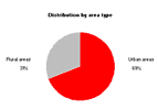
I used the pie chart for visualizing the distribution of gender and area type for a selected part of the Lithuanian population.
The context:
- Exactly 2 data values (male/female and urban/rural)
- No trend / development over time to be displayed (census data)
I pondered. I tried a bar chart, a horizontal waterfall, a vertical waterfall. I was not convinced. I still can’t think of any other way of visualizing this data better than with pie charts.
The lesson I learned: Don’t discard pie charts as a matter of principle. Sometimes they might be the way to go.
If I missed something and anybody has an idea, which visualization would do a better job than pie charts in this specific case, I would be happy to read about it.
1. I find pie charts difficult to format in Excel and tend to stay away from them.
2. But I do think they can have great utility when trying to illustrate a point. I think they have no place in a dashboard since dashboards are constantly changing. However, if there is a static message I want to present in a presentation, especially if it is to show a disproportionate number of items in one category compared to others, pie charts are good.
@Jon: Great suggestions, as usual.
You say : "Pie charts should not be used to quantitatively compare data values." I would add, "Pie charts should almost always have data labels so that normal people can know what the values are"
@PragmaticCynic: That is a very wicked username you have 🙂
I dont think I have seen you commenting here. So a big warm welcome.
And you are right, "it depends". That is the point of this post. To sensitize people about the "it depends" and let them use pie charts where they would work like a charm.
And you are right on all counts.
@Leonel : Very cool suggestion. I will try to think of an automated way to do this in excel, may be sometime in march.
@Robert: I found your choice of pie chart in the dashboard very useful and effective. I know using pie charts is a dilemma, and that is why I made this post. To discuss how I feel and to know how others feel about it.
@Daniel: You have raised a very good point. Unfortunately formatting pie charts is a painful thing in excel. May be in office 14 they overcome this and make it easy to manipulate labels etc. in pie charts. (while at it, I hope they remove stuff like 3d lighting etc :D)
I found that pie charts are quite limited to show intelligent data / information, and this because pie basically deals with "share", that is to say, a mere taxonomy. This can hardly take care of complexity of business or management in a general way.
In this way, I slighty disagree with Jon: it is not that people cannot explain pie charts, but just that not very much can be explained with pie charts.
People normally tend to use them because they are simple and easy to understand, EVEN if they do not explain very much. You seem to be in control when you show one of them... 😉 (maybe this the sense of Jon's comment; sorry if I missed it).
However, they can be very useful when a simple and strong message has to be delivered and the information is suitable (PragmaticCynic's "it depends").
I'll give an example: a pie chart is useful when showing a salesmen audience that (for example) 70% of sales are concentrated into 2 customers (2 slices of pie). This gives a very strong message that people will retain and (if properly leaded), try to change. 6 months/1 year later you can plot the previous pie and the updated one (only 2 comparative pies) and quickly show the audience if a change was achieved or not.
My conclusion after years using graphics and KPI is that pie are very basic tools, mainly suitable for descriptive and first-approach situations. Almost never for analytic ones, and definitively not for change over several periods of time. I except comparisons over 2 very-separated time snapshots (China rural population share in the 90's and in the 00's, for example).
I often use a 100% bar chart for the types of data you could show in a pie chart. Columns would work just as well, but require short or non-horizontal category axis labels. Made with just one bar these charts are essentially the same thing as a pie chart. Their utility comes from how they facilitate comparisons; a single chart can contain many bars and each bar can be compared easily to any or all of the others. Try doing that with a page full of pie charts!
Mike -
Stacked bars are a great improvement over pies, but they are still not perfect. Since only the bars ate either end of the stack have a common baseline, these are the only ones that can be compared with any accuracy. The ones in the middle can only be "eyeballed", though comparing lengths of offset blocks is better than comparing angles or areas of offset and misaligned pie segments.
@Mike: Stacked bars are a good idea, but as Jon pointed, they come with limitations like not having common baseline. check out our discussion on stacked bars to see more ways to stack charts to improve comparison.. http://chandoo.org/wp/2009/01/21/stacked-bar-charts-excel/
Hi Chandoo, I have a weird issue with Pie charts.. whenever I have Zero's in any of the fields (data).. the colors of the segments will change. I cant eliminate zero, as there or formula involved.. If I delete that formula in that field then the colors come back correctly..
I cant make the formula to show a blank when the result is '0' because the error persists as long as there is a formula (though the result is blank) or Zero.. how to avoid that wrong colors..?
@Sai
Have you tried using a NA() instead of 0 or a blank
Eg: =if(a10=0,NA(),a10)
Hui, Thats a miracle..!!! Its perfect now... Will try on all possible scenarios and will get back to you..
Thanks a TON!!!!
[...] What is Your Opinion on Pie Charts? [...]
I must get across my gratitude for your kind-heartedness giving support to those who have the need for help with this concern. Your very own dedication to passing the solution around appeared to be exceedingly interesting and has consistently enabled workers like me to arrive at their aims. Your personal warm and friendly useful information denotes a great deal to me and additionally to my office colleagues. Regards; from all of us.
[…] http://chandoo.org/wp/2009/02/20/better-pie-charts/ […]