All articles with 'tutorials' Tag
Incell Dot Plots in Microsoft Excel

Dot plots are a very popular and effective charts. According to wikipedia “Dot plots are one of the simplest plots available, and are suitable for small to moderate sized data sets. They are useful for highlighting clusters and gaps, as well as outliers.”
Today we will learn about creating in-cell dot plots using excel. We will see how we can create a dot plot using 3 data series of some fictitious data.
Continue »Highlight Top 10 Values using Excel Conditional Formatting

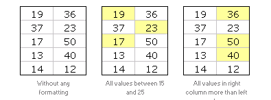
In excel conditional formatting basics article, we have learned the basics of excel conditional formatting. In this article we will learn how to highlight top 5 or 10 values in a list using excel as shown aside. We will use LARGE excel formula and conditional formatting to do this.
Continue »Excel Conditional Formatting Basics

Do you know What is excel conditional formatting? Learn the basics, few examples and see how you can use it in day to day work in this installment of spreadcheats.
Continue »
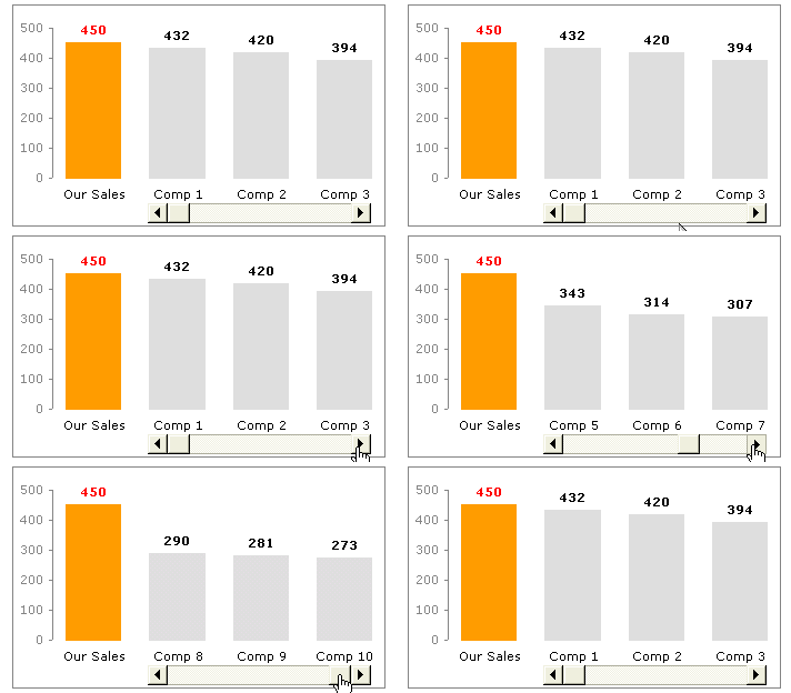
Today we will learn a little trick to compare 1 value with a set of values, For eg. our sales vs. competitor sales. We will learn how to create a chart like this.
Continue »Market Segmentation Charts using Conditional Formatting

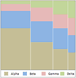
Trust Peltier to come up with solutions for even the most impossible looking charts. Today he shares a marimekko chart tutorial. I couldn’t sit still after seeing his post. So here comes market segmentation charts or marimekko charts using,
Excel Basics – What are Combination Charts and How to Make One?

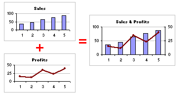
A combination chart is when you combine two different charts to make one. A popular example for combination chart is a line & bar graph combination.
Continue »Extracting Unique, Duplicate and Missing Items using Formulas [spreadcheats]
![Extracting Unique, Duplicate and Missing Items using Formulas [spreadcheats]](https://chandoo.org/wp/wp-content/uploads/2008/11/duplicate-items-excel-formula-find.gif)
Often I wish Microsoft had spent the effort and time on a data genie (and a set of powerful formulas) that can automate common data cleanup tasks like extracting duplicates, makings lists unique, find missing items, remove spaces etc. Alas, instead they have provided features like clippy which are intrusive to say the least. So […]
Continue »
Yesterday I have learned this cool excel charting trick and I cant wait to share it with you all. The problem: I have too many charts & want to show one based on selection You have made 3 charts to show your company performance in the last 8 years. But you don’t want to clutter […]
Continue »![Excel KPI Dashboards – Adding Micro Charts [Part 4 of 6]](https://chandoo.org/wp/wp-content/uploads/2008/09/kpi-dashboard-excel-thumb.jpg)
This is 4th part of Creating Management Dashboards in Microsoft Excel 6 post series by Robert. This 6 Part Tutorial on Management Dashboards Teaches YOU: Creating a Scrollable List View in Dashboard Add Ability to Sort on Any KPI to the Dashboard Highlight KPIs Based on Percentile Add Microcharts to KPI Dashboards Compare 2 KPIs […]
Continue »![KPI Dashboards – Highlight KPIs Based on Percentile [Part 3 or 6]](https://chandoo.org/wp/wp-content/uploads/2008/09/kpi-dashboard-3-thumb.jpg)
Creating KPI Dashboards in Microsoft Excel is a series of 6 posts by Robert from Munich, Germany. This 6 Part Tutorial on KPI Dashboards Teaches YOU: Creating a Scrollable List View in Dashboard Add Ability to Sort on Any KPI to the Dashboard Highlight KPIs Based on Percentile Add Microcharts to KPI Dashboards Compare 2 […]
Continue »

