All articles with 'stacked bar' Tag
Impress with Tornado Charts in Excel

It’s tornado season. Don’t freak out, I am talking about Excel tornado charts. Use them to visualize age and gender-wise KPIs. Here is a quick demo of interactive tornado chart made in Excel. Watch it and read on to learn how to make your own tornado in a spreadsheet.
Continue »Source vs. Use of Funds – 14 charting alternatives

Let’s say you manage a fund or charity. You get money from various places and you use that money for various reasons. How do you tell the story of source vs. uses of funds? In this post, let’s review 14 charting options. Source vs. Use of funds – Sample Data for this problem Let’s say […]
Continue »![Designing awesome financial metrics dashboard [tutorial]](https://img.chandoo.org/contests/mv2016/rs/09-chandeep-c.png)
In this amazing guest post, the winner of our 2016 dashboard contest – Chandeep – Explains how he constructed the jaw dropping beauty (shown above) using Excel, creativity, love and sweat. Grab a full cup of coffee (or whatever liquid fancies you) and read on. Take lots of notes and play with the ideas in Excel while reading to maximize your learning.
Thanks Chandeep.
Continue »
Lets take last weeks Stacked Bar/Column Chart and add some high-performance steroids.
Continue »
Learn how to develop a Stacked Bar chart with Indicator Arrow in this Tutorial
Continue »Excel Links – Getting used to life in Windy Wellington Edition
So we moved to Wellington, New Zealand few weeks back (on 17th of July 2016, to be precise). After spending first 3 weeks in Jeff’s house and a hotel, we moved in to our rental home over the weekend (on 6th of August). Around the same time, the worst of Wellington winter waved welcome to us. We quickly learned how to stay warm indoors (layers, hot water bottles, rugs and more layers). Kids started going to school few days back and they are loving it. I bought a bike and managed to go out on few rides on the hilly roads of Wellington and found a strange for sale sign too.

Anyhow, Since we didn’t have internet connection until today, I thought I will start by sharing a few Excel links with you. Check them out to get your fix of spreadsheets.
Read on…
Continue »Use Advances vs. Declines chart to understand change in values

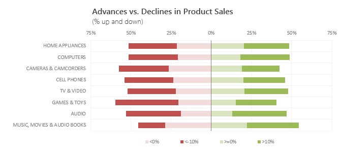
Lets say you are responsible for sales of 100s of products (which belong to handful of categories). You are looking at sales of each product in last month & this month. And you want to understand whether sales are improving or declining by category. How would you do it?
Turns out, this is not a difficult problem. In fact, this question is asked every day & answered using Advances vs. Declines chart.
You may have seen this chart in financial newspapers or websites. Shown above, Advances vs. Declines chart tells us how many items have advanced & how many have declined.
Read on to learn how to create this chart using Excel.
Continue »Gantt Box Chart Tutorial & Template – Download and Try today

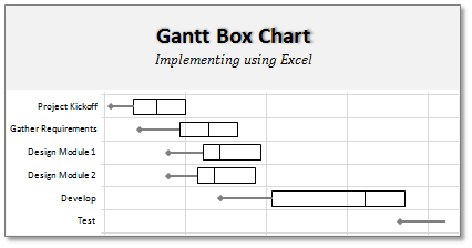
On Firday, we proposed a new chart for showing project plans. I chose an ugly name for it and called it Gantt Box Chart. Essentially, a gantt box chart is what you get when a gantt chart and box plot go to a bar, get drunk and decide to make out. It shows the project […]
Continue »![How to Visualize Survey Results using Incell Panel Charts [case study]](https://chandoo.org/img/cb/survey-results-panel-chart-example.png)
A panel chart (often called as trellis display or small-multiples) shows data for multiple variables in an easy to digest format. It lets users compare in any way and draw conclusions with ease.
Today, I want to discuss how the principles of panel chart can be applied to visualize a complex set of survey results. For this we will use the recent survey conducted by Gartner on how various customers use BI (Business Intelligence) tools.
Continue »As some of you know almost 10 days back I left Denmark and came back to India. I had to come back because of visa and personal issues. For the next 6 months PHDs will be based out of India and working from home. While this gives me a lot more time, I will be […]
Continue »Make a Quick Thermometer Chart to Compare Targets and Actuals

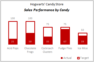
Comparing values is one of the reasons why we make charts. So today I am going to teach you a handy little trick to make a thermometer like chart to compare targets with actuals. This type of chart is very useful when you have a bunch of sales targets and you want to measure how the performance has been.
Continue »Do you want to make a budget vs. actual performance chart but not sure what option to use? Check out these 14 excel charting alternatives and find the one that tells your story.
Continue »Market Segmentation Charts using Conditional Formatting

Trust Peltier to come up with solutions for even the most impossible looking charts. Today he shares a marimekko chart tutorial. I couldn’t sit still after seeing his post. So here comes market segmentation charts or marimekko charts using,
Review of PTS Clustered Stack Chart

My Friend and long time Microsoft Excel MVP, Jon Peltier has released a wonderful little excel charting utility called Cluster Stack Chart Utility. Out of curiosity I have mailed Jon and asked him if he could send me a copy of it so that I can review the product and recommend it to PHD reader community. He is kind enough to mail the add-in to me and here goes my review of the tool.
Continue »[Reader Poll] Stacked, Seperated or Mirrored ?
![[Reader Poll] Stacked, Seperated or Mirrored ?](https://chandoo.org/img/a/bar-charts-ways-to-stack.gif)
Stacked bar charts are a popular way to depict 2 more series of related data, like sales of 2 products.But there are several ways to stack the bars in a bar chart. Here is a list of 6 ways to stack them
Continue »

