All articles with 'shapes' Tag
{ 10 Comments }
Make info-graphics with shape fill technique [Charting Tip]
Published on Jul 11, 2019 in Charts and Graphs
![Make info-graphics with shape fill technique [Charting Tip]](https://chandoo.org/wp/wp-content/uploads/2019/07/make-info-graphics-in-excel.png)
This is a quick, fun and elegant way to make impressive charts. You can easily create info-graphic style charts in Excel using shape fill technique. Something like this:
Continue »{ 15 Comments }
Use shapes to enhance your Excel charts [tip]
Published on Aug 8, 2015 in Charts and Graphs
![Use shapes to enhance your Excel charts [tip]](https://chandoo.org/wp/wp-content/uploads/2015/08/use-shapes-to-enhance-your-charts.png)
Here is a simple way to enhance your Excel charts – use shapes & pictures in your charts.
We will learn how to create something like above.
Looks interesting? Read on…
Continue »{ 32 Comments }
Happy Birthday Hui, An Excel Dashboard to prove you are awesome!
Published on Jan 14, 2011 in Charts and Graphs, Cool Infographics & Data Visualizations
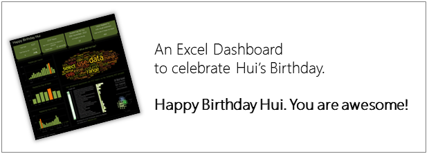
Some of you know our guest author and Excel ninja Hui. Yesterday was his birthday. And I wanted to create nice birthday gift for him. So I took a database dump of our forums data and created a dashboard.
Read rest of this post to see the dashboard & download workbook.
Continue »{ 16 Comments }
Use Shapes and Images to make Prettier Charts [Dashboard Tricks]
Published on Dec 3, 2009 in Charts and Graphs
![Use Shapes and Images to make Prettier Charts [Dashboard Tricks]](https://chandoo.org/img/c/use-shapes-to-make-better-dashboard-charts.png)
One of the annoyances of charts is that they all look like boxes (except for pie charts, they just look wrong). Boxes might be ok when you are making 1 or 2 charts. But a whole dashboard of boxes can look little rigid. So how can we make the charts peppy without loosing any effect? Like these charts below:
Very simple, we use drawing shapes in MS Excel to draw whatever we want and overlay the chart on top.
Continue »
