All articles with 'histograms' Tag
{ 4 Comments }
Histograms & Pareto charts in Excel – tutorial, tips and downloadable template
Published on Oct 5, 2017 in Charts and Graphs

Time for some statistics and charting fun. Let’s learn all about histograms and Pareto charts in Excel 2016. You will learn
- What, why and when?
- How to set up and customize histograms
- How to use Pareto charts?
- How to create dynamic histograms?
- Creating histograms in old Excel (2013 or prior versions)
Sounds interesting? Let’s get started then.
Continue »{ 8 Comments }
How Many Bubbles are Too Many Bubbles?
Published on Feb 26, 2009 in Charts and Graphs, Cool Infographics & Data Visualizations
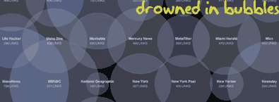
In How Many Links are Too Many Links, O’Reilly radar shows us this unfortunate bubble chart. Read the rest to see why the chart is unfortunate.
Continue »
